
New map reveals red zones for pedestrian safety risks
We know ‘speed kills.’ Now we have more context for where and why.
🚨 Please note: BikePortland is currently on hiatus and only publishing guest articles. Learn more here. Thank you. - Jonathan 🙏
We know ‘speed kills.’ Now we have more context for where and why.

A helpful analysis. Now we just need to get a few of them on the ground.

Part of ODOT’s goal to reach zero deaths in the next 11 years.
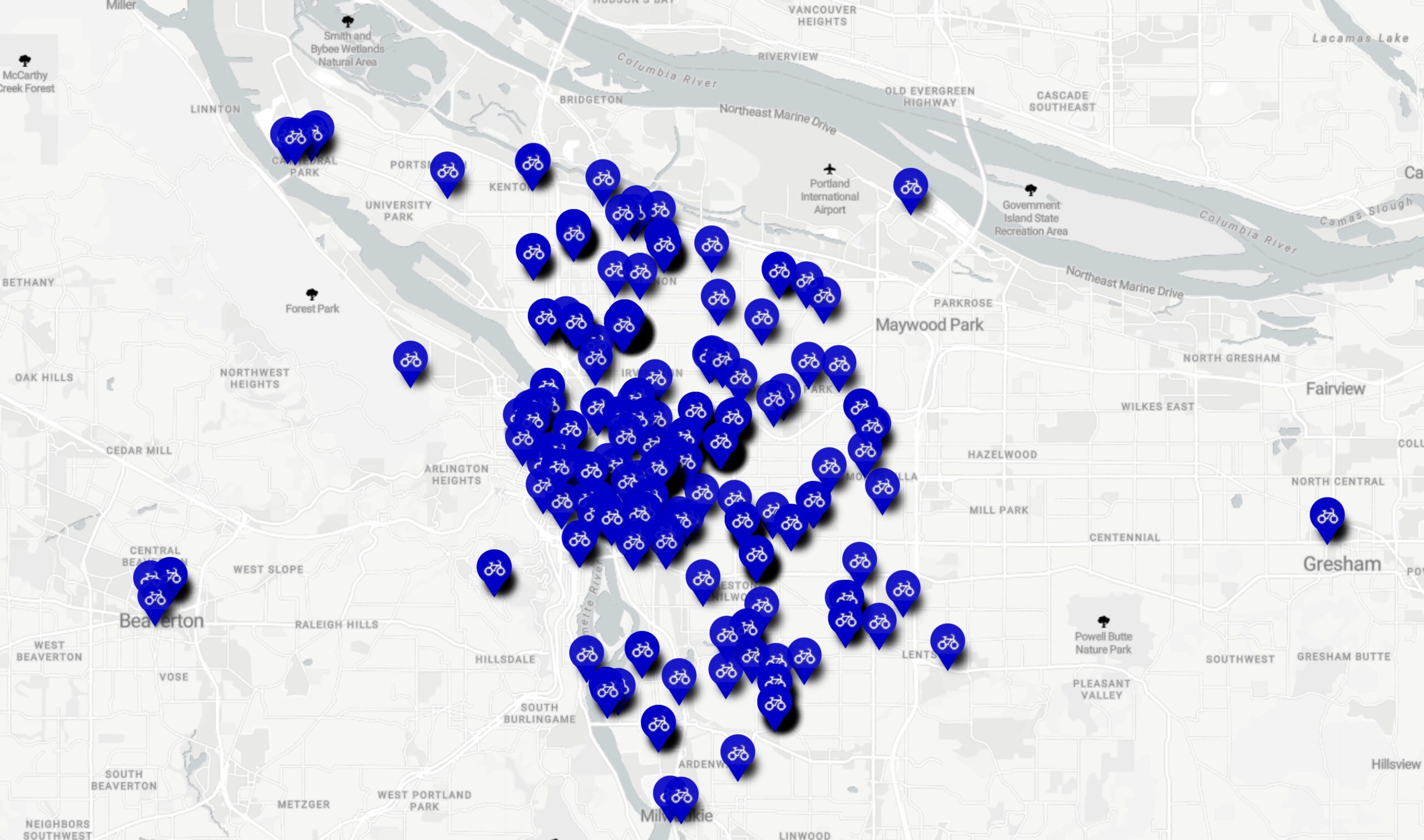
Excited to take part in the daily rides going on as part of Pedalpalooza right now, but don’t have a lot of time to get to the start location? Curious which parts of Portland are host to the most meet-up spots? A new map created by Portlander Aaron Kuehn can help. Aaron just shared this … Read more
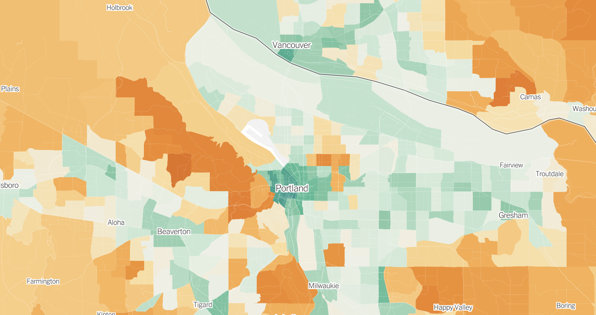
The neighborhoods colored deepest orange on the map include the wealthy east side areas of Irvington, Alameda and Laurelhurst.
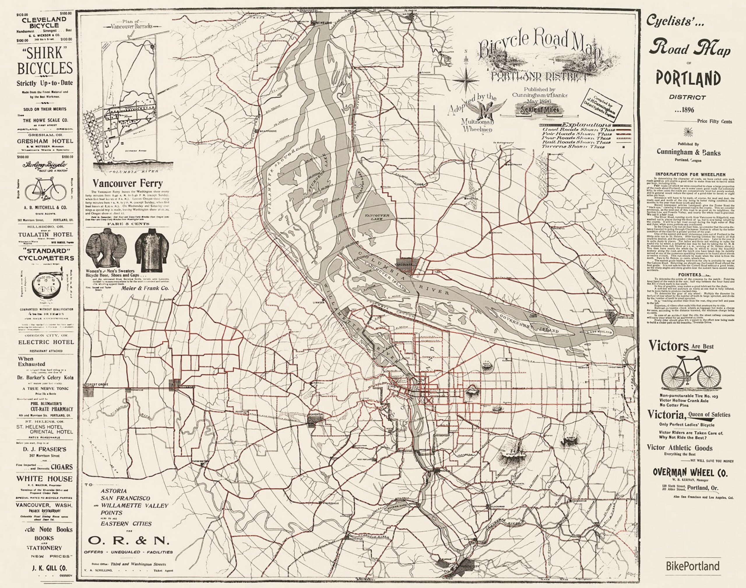
The map includes several amazing details that give you a window into Portland bike culture at the turn of the 19th century.
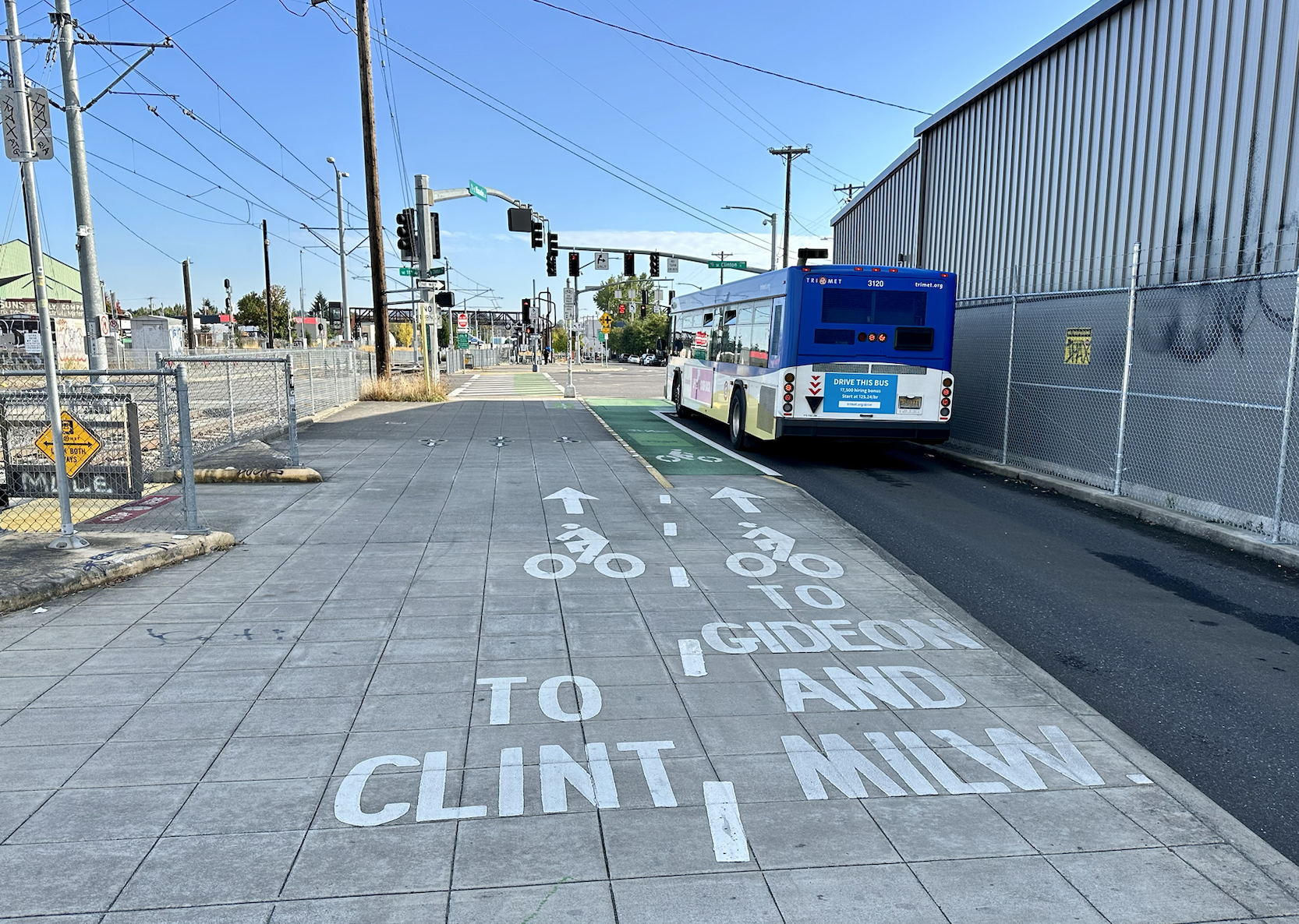
A grassroots report will look to raise the profile of signage as a key tool to boost bike ridership.
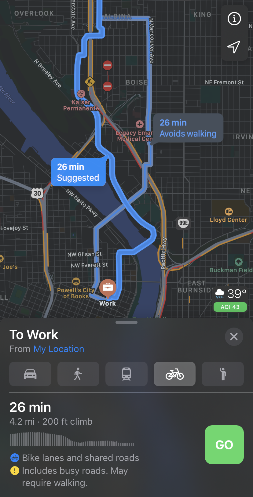
If you use Apple devices and rely on a bicycle to get around Portland, we’ve got some good news. Apple Maps has just expanded its cycling directions feature to our wonderful city.

Those were the days.

The best printed bike map in the Portland region will soon be a collector’s item. Metro announced yesterday that they will no longer sell the printed version of the vaunted Bike There! map. The map was first published in 1983 and has gone through nine major updates. The ninth (and last) edition came out in … Read more
A very useful tool.
The more dangerous our streets are, the better our bike maps need to be.