For the first time ever the City of Portland’s official bike map is available in an interactive online version.
This is great news for anyone who wants to learn more about how to get around town on a bike using the safest, most efficient routes.
The map is very detailed and allows you to zoom in for fine-grain analysis and inspection. Layers can be turned off and on and include helpful symbols that tell you the the location of: bike shops, one-way streets, climbs, caution areas, and more. Click on a bike shop symbol (blue wrench) and a window pops up allowing you to go directly to the shop’s website. Both satellite and basic map view are available. The mobile version works very well so I recommend adding a button to map on your home screen.
This latest GIS-powered version sure has come a long way since PBOT’s 1975 “From here to there by bicycle” map.
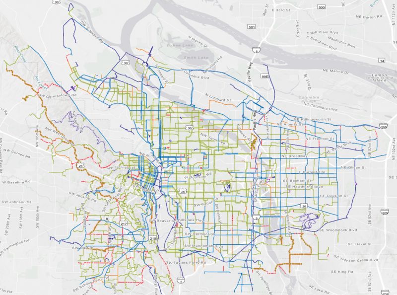
This is a very useful tool for journalists and advocates who need to understand where problems and opportunities lie. I like to zoom into different quadrants and neighborhoods to see how dense the bike infrastructure network is — or how much it’s lacking.
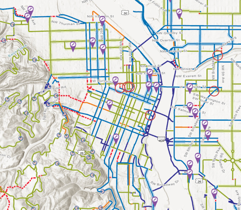
Take a look at downtown (they still have some bugs to work out as it appears the street names are a bit off):
Advertisement
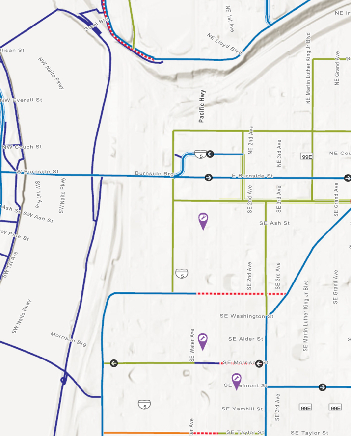
Then just across the river in the Central Eastside, notice the huge gaps and lack of north-south routes (and lack of bikeways in general!):
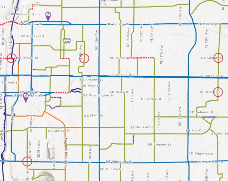
And here’s what our bikeway network looks like east of 82nd between Halsey and Division:
Southwest Portland sure has a lot of caution areas:
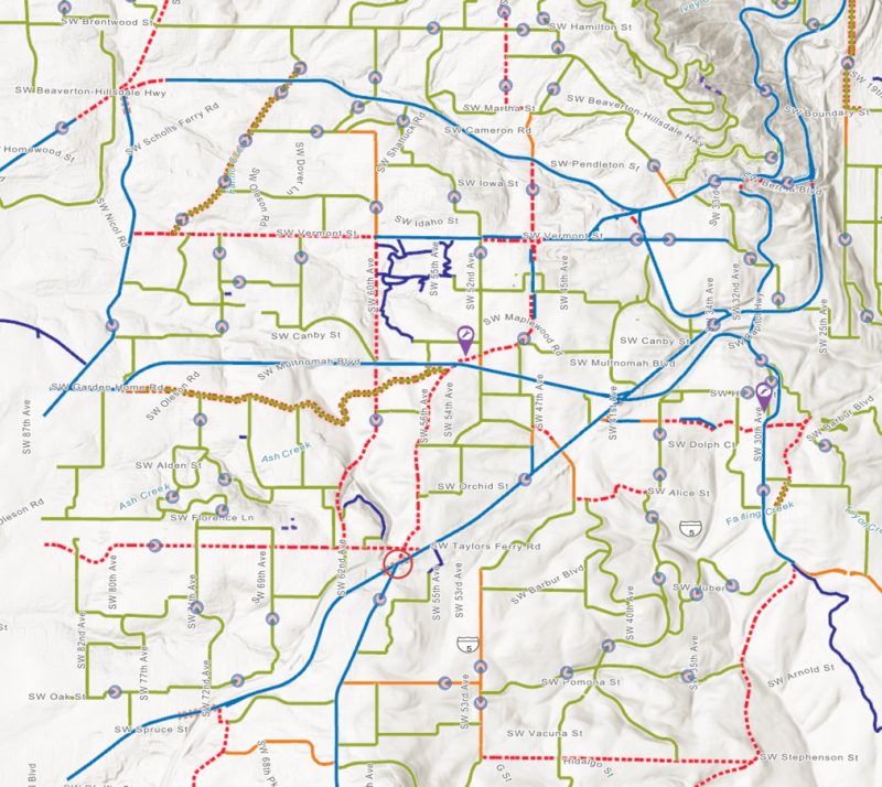
Having this map online also means we don’t have to wait for reprints to see the latest updates to the network. Hopefully PBOT maintains this so it shows the most recent additions and changes to our streets.
Bookmark the map page for quick reference, and add the online version of Metro’s Bike There Map too while you’re at it.
— Jonathan Maus: (503) 706-8804, @jonathan_maus on Twitter and jonathan@bikeportland.org
BikePortland is supported by the community (that means you!). Please become a subscriber or an advertiser today.




Thanks for reading.
BikePortland has served this community with independent community journalism since 2005. We rely on subscriptions from readers like you to survive. Your financial support is vital in keeping this valuable resource alive and well.
Please subscribe today to strengthen and expand our work.
Looks pretty good on mobile as well. Bien hecho.
oh good point Justin. I added a line to the post encouraging folks to add a button to their home screens that links directly to the map. I just did!
For NW 10th, that’s not just a “difficult connection”, more like streetcar track doom.
Perhaps PBOT can add skull and crossbones to the map’s legend for all areas impacted by streetcar.
Or maybe a graphic of their existing on-street warning signage, showing a rider being thrown from their bike from hitting tracks?
I like your symbol suggestion though, but I’d reserve it for any location that has had fatalities or life-changing injuries over the last 10 years, with a graduated size based upon the number.
Given PBOT’s “commitment” to Vision Zero, I’m rather surprised by the relative lack of warning symbols on the map.
And that’s the rub — since PBOT doesn’t have a reporting mechanism for submission of accident/crash info, no one knows how many “life-changing injuries” have occurred. It appears that PBOT has liability issues if they compile injury statistics.
PBOT already compiles this info as part of Vision Zero. All I’m calling for is to overlay this data onto the city bike maps. BP has shown their maps repeatedly: http://pdx.maps.arcgis.com/apps/MapSeries/index.html?appid=cf122cd3b4ef46f0ac496b2d61d554e9
Really? Then what was the purpose behind the AROW (Active Right of Way) reporting form (which appears to be defunct)? I’ve been looking all over PBOTs web site for a reporting form, and if it exists, let me know. If I’m interpreting the overlay correctly, the report source is PPB, so if PPB didn’t show up to the incident, then it’s the proverbial tree falling over in the woods.
I just got off the phone with a helpful staffer from PBOT, and the only incidents compiled are those where the bike is involved in a crash with a motor vehicle. So I’d take the crash number totals with a grain of salt (outside of fatalities of course).
Just curious, since neither of your posts make much sense to me, but how likely would a bike vs bike or bike vs pedestrian crash cause a life-changing injury for the bicyclist(s)? And how frequent are they likely to be, in your estimation?
I would be leery of marking crash locations — this could lead to mistaken impressions.
Such markings could make safe but heavily used routes (particularly by novices, people who’ve been drinking, etc.) appear dangerous while making much more dangerous but lightly trafficked routes taken almost exclusively by experienced riders appear very safe.
This would be a severe disservice.
Taking a look at the data, I’d say you are quite wrong. Most of the fatalities are on streets that are already widely perceived as dangerous, based upon the comments I’ve seen on this blog for the past 5 years. As for injuries, might not the showing of them encourage all riders to be a bit more cautious during heavy bike traffic on Lincoln or Salmon (or any other busy route)? How much difference is there, really, between a very confident rider and an over-confident rider?
I would still have conditions rather than numbers drive designations. BTW, where on Lincoln and Salmon were you thinking (or where’s a pointer to the data)? I’ve never thought of either of those streets as being remarkable in any way.
Being a solid rider involves confidence, but having confidence in and of itself doesn’t indicate anything. It all boils down to situation management.
Showing crash locations could help people be more mindful, but I still think it could steer people from good routes to ones that are less safe.
Sorry, I have the data in the stream above: http://pdx.maps.arcgis.com/apps/MapSeries/index.html?appid=cf122cd3b4ef46f0ac496b2d61d554e9
You’ll need to click onto the bike crash data. Injuries are small grey spots.
Looking at this data reinforces my belief that not displaying it by default is the right call, though I support making it available for those wanting to see it.
One thing I learned from this map is that practically all of my commute is along high crash corridors including multiple fatality points. I have personally witnessed many conflicts at a number of crash points indicated on the map.
As someone who has ridden this route literally thousands of times, sometimes (including today) on a recumbent trike which puts my eyeballs at bumper level, I do not think the takeaway should be that these areas are unsafe because they aren’t and I’m not sure alternate routes would necessarily be safer. Rather, I believe these crashes are a function of the large number of cyclists that can be found there combined with dangerous practices which I see every day. BTW, I couldn’t help but notice that Naito which constantly gets riffed for being so terrible looks pretty dang good from a crash perspective.
Anyone willing to take the time to study crash data should also be willing to take the time to familiarize themselves with safe practices for navigating in a busy urban environment.
Looks like the ODoT bikeways (Interstate Bridge / I-205) etc are not included (layer turned off?)?
“PBOT’s 1975 “From here to there by bicycle” map” link doesn’t go to the correct link. It should go to the below link.
https://bikeportland.org/2016/03/15/heres-what-portlands-bikeway-network-looked-like-in-1975-177800
On the online PBOT key, with a separate symbol of blue with squiggly lines, is:
Bike Lane: Very High Traffic
on very high traffic streets
Carril de bicicletas en calles con tráfico mayor.
Please tell me, what streets are these? According to the online map, busy streets like Yeon, 122nd, and outer Division are equivalent to inner Division, 52nd, etc.
I also noted that the hill arrows don’t show if you are zoomed out a bit.
I checked to see if they called out the dangerous pinchpoint on southbound Interstate Ave under the Larrabee Viaduct: Not only is the dangerous spot not called out on the map, the bike lane is not depicted on the map. The map shows bikes being routed up the Larrabee Viaduct, across Broadway, and back down to Interstate on Larrabee. I have often thought that would be a fine way to route motor vehicles (though it would require structural improvements to handle the freight) but this is a horrible bike route. I hope this map is not a prediction of things to come!
Why are “shared roadways” even on this map? In no way can those count as bike infrastructure.
Well, SW Raab Road is a quiet road outside of church hours for the adjacent church. The concrete path was built because neighbors objected to govt thoughts of making it a through-Road for car traffic when the roads and trails were rebuilt around Sylvan in the 1990s.
You’ll have to be more specific. The shared roadways I regularly use on this map are great places to ride, and if they weren’t marked it would appear that there’s no good connection there, which is wrong. Kingston & Couch, just from a quick glance.
The Shared Roadways in my neighborhood (Brentwood-Darlington) are completely arbitrary and not related to road conditions or the roads people actually cycle on.
In years past we called them “bicycle boulevards” and took great pride they were on the bike map. “Shared streets” is the new national term, so Portland can compare its system with Pittsburgh and Charlotte. I’m glad the city distinguishes between different types of markings on such routes – it’s helpful on getting other cities nationwide to do the same on their maps, which are often way more dishonest than Portland’s.
Are you mixing up “Shared Roadways” with “Neighborhood Greenways” on the map? They have different markings.
No, I’m not mixing them up, they are both green lines on the map. The NGs have a hallow along the lines, which isn’t easy to distinguish for those with poor eyesight. An NG in Portland has a certain set of improvements such as sharrows and sometimes better crossings at busy intersections, but in many other cities it’s often just signage that distinguishes them, and no more than that. And in Portland 10 years ago, most NGs didn’t even have that, nor were they called “greenways”. In fact, in many cities, a “greenway” is what you would call a multi-use path.
The comment you responded to was talking about “Shared Roadways”. On this map, that is a single green line. Kingston is marked a “Shared Roadway”. It is not a “greenway”. Why are you talking about greenways?
This thread starts as my response to Adam, in parallel with your response. My responses weren’t related to yours until you started responding to mine. I have no opinion about Kingston.
Adam: Why are “shared roadways” even on this map?
David: In years past we called them “bicycle boulevards” and took great pride they were on the bike map.
No. The Shared Roadways on this map were not “bicycle boulevards”. Those would be the Neighborhood Greenways on this map, and they are marked differently.
Well, technically, this isn’t a “bike infrastructure” map. It is a map of the city, showing the varying levels of bike accommodation or conditions on most streets. It is still helpful to see the difference between green “shared roadways” and dashed red “difficult connections”. My route choices would be nil if I relied on having protected infrastructure everywhere along the routes I use, but seeing the difference between red and green makes route selection easier.
Also, why are protected and buffered bike lanes given the same markings? They are vastly different things. This map makes Portland look deceptively full of bike infrastructure, when in reality, this is not the case. Especially downtown — by including the “shared roadway, low traffic” designation, downtown appears to be full of bike infra. When in reality, while yes I do ride many of those shared roadways, I would not consider them to be “low traffic”.
Would a bike map of only protected lanes be of much use to anyone?
It would be honest, at least.
So…an honest map of Adam-approved routes that don’t connect to each other. If that’s what you want, I would start by suggesting that they increase the flexibility of the app to allow you to turn more specific layers on and off, rather than just turning off all bike routes.
But as the map gets more complicated, more people will make mistakes using it, e.g. forgetting that they turned off layers of non-Adam-blessed routes. (In this thread there’s already someone who thought the map had a route-finding function and got so confused that he stopped using the map.)
I think this would simplify the map dramatically as every route could be indicated to be a trail of death 🙂
Yes, it would be more useful. Honesty is not the issue here, but rather finding safe routes to ride, especially for the “interested but concerned” rider, the main user of these maps. Given that intersections are the most dangerous portion of any local bike system, as a visitor I’d like to know what routes will be safest for riding. Paths and no-car bridges are best, followed by protected lanes and intersections, then buffered, then maybe regular bike lanes and/or shared streets, then local streets, then non-laned arterial roadways, etc.
A map of just protected lanes in Portland as defined by Adam would be nearly empty. They are the ones marked on the map in triple blue lines, and many of them are not actually protected so they wouldn’t even qualify.
At the very least, this map should ditch all the “shared roadways”.
Well, again, I disagree with that. As noted above, it’s helpful to have Kingston marked as a shared roadway bike route (so that people don’t choose to ride Burnside instead). Same with Couch. And many, many other ‘green’ roads on this map.
Maybe you should put out a competing Adam Map to show only the flat and physically protected bike lanes? It would be pretty easy to mark up.
I’ve seen such maps. Raleigh has two competing bike maps – the city one has lots of blue lanes, some purple sidewalk connections, and a few green shared streets, while the state map only has multi-use paths, no other bike infrastructure, just a huge blank city of 400,000 and a few paths, as if PBOT only showed their infrastructure, and ODOT their paths.
It specifically categorizes the “shared roadways” based on traffic volumes. Most of the low volume routes are residential streets that a lot of riders would feel comfortable on (and currently do ride on). How is that not being honest?
I think it is important to provide a completely overlay of all possible routes in a manner that is easily understood and usable by the majority of consumers, as compared to what one individual finds personally inconvenient or isn’t purist enough.
It’s not about purity, it’s about comfort for a cyclist who is still learning their way around a city. Most of the shared roadways and greenways are often clogged with cars — greenways being far worse on the motor volume front. To be honest, it’s probably not even the map’s fault that PBOT is so inept at designing quality cycling infrastructure that doesn’t also attract additional motor traffic.
I think a cyclecross-style map needs to be made for the westside to create routes for commuters. I often carry my bicycle up stairs.
Who should be informed (or re-re-reminded) of errors? Examples: showing SW Terwilliger between Sam Jackson and Sheridan (along Duniway Park going toward OHSU) as a bike lane when it’s actually a gap. Or showing Hwy 30 toward the St Johns Bridge as bike lane when there are pinch points of 3′ or less that should be shown as gaps. It shouldn’t take a person getting killed to get the gaps shown.
https://bikeportland.org/2017/03/15/portland-edits-city-bike-map-to-reflect-fatal-bike-lane-gap-221593
Scott — Timo Forsburg is the person that does map updates. His email and phone number are on the Portland By Cycle web page.
“For more information, contact Timo Forsberg | 503-823-7699” timo.forsberg@portlandoregon.gov
https://www.portlandoregon.gov/transportation/44099
I have a bunch of things that I’d like to see corrected on the map. For instance, the Bryant Neighborhood Greenway crossing of NE MLK has been bugging me for years, it really needs a red circle on the map.
Ted Buehler
I sent an email to Timo asking for a red circle at Bryant and MLK. We’ll see if it gets modified.
Anyone else sending in requests for corrections?
Ted Buehler
Ted,
The map is pretty buggy on my computer so I haven’t spent too much time looking at it, but I did notice a few omissions I thought I would send to Timo with a request to include:
Southbound Interstate Ave between Tillamook and Larrabee: the existing bike lanes are not shown, though they are painted on the road. When added to map, please include the “Difficult Connection” beneath the Larrabee Viaduct.
Southbound Greeley at the I-5 on-ramp: please add a “Difficult Connection” symbol here
N. Blandena/N Going: please add a “Difficult Connection” symbol where the route crosses MLK without a signal (double threat condition). Also add at the unsignalized crossing and required out of direction travel at N. Vancouver and at N. Williams
Northbound Interstate between Greeley and Fremont: Indicate the hill
Northbound Interstate between Cook and Fremont: The bike lane abruptly ends here on a steep uphill. There are no sharrow symbols and car traffic is quite heavy and fast. Please indicate this is Difficult Connection
Multnomah-to-Glisan over the Steel Bridge should be marked as a Bike Lane -> Difficult Connection –> Sidewalk Connection. It currently doesn’t show anything.
The Canyon Ct markings are all kinds of goofy. It should be Multi-Use Path from Skyline to Canyon, then Bike Lane, and then Shared Roadway/Bike Lane. It is marked as Protected Bike Lane in two places, and neither of those exist.
How about pdxreporter/safeline data? I would like to get some map version of where people have complained about an intersection/crossing so others can subscribe/pile-on instead of everyone feeling like they must be the only person who ever rode a bike through here or walked on this half-overgrown sidewalk.
Why aren’t the “difficult connections” closed to through auto traffic? We know why these streets are dangerous, it’s the fast-moving cars.
I wonder why it cuts off at the city limits? The .pdf version goes on to cover Gresham, Vancouver WA, Beaverton, etc.
https://www.portlandoregon.gov/transportation/article/322407
Ted Buehler
Typed in my address. Map reloaded. Tried again. Address went in, tried to add another address for destination. Map reloaded. Tried just shinking map to get over view. Map reloaded. Tried moving map to see my neighborhood. Map reloaded. Gave up and went for a ride. Am much happier now.
You can’t input two addresses and get a route. Its not a Google Map.
Tried it again. Yep, sure can’t use it to get a route. That kind of limits its utility, doesn’t it? After all, shouldn’t I be able to plan how to get from here to there, without having to trace the route on my own? If you can’t plan a route, it is at best Mapquest from 1999 or so.
Google Maps will already show you a “bicycling route” from A to B. Sometimes it uses the roads designated on the Portland bike map, sometimes it doesn’t. Sometimes it is a route that I’d choose to ride, sometimes it isn’t.
I don’t know how easy it is to modify Google’s routing algorithm to use just the roads designated on the Portland bike map, rather than the algorithm’s default route. I suspect this would be a business service that the city would have to pay for. I think writing an entirely custom routing algorithm would be a significant task.
Anyway, I think what you’re asking for would be neither simple nor inexpensive for the city to do. And I wonder how much additional utility it would really bring, considering that anyone can simply look at the Portland bike map and see the route.
From my experience here in NC, Google maps all routes in local bike master plans as if they have already been implemented, even when they are decades away from funding. If the section of Morrison is on the BMP 2035, then they mapped it accordingly.
Marrying this data together with google street view of the areas, would be a very good tool for planners and concerned citizens to look at and think about weak spots, and dropped connections from the comfort of the home or office.
It kind of is. Click on a red circle (difficult intersection) and you’ll get a link for that location in Bing’s StreetView-like service.
why are they re-inventing the wheel here…
There seem to be quite a few missing paths/streets..are they using a 1975 map for the base?
I use Openstreetmaps a lot paired with ridewithgps..works wonders for finding routes.
I’m rather surprised not to see Gateway Green on any of the maps.
Thanks, Jonathan. I forwarded this article to my wife, who recently purchased a new bike. I also blew the dust off of my vintage Bianchi Volpe, so watch out for us in the seniors lane 😉
P.S. This article is a good example of the excellent resources you have among your archives.
The interactive map isn’t. It can’t find Peace memorial park and the is no facility to enter and address and receive a route. If you don’t put in the city, you’ll get directions in CO
Like most DOT’s, you need to prove your parents are first cousins to get a job