“Households in denser neighborhoods close to city centers tend to be responsible for fewer planet-warming greenhouse gases.”
– New York Times
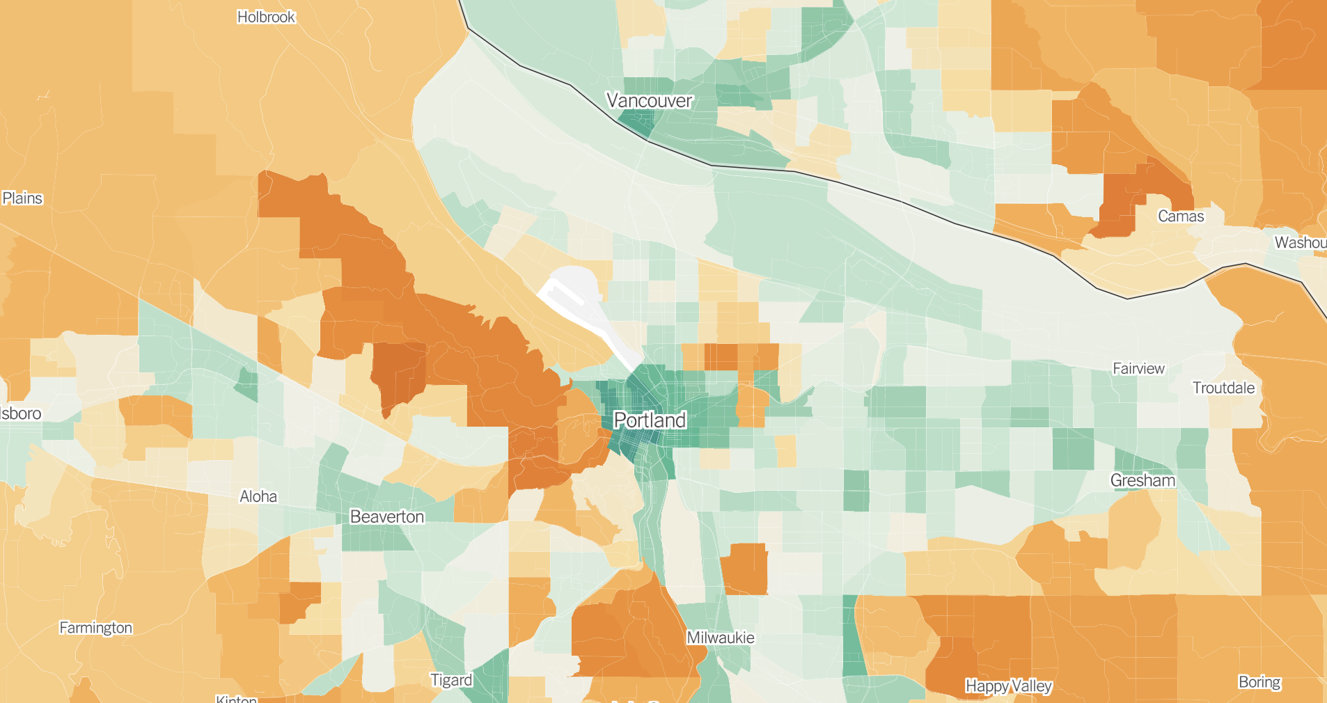
Want to know how your neighborhood’s average carbon emissions stack up to other places around the country? Look no further than a new map from the New York Times created with data from the University of California, Berkeley, which puts the important relationship between city planning and the climate crisis on visual display. For people who know how important sustainable city planning is for carbon emissions reductions, these findings won’t be surprising, but it’s striking to see it laid out so clearly.
The data breaks down every U.S. census tract according to five categories: transportation, housing, food, goods and services. Although the latter three categories are important as well, the first two categories are the most crucial for city planners to look at, especially since they often make up the biggest contribution to a household’s carbon footprint.
Taking a big-picture view of the map, it’s immediately obvious that people living in cities have a much lower carbon footprint than people living in the suburbs or rural areas — largely because of housing and transportation.

As many proponents of dense housing developments will tell you, transportation and housing are inextricably linked. This is not only because denser cities typically have more options available for people to get around without cars, but also because smaller homes located in more populated areas require less energy for electricity and heating/cooling. The article states:
Households in denser neighborhoods close to city centers tend to be responsible for fewer planet-warming greenhouse gases, on average, than households in the rest of the country. Residents in these areas typically drive less because jobs and stores are nearby and they can more easily walk, bike or take public transit. And they’re more likely to live in smaller homes or apartments that require less energy to heat and cool.
When you zoom in on Portland on the map, you’ll see that many of our neighborhoods — especially in the central city — are comparatively pretty green, with emissions below the national average of about 40 tons of carbon dioxide per household. The lowest impact neighborhoods are in the transit and housing-dense west side (downtown), where the average household consumes less than half the national average.
Interestingly, in the parts of the city where emissions are higher, transportation and housing aren’t necessarily to blame. The neighborhoods colored deepest orange on the map include the wealthy east side areas of Irvington, Alameda and Laurelhurst, all of which are located near the city center and where residents have carfree transportation options to get around. In these neighborhoods, the main problem sources come from food, goods and services.
“Density isn’t the only thing that matters,” the article says. “Wealth does, too. Higher-income households generate more greenhouse gases, on average, because wealthy Americans tend to buy more stuff — appliances, cars, furnishings, electronic gadgets — and travel more by car and plane, all of which come with related emissions.”
Just because many Portland neighborhoods have lower average household emissions than other places in the country doesn’t mean we can’t continue to improve. The average carbon emissions per capita in most other countries around the world is much lower than what can be seen even in Portland’s greenest areas.
The NYT article makes it clear that this research isn’t meant to shame people for things out of their control. The article points out that it is “often easier and cheaper to find a home in a high-emissions community than a lower-emissions one.” Researchers want to use this data to encourage cities to make systemic changes that will reduce emissions on a large scale.
“Cities and local governments could use the data to identify the most effective ways to fight climate change — by, for example, encouraging developers to build more housing in neighborhoods where people don’t need cars to get around or helping households in suburbs more quickly adopt cleaner electric vehicles,” the article states. (Or perhaps expanding public transit options into under-serviced communities and improving bike infrastructure?)
This kind of data visualization really highlights how smart city planning is so important if we want to make progress to combat climate change. Take a few minutes to zoom around on the map and let us know what you think.


Thanks for reading.
BikePortland has served this community with independent community journalism since 2005. We rely on subscriptions from readers like you to survive. Your financial support is vital in keeping this valuable resource alive and well.
Please subscribe today to strengthen and expand our work.
As a resident of one of these higher emission inner-city neighborhoods, I can tell you that basically none of my neighbors walk, bike, or take transit for most activities. Many do walk their kids to school (which is great for the safety of my own kids), but that’s about it. All other activities, including short trips to the local stores and restaurants, are nearly exclusively done by motor vehicle.
Ditto.
Taylor, as an afterthought, it might be appropriate to tie this article to your December 7 article, Alameda Bike Bus still going strong through winter. If adults aren’t walking their talk in my neighborhood, at least their children are, thanks to Sam.
Same. What’s truly disappointing about this is that these people live in a very walkable, bikable, transit-dense neighborhood, and they won’t make better choices. If you’re not going to walk the walk, so to speak, move to a less walkable area and leave it for someone who will actually take advantage of this privilege.
Nice resource! (And good to see that Downtown Vancouver – Esther Short neighborhood did so well.) Though I am surprised that Beaverton did as well as Milwaukie (and Camas so poorly vs Beaverton) …given the older land use and pre war grid
This is only the case if one uses a production-metric — a completely nonsensical approach for a city that produces little but is a hotbed for overconsumption. As the 2015 Portland Climate Action Plan noted, emissions due to consumer demand are the single largest contributor to greenhouse gas emissions.
And as the NYT piece notees, the overconsumption of the upper-middle and upper-classes causes the majority of consumption-based GHG emissions in the USA and in Portland;
I should note that Portland has stopped measuring consumption-associated GHG emissions becuase their rapid increase would make the city’s climate action greenwashing obvious. However, state estimates indicate that consumption-based green house gas emissions in Oregon have increased enormously in the past decade:
From the NYT article:
The real take away from this spatial analysis of GHG emissions is that the inequality created and maintained by our racist and classist market-based systems is a major barrier to a just transition, ATMO.
The last time I posted about consumption-based emissions on bike portland someone accused me of being a guilt-tripping ecofascist. Cohen and Ummel (also leaders in this field) address this angry resistance to accounting for household carbon emissions here:
It is impossible to imagine reducing energy demand—direct and indirect—in rich countries if affluent consumers refuse any changes to their lifestyle and consumption habits (Méjean et al. 2019; Van Vuuren et al. 2018). The great upshot of a systematic carbon footprint analysis is to understand how consumption practices are socially and spatially structured. We aim to inform policy actions to reduce emissions in a way that is commensurate with greater equality, and with individuals living well.
https://kleinmanenergy.upenn.edu/research/publications/follow-the-carbon-the-case-for-neighborhood-level-carbon-footprints/
If that’s the case, why are the poorest parts of Portland with the worst public transit service and worst sidewalk and bike infrastructure showing up as mostly “green”?
Lower income/consumption is associated with lower emissions but car-dependence (of all the demographics in that nhood) is associated with higher emissions.
The real take away should be that a significant portion of consumption based emissions are from products produced overseas, and a significant portion of that is in China. Currently, China is an awful producer of clean energy, but they have a considerable number of nuclear plants coming on line in the next 10 years which will have a material reduction in their emissions making consumption from China not nearly as fraught and improve consumption based emissions.
It would be good to know more about the model. For example, if the model used household wealth as a proxy for consumption, then what the map is really showing is that people are wealthier in wealthy areas.
So before you draw any inferences about what this map shows, it would he helpful to understand how the map was drawn so we’re not just mirroring model assumptions back in our analysis.
Based on earlier publications they created a linear regression model based on the BLS consumer expenditure survey:
https://pubs.acs.org/doi/abs/10.1021/es4034364
Also, if emissions are higher per-captia in areas that have few people, they probably don’t matter, yet that area will visually dominate the map.
This type of map is probably not appropriate for data of this nature; showing per-capita data on a map of this nature can be misleading.
Plenty of higher income people live in those other neighorhoods. One point of this map and the dozens of associated peer-reviewed publications is to draw attention to the link between high income and consumption-based CO2e emissions.
https://coolclimate.berkeley.edu/publications
I have little doubt that there is a correlation between income and consumption based emissions (a relationship more clearly illustrated by a scatter plot than a map). The map is captioned “Portland’s carbon footprint, mapped by neighborhood”, and my critique is the data display creates a distorted view of where our emissions are coming from. I’ll bet some of the high-density dark green areas are emitting significantly more than the hardly populated giant orange areas.
On a technical level, to construct the map, you are dividing emissions by population, then multiplying by area which creates non-sensical units.
I agree with this. Large urban areas spew far more aggregate CO2e than sparsely populated suburbs or exurbs.
I don’t find it misleading at all. On average, residents of some areas are responsible for more carbon emissions than in other areas.
Presenting the data as a map has a strong visual impact that a scatter plot wouldn’t, it’s narrative-busting. Anecdotally, I’m always taken aback by people who think that, because they have a house and a yard, and like to hike and windsurf, that they are somehow more “environmental” than apartment dwellers in a city.
I’ve never had a smaller carbon footprint than when I lived in a small apartment in Manhattan. This map makes that obvious. It also busts some Portland narratives.
A fundamental tenet of data presentation is that the amount of ink should correspond to the amount of the quantity being displayed. That is not the case here.
In this case, large areas that are pretty insignificant visually dominate the map. Put another way, areas such as Forest Park, with no people whatsoever and therefore no emissions (and therefore undefined emission rates), are colored orange.
And we should remember that the data shown is modeled, and does not reflect in any way what the individuals living in any given area actually do. The map should probably be captioned “Based on reported income, this is what we expect emission rates would be.”
I like maps, but I don’t like when they misrepresent the data.
What narratives? A link to the source(s) would be helpful. For example, do the narratives include the entire metro region or just Portland proper?
On a side note, do you think the results of this study could be used during Phase II of Portland’s charter reform?
https://www.portland.gov/omf/charter-review-commission/phaseiicharteramendments
If so, I’m going to assume the new Transparency Advocate office will be clear about their intent.
Hi PNW,
I probably should have written micro–narratives. Most people want to do good, be good, and we have inner-narratives that tell us we are.
So when I say micro narratives, I’m talking about the magical thinking that all of us fall into when we build a narrative to justify how we want to act anyway.
I had a neighbor who owned three large cars, an over-sized house, but gosh-darn-it she bought organic and only shopped at New Seasons. Maximizing anthocyan consumption was a big deal. She was good.
Other people I’ve chatted with over the years have deeply held beliefs that it is wrong to raise a child without a house and yard. And it needs to be a pretty big yard too, damn it.
What I like about the map is that I can look at the five different cities where I’ve lived in the US, and their color score jibes with my experience of how easy or hard it was to live a low carbon life. The easiest was NYC, Paris is even easier.
I’m very aware that I’ve made two intercontinental plane flights this year, and that I eat meat.
Thanks, Lisa. I think your comments are spot on.
I just read your Dispatch from Paris article and will add a short comment there.
I’m looking forward to eliminating intercontinental plane flights. ~Elon Musk just needs to bore a tunnel from the US to Europe.
If only quality of life was the same regardless of location and per capita emissions…
I don’t think the data itself misleads here – per capita carbon emissions is the relevant measure they are looking at. I think this article also makes it clear it is talking about per capita (or per household) emissions.
Total emissions are relevant, but evidently not the focus of this map. And in any case, this is still useful for finding places to target for emission reduction strategies – since after all, people do largely drive emissions one way or another. Reducing per capita emissions will be easier* to do in Eastmoreland than Buckman – considering Eastmoreland is coming from a higher start.
*easier in the general case.I wouldn’t claim to be able to convince anyone in Eastmoreland of anything.
I would contend it is not, and that’s one ways the map misleads. Want to reduce CO2 emissions? We’d almost certainly be better off targeting highly populated areas (many of which are green) because that’s where the emissions are (even if the per-capita rates are lower). Improving things by a few percent in Buckman (for example) is likely to have a much larger impact than a 20-25% improvement in one of the sparsely populated big orange areas (your prejudice notwithstanding).
I actually can’t think of a whole lot of emission reduction strategies that are best targeted on specific census tracts, so I’m not even sure the whole concept is useful from that standpoint. If you know of any, please post them here!
As someone here used to say repeatedly, it’s not the ratio that matters, it’s the number on top. (i.e. we reduce total emissions, not per-capita)
The underlying assumption you maybe are missing from me is that it’s easier for someone who emits 50 tons/year to reduce their emissions by 5 tons/year (-10%) than it is for someone who emits 10 tons/year to do the same (-50%).
I also can’t really think of emission reduction strategies that would be as granular as specific census tracts – but reducing leisure travel (especially by air), reducing things like rush shipping/Amazon prime, and reducing VMT are all tactics that would have a larger effect in richer, more suburban environments. This map is clearly showing that living further away from an urban core means more you need to spend more resources to live your life than someone who lives within that core. And that is a useful way (albeit still somewhat flawed – but not for the reasons you are getting at) to conceptualize emissions.
The most effective emission reduction strategies are institutional – railroad electrification, nuclear power, highway divestment, inland waterways, solar and wind power, carbon taxes, stuff like that.
This is a completely nonsensical point. Obviously the total emissions matter, but any change to per capita emissions will also change the total emissions. People are the ones doing the emitting, either by their own volition, or by the goods they purchase, or by the government on their behalf.
There is a tendency for USAnians’s — including climate activists — to ignore or downplay the embedded C02e of consumption. This is likely due to the unwillingness of USAnians to address the lifestyle changes needed to decarbonize our socioeconomic system (Fordist climate-crisis denial). These spatial visualizations are an important way to illustrate how “keeping it in the ground” (in the USA) is nowhere near enough.
That’s not what it shows at all. It shows that wealthier people (who the models say will consume more) tend to live further from the core. It may be there’s a causal link there, but the map is not evidence of such — it is simply a reflection of the way the map was built. As I said… misleading.
This sounds true in the abstract, but I’m not sure what this means in practice. It is also true that reducing emissions from a downtown district by 1% per person will have a much greater impact that reducing per-capita emissions from a much less populated district by 10%. Not that it matters without strategies that target districts by geography.
Anyone familiar with East Portland or any other part of the city with large neighborhoods can tell you this data is mapped by census tract and not by neighborhood.
What I find really really odd about the Portland map is how low the carbon footprint apparently is for the most car-dependent residents in the city, particularly in Cully, Gresham, and East Portland – it makes me very suspicious about what data and criteria is being used – is it by any chance based on a NYC-centric assumption that the poorest residents must be the most transit-dependent, when if fact in most of the USA the poorest residents have the least access to public transit and are the most car-dependent for their survival?
David, read the NYT article, the map is based on research out of UC Berkeley. Follow the links.
They literally call out Portland as an example where poor people have been pushed out to car dependent areas and thus high carbon footprint in the article.
As Watts points out above, it’s because they are using assumptions based on income, rather than local surveys or actual data for consumption-based emissions.
No. They used the best available granular data on consumption as I noted above.
Right… so they take national data (unless those 15,000 interviews and 3,200 diaries were here in Portland), and apply that to Portland census tracts using some “index”, which is probably income. So it’s just what Chris I was saying.
Now that may also be the “best available granular data on consumption”, so you may also be right (except for the word “No”).
Now you are just making things up. They did not use an “income index” for this visualization. However, it turns out that wasteful overconsumption is highly correlated with wealth. I think we should do away with both.
How did they translate model predictions/survey results to the map if not with income?
Important note is this data is “GHG per household” and NOT “GHG per capita.” I understand the intent of presenting data in this manner, however, even the Berkley study, which is the basis of creating these maps, admits “Differences on a per capita basis are lower since high carbon footprint households tend to have more people.” (Sept 20, 2020 study on the linked Berkley data). When you adjust for Per Capita, the differences do not look as dramatic.
That is my understanding, too. In my Portland zipcode 97211 the average household size is around 2, with only around 25% of households having kids. The average size of US family households is about 3.1, and the majority of families reside in the much maligned suburbs where they find better schools and more expansive green space. So indeed, if the data is per household rather than capita, urban zips like mine need to increase their footprint by 50% for an apples to apples comparison with suburbs.
I would like to see the map of GHG emissions for Transportation. CoolClimate used to have hover-over data on a national map that broke down those 5 components for each Zip, but this map only gives “higher/lower than average”. From the old CC map, several years ago I made my own crude map of transportation emissions per hh (with overall emissions in parens), attached.