More than just about anything else on BikePortland, we write about street projects — and, if our records are any indication, you like to read about them more than just about anything else, too.
But what do they cost, really? Sometimes it’s hard to visualize.
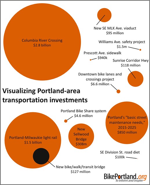
So we gave it a shot:
It’s worth noting that most of these projects were or would be funded by combinations of state, local or federal tax dollars — and in the case off the CRC through tolls, too.
Readers of the site will probably be familiar with every project on this list, except maybe the 11-block Northeast Prescott Avenue sidewalk project between 105th and 116th, which picked since it was just dedicated last month.
Here are some links to coverage of the others, from most to least expensive:
— Our coverage archive of the highway and rail expansion across the river to Vancouver is here. (The state legislature will decide in the next few weeks whether to build this project without Washington’s approval.)
— TriMet’s 7.3-mile Portland-Milwaukie Light Rail rail extension, including most of the future Orange Line, will include a yet-to-be-named multimodal bridge between the Division Street area and South Waterfront.
— The biggest single item on the City of Portland’s working transportation wishlist is $850 million over 10 years for basic street maintenance, mostly repaving work.
— PBOT’s plan to invest over six million dollars into a network of high quality bikeways and other street design updates downtown is already funded and in the planning stages.
— The new Sellwood Bridge is scheduled to open next year near Portland’s southern border.
— The 2.5-mile, two-lane Sunrise Corridor highway in Clackamas County, under construction until 2016, is the first new highway in the metro area for 30 years.
— From 2007 to 2011, the state built a new viaduct south of the central eastside where Southeast Martin Luther King Boulevard becomes McLoughlin Boulevard.
— The Portland Bike Share system has reached a closed-door agreement with its primary sponsor but is awaiting a signature and announcement.
— Work will start on the Williams Avenue safety project, adding buffered lanes to the region’s busiest on-street bike route, in late July or early August.
— Last year, Southeast Division Street got traffic signal upgrades, median islands, bike lanes and two fewer general travel lanes between 60th and 80th Avenues.
Kudos to Transitized, a Chicago-based blog about “modern transportation in cities,” whose similar infographic last year inspired this one.
People have a lot of things going on in their lives, and the scale of projects like these can be bewildering. Sometimes, it helps to take a step back and put the tradeoffs before us in perspective.


Thanks for reading.
BikePortland has served this community with independent community journalism since 2005. We rely on subscriptions from readers like you to survive. Your financial support is vital in keeping this valuable resource alive and well.
Please subscribe today to strengthen and expand our work.
People absorb information in different ways. This graphic is great and really gets the point across.
Nicely done. It’d be great to see a dotted line showing the original CRC cost ($4.2 billion) thrown in there, for even more perspective.
Or circles within circles to show ever-expanding costs, like the 30% or so by which big projects like that almost invariably go over budget, and the additional costs Joe Cortright turned up in his report, like the cost of all that debt service, and the cost of addressing the extra congestion that would be crammed into I-5 through North Portland if the CRC were to be built.
What sort of accounting voodoo are ODOT & WADOT using to adjust this number that much lower?
I’d be curious to see this as a bar chart. Area or circle charts often downplay the largest (cough CRC) areas as smaller than they actually are. More info: http://blog.revolutionanalytics.com/2011/01/for-data-visualization-circles-dont-cut-it.html
YES! I was about to post the same thing, so kudos for getting here first 🙂 Humans aren’t good at comparing the area of circles and tend to underestimate the area of large projects. A bar chart is much easier to grasp visually. It would be really cool to build it in Prezi or something similar so you can zoom in and see the comparatively tiny projects. Hmmm…
+1 on bars instead of circles. It’s one of those infographic norms that values graphic prettiness above comprehension.
Also, I’d imagine the jumping around of magnitudes decreases comprehension. Using a common base – millions, say, or thousands – would help readers understand what billions are. As people struggle with decimals under one (I bet $0.040 million is not generally understood), I might argue for thousands, or even straight dollars.
Hence, the CRC is $2,800,000k +
Good feedback, guys — I’ll keep it in mind if we do something like this again. If you ever want to make your own, my data is here:
https://docs.google.com/spreadsheet/ccc?key=0AnxdlXL8sAh3dGZScWtxMzJ1OTJJTFJEY1BnNmdhZ0E&usp=drive_web#gid=0
Really cool! Makes me want to learn more about each project to get a sense of what a million (or billion) buys you. I know the CRC is only just over two miles or so, but is wide and tangled. And I just looked up Portland-Milwaukie light rail, which is just over 7 miles. Portland’s streets total around 5000 miles, but I wonder how many miles of that are addressed in “basic street maintenance needs.”
I’d like to see this same info-graphic with similarly priced automobile-focused projects next to them… that way we could see how far our money goes for each type of project…
Superbly done.
One nice addition would be (for reference) the cost of one mile of new freeway, and/or the cost of one mile of standard urban roadway. They are sobering (when compared to relatively tiny expenditures like the Portland bikeshare system).
As others have said, this is great to see visualization of the scale of investments. A suggestion would be to make it a Treemap style chart, as that shows the relative area even better than circles, and provides it all in one view without wasted whitespace.
I’d note the SE Division Road Diet was $100k, not the $500k listed. I mention it because one of the reasons projects of that sort are so compelling is they have significant safety gains with relatively minimal costs.
Thanks, Gabe. I was basing this on the figure for a more intensive set of changes listed in the Division Street high crash corridor plan, but you’re right that $100,000 is better since that was the work done last year. I’ve changed the graphic.
Thanks Michael!
Not an apples and apples cost comparison. Project funding varies from federal, state and local sources. A simpler comparison might have been what the City of Portland’s contribution to each of these projects. May not be as dramatic, but still very revealing and can be used to influence ongoing local budgeting decisions.
Wait, you don’t like the CRC?
I wonder how Craig Harlow feels about it…
I would say B+…close but missed a home run of sort…so on the Milwaukie project the graphic offered information on a subset of the project cost to represent the MUP Transit Bridge portion…too bad the CRC graphic did not do the same by showing the transit/ bike / ped portion of the total project.
A very missed opportunity to educate readers.
I’d like to see a “dot” that represents the cost of fully implementing the (forgotten) bike master plan that was heralded during Adams’s reign. It’s surprising how small it would be compared to some, I think.
Needs more color. And grouping of the projects by mode, which could be accomplished with color. Also agree circles make large projects seem smaller than they are. Maybe go with stacks of currency.
Any graphic can be slanted. This one shows cost, but not cost benefit.
What will it cost me for each project?
How many people will benefit from the project?
How many people will not benefit from the project?
Dollars and cents is one measure but not the only measure of a projects worthiness
And again, first cost is not true cost, as previously alluded to. Between any two or more choices there are results/outcomes, costs and benefits, that can be estimated. A few include: operation and maintenance, crash reduction, and delay and emmissions. These items can be estimated and multiple choices should be compared over a common time period. This is known as life-cycle cost/benefit analysis.
Yes, this is a simple graphic, and yes, we should all think skeptically when presented with info – that said, focusing on a single variable paints a clear picture of the magnitude of these projects that is very illuminating.
id like to see a graphic showing the (un)popularity of the CRC in Portland, Vancouver and the rest of Oregon and Washington over time. Im trying to understand A) what changed people’s minds and B) why the powers that be haven’t got the message.
I’d like to see both the high and low estimates for the CRC, 2.8 billion is about the smallest estimate I have ever seen, and considering the cost overruns they have already have before they even think about taking out a shovel it seems impossible that it would be built for that amount… I’d still include the low estimate so that people can’t say you are trying to exaggerate the value unfairly, but really let’s not just take ODOT’s estimate as fact. It is easy to find other estimates putting the final number at as much as 10 billion, and I think even ODOT has at times pegged it at 4 billion.