Last week, the U.S. Department of Transportation announced $800 million in roadway safety grants nationwide, including more than $22 million for Portland-area projects. But it will take more than funding and a plan to achieve the goal of zero roadway fatalities nationwide. First we have to see where we currently stand and admit there’s a problem.
A new set of interactive visualization tools just released by the USDOT show just how dire America’s traffic safety crisis is. These visualizations use a national dataset of all fatal motor vehicle crashes from the National Highway Traffic Safety Administration (NHTSA) to “illustrate the significant impact of motor vehicle deaths in our communities.” These maps provide an illuminating look at traffic violence statistics nationwide, giving insight on the different factors that contribute to fatal crashes and where they’re most and least prominent.
How does Portland compare?
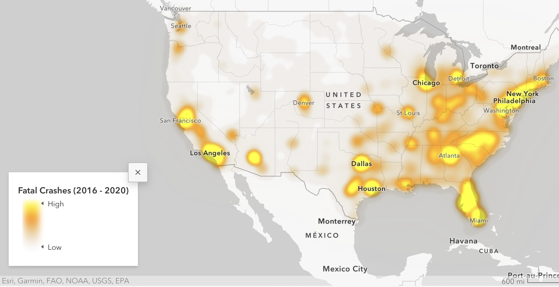
Looking at the first visualization, which shows traffic death hotspots across the U.S., Portland might seem like it’s in pretty good shape compared to other places in the country. While central and southern California, Florida and the mid-Atlantic coasts are covered in blobs of bright yellow to indicate a very high rate of fatal crashes, the Portland region is more of a burnt orange. The number of fatalities in Multnomah County from 2016-2020 was 5.3 times higher than the national average — but Los Angeles County experienced 63.4 times the national traffic crash deaths in that time.
However, it’s difficult to compare a county’s fatality rate against the “national average county,” because a lot of counties in the U.S. are in very rural areas. Los Angeles County has more than twelve times the population as Multnomah County, so it follows they’d have a much higher number of crash deaths. This is where another visualization, which looks at per capita crash rates, comes in handy.

Per capita, Kern County north of Los Angeles makes a better comparison against Multnomah County. About 100,000 more people reside in Kern County than Multnomah, but the fatality rate there is 18.57 per 100,000. In Multnomah County, it’s 7.68. The median for all counties nationally is 17.98, which points to a really dire situation particularly for rural areas.
The fact that the Portland area is doing better when compared to some other places is more of an indictment against them than a credit to us. From 2016-2020, 313 people died due in car crashes in Multnomah County, and the crisis has only been trending upwards in recent years. Our region is depicted on the less dire end of the spectrum nationally, which shows just how bad the problem is nationwide.
Inequitable impacts

The tool also depicts an “equity-focused analysis of the unequal distribution of roadway fatalities at the neighborhood level,” visualizing how many crashes take place in historically Disadvantaged Communities (DACs). DACs are defined by the USDOT through their Justice40 initiative, which aims to tackle transportation inequity. In order to fit the title of Historically Disadvantaged Community on the map, a neighborhood has to meet at least four of the following criteria:
- Transportation access disadvantage identifies communities and places that spend more, and take longer, to get where they need to go.
- Health disadvantage identifies communities based on variables associated with adverse health outcomes, disability, as well as environmental exposures.
- Environmental disadvantage identifies communities with disproportionately high levels of certain air pollutants and high potential presence of lead-based paint in housing units.
- Economic disadvantage identifies areas and populations with high poverty, low wealth, lack of local jobs, low homeownership, low educational attainment, and high inequality.
- Resilience disadvantage identifies communities vulnerable to hazards caused by climate change.
- Equity disadvantage identifies communities with a with a high percentile of persons (age 5+) who speak English “less than well.”
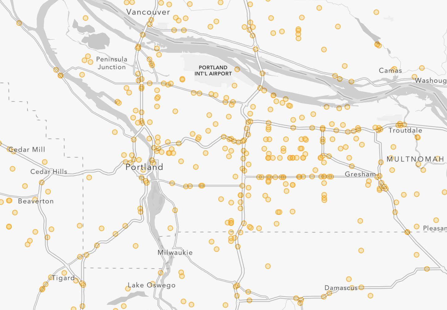
As transportation equity advocates know, people who live in DACs are more likely to be victims of traffic violence. When you zoom in on the map and look at where vehicular fatalities happen the most in Portland, they are located in the lowest-income parts of the city, predominantly in east and north Portland.
According to the data, nearly half (43%) of the communities in the top 20% of roadway fatalities nationwide belong meet the DAC criteria. 26% of all fatal crashes in DACs result in pedestrian deaths. (It’s unclear how the national data accounts for people biking or rolling.)
The Portland Bureau of Transportation’s annual fatality reports demonstrate this as well. But looking at the national data is helpful for putting together larger trends over time and place.
Is there any progress?
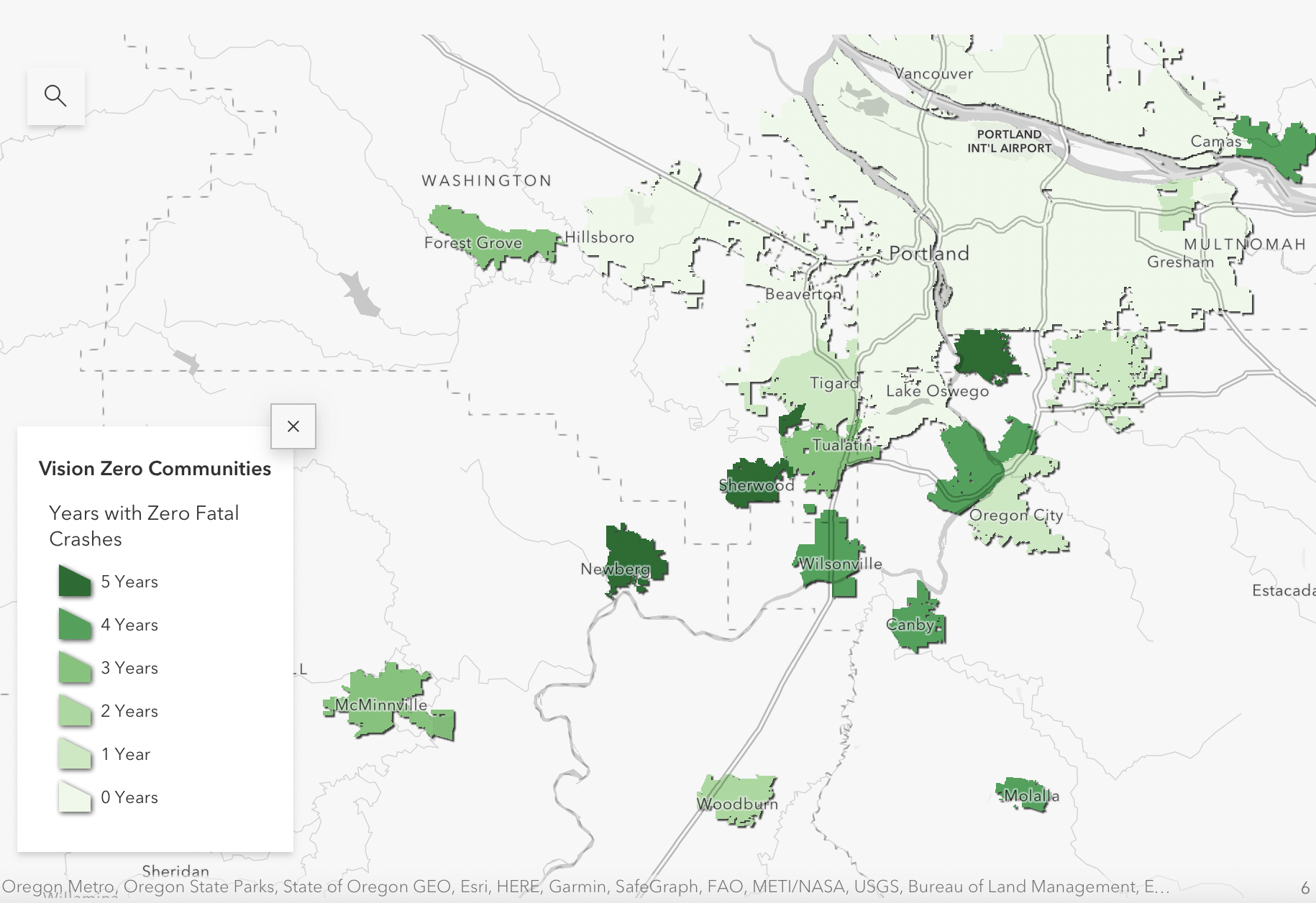
According to this data, there are some places in the Portland area that are doing well. Sherwood, Milwaukie and Newberg are all Vision Zero cities on the map, with no fatal crashes from 2016-2020. Wilsonville and West Linn are both in the top 25 small cities for low fatality rates, having reported one fatality each during those five years.
But as Kea Wilson points out in a Streetsblog article about this new tool, the cities that the DOT heralds as Vision Zero-achievers haven’t necessarily gotten there on purpose. Some, like Hoboken, New Jersey, have a dedicated Vision Zero strategy that guides their infrastructure development. Others haven’t put in quite so much work. Without more context, this data shouldn’t necessarily be used to indicate the best cities to emulate for meeting Vision Zero.
“Many are exclusive, minuscule suburbs that simply shunt faster vehicle traffic onto arterial roads outside their borders, effectively endangering residents every time they enter or leave,” Wilson writes.
While there are some glimmers of hope on the map, the overall takeaway from this data is bleak. Nationally and locally, the problem is getting worse by the year. The only good news depicted in this data set is that we have a national transportation department willing to look at the problem honestly enough to create these impactful visualizations.
You can find the full set of visualizations at the NRSS website.


Thanks for reading.
BikePortland has served this community with independent community journalism since 2005. We rely on subscriptions from readers like you to survive. Your financial support is vital in keeping this valuable resource alive and well.
Please subscribe today to strengthen and expand our work.
Re; the first image:
sounds like a population density map, but ok
This raw data is useless unless corrected for population. Of course Los Angeles has tons of traffic crashes and deaths: it is the largest county and second largest metro area in the country.
The “years without a fatal crash” map is also not very useful when not corrected for population. It’s easy for a small town to go many years without a fatal crash if the total population is low.
Also see:
https://www.explainxkcd.com/wiki/index.php/1138:_Heatmap
Yes, that has some merit, but there is also a high rate of crashes in a lot of more rural/less densely populated areas (the Streetsblog article I linked to does a good job at explaining this).
I think the fact that it’s comparing counties to the average does a disservice to the data – a lot of counties in the US are very sparsely populated, so being higher than the average doesn’t mean much when the “average” county is representative of rural Kansas or something.
A better comparison could be made with somewhere like Kern County in central California, which is similar in size as Multnomah but has a higher fatality rate.
I edited the story to account for this. Hopefully it’s clearer now.
Great update, thanks!
It’s interesting to see USDOT’s definition of “Historically Disadvantaged Community”. The boundary they use for Albina is Fremont (https://usdot.maps.arcgis.com/apps/dashboards/d6f90dfcc8b44525b04c7ce748a3674a), which is simply not accurate. In “Bleeding Albina” (a historical review of the area published in 2007 (https://pdxscholar.library.pdx.edu/cgi/viewcontent.cgi?article=1289&context=usp_fac), the author notes that Boise (primarily north of Fremont) was 84% black in 1970, and that as urban renewal and freeway building destroyed the housing stock in lower Albina (with Fremont as the boundary), it increasingly forced Black Portlanders further north. Housing integration happened in Portland rapidly in the 1990s, and by that time the residential center of Black Portlanders was closer to Killingsworth than Fremont.
Which brings me to my real question – if the feds define areas which currently have so radically changed demographics since the 1990s, is it really appropriate to use a historical boundary? And it just seems strange that Fremont would be the boundary – when Albina as a whole was certainly larger than that. Census tract 33.01 in particular (bounded by Killingsworth, MLK, Prescott and NE 15th) was 63% Black in 1970 and 1980 (a time when residential segregation was still the norm in Portland). It was also a redlined area, so I am not really sure how/why that could be missed.
It’s also worth talking about how the USDOT defines “disadvantaged”. Per the Justice40 site, having a driving commute > 30 minutes and not owning a motor vehicle are indicators of “disadvantaged”. Which is supremely car centric – leading to things like the census tracts directly adjacent to Penn Station in NYC being labeled as “Transportation Disadvantaged”. Keep in mind, Penn Station is the busiest train station in the Americas, and has direct service on two very busy subway lines (the A-C-E on Eight Ave, plus 1-2-3 on Seventh), with nearby service on two more (N-Q-R-W on Broadway, plus B-D-F-M on Sixth) and a connection to NJ on PATH as well. Yet Happy Valley, in perhaps the most car dependent part of the Portland metro area is not transportation disadvantaged. Hard to take any analysis seriously that comes to that conclusion.
Broadly, it’s good to consider equity – but I’m not sure at this point what it all means. It seems like the sort of census tract level analysis misses something though. What people really need is fair economic opportunity, and in some cases compensation for past wrongs. These are necessarily individual questions, particularily when considering righting something like redlining. If we are looking to boost homeowner rates in historically redlined areas, and give stipends to people who live there now (ignoring 50 years of demographic change and economic shifts) we will give a lot of money to the wrong people.
You might try the US Housing and Urban Development (HUD) Qualified Census Tracts, which tend to get to the (relatively) poorest residents in any one community.
Data – https://www.huduser.gov/portal/datasets/qct.html
Maps/GIS – https://www.huduser.gov/portal/sadda/sadda_qct.html
Thanks Taylor for reporting! I found these statistics a bit difficult to parse because they initially don’t account for population. So LA county has so many more fatalities because it has many more people living in there. The first heatmap is essentially a heatmap of where people live.
Further down, they show counties with a high fatality rate, and target counties are those with a high rate and population count. That seems sensible to me. Of note, Portland is not part of these counties. Oregon counties that are target areas include: Lincoln county, Douglas county, Josephine county, and Klamath county. There are also a number of Oregon counties with high fatality rates but low population numbers, such as Jefferson county.
Yes, I just changed the story to reflect this, thanks for pointing it out. I should’ve included more information about per capita fatality rates initially.
The fact that the median crash death rate for counties across the country is about 18 people per 100,000 (and any county with a lower death rate than this is considered to be doing pretty well) is terrible. I think it’s worth looking at what makes these rural counties in Oregon so dangerous and what we can do to improve the situation there.
What I gather from the per-capita visualizations is that rural roads are unsafe. Also, their range of low to high population is questionable. For instance, LA county’s population is more than 10 times Kern County but they’re both considered high population. A little more granular breakdown might be useful. I’m guessing high population counties (50,000 or more per their legend) have a small city in them but most of their roads are highways.
A visualization of miles of road type city/highway/interstate and per capita deaths would be useful. Are the counties with high fatalities also the counties with a higher percentage of highways?
The municipality breakdown is a bit useless too. Both Portland and Phoenix are high population and high fatalities but Phoenix has over double our per-capita fatalities.
Taylor thanks for the article, I think the information is important. I am confused by the color coding for the Per Capita map. Blue represents high population and comparatively low crash fatality rates, white represents low population and low fatalities, yellow represents low population and high fatality rates and red represents high population and high fatalities. I am trying to figure out why all of Northern Arizona is red. Parts of it have a very low population density. Some parts have less than 3 people per sq mile. I think the same thing is true about the red areas in Oregon. It makes me question the rest of their data.
Go Washougal! Looks to be a VZ zero community too!