concepts the city hopes will
help identify SE Clinton as a
bike priority street.
The City of Portland has shared more of the design elements they’re hoping to bring to Clinton Street as part of their Clinton Street Bike Boulevard Enhancement Project.
Earlier this month, we shared a few peeks of some of the artistic signs, pavement markings, and new bike parking designs slated to appear on the popular bike street.
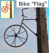
The Bureau of Transportation is working with local artists to put a new type of aesthetic spin on the street in order to strengthen its identity as a bicycles priority street. Here’s what looks like it could become a logo for the all-new Clinton Street.
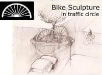
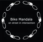
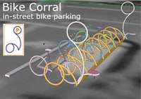
And here are more of the design elements under consideration:

|
|
|
|

|
The City has also uploaded maps of the sections of Clinton where these design elements would be placed. See those maps and learn more about the project on PBOT’s Clinton Street Bicycle Boulevard Enhancement Project website.


Thanks for reading.
BikePortland has served this community with independent community journalism since 2005. We rely on subscriptions from readers like you to survive. Your financial support is vital in keeping this valuable resource alive and well.
Please subscribe today to strengthen and expand our work.
Bike flags– I like it…
Clinton St. is represented by a Dutch bike with Aerospokes? There’s something you don’t see every day.
I was on the advisory committee. Those racks are seriously wonderful. They’re practical and beautiful – and not much more expensive than the current design. The angled layout is especially nice, as we live in a town with lots of panniers and such attached to bikes.
I hope the artists copyright or patent (I don’t know which) this design because I think they could do well for themselves with it in a monetary sense. Other communities would also want them – they’re that pleasing to the eye.
I am sooooo jealous. Living back in Beaverton now. Out here, we’d be lucky to have bike signage, let alone fancy artwork that shows bikes are actually a valued part of society…
Nice work, PBOT!
I’m liking the sign toppers. Those would be pretty easy to put on most Bike Boulevards. One design that I’m surprised they didn’t have would be just like the part of the wheel they have in the traffic circle. I think that would look nicest on top of a street sign.
My biggest complaint about the typical staple racks, is that if there is already one bike parked there, I almost can’t park on the same rack with panniers – thankfully I have a nice center-mounted kickstand so I can park a few inches away and still lock up, but racks that accommodate city bikes would be really nice.
Dude, totally envious of SE right now. Bring the bike design love to NE…soon please…
The angled design addresses that problem quite nicely, Dave.
I’m curious about the incremental cost of the art compared to functional bike boulevard amenities. Not because I don’t love the art, but because we are going to be defending it, especially in a poor economy.
What does the “bike swarm” marking mean? Just to let motorists know they might encounter a clump of cyclists in that particular stretch of road?
looks good to me. one of the first new PDOT projects in a while other than the new bike parking corrals that I think I can fully support.
The advisory committee needs are not that of the overall bike community needs. I can think of 3 factors here that will hurt the bike community in the eye of the non cycling public:
a) Mostly white, rich neighborhood where the local art community and property values don’t need boosting priority.
b) Huge economy crash.
c) Money would be better spent on safety and functional work, rather than art forms. For example why not spend money to prevent cars from using Clinton as an alternate to the Division artery? For example, this traffic calming barrier:
http://www.tinyurl.com/bikeboulevard1
Love the bike flag, love the sign topper, am intrigued by the other stuff. I don’t know what a “bike swarm” is but it sounds fun! 😀
Joe (#12) – The project is using earmarked funds, and it’s low-budget. Point “a” is true, but Clinton also is one of the busiest bike boulevards in the city, and an increase in the number of bike/car conflicts was a large part of the impetus behind this project.
The project has been going on for about a year now, and is getting close to the final design stage. Jeff Smith could provide more detail if he has time and inclination to post it, or if you’d like to contact him.
Maren (#10) – I was also a member of the advisory committee, the bike swarm was one of a number of alternate markings presented – the purpose is to present a motorist with something that is recognizable but which doesn’t blend in – combating the “sign blindness” that occurs after drivers get used to seeing a particular feature or sign. The idea is that it will reinforce that Clinton St has bikes on it, and will hopefully make drivers more aware.
Jonathan, thanks for covering this — and kudos to project artists Matt Cartwright & Brian Borello, who have lent considerable creativity and sweat to synthesizing community & PBoT input into something truly Portlandesque. They’ve been a delight to work with throughout, generating one idea after another.
A couple of notes on this project, in response to the questions raised, and to give it a bit more context/background:
– the project elements shown are still undergoing refinement. While the plan maps show an overall installation concept, initially we want to do a more modest roll-out: get some of all project elements out on the street, and give people a chance to experience them in their natural habitat. That will be a useful gauge of what people would like to see more of. Potentially, some elements could be used (or adapted) to future bike boulevards.
– PBoT is also working on developing a standardized bike boulevard pavement marking that would be employed on all bike boulevards. It would be large and unambiguous enough to communicate to motorists (and cyclists, obviously, as well) that they were on a bike boulevard. These could be used on Clinton St., in conjunction with the “bike swarm” markings.
– This project was never intended to be a traffic engineering-type project. Clinton has had several iterations of traffic calming (diverter at 39th, islands in the late 80’s, bumps in the mid 90’s). While these have certainly made Clinton a much better place to cycle (traffic volumes are about half what they were 1980’s pre-calming) some help is still needed to move it a little closer to the bike boulevard ideal. And while traffic diversion would certainly be the most direct means to achieve this, it would not be a easy (or cheap) process. It seems so simple, but the neighborhood involvement and planning required is huge. Moving cars from one street to another can be very contentious.
ok, sorry to run on so long – if anyone has questions on the project feel free to contact me (but not until Aug. 4th because i’m headed off for some cycling on Vancouver Island as of, like, right now)
Jeff Smith / PBoT
503-823-7083
jeff.smith@pdxtrans.org
Putting artwork or any obstruction in the middle of a traffic circle is not safe.
You still need to see across the traffic circle to determine who has the right of way. Blocking that view with anything doesn’t make sense.
@Anonymous: the shown artwork planned for the traffic circle doesn’t look like it would restrict vision much, as it’s very open, you can see through it. It would restrict vision a lot less than all the parked cars on the side of the road, which I can’t see over or through when coming to an intersection (on a bike or in a car).
Using a bad situation, parked cars near intersections, to backup creating another bad situation, blocked line of sight at traffic circles doesn’t work for me.
It’s safe or it’s not and these installations reduce safety.
“rich white neighborhood”? Really? Have you ridden down Clinton? There are plenty of lower rent apartments, duplexes, and other inexpensive housing options on Clinton and the surrounding streets. Sure, there are some really expensive houses, but you can find those in almost any neighborhood intown. It’s not like they’re revamping the Alameda Ridge or Eastmoreland.
I’m sorry, art is nice and all and really beautifies a neighborhood, but NONE of those signs or designs, to me as a driver, tell me anything about Clinton being a designated “bike boulevard”…
@Anonymous: my point was, I don’t think the installations will be much of a problem.
As I said, you can see through them. If you’re paying attention, what’s the problem?
I don’t see them reducing visibility any more than foliage on the traffic circle would.
I love the idea of redesigning the intersection at Clinton and 26th. The extra sidewalk space + safer intersection + bike corrals will be fantastic!
I love the designs. Though I still think there needs to be a traffic diversion at 50th ,and 12th. A lot of cars use Clinton as a cut through, I’m not sure if art alone will make them change their ways. As it is now cars turn off 50th, go down to 39th, detour around then have a straight shot all the way to 11th and 12th.
Joe Rowe (#12) is spot on!
Really? How much paint for lane striping, standard signage, or other needed improvements could be purchased with these funds?
Earmarked or not, this art installation could backfire. They are functionally dubious. Are harried drivers really expected to notice the artistic nuance of bike flags or sculptures and think, “I better slow down ’cause this is a bike boulevard!”? They look nothing like the signs on the driver’s license tests.
I suspect with 1 in 8 Oregonians out of work, most will see this as a wasteful bone thrown to us “damned bikers”. Why can’t PBOT focus on the boring nuts and bolts of basic bike infrastructure during these times and save the artsy stuff for better days?
I love Portland! ohh yes with the out of work thing, i was caught in that waaay back in the .com in calie.. people would get mad since i was training to help with stress.. bike can save the world if we allow it too.
I love the sign toppers—very cute and distinctive! But could someone PLEASE tell PBOT that this is an opportunity to change the signs too. The white letters, all caps, on reflective medium-green field are nearly impossible to read, especially at night.
PBOT, do this to your signs:
Use mixed-case letters. All-caps are harder to read! This is because all all-cap words have the same shape (rectangle) and are missing the ascender and descenders that make mixed-case words faster to recognize.
Use a higher contrast between foreground and background. I don’t care which one is darker (dark letters on light background or vice versa). But medium green and white do not make for good contrast.
Whatever foreground-background combo you choose, do not make the darker color the reflective surface. When light hits it, it’s all light colored. It’s pointless to read a glowing all-white sign. Better yet, consider using no reflective paint at all. Even with the corrected foreground-background relationship, reflective paint on letters the size that are used on street signs are ridiculously prone to halation, making them difficult to read.
PBOT has heard the same thing about bike lanes, bike boxes, curb extensions, etc.. etc.. etc..
Yes.
I think it’s great that we have a city that is willing to try different things. “Boring nuts and bolts” is not just boring it is limited in its effectiveness (what’s the average mode split for bikes in the U.S. again? Oh yeah, less than 1% or so).
PBOT is trying to do something different.. i think we should encourage this sort of thing. If it’s a failure.. they know we’ll let them hear about it.
The art looks fantastic and is really going to make Clinton a lot of fun, but…
How is this going to stop cars from using this street as often as they do? There are a ton of cars on Clinton, our soon-to-be glitziest bike boulevard. I would prefer to see more circles or car-traffic calming/eliminating elements than some cool art.
Brad, you contradict yourself. If drivers notice and see the new signage, then it works – it gets their attention. If it doesn’t work – if drivers DON’T notice it – then a backlash is extremely unlikely. Do you get mad about stuff if you don’t know it exists?
I get that you don’t like it. That’s your prerogative. Doesn’t make it a bad idea though.
Didn’t we just go through an us vs them debate about cell phone usage in cars taking away from drivers attention to the road?
Don’t these artistic designs draw driver attention away from the road where it belongs?
Form over function once again.
Non-standard signage that only means something in Portland.
It’s a road requiring all users to pay attention, not an art gallery for the users to gawk at the installations.
Since most here seem to think that the average car driver is dumber than a bag of hammers and already far too distracted to focus on safe operation, I am surprised that most think a little bike sculture on top of signs or on a phone pole communicates better than road signs clearly communicating:
Bike Boulevard – Yield to Bikes!
Bikes on Road – Caution!
Bikes / Motor Vehicles Must Share Lanes
or
Max Speed 20 MPH When Bikes Present
Cheaper, placed at each intersection, probably more effective as they would be a standard format that driver’s are trained to look for. (Training / Testing they get ONCE at age 16!)
To each his own but I think most drivers will continue driving too quickly down Clinton and think, “Little bike statues? Weird.”
How about scrapping the art and putting several blinking LED signs above the street that say ‘Warning! Bike Boulevard!’? This is seems a lot more effective than artwork that has no universal significance to anyone. Block the street to cars every 10 or so blocks like Lincoln. I appreciate the effort of this project, but it seems that after all the artwork is added the old problems will still exist.
@32: EXACTLY right!
Please, no.
I like art, but I also like safety. I ride Clinton everyday, most motorists have no idea it’s a bike blvd. Why? because of the almost imperceptible markings currently employed.
Can’t we spend our money on effective markings instead of fluff?
Simply mark Bike Blvd’s with lane wide markings, instead of this stuff.
Wow, lots of negative feedback on this one! I’m curious why no one brought this up during Jonathan’s prior stories. In any case, if you’re looking for the “why”, check out the project website referenced above, and Jeff Smith’s post at #16. Jeff also left his contact info – even though we’re past the second open house, there’s still opportunity to register your opinions with the city.
I brought it up as did many other Matt.
For a city virtually devoid of sharrows or any large, functional signage with bold lettering, this ‘art’ seems a bit wasteful.
Great post Brad #32
If only the people working on these projects had as much sense as you.
Dillon(#24):
I agree with you. A lot of drivers have discovered the dearth of stop signs on designated bike boulevards and use them to speed through. Salmon St. is another case in point. The car traffic there is sometimes so thick that I often switch to one of the parallel streets..better to deal with the stop signs than get buzzed and have to breathe that much more exhaust. Traffic circles should be included at more intersections on bike boulevards. If drivers really have to slow down on the bike boulevards they won’t go out of their way to use them.
Anonymous(#17):
There are plenty of traffic circles with vegitation that obstructs the view across. The objective is to get people to slow down enough so that they yield, not look diagonally, see the way clear and zip on through.
This is a GREAT VALUE to the community and should be recognized as such… An aesthetically pleasing transportation-related project! Bring it to my street any day! There are a rare few transportation projects that actually increase the desirability of residential neighborhoods. This is one.
Since in some of the comments above, a challenge is being raised about the expenditure of money for artistic, as opposed to plain, functional signage to indicate the presence of SE Clinton’s bike boulevard, it seems worthwhile to know how much money is being spent on this art. From the PBOT website (link in lead article):
“Where is the funding coming from?
* The Regional Arts & Culture Council (RACC) has allocated $10,000 from their “Art on the Streets” funds. This funding is to be used exclusively to fund the selected artist’s project time.
* PBOT has allocated up to $15,000 for initial installation of project elements.”
Are material costs extra? $25,000 is quite a lot of money, but $10,000 of it isn’t even in PBOT’s budget allocation. How much purely functional signage, diverters, etc, could be built for $15, 000?
If I remember correctly, it seems like a lot of people were rather upset about $10,000 of public money being spent on art specifically so zoobombers had something to lock junky bikes to. Is anyone still complaining about that expenditure?
People like friendly upbeat art, which the stuff in the pictures seem to be. That kind of think might do far more to persuade a cranky motor vehicle driver to decide not to drive down the boulevard than plain, functional but inevitably authoritarian signage and barriers would.
Maybe upon seeing a glimpse of it as they drive by, they’ll be so charmed as to break out the old coaster bike on the weekend just to take a few trips up and down the boulevard to see what its all about. If they like what they see, well… .
“Maybe upon seeing a glimpse of it as they drive by, they’ll be so charmed as to break out the old coaster bike on the weekend just to take a few trips up and down the boulevard to see what its all about. If they like what they see, well… .”
Or, maybe they don’t notice it at all and will continue speeding through, using boulevards as an escape from clogged arterials(Division).
Or, they will be so be staring at the nonsense, attempting to figure out what the hell it is, that they plow into a mom pushing a stroller.
Sharrows.
Large, plain, easily observable signage.
More intersections that route cars off the boulevards.
Why don’t we just fix the problems? Art is swell, put it in after cars are back on Division/Powell where they belong.
steve…is that your neighborhood? If it is…go to the neighborhood association meeting and pass your thoughts about the situation through the neighborhood association to PBOT. Take Joe Rowe with you…it seems he too wouuld like to see barriers and functional signage before art.
Not too far away from me, there’s a street out here in Beaverton that uses a couple different variations of traffic calming barriers something like the one Joe has a link to in comment #12. Their function is a little different; idea is to make motor vehicles motor vehicles go slower, and stay fully to their side of the street when making left turns.
They work, sort of. One of them, just like the one in the picture Joe linked to, can be driven right over. The other is a big 3′ high planted concrete culvert. It kind of blocks road users view of the street ahead. I’m not sure how much good it does. There’s speed bumps on the street as well.
As I understand them to be, sharrows seem like a good idea. I think though, that the average motor vehicle-driving, non-biking person is, at least for awhile, going to have a heck of a time understanding the difference between a sharrow and a bike boulevard, or, even what a sharrow is.
By now, I would think it’s commonly understood amongst most road users, what a bike lane is. A bike boulevard though, is something considerably different. Can a street be a sharrow and a bike boulevard at the same time? That’s not my impression at present.
As I understand it, bike boulevards in a neighborhood are supposed to be only for bikes and motor vehicles having business in that neighborhood. Motor vehicle drivers aren’t supposed to be using it for a short cut or cut through. And also, it being a bike boulevard, motor vehicles defer to the pace or speed set by bikes using it, not vice versa as is the rule on regular streets.
Traffic engineers and road designers seem to have their minds set on coming up with new ideas for physical barriers that work better to discourage motor vehicle drivers from using streets where their presence causes problem.
If people from amongst the public, or traffic engineers come up with good ideas for a physical barrier at the entrance to the Clinton bike boulevard, functional street markings or signs that would limit the number of motor vehicles on the boulevard, it should probably be given some consideration. Maybe before the art. A combination of the two is probably a good idea.
I think though, that alerting people through art to the idea that a particular street is uniquely dedicated to enabling easier, safer, minimally restricted travel by bike, can be more effective in promoting understanding and acceptance of bike boulevards than only the use of functional barriers and signs can.
Banal, inane. Ugh.
I don’t want the cars on SE Division either, it makes it harder to ride my bike safely there, where all the businesses I might want to shop at are.
“Banal, inane. Ugh.” steve
But obviously, you couldn’t stop yourself from reading it or leaving a comment in response. From someone like yourself, that’s a great review! Thanks steve!
Everyone knows what a white bike in profile on a green background means.
Everyone knows what a cyclist on a bike in profile painted on the road means.
What the heck does the white bracelet on a black background mean?
I don’t even know how to describe the birds eye view swarm identifier that is going to be on the streets.
There are standards used for signage to ensure universal understanding. The written drivers test includes sign identification.
Why create new symbols that mean nothing outside of a single neighborhood? Is creating confusion for drivers going to make it safer on the road for cyclists?
Put up all the sign toppers and bike badges you want but these new signs are not conducive to safety.
It is actually quite odd that the city is apparently willing to paint all this non-standard stuff on the street for traffic control, but when you ask them about painting sharrows on the street they say they can’t do it because a sharrow constitutes a ‘traffic control device’ that hasn’t been officially approved by the National Transportation Safety Board and incorporated into the Manual on Uniform Traffic Control Devices yet.
@ wsbob #42
‘sharrow’ is simply a shorthand name for (or contraction of) ‘shared lane marking’ or ‘shared lane arrow’ which can theoretically be used anywhere; I don’t believe there is any valid distinction between a street with sharrows and a bike boulevard, the former could easily be incorporated into the latter without violating any sacred principles of street classification or traffic control engineering.
BURR, are you sure there isn’t a valid distinction between a street with sharrows and a bike boulevard? Would it be correct to say any street with sharrow markings is a bike boulevard? Does PBOT have an official response to this question and the question of what distinction there is between sharrows and bike boulevards?
I tried to address this point in my comment #42. I would tend to think there’s definitely an important distinction between the two. When they see signs that say ‘Bike Boulevard’, people are probably going to recognize quickly that it’s a street for a lot of bikes to travel on. Sharrow signs in addition to those signs might not be necessary…probably shouldn’t be, but if people think they are, by all means, the city should spend the money to install them. Or, in the meantime, let the art signage be put up and see if that does the trick.
Does anyone know whether PBOT has data collected for Clinton St traffic that might help them note with some accuracy, possible changes in traffic on that street occurring as a result of the signs after they’re installed?