(Photos/images: Metro)
With dozens of different jurisdictions managing over 100 walking and bikings paths and trails in our region, the design of route signs is all over the map. There’s no consistency from one path to the next and many signs are outdated and not nearly as helpful as they should be. Thankfully Metro is working to change that. They plan to put up 400 new signs on paths and trails in 2016.
Metro’s Senior Regional Trail Planner Robert Spurlock said the project is at the heart the mission of The Intertwine, a regional coalition launched in 2009 to build all the parks, paths and trails in the Porltand-Vancouver metro area.
“For years we’ve been asking the public how the regional trail system is working for them and how it can be improved,” he said in an interview last week. “And people always say they want better wayfinding.” Metro has been working with other Intertwine partners for years to create a unifying signage standard that would cross jurisdictional boundaries and serve the public with more clarify. Spurlock says a working group of 20 representatives from regional parks and transporation agencies got together four years ago to help write the grant application. Tests of the new design first went up in 2012 along the Fanno Creek Trail in Tigard and surveys have shown they have a 95 percent positive feedback rating.
The new signs are funded with federal transportation revenue that came to Metro through a $265,000 Oregon Department of Transportation grant.
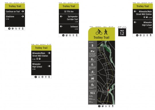
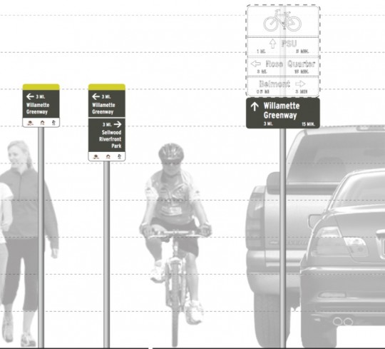
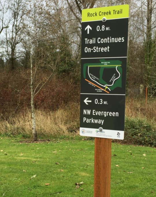
Here are more images and examples of the signs:
Advertisement
The ODOT grant will help pay for installation of signs on 20 more miles of trails including: the entirety of the Trolley Trail from Portland to Gladstone, the Tualatin River Greenway (which will open next month), portions of the Rock Creek Trail in Hillsboro, and so on.
In addition to the new signs which will help people navigate paths and trails with a clear design and consistent look-and-feel, there are also new mile-markers that will be installed every quarter-mile, “to boost safety by making it easier for trail users to know their precise locations.”
CORRECTION, 8:57pm: An earlier version of this story showed sign designs that were out of date. For the current sign design guidelines, see this document (PDF). We regret any confusion
— Jonathan Maus, (503) 706-8804 – jonathan@bikeportland.org
BikePortland can’t survive without paid subscribers. Please sign up today.




Thanks for reading.
BikePortland has served this community with independent community journalism since 2005. We rely on subscriptions from readers like you to survive. Your financial support is vital in keeping this valuable resource alive and well.
Please subscribe today to strengthen and expand our work.
I wish the signs would not put a time estimate and just stick to standard distances. The time estimate is distracting, and with the signs already being somewhat small and added clutter makes it harder to see the useful information.
Plus everyone doesn’t travel at the same speed.
Do we know how they come up with that estimate? Is it just assuming a specific average speed over a certain distance? Or does it take into account things like elevation gains/losses?
The times I’ve tried to figure it out, it seems like there is an assumed average speed of 10 mph.
I really like the time estimates. I know to take them with a grain of salt. I also like to race myself and see how I’m doing compared to the signs.
I don’t understand this. It seems there are three different sign designs being put out as part of the “unifying design”. Which ones are the standard? The ones with the yellow tops, the vertical sideways text ones, or the horizontal ones underneath the green bike sign?
Relevant xkcd:
https://xkcd.com/927/
I was literally thinking the same thing.
Hi Adam,
I unfortunately included some sample sign designs that were out of date. I’ve updated the post with the current designs. Sorry for the confusion.
No worries, thanks! I like the yellow/black design. Looks very modern and easy to read. The old signs with the large “Intertwine” logo, were a bit odd, so I’m glad to see that was removed! Looking forward to seeing these around town!
Will they point out the designated camping spots?
I hope they plan to include the ever-elusive 205 path!
And indicate where the homeless camps are.
The black background on the maps is an interesting touch.
Beaverton (Tualatin Hills Park and Recreation District) have had these signs for over three years.
I wish the city would add hundreds of route finding signs to the Neighborhood Greenways. It is really helpful (Especially to those new to riding bikes, out of towners, or those new to Portland.
But no bikes on METRO owned dirt!
I would really appreciate if the maps would include a small compass rose/designation of North.
These signs aren’t always oriented with the trail and they don’t always contain significant landmarks. As a result, the most detailed map might be useless to me if I’m trying to explore the area.
The average trail user may not even notice this information, but if you have a basic understanding of the way maps work and this information isn’t there when you’re feeling turned around, this can be very frustrating.
Put it this way: It’s simply not enough to put current location (“You are Here”) on the map. I need more than one data point to navigate, and sometimes local landmarks aren’t sufficient.
After every intersection, there should be a trail name sign with a cardinal direction given. This would be consistent with longstanding practice on many highways. Posting street names at each road crossing would be helpful, and an advance warning of at least 1/2 mile would be helpful. The old waist high distance signs should be replaced by proper signs. The Springwater / I-205 junction deserves proper recognition. Travelers starting west from Boring should be seeing signs pointing to Gresham (S. Main St,), Powell Butte, the Sellwood Bridge, Oaks Park, and Tillicum Crossing as key destinations. Likewise in reverse for eastbound. ODOT does have I-205 Trail signs at each street crossing, but no destinations are signposted. Access to / from the Airport to the 205 Trail has never been properly signposted. Hopefully that’ll be changed. Guide signage on the Springwater rigged to the sides of the I-205 freeway overpass just east of the SWT/205 trail would make sense. Exits off the trails should now get better signposting!
Car-laden greenway —>
<— Bike lane just stops, good luck
^— Drivers on cell phones giving you the finger
<— An Uber driver who's not double-parked in a bike lane… jk, they are
Consequences for negligent road users (under construction) —^
These signs have been great. Feedback from my friends have been all positive for the fanno creek trail and the Westside trail. Looking forward to the expansion of these.