Old
|

New
|
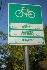
The City of Portland Bureau of Transportation (PBOT) has begun installation of new wayfinding signage along the growing network of bike boulevards. The new signs — which include arrows, distance, and travel times to key destinations — have a slightly different design than existing ones.
As you can see in the photos above, the destination labels are larger and more legible on the new signs and the colors are reversed. The old signs (which will remain in place) have a white pennant with green lettering and the words are in all caps. The bike symbol on the old signs was larger, giving designers less room to work with.
According to Roger Geller, the old signs were non-standard when they went in but ODOT gave Portland special permission to use them. Now, with ODOT’s tweaks, the signs are official and can be used as a standard in cities throughout the state.
The new signs follow more standard design conventions with white lettering on a green background. The ODOT-influenced signs also have a smaller bike symbol which left more room for the destination labels. The result, at least in my opinion, is clearer, more legible sign. You’ll also recall that these are the same signs the City of Milwaukie installed on some of their bikeways back in February.
The signs are part of the $1 million federal stimulus grant that is also paying for the 2,000-plus sharrows being installed on the bike boulevards.
At least one reader shares my opinion that the new signs are more legible from further away. Have you seen them yet? What’s your opinion?


Thanks for reading.
BikePortland has served this community with independent community journalism since 2005. We rely on subscriptions from readers like you to survive. Your financial support is vital in keeping this valuable resource alive and well.
Please subscribe today to strengthen and expand our work.
Much more legible!
Lower-case lettering is always more legible and easier to read. Note that new street signs going in around Portland are also getting a similar upgrade (see any of the Caesar E. Chavez signs going in on 39th). The font is larger, non condensed and mixed case: all things making it more legible from a distance.
Just one complaint: make the arrows bigger, please! With my not-very-20/20 eyes, I could at least see the options on a sign a few blocks away, even if I couldn’t read the text. If I knew I had to make a left soon, the sign let me know what block it came up on (think the left on Tillamook from Vancouver), and I could use that time to move over to the left lane on the street.
There’s space to make the arrows bigger, and I think the distances are a nice-but-secondary function that can be kept small. Also, I don’t like how the arrows don’t vertically align on the same sign.
Other than that, great.
Great to see the new signs are using the Clearview fonts rather than the old FHWA Highway Gothic. That helps the legibility quite a bit. A well designed font, proper destination delineation, standard arrows, and positive contrast are all wonderful improvements. While it is nice to have signed bike routes, the old design always make me cringe.
since we got the Omnibus Trade and Competitiveness Act in 1988 maybe we could start using metric on some new signs to get people used to the 22 year old standard and start migrating it to roads…
but yes, the new signs are better…
Glad to see the new signs using the much more legible Clearview typeface, even if they’re still not using the typeface correctly per the FHWA style guide. The text still needs to be larger, you should be able to read the signs before you get up to them from a bicycle moving at a reasonable speed. Both the old and the new signs have the problem of needing to slow down below 10 MPH to properly identify and read the message presented, which is a Bad Thing™ in traffic.
These are a real step in the right direction compared to the truly non-compliant reverse-color/pennant signage.
Honestly, that’s an ugly sign. Someone who probably doesn’t know much about layout, design, or typesetting decided to center align the arrows and titles horizontally instead of left aligning. It’s not easy to read nor is it very nice to look at.
@Spiffy #5
I’d be opposed to switching to metric. The British-American system has the nice feature of allowing just about anyone to deem any arbitrary object as a unit of measurement. For example, it’s 856 Raleigh Centurions from my home to work. You show me a convenient means of converting Centurions to meters and then maybe I’ll consider your fancy metric system.
Ooo…imagine what hay Dan Maes would make of using the metric system on bike traffic signs! How many kms to Geneva? It would be further confirmation of the U.N. plot to destroy American autonomy with bicycles and bring us into a one-world government.
(P.S. — The new signs are nice looking, with or without metrics.)
@Aaron Tarfman: I agree, the MUTCD says arrows should be aligned (though right arrows would be on the other margin). The legends need to be much, much larger. Also, the current MUTCD favors SI units to English units, so if you’re driving and you see a speed or weight limit with the numbers circled, be aware that the sign is in SI units, not English units.
@Jack: So you frequently convert obsolete units into nearly-obsolete units? Never mind the billions of people who can convert base-10 SI units in their heads quite easily? Example, how many decimeters are in 570 kilometers? OK, now how many feet are in 570 miles? NO CALCULATORS!
@Michael Andersen (Contributor) #9
LOL. Just another example of Gov’mint tellin’ us bikeriders where to ride and how far to go!! Next thing you know, they’ll want to require adult riders to wear helmets!!
(p.s. — the signs are an improvement.)
@Bob 12: You mean, like British Columbia and Alberta? I still laugh every time I ride around up there and someone gets busted for not wearing their helmet while their helmet dangles from the handlebars, “But I have my helmet!”
@Paul #13. Canada has single-payer government health insurance so, if someones head gets crunched, the government pays. As long as I’m paying my own health insurance, they should stay out of it. Fact is, I do wear a helmet but I’d gladly accept a helmet law in exchange for National health Insurance.
will PBOT have a “yard-sale” with the old signs? I would like to buy one for my room and another for a XMAS present. I am sure PBOT could raise at least $1,000 selling old signage, which could be reinvested in sharrows and other bike infrastructure.
Me, shortly after moving to Portland this summer: “Wow! Bike signs!”
Me, now: “Wow! Better bike signs!”
As far as metric distances are concerned, I’d like to see them in addition to miles. Km makes me feel like I’ve ridden farther & gotten more of a workout.
Km and miles? No: information overload. Either we make the leap and go metric, or not. Please, KISS.
I agree, let’s just go to SI and get it over with; quit proving to the rest of the world that we’re not a first world country.
Metric Map: Which Countries Don’t Belong With The Others?
http://matadornetwork.cachefly.net/matadorabroad.com/docs//wp-content/images/posts/20100203-metric.jpg
@ Paul and Aaron:
I agree about the ugliness of the signs. Do they not employ any competent designers?
PBOT seems to be on a tear when it comes to non-compliance with the MUTCD –I’m thinking of the use of sharrows as wayfinders on low-traffic “neighborhood greenways”– but there appears to be zero consequence for flaunting the standards.
MUCH better
BUT: why is the text not left aligned and the arrows on the right side as all other roadway signs?
its not we have to reinvent the wheel here folks.
@kitten: Because the MUTCD requires arrows to be left justified unless they’re pointing right. Not sure which signs you’re seeing that don’t do that.
@Androw: Could you give a photographic example of what you’re talking about? Offhand, I can’t think of any reason why this wouldn’t be compliant, but perhaps if I’m seeing it in the same context you’re seeing it I might be able to provide some insight.
I too would love to buy an old sign but there’s probbly some arcane bureaucratic systematic United Nations certification a’gin it.
And yes, metric. If not here, where?
“I like the idea of going metric but am afraid that we don’t have enough room on the signs to accommodate that. Keep in mind that our primary target audience are city residents who we want to encourage to ride. Our out-of-country visitors will have to do the mental calculations to convert to a measurement they understand, much as we do when visiting Canada, Europe, or Asia.”
That was Roger Geller’s reply to the issue of metric on the signs, when BikePortland covered the new signs 4 years ago.
That said…I’d like metric too!
As a visitor to Portland I appreciate the old signage. Where. How far. How much time are there. The new signs give the same information but appear to be more difficult to glean due to the smaller graphics. For those who live there and know the routes this is fine. I will be one who has to stop, adjust my glasses, and make a choice.
The MUTCD doesn’t allow English and SI to coexist on the same sign. Just make a clean break already, if you can’t grok SI in 2010, I honestly have to wonder if you can even read this way back in the 1950s.
@#25: The new signage features a smaller bike logo and eliminates the hard to read reverse color scheme the old pennants used. The new signage also features a more open, easier to read font. Text size is the same on both signs, which I tend to agree, even on cycleways this text size is far too small unless you’re sitting at a stop sign already.
Just came back from a ride on the Spring Water (the new paving is deeeelightful!) and had a chance to test both types of signage. Yes, the new ones are easier to read, although the type size is a tad small. Still, they are an improvement.
@patrickz: What’s the status on the paving project out there? Is it complete for the full length?
I agree with those that say that the center alignment is wrong, but I do think that it’s a more legible sign. Either way I appreciate Portland’s efforts to help folks get around town by bike.
Paul Johnson:
Somewhere (sorry I can’t be more accurate) after 122 or so (Lents?), you’ll run into some of the old corduroy, which is not bad at that point. I’m going again tomorrow and will pay attention.
Awesome, don’t forget the photos!
The fonts should be larger, the arrows should be left justified, and the arrows should be larger. Hard to understand why the arrows are so small!
Still, an improvement over the old ones, so moving in the right direction.
The fonts should be larger, the arrows should be left justified, and the arrows should be larger. Hard to understand why the arrows are so small!
Still, an improvement over the old ones, so moving in the right direction.
These types of signs make sense. The sharrows were just a horrible waste of a lot of money on some temporary markings. There will be no money to repaint them in a couple of years when they are worn off. The metal signs will still be there in 25 yrs.
If you cant tell which way the arrow is pointing you souldn’t be riding in the street.
Get some glasses before we revoke your riding privelage
They look nice!
+1 on the bigger type size, and for the love of all things good, please left align this sucker! (saying this knowing that it’s probably too late)