
(Images courtesy Ride Report)
Ride Report, the locally based mobile app that’s trying to bring new insights into bike planning by making it much easier to estimate stress levels and count bikes, is up and running.
To celebrate the release this week of their free iOS app (Android is in the works), the Ride Report team gave us the keys to their internal map so we could take a look at some of the interesting details they’ve already turned up about biking in Portland.
Here’s how the app works: like other fitness apps, it uses your iPhone’s hardware to detect how fast you’re moving in which direction, and uses that to automatically detect whether it’s happening on a bicycle. After your bike trip ends, it sends you a brief alert, asking you to give the ride a quick “thumbs up” or “thumbs down”:

I’ve been using the app myself for a week. I have yet to rate a single ride “thumbs down” but it actually gives me a sense of accomplishment and I’m happy to be laying the groundwork for the day when I need to report a problem.
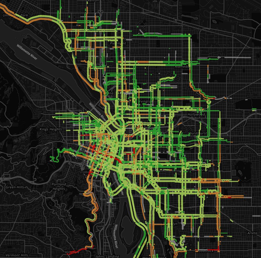
By combining about 30,000 of those ratings during the app’s testing phase, Ride Report has assembled a very detailed stress map of Portland’s bikeable core.
Before we dig in, an important caveat: The more users Ride Report gets, and the more different kinds of users Ride Report gets, the better these maps will become. Right now its user base of about 400 active beta testers is heavily dependent on the social and professional networks of Ride Report’s creators and probably some BikePortland readers who started following the project after our earlier coverage. Those populations probably skew it toward relatively experienced, passionate and (let’s say it) privileged bike users.
That said, to some extent stress is stress.
Another caveat: Knock Software CEO William Henderson, the lead creator of Ride Report, said one of his team’s early discoveries was that most bike trips are not rated as stressful. So even the routes with red ratings include plenty of non-stressful trips. But if one ride in ten were unpleasant enough for someone to give it a thumbs-down, that’d definitely still be a poorly performing route.
OK, with those things in mind, let’s see what their maps are finding so far.
Rush hour lights up Southeast Portland with stress
Here are larger versions of the maps at the top of the post. First, off-peak hours (trips taken during everything except the 8 a.m., 5 p.m. and 6 p.m. hours on weekdays):
And then peak (those three rush hours):

Stress patterns in several parts of the city change dramatically (check out Williams-Vancouver north of Alberta, and the Portland State University area) but none more than Southeast. Clinton Street flips from green to red almost all the way from 26th Avenue to 50th. Ladd’s Addition goes orange; so do the new buffered bike lanes on SE 17th Avenue between Powell and Holgate.
Almost all of this data was gathered before the trial diverters installed two weeks ago, so with Ride Report’s current user base it’s too early to learn anything about how well they’re working so far.
I’ve heard several people say in the last two years that they think reports of stress on Clinton Street are exaggerated. I suppose it’s possible that a group of complainers have also hijacked Ride Report and are deliberately skewing it. Alternatively, this data makes it pretty clear that Clinton becomes a very different street for three hours every weekday.
The Morrison Bridge path is rarely used except for local trips
Here’s the extended network of popular bike routes that cross the Hawthorne Bridge, Portland’s busiest:

Here’s the core rideshed for the Broadway Bridge:

Tilikum Crossing:

And here’s the network across the Morrison Bridge, in its entirety:
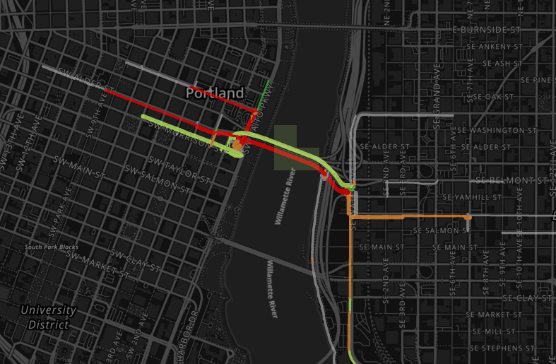
The gray lines suggest that a few trips across the Morrison actually go somewhere besides the central eastside and downtown, but not enough to be measured.
Another interesting question: eastbound traffic on the Morrison Bridge is marked as highly stressful despite having one of the best traffic-separated facilities in the city. Why? Based on the chart above, it seems to have something to do with the approaches from Alder, Stark and Naito on the west.
Advertisement
NE Weidler seems to have a problem

The eastbound bike lane on the right side of NE Weidler between 3rd and 14th jumps out as one of the city’s most stressful, especially during rush hours (pictured above). Why?
It’s hard to say for sure, but these blocks of Weidler alternate between blocks with a bike lane sandwiched between a through lane and a right turn lane; blocks with the bike lane in a door zone; and blocks with curbside bike lanes that cross the driveways of fast-food restaurants.
So does SE 6th
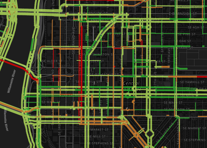
I rarely ride this street, so I was surprised to see this. It seems to be worse during non-peak hours, so truck volumes may be involved.
Broadway is a long streak of bad
The stretch of parking-protected bike lane alongside PSU apparently doesn’t help:
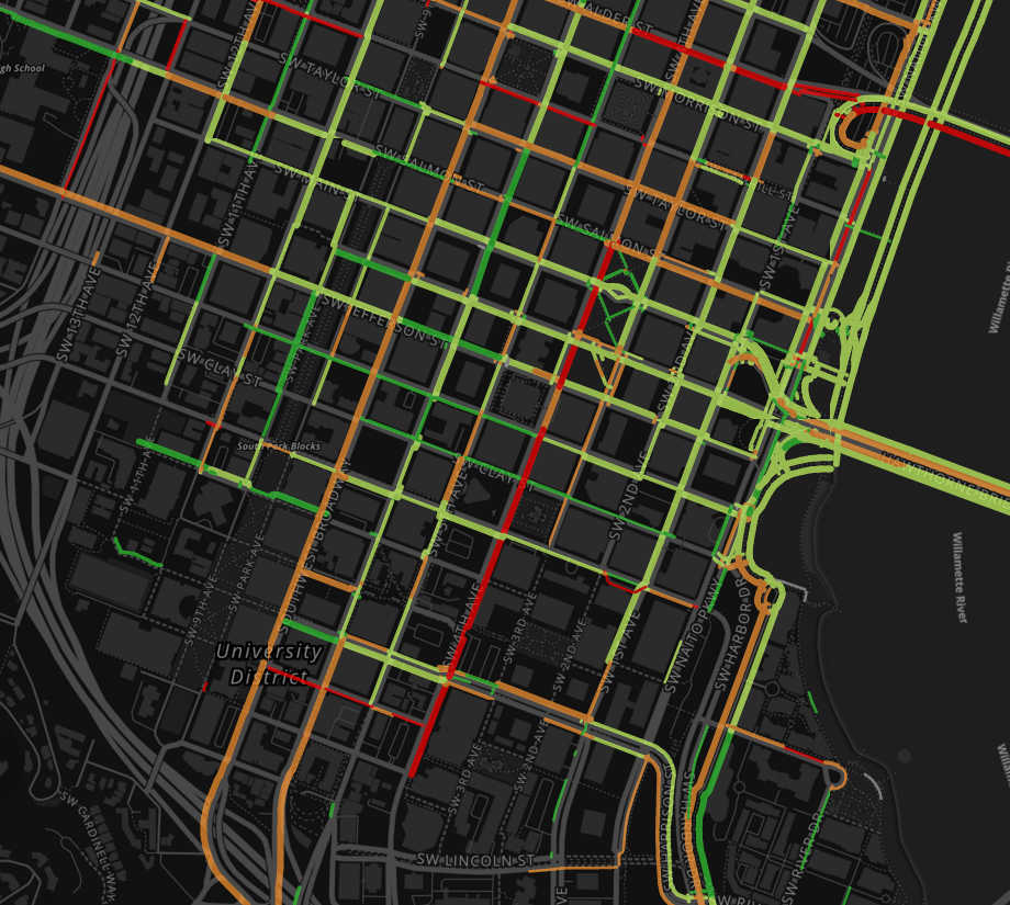
(Also note the trouble on SW 4th Avenue, which is one-way northbound; this part of downtown has no continuous northbound bike lanes.)
The one part of Broadway that actually performs well is the lead-up and crossing of the bridge itself:

I’ve focused here on the bad news turned up by Ride Report, though there’s good news too: south of Alberta the Vancouver-Williams corridor seems to be performing well. So does the current crossing of Interstate 84 at 28th Avenue and (surprisingly to me) the Burnside Bridge.
But the most exciting thing about Ride Report isn’t that it can find bad news. It’s that if enough people install it, it’ll be able to document the future changes on streets — new diverters on Clinton, better bike lane on Weidler — that turn bad news into good news.
If you’d like to log your own trips, check out their website to get the new app.
— Michael Andersen, (503) 333-7824 – michael@bikeportland.org
BikePortland can’t survive without paid subscribers. Please sign up today.


Thanks for reading.
BikePortland has served this community with independent community journalism since 2005. We rely on subscriptions from readers like you to survive. Your financial support is vital in keeping this valuable resource alive and well.
Please subscribe today to strengthen and expand our work.
This is fascinating. As an Android user, I’m looking forward to participating as soon as the app is available.
Thanks for pointing out the flaws and opportunities in the simple stressful/not stressful switch. Most of us probably don’t view our most familiar routes as stressful. We’ve gotten used to the problems and, when we get where we’re going, all invigorated and full of oxygen, we probably won’t label that trip as stressful.
But I’m pretty sure that when I start using this app (hoping to make a difference in, say, PBOT’s calculus), I’ll start taking those stress points back into account. A bit disingenuous, perhaps, but kind of a micro-activism.
Looks like they have pretty much no one riding to/from east of 60th.
So the “stress” ratings are just figured out based on a single thumbs up or down from the entire ride? I’m surprised they’re able to parse out differences in certain sections on the same street with such a generic and broad rating system.
Or am I not understanding how that is calculated correctly?
applying the Portlandia brush I’d say the greater density of hipsters closer in means more iPhones… we should see the rest of the city once the developers add the most common type of phone OS…
We can only conclude that everyone east of 60th uses Android.
Or has no smartphone….. Or doesn’t ride a bike…….
Also a lot of the stress on my daily rides is due to random circumstance that completely changes each day (whether you run into that jerk who yells at you, or whether that UPS truck is parked blocking the bike lane.
I guess this would get normalized out with enough users and trips though.
Yes. I wondered about this too. But if by “random circumstances” we mean cars, drivers, and weather effects, they aren’t entirely random. I know where I can confidently expect peaceful, easy riding versus potential conflicts, and I know where slippery leaves are likely to accumulate, etc.
If I’m reporting a stressful ride because of trucks parked in the bikeway on Multnomah one day, chances are very good that another rider will do the same, and the route will begin to look reddish.
The missing link is, and ever will be, all those trips not made because the available routes are all perceived as beyond-red.
I might add that while stress is indeed stress, it has a large individual component. What one experiences as stress is largely made up of internal factors, not the externalities.
Maybe there’s a plan in the works to superimpose these data maps over the maps of “official bike infrastructure”. Then those too-dangerous-to-use routes might pop right out.
I love this idea. We’ll definitely build something like this.
I work in the Central Eastside and I use 6th all the time as a cyclist and pedestrian. I find it the very best north/south route, but there is a lot of stress from cross-traffic. There is a ton of stop-sign running in this area, and frequent sketchy passing. IMO, the low rating on the Morrison is due in some part to the 2-way on one side of the street design. The connections are really non-existent, but the design itself is very uncomfortable to ride on.
Agreed. 3rd, 6th, 8th, 9th, and 10th are wonderful streets to walk and ride on if you take away the intersections, particularly at arterials. Low vehicle volumes and speeds, and the trucks are big and loud (hard to miss, easy to avoid). Mostly local traffic too, so drivers are chiller. But trying to cross Morrison and Sandy in particular is scary. Morrison’s eastbound lane needs to go.
Morrison Bridge: downtown approaches are one thing, but CEID freight trucks, train crossings, a freeway offramp, MLK/Grand, 11th/12th, and the superiority of Ankeny and Clinton are major factors, too.
NE Weidler: personal experience, I was two inches from the bumper of a right hooking armored car (two lanes over), my special lady friend stopped short and went down. Frankly we just try to avoid the Lloyd, despite the advertisers’ claims here.
“I’ve heard several people say in the last two years that they think reports of stress on Clinton Street are exaggerated.”
I don’t ride to work often but when I do I’ll take Clinton… it’s stressful about 50% of the time… and I’m in the “strong and fearless” classification…
I think I’ve only perceived to be stressful recently because of reading reports on this site.
Ignorance is bliss sometimes.
I don’t discount what others feel, but I’ve only once had a stressful experience on Clinton, and I’ve ridden it a lot. I don’t know whether that’s the result of good luck, riding style, or perception, but I do know that what others have reported is very different than what I’ve experienced.
But I do discount — completely — that it is more stressful than Division, which is what this app reports.
We have a pretty low volume of data on Division (the volume is indicated by thickness of the line), which is probably what accounts for this strange result.
In addition, there could be some selection bias going on here. That is, perhaps the riders who choose to take the lane on Division are more comfortable doing so and so tend to rate the trip more positively. In the future, you’ll be able to filter the data to see how different types of riders rate things.
unfortunately i forget i’m being tracked and don’t often rate my ride. the newest version of the app also displays what the weather was during your ride, so that’s sorta cool.
I record most of my rides with a Garmin, saving my phones battery from GPS usage. How is the battery life with phones that are using this app? Is it pulling GPS data the whole time? Could we connect our Strava or Garmin accounts to their service? I’d imagine that Strava has a gold mine of data on rides taken here, we’d still have to log in and rate the ride.
As I understand it, this app saves battery by not pulling GPS constantly – it uses momentum and compass a lot of the time instead.
This confirms what I already know to be true: the majority of the trips I take outside of rush hour are fairly nice rides. However, none of the trips I take during rush hour are peaceful. There’s not a single “low-stress” way of getting to my house during rush hour.
This is really great data to visualize. I can’t wait for the Android version to come out so I can contribute.
Yeah, I agree about Weidler being too stressful to use.
It’s amazing how much attention Broadway gets for possible future improvements, but it is almost as if we’ve given up on Weidler being a bike facility anyone would routinely use in the future.
I tried it a few times, but honestly it’s currently one of several routes I’ve deemed to be too unsafe to ride until it is fixed (such as NE Lombard). Such a shame because it is so direct from the Broadway Bridge to many destinations directly east of there.
I look forward to the day when people driving cars experience the equivalent amount of fear when choosing their planned travel routes….oh wait, no I don’t. No person deserves to experience such fear just because they want to travel across town.
Agree on Weidler. I re-routed my commute to avoid that stretch. Even aside from the traffic concerns on that road, the surface of the road that the bike lane sits on is terribly bumpy, and the bike lane itself constantly needs to be repainted because drivers can’t stay out of it.
Agree for me on Weidler. I’ll take Broadway inbound, since if you haul at 20-23mph you can hit the green wave. Every once in a while I’ll take Weidler and regret it every time. It is a loud, smelly, right hook fest of a lane. Instead I take Multnomah outbound.
Only available to iOS users. These wilting flowers likely do not find streets intuitively designed enough for their tastes.
My feeling is that my fellow Android users are more adept at finding workarounds for ourselves.
We definitely want your voice too. Android support is coming!
Fascinating data, what a great job collecting this.
The paltry rideshed for Morrison particularly struck me; I find it less stressful than the Hawthorne going East and it’s my regular route (arriving on Naito down SW Stark it’s only a short – but admittedly awkward – hop down Naito until you’re off the road again and onto the bridge, then you can drop directly onto the esplanade at the other end and off down to the Springwater – it’s also quicker from my uncalibrated who-gets-there-first observations with a friend who goes the other way). Naito doesn’t seem to get painted with the same red brush for rides going over the Hawthorne bridge, so I wonder if it’s the other (definitely bad, stressful) links to the Morrison bridge at either end doing the damage? Coming in to town though I take the Hawthorne, as coming off the W end of Morrison on a bike just hasn’t been thought out at all, just nada.
I sincerely hope that if the powers-that-be see this, it encourages them to improve rather than eliminate the bike route over the Morrison.
As someone else pointed out above, it’s a bit limiting that the entire ride gets the same rating, though certainly a lot better than nothing. Perhaps they could add a bluetooth widget that you put between your teeth (or elsewhere) to go with the app – the harder you bite (or squeeze), the more stressful the route at that point!
If this app is to be believed, it is less stressful to ride along Division during peak hour than it is to use Clinton.
Really?
It’s actually pretty fun to ride on some of the eastside arterials *if* you’re headed westbound, i.e. downhill, and traffic is light.
You can keep up with other vehicles. There are no stop signs. You make every light. The sense of flight doesn’t come naturally to humans, but that’s what it is, and it’s great if you can enjoy it.
I think that it means, of people who decided to ride on Division, most found it unstressful. The adrenaline junkies got their fix, but no ambulances were called.
I’m almost-strong and nearly-fearless, but with Clinton 2 blocks over, I’d much rather go that way… I presume that the researchers, when they have more data, will use appropriate statistical techniques to figure out what is stressful, what is surprise-stress, and what is differential route selection.
I suspect this is exactly what is going on. In the future, we’ll let planners filter the data to see how different types of riders rate things.
The stress rating for the Broadway cycletrack makes sense to me. Nowhere else on my commute do I come close to hitting other people as often as I do on the Broadway cycletrack.
It’s entirely possible that with only active 400 users (Ie 75 reports per user), that a couple users are messing up the data, which has been part of my problem with using data from this type of app. A few people can really swing the data.
It’s kind of like online customer reviews, most people don’t care enough to report such information, it’s mostly going to be people that will complain or offer the highest praise. And most the time those most inclined to complain out number those predisposed to “like” the ride.
Great to be able to see bridge ridesheds!
Southwest riders only use android?
What’s with the two lines along Terwilliger? Is the orange one the MUP?
So is the idea that this app is always running in the background? Doesn’t it suck down your battery? Also how else might it be spying?
Why does burnside get no love? Every other bridge was featured above. 🙁
I’m finding the maps a bit difficult to read. I would suggest that street names should layer on top of the red/yellow/green stripes, not underneath.
I don’t know… as someone who can’t use the app yet, I don’t think the data supports the stated conclusions.
If anything, I think the app is currently tracking the stressed people more than the stressed routes. That one little block of red next to the green route? That’s where “stressed guy” starts riding.
The visualization is interesting, but with only one data point per ride, I just don’t see how you could support block-by-block conclusions about a route. Maybe the future when your neural implant is sending real-time stress levels to the app.
Caveat – I have no first hand knowledge of the inner workings of Rate My Ride.
That said, I would think the algorithm could be looking for the overlapping sections of rides rated low and high stress. If there are many rides all rated low stress and they all overlap for a six block section of a street, then that overlapping section must be low stress. If there are many rides all rated high stress and they all overlap for a six block section of another street, then that section might be high stress; you’d look at the other parts of each ride, and the more of them that are on low stress section of streets, the more it suggests the overlapping section is the high stress part. Since most rides are rated low stress, as data accumulates it should be easier to identify the high stress sections.
The limitation would be identifying the specific problem point in those high stress sections. As an extreme example, every ride across a bridge must cover the entire length of the bridge, so if the bridge is hypothetically determined to be a stressful section, there is no way to get more granular and determine if the stress comes from one exact point on the bridge. As a more realistic example, given enough data the algorithm might hypothetically determine that Lombard between 33rd and 55th is a stressful section, but it would be hard to pinpoint the 42nd st overpass as the stressful point. But that level of granularity isn’t really necessary for the data to be extremely useful to cyclists and the city.
I don’t think any conclusions can or should be taken until the other 70% of us can participate. In particular you are skewing data to the affluent and young (http://www.businessinsider.com/android-is-for-poor-people-maps-2014-4) which conveniently also correlates to the inner core.
Obviously correlation is not causation blahblah but it will be interesting to see what changes.
I also realize you mentioned the small data set Michael, FTR.
I think it will be interesting as the tons of routes that don’t go to or from downtown fill in. Those routes are often the worst in my experience. There aren’t many ways to travel unless you want to go directly toward or away from downtown. Cross town routes don’t exist or are a motley patchwork of short sections with bad crossings and jogs. Try to find a long straight route north and south other than Williams/Vancouver?
What about the routes that are thick green?. Does that imply they should be lower priority for bike infrastructure, in favor of spending money on other routes which are thick red?
We have to find balance between keeping people safe, getting more people riding (to reduce congestion), and convenience. Spending a fair bit for separated bikeway and signals on a heavily used route with a lot of auto conflict might have the same cost/benefit ratio as painting 12ft of lane onto the pinch point at the light on SW Vermont eastbound at Capitol Hwy.
I agree, but while most of the comments on this post have focused on the routes that are high stress, I’m asking about the other end of the spectrum. I’m asking about the routes that, according to Rate My Ride, is already both heavily used and low stress (i.e. a thick green line). What conclusions should we draw about those? Should we redirect spending (of money, energy, political capital) away from those low stress routes, in order to spend more on high stress routes? Given that total spending resources is limited, it seems to me that we need to choose what not to do, as well as what to do.
We need to focus on routes that are barriers to transportation cycling. For example, while I (and others) find the broadway cycle track to be stressful, it is not a significant barrier to transportation cycling.
No, because there’s no basis for that, or any other, conclusion based on one data point per ride. This is not an infrastructure planning tool.
For example, NE28th between Burnside and Hwy 84 is thick green which signifies that it is low stress. Given that, are the demands for more bike infrastructure on that section really justified?. Should the city instead focus on sections of other streets that are high stress?
(Assuming, that is, that these ratings hold up after more data is collected.)
I did some rating with the beta version, and just installed the new app. I really wish there was a way to pinpoint or highlight a portion of a ride that is stressful, rather than saying the whole thing was or wasn’t stressful. Like, crossing NE 60th at Davis during morning rush hour is pretty stressful, but the rest of my ride is easy until I hit 11th.
Is it just me or does the Ride Report app have “updates” available way too frequently? Getting prompted to update the app several times a week starts to get a little annoying. Also, I’ve noticed that the app records quite a few of my car rides as bike rides, which might be skewing the statistics a bit. Overall, I think the app is a great idea, and I intend to keep using it, but between those minor annoyances and the fact that each entire ride only gets assigned a binary good/bad rating, sometimes the app feels a bit clumsy.
Hey Ian,
Sorry about that. The frequent updates are just for beta users – we push updates to the App Store version much less often.
If you would like to move from the beta version to the App Store version, here’s a guide on how to do it and make sure all your rides get synced over:
http://help.ride.report/customer/en/portal/articles/2295512-how-do-i-move-from-the-ride-report-beta-to-ride-report-1-1-a-ride-report-1-1-migration-guide?b_id=10610
Oh cool, thanks!
Clarifying question- does the app let you rate segments of your ride? Or just the whole ride overall? My daily commute is 5.5 miles each way. There are some segments that are pretty stressful, while overall it’s ok. It would be nice to be able to differentiate between them, otherwise I would probably go with a thumbs up (3/4s good, 1/4 stressful). I don’t think it’s helpful to give a thumbs down to a trip where large portions are on pretty good infrastructure.
Not having seen the app (android), I’ll have to assume from the dialog that one can only report a thumbs up or down for their entire route. If that is the case, I think it will miss the most important thing to focus improvements. “Pain points”. 90% of my commute is fine, but only a few locations cause me pain. Being able to segment a commute and rate different sections would be really useful. If you can do that great, then the data might be useful. But if you have to rate your whole route, well, a lot of detail will get missed.
We need our cities, counties, and states to listen to cyclists and fix danger spots and corridors promptly, not wait for needs inventories, strava data, scoring systems, apps and even fatalities to re-tell them what they should already know.
^ Sorry, I re-read this comment – this was not the tone I was intending to convey.
I’m glad for apps like this one but I don’t want to see “We’re still analyzing the data” as an excuse not to fix something.
I wish Ride Report didn’t show my trips by car or on foot. I don’t have any interest in rating these, and they just clutter up the app.
Also, I guess there are some trips that are hard to identify as being by bike or by car. For example, I drove the kids to a movie last night, it was a 1.5 mile trip on local streets and I never went above 25 mph. That trip showed up as a “ride”. I suppose that based on acceleration and speed data, it could have been a slow drive or a fast bike ride. But for a cyclist to accelerate from a stop as fast as a car, even a slowly driven car, that rider is almost always pedaling hard (and often out of the saddle), and there should be a pattern of movement (of the phone carried on his body) that distinguishes that sort of hard pedaling from sitting in a car seat.
I deleted this app since it didn’t appear to record my daily commutes or give me the chance to rate them even. Of course, I seldem venture far from the 205 bike path towards downtown so that is probably why it didn’t work. For all of you Androiders, unless you ride downtown, it’s really not that great to have an app on your phone that just takes up space and doesn’t work, so don’t feel left out! 😉
as usual outter areas are left out…when is portland going to learn its not all about downtown and the inner area…