The community is still processing how Multnomah County engineers and planners could have ever approved a design for the Hawthorne Bridge viaduct that put bike riders in even more risk than usual.
Over the course of a week or so, we learned that the County changed the existing bike lane design at the SE Clay/Martin Luther King Jr Blvd off-ramp, then changed it again after hearing such a loud backlash. Now many folks are wondering how this opportunity to fix a clearly dangerous intersection was missed and what can be done going forward.
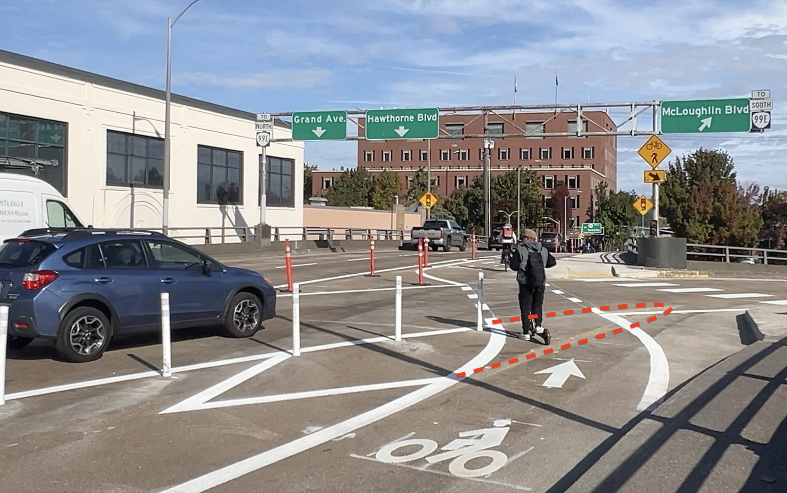
To back up a bit, this work from the County was done as part of a $9.5 million paving and maintenance project. Like we’ve seen from Portland Bureau of Transportation, the County took advantage of a clean slate to make adjustments to the bike lanes on the viaduct, including a tweak to the SE Clay offramp. Why? Because it’s common knowledge that this through bike lane and right-turning general vehicle lane is a conflict point.
Given the critical tone of my story about the change Wednesday, and the fact that at least one person was actually hit at this location after the change was made, I was eager to hear more about the thinking behind the design change from the County. Surely they could supply some sort of rationale for the striping shift that created a very awkward angle for bike riders while doing nothing to deflect or deter driving movements.
I didn’t end up learning anything new from the County. In a statement emailed to BikePortland Thursday afternoon, they acknowledged receiving “a lot” of feedback about the initial change and said they made, “immediate changes to that bike crossing to reconfigure it to better align with what was previously in place.” A few hours after my story posted, I rode by the intersection and uploaded a video (above) of the reconfiguration to verify that it had, indeed, been returned to its previous design.
Wednesday night also happened to be the monthly meeting of the Multnomah County Bicycle and Pedestrian Community Advisory Committee. I know a few members and they assured me this topic would be discussed. They also shared the BikePortland story and video with committee members and County staff at the meeting.
One of the committee members, Andrew Holtz, was willing to share his personal reflections about the situation (note Holtz is speaking only for himself in these comments and is not authorized to speak on behalf of the committee). What does Holtz think happened?
“Rather than an ‘oversight’, my sense is that the real world outcome was unanticipated and that the effect of the angle change was thought to make it easier for people on bikes to see cars coming without having to turn their heads as sharply,” Holtz shared in an email to BikePortland. He based that feeling on recollections of a discussion at the committee one year ago when County staff presented on the project.
“It seems there wasn’t much discussion of the angle change because it didn’t seem like it would make much difference. And there was some thought from committee members that a sharper angle would make it easier to turn and see drivers coming,” Holtz added. He also shared that County staff plan more discussions about how the change was developed and what lessons can be taken from this experience. Staff will likely address the committee about this future at a future meeting. “It’s fair to say everyone, committee members and staff, are looking for lessons for the future.”
To the County’s credit, they changed course quickly and altered the design. But this back-and-forth has triggered interest from several people to actually make the design safer.
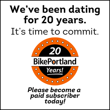
Nick Falbo, an urban planner and infrastructure designer who earned acclaim in his field for pioneering work on protected intersections and worked at PBOT for six years, shared a drawing on Bluesky this morning for the design he’d recommend. Falbo’s drawing shows a raised crossing and concrete islands to create a more predictable path for bike riders and slow drivers in the turn. “Drivers should yield to people walking and biking, and we should design the crossing so that behavior is intuitive,” Falbo wrote of his “Dutch-inspired” design.
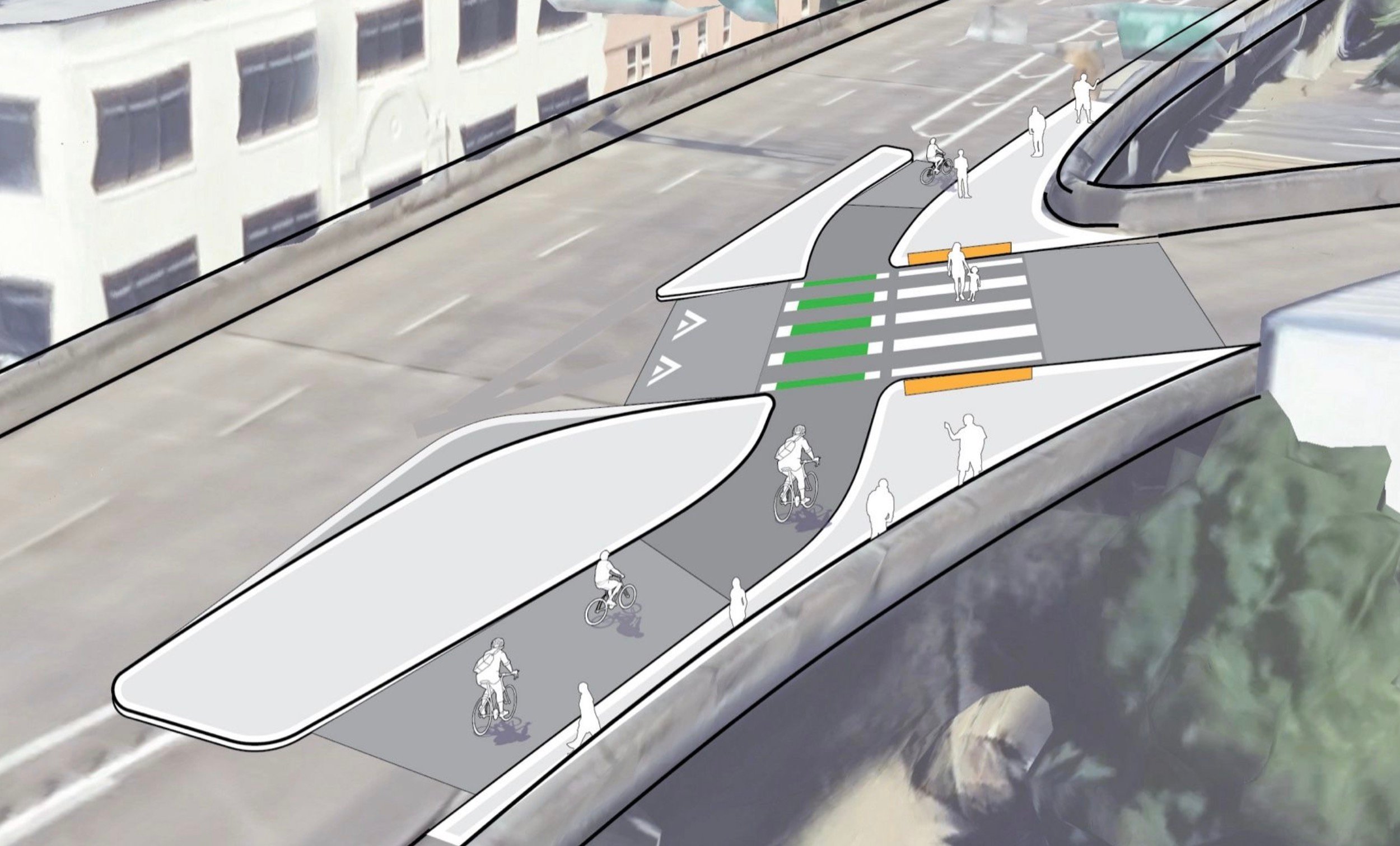
And a local bike advocate who I’ll keep anonymous for now, copied BikePortland on an email to a member of the County advisory committee that shared a PBOT plan drawing of this intersection. The drawing was created for PBOT’s Central City in Motion plan, a list of 18 recommended projects that includes revamps to improve biking and transit service on SE Hawthorne and Madison.
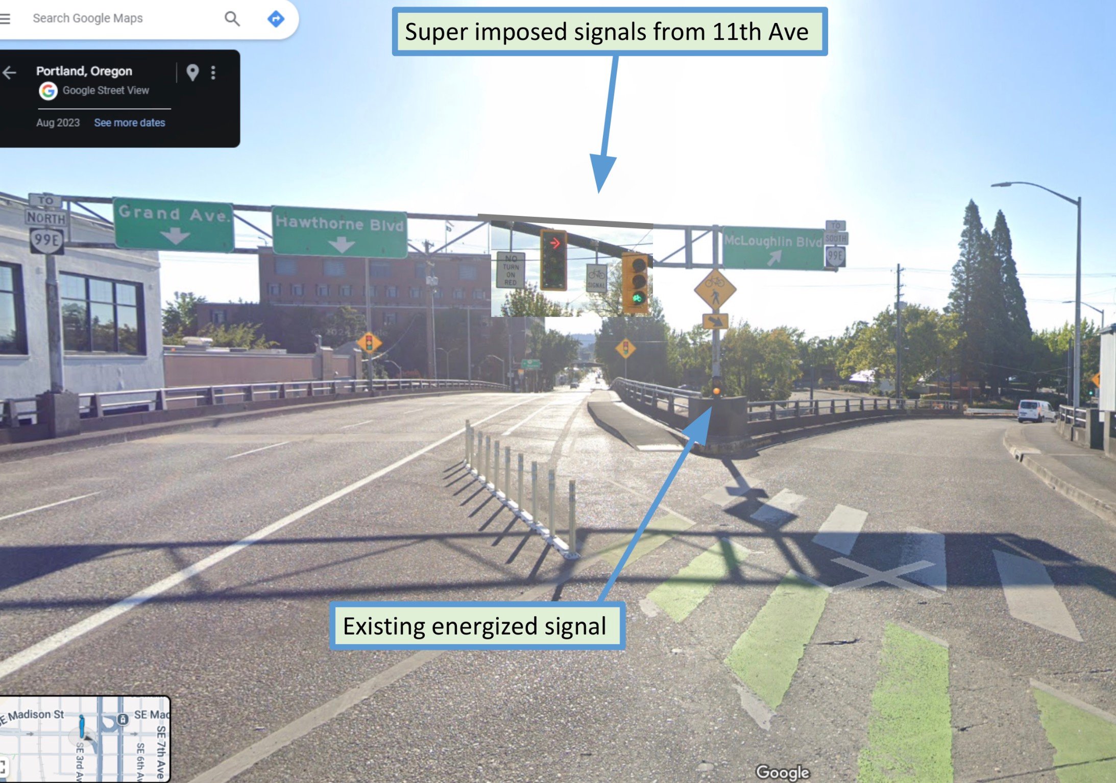
The CCIM conceptual design (above left) for this intersection shows a bike signal at the off-ramp. The bike signal would be triggered by approaching riders and an existing signal head that blinks yellow would be upgraded to a full signal for right-turning drivers. PBOT’s website says designs for the project have been finalized, “and will be delivered by Multnomah County.” But somewhere along the way, the signal element of the project has not been delivered. I’ve asked PBOT for an explanation and will share more when I hear back.
We clearly have solid options to improve this intersection and now there’s considerable public urgency to do something. It’s unfortunate this opportunity was missed, but I feel confident in saying a longer-term, higher-quality fix is now squarely on the radar. Stay tuned.


Thanks for reading.
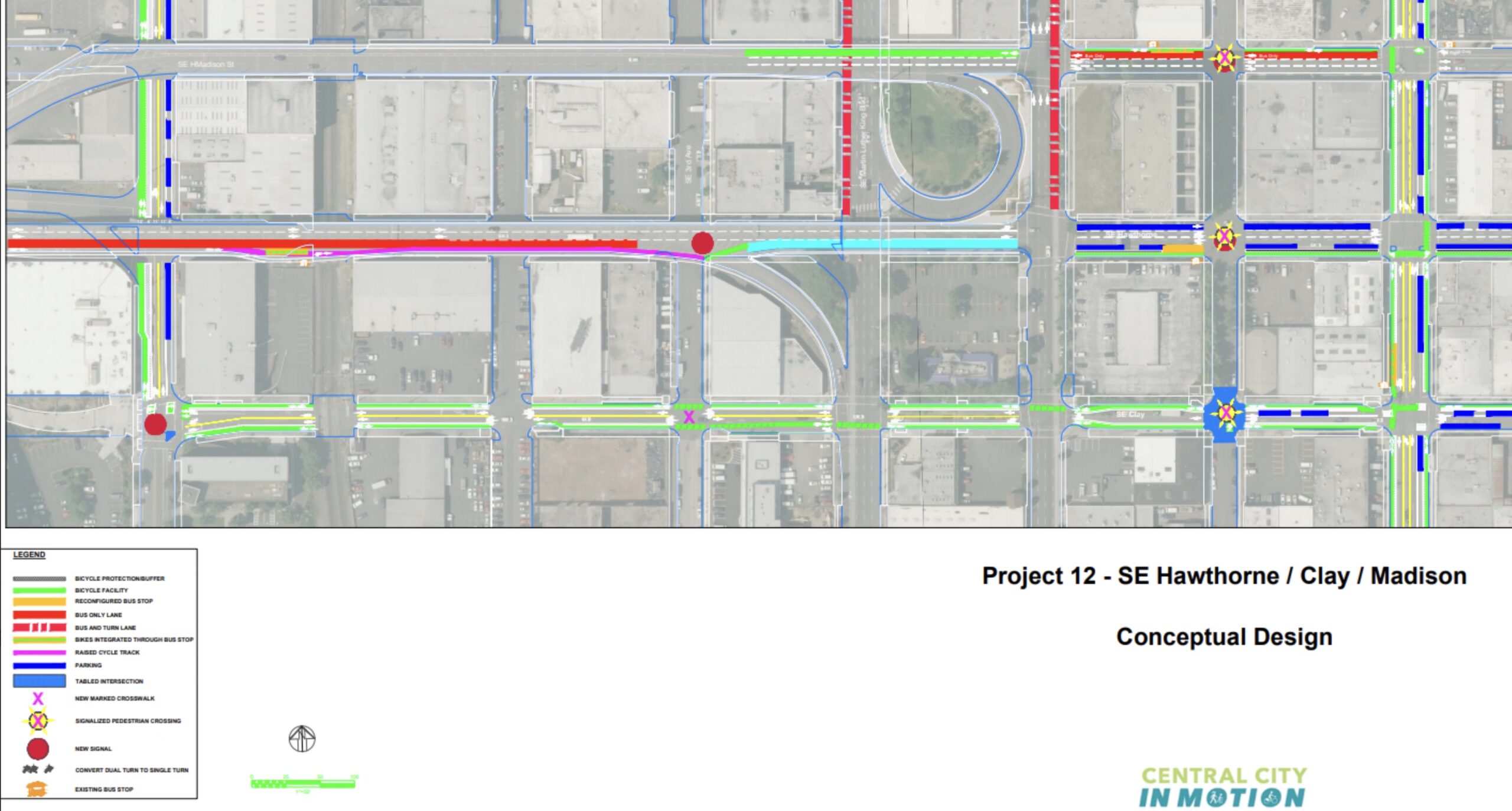
BikePortland has served this community with independent community journalism since 2005. We rely on subscriptions from readers like you to survive. Your financial support is vital in keeping this valuable resource alive and well.
Please subscribe today to strengthen and expand our work.
In my mind, the issue with the current and previous design was that there wasn’t a “concrete” definition of who was supposed to yield to whom when a driver and cyclist approached each other. Sure Oregon law says right turning vehicles yield (811.050) but drivers assume this is a freeway exit so they think they have the right of way (yay 1970s design!). Nick’s design seems to be an effective and efficient solution that takes away the the freeway-style flow and makes it clear that there is indeed a crossing. I would perhaps add in large letter YIELD parallel to the crossing to make it clear to drivers what the appropriate behavior would be, and who is required to stop. Sure, a few drivers aren’t going to care (I doubt a small red turn light would be much better) but they aren’t going to stop for anybody anyway. I will, however, reduce the ambiguity for the majority of interaction. The stoplight design likely costs more and since there isn’t a light for car traffic going straight, would likely be easy to miss for right turners.
I also like Nick Falbo’s design a lot. It looks like it would be a lot more intuitive for all modes. I think it would also have the added benefit of narrowing the roadway a bit, bringing down speeds of vehicles coming off the viaduct.
I have two wonderings. How does the cost of the signal solution compare with the cost of the concrete island? And; would the weight of the concrete islands and raised crossing be an issue for the bridge structure itself?
If the Mayor/Council allowed Nick to design our separated bike network, we’d be in excellent hands.
didn’t Nick design the northbound bike lane on NE 7th that cuts across the curb extension and removes pedestrian refuges to make more space fore people driving?
Yes to all that. Even the yellow sign that was included is ambiguous. It shows a bike and pedestrian silhouettes with an arrow pointing down the exit ramp. No “YIELD” or anything else.
Those silhouette signs are like dog owners who yell out their dog’s name to get them to stop barking or jumping up or whatever. All they’ve done is establish to their dog that they know his name. But he continues barking and jumping because they never actually gave him a command. He has no idea what they expect him to do, or whether they’re even expecting him to do ANYTHING.
Dog comment of the week.
Part of the problem with the existing slip lane (both before and after all these changes) is that it makes it easy for cars to zoom from the main road onto the off-ramp. What I like about Nick Falbo’s design is that it sets the ramp closer to a right angle to the main road. That forces cars to slow down — and significantly increases the chance that cars and bikes can escape from any conflict.
Why not go further, and make that turn a real right-angle turn, and then treat the bike lane like any straight-through lane that crosses an intersection?
The obvious solution is to close the slip lane. What’s more important, a safe route on the one of the most important bikeways in the city, or saving drivers the horror of making a few extra turns on a minor connecting route? Especially since drivers have the option of taking Naito -> Ross Island -> McLoughlin for trips on 99E heading south (same time from City Hall), it really is a minor route
Wow. How many other fully fleshed design improvements have been improved but ultimately, “Not delivered”?
In the last article, a similar slip lane between Bertha and Beaverton-Hillsdale Highway in SW was mentioned so at least one more
In the interim ~~ before the conceptually-designed light signal is broached and then discarded due to predictable budgetary or feasibility reasons, wasting valuable time ~~ can we just install a Yield sign to the auto lane?
First, thanks for your coverage as always, Jonathan. I admire the optimism you express in the last paragraph. If I’m heading E on the Hawthorne Br., I almost always get off at the esplanade, so I’m not that familiar with this intersection. Yesterday, I detoured through the area to get a look. As I rode through, I was struck by how difficult the task of making such a road bike friendly is. Despite quite a lot of investment, reflective wands, and even responsive fixes by the county in response to public dissent, I thought the biking experience was no better than (maybe not even as good as) a standard painted bike lane/wide shoulder. It was still stressful crossing the offramp, and I cut through the wands as I expect most bicyclists will. I will not be surprised when I hear of collisions here in the future. This experience was disheartening.
I would love to understand more about the process that connects the CCIM documents (which have some high-level information, including the missing signal discussed in this article) to the folks that do the repaving, install the decorative wands, and stripe the bike lanes. As others have commented, it seems like there was not much consideration of a bicyclist’s perspective (I think Holz’s comments are illuminating in this regard). It also seems like a competent designer could draw up something better (e.g. Falbo’s drawing). So, what I want to know, is what information the people that completed the installation were working from. Are there more detailed drawings than the CCIM GIS map? Or do they just show that to the contractors and say ‘try to make something like this.’?
I worked at PBOT 2000-2006 as a GIS technician and would often use Maintenance Bureau (a division of PBOT) work orders to map street features, which were usually amazingly detailed and precise, which lane marking goes where, how wide, how far from the curb, and so on; same with signage, candlesticks, curbs, pretty much everything. These work orders at that time were carried out by city workers if the job was $125,000 or under, by private contractors if over that amount, but they all had the same work orders, and it was all inspected afterwards, remeasured, and the original work orders had new markings wherever there was deviation from what was ordered. We also saw the the work orders from ODOT, usually in “engineering metric” whereby one inch isn’t 25.4mm but 25.00mm, but again fairly detailed and precise (aside from the built-in metric conversion errors). However, the few county diagrams we examined were all from the 1950s through 1980s, vary vague, so I don’t know what their more modern work orders look like.
Thanks for your insight. I would be informative to see such work orders for this project.
Why does the bus platform also suck compared to the plan. The plan calls for a raised bike path from a bit before the platform through to the crossing at question. Instead cyclists now have to veer pretty aggressively over to the right to give pedestrians space (which is good) and then veer back over to the left since the platform is only a small part.
This whole thing feels very half assed and done fully with the “so be it, cyclists can adapt” mentality.
I hope the person that was hit sues the sh!t out of the county
The bummer about this approach is that you usually have to be hurt pretty bad to make it worth doing.
Thank you Nick Falbo. Your excellent design really puts all the other lesser solutions into perspective.
Came here to say this. Some really interesting and well illustrated concepts Nick has posted. Grateful for your work, Nick!
Nick’s design is nice, and if we *must* keep that turn lane open then it would be an improvement over the current situation. But, it’d be cheaper, faster, and safer to simply close the turn lane altogether.
I’d like to see them paint a lane-filling yield symbol on the auto slip lane before it crosses the bike/pedestrian zone. I’d suggest a sign on the candlestick, but we know how long that would last.
I went to their website and submitted a comment suggested closing the slip lane.
https://www.multco.us/bridges/webform/hawthorne-bridge-paving-and-repair
Thank you for the link, which leads to https://www.multco.us/bridges/hawthorne-bridge
There is already a strong precedent for managing areas where fast traffic mixes with slow traffic on the Hawthorne bridge: rumble strips/ speed bumps. If they are good enough for the bike lanes they are certainly good enough for the car lanes.
I’m going to out on a limb and say noone in that room who agreed to the sharp angle change had ever ridden a bicycle on portland streets. Ever.
I’m glad I don’t commute this section to get home anymore.
To me, the short term “fix” is still suboptimal because, if I’m turning my head around to the left to check for zoned out drivers, I *do not* want to be simultaneously negotiating a squiggly, narrowed bike lane full of wands and curbs that could make me crash. The bike facility that gives me the greatest sense of safety is one in which I can easily maintain my speed and maintain my line, preserving cognitive function for awareness of nearby danger (automobiles).
It’s a central irony of some of the City’s recent bike facility designs: we know pretty well that narrowed and/or squiggly roads are harder to drive, and thus slow down drivers, which is great because drivers kill cyclists. However, what’s the point of making of making cyclists negotiate narrow/squiggly bike facilities? Why do planners want it to be harder to ride?
If we are trying to increase the number of riders, shouldn’t bike lanes be wide, straight, and easy to negotiate???
If we applied appropriately scaled design principles from the interstate highway system to bike facilities, we’d have glorious riding.
So this project is applying these principles absolutely backwards: making it harder, more inconvenient, and more dangerous to ride, while rolling out the spacious red carpet for speeding cars.
It’s bass ackwards, even it it’s newest form!
This is something I keep coming back to as well, and I find it pervasive in most new bike infrastructure in the city. There are so many chicanes and other places where the bike facility jogs to meet a car lane at 90 degrees, but I cannot think of single place where a car lane jogs to meet a bike facility at 90 degrees.
I want to second this! The ridiculous chicanes in the bike lanes on Rosa Park greatly diminish their rideability, and the north end of the Blumenauer Bridge is unforgiveable!
Just wait till you see the new painted crossing at NE 38th and Tillamook. We can even have straight shots across square intersections. I guess we’re supposed to swerve out of the way of cars that want to zoom past us through the intersection?
There’s room at this location for a third lane that could be a dedicated lane for motorists taking the viaduct. There should be physical barriers between that lane and the bike lane, and use islands to slow motorists as in Falbo’s design. Limiting eastbound motorists to a single lane on the Hawthorne (i.e., when motorists heading for the viaduct need to stop for cyclists) feels really inefficient when there’s room for a dedicated viaduct lane
Why can’t the usual “mixing zone” work here? – provide a couple of hundred feet of dotted-line striping for bikes to cross the exit lane and end up in their own lane going east. Or do planners think cyclists can’t judge the speed of cars in that situation?
I’m a fairly fearless cyclist in Portland, and those “mixing zones” give me the willies every time I deal with one. I’m thinking of the one just east of I-205 on Stark in particular. Cars are flying up behind me, some wanting to go straight, and some wanting to turn right, and they don’t expect that I’m going to merge into their lane. There can be a huge speed difference, and when it’s dark and rainy, it feels even more unsafe.
Signalize it or remove the slip lanes. They weren’t built for the safety of cyclists.
I agree with you that slip lanes are great for cars and terrible for cyclists. But from the mixing zone you’d end up in your own bike lane going east. I’m not familiar with the location on Stark you mentioned, but the mixing zones I’m familiar with in SW, such as on SW Capitol Hwy, work really well. Basically you look in your mirror and over your shoulder as you approach the zone and if there’s no car coming, you scoot across into the bike lane going straight, so that cars can zoom past you on the right to make their right-hand turn. There are a bunch on Barbur also, such as the turnoff onto Bertha. You can get used to cars passing on your right and it all seems pretty normal. I don’t know of anyone who has been hit there (fingers crossed).
The volumes and differential speeds here just wouldn’t support a mixing zone. Too many cyclists going slow, too many cars going too fast.
There are so many ways to get from downtown to MLK southbound already, they should just close the slip lane and develop the lot.
We could use some speed cameras on all of our bridges. Speeds are routinely faster than 50mph. It might seem sort of safe while on the bridge, but the but the first few intersections at either end of most of the bridges are pretty sketchy. I have been commuting down Broadway, and every morning there are 2-5 cars who fly through the red light heading west on Burnside. I ride the Hawthorne pretty regularly and speeds on the viaduct are not conducive to safe driving.
The yellow diamond ped/bike caution sign just below the large green McLoughlin directional sign needs revision: the arrow points past the crossing area, leading to additional confusion. It seems that it would be best posted upstream of the crossing, not after passing it. Also: the large green directional signage subliminally suggests to drivers that they are on an interstate highway– which is not a good message. An inappropriate use in this location!
Jonathan:
Can you confirm that the paving on the Hawthorne Bridge viaduct is actually done? Doesn’t the surface seem unfinished?
There are grooves in the pavement and lots of rough areas where old lines were ground down. Tons of sandy debris on the bridge in both directions. I assumed they were going to repave at some point. Is this it, as far as resurfacing?
There was literally a truck parked out there at 4:15pm in this exact spot while they did work on some markings today. It wasn’t part of the work. It was an unmarked black truck completely blocking the view between cyclists and drivers. All so the driver didn’t have to walk an extra 50 feet. It could have been parked further up the road by the other construction and county trucks but nope they did it right where these two lanes cross. Feels kinda deliberate.
Add to that the tent fully blocking the bike lane at 10th and the Hawthorne protected bike lane wasn’t very protected this afternoon. Apparently a tent in a bike lane isn’t an emergency but in the other travel lanes it would be.