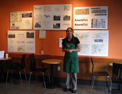
(Photo: Brian Borrello)
The Starbucks Coffee in the Piedmont neighborhood (at NE MLK Jr. Blvd and Ainsworth) is displaying the master plans, artist’s renderings, and possible bridge treatments for the Bryant Street Pedestrian Bridge improvement project.
There’s also a comment book available where you can leave your opinions and feedback.
Read more about this project here.

Thanks for reading.
BikePortland has served this community with independent community journalism since 2005. We rely on subscriptions from readers like you to survive. Your financial support is vital in keeping this valuable resource alive and well.
Please subscribe today to strengthen and expand our work.
I like the idea of murals and art hanging on the sound wall much better than portals or windows. The purpose of the wall is to block out the noise of the freeway which would be ineffective if you start putting holes in it. Ideally I’d prefer not to have to see or smell the freeway at all; art on the bridge itself as well would be nice.
Isn’t Starbucks for tourists?
I can see your point Lisa for the people living nearby. However, as a safety issue, I feel like it would be nice to be able to have some visibility through the wall. When I ride around that corner coming from the Fred Meyer side I often feel startled by the people who are huddled there smoking crack or shooting up. It can also be unsafe around that corner because there is no way to see if another biker is coming. I wonder if there is maybe some glass that is soundproof but still see through? But I guess if it came down to it, I’d rather see some changes even if it meant no windows / holes.
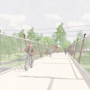
I think a few of these design ideas would be probematic (they look really cool and creative) – and I realize these are from community input, not a formal design proposal. The designs that have a “undulating” bridge or “off-kilter” appearance will make it difficult for some riders to maintain a straight line when crossing the bridge. The eye fools the inner ear, and the body tries to compensate – some riders could careen into the side fence, or into oncoming pedestrians or bikes. It wouldn’t be as much of an issue if the bridge were wider, but a narrow bridge increases the effect.
Very creative, though – I hope the city incorporates some of the design ideas.