(Photos by Betsy Reese)
The Portland Parks & Recreation bureau has completed a project that aims to improve safety on a busy portion of the Springwater Corridor path.
As we reported on April 20th, the project came in response to safety concerns that came into focus after a collision between two path users last spring that resulted in a serious injury.
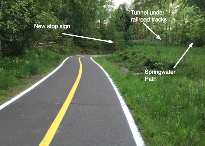
The location of the changes is two miles south of OMSI where the Springwater path comes to a “T” intersection with a path through the Oaks Bottom Wildlife Refuge. The Oaks Bottom path emerges on the Springwater after a tunnel, which limits sight lines. Making things more dangerous are the relatively high speeds Springwater path users reach as they ride downhill to the intersection.
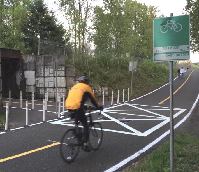
Parks has used a variety of pavement markings, signage, and plastic bollards to encourage people to slow down and use caution. BikePortland reader Betsy Reese rode by the area yesterday and sent us a few photos…
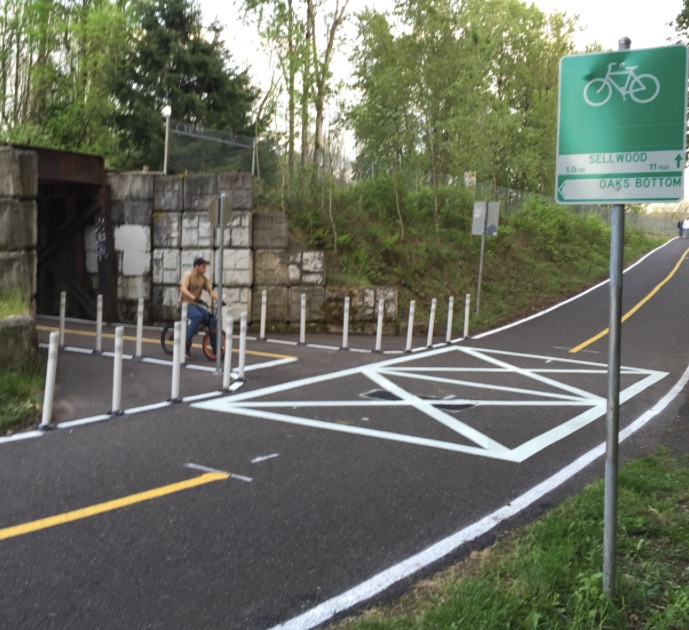
Parks added lane striping to the Oaks Bottom path as it approaches the Springwater…
Advertisement
Here’s the view looking west from Oaks Bottom path just before the tunnel and the Springwater…
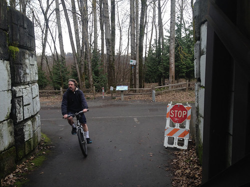
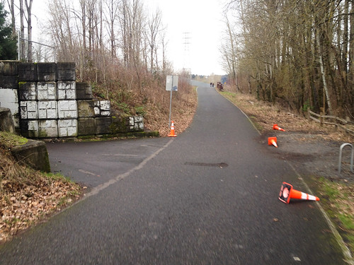
And here’s what it looked like before the changes…
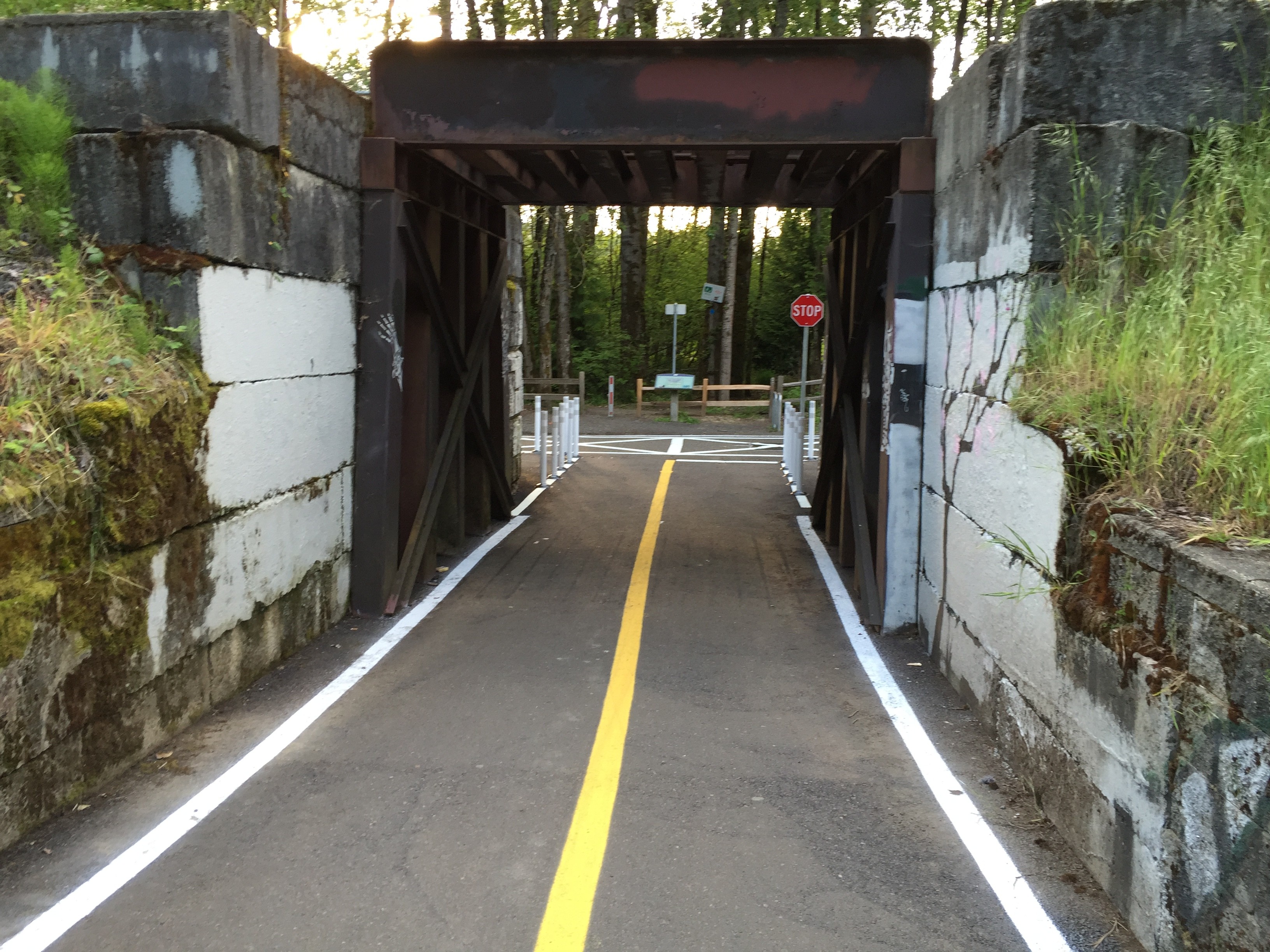
This is a closer-up view of of the “T” with the Springwater…
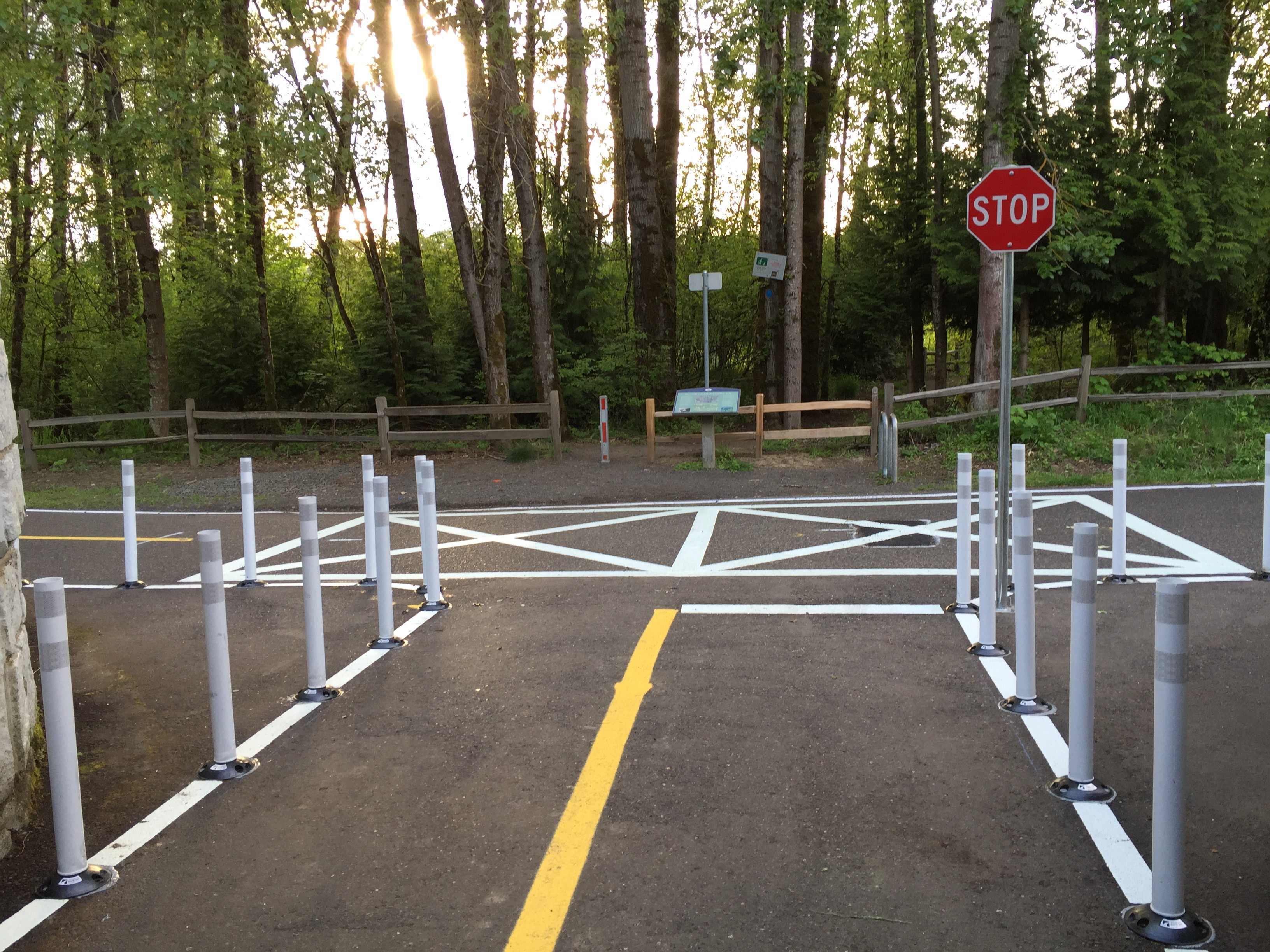
And here’s another view of the entire intersection looking southbound from the Springwater…
Compare that to this photo taken before the changes…
Betsy says it looks pretty good: “I like the solution. It is a simple and relatively inexpensive fix. I think it will work.”
Have you ridden it yet? What do you think?


")

Thanks for reading.
BikePortland has served this community with independent community journalism since 2005. We rely on subscriptions from readers like you to survive. Your financial support is vital in keeping this valuable resource alive and well.
Please subscribe today to strengthen and expand our work.
Simple and elegant. I love it.
Simple yes…not so elegant (in my opinion)
Wow that thing is busy.
The busy appearance certainly made me slow down. Not sure that was the intended mechanism, but it was an outcome.
I could have done without the rumble strips at the top of the hill (I know, not that big of a deal). I’m just super thrilled that they didn’t go with a roundabout.
I’d like more info on the rumble strips – are they as bad as the ones used by MultCo on the Hawthorne bridge or not? Also, did they paint a center line for the entire length of the main path or just in this one location?
They don’t seem as bad as the Hawthorne strips were but they are noticeable. On the plus side, just like the ones that were on the Hawthorne you can easily go around these as they are only on half the path.
The center painted line is only in this section. Starting at the top of the hill on each side of this intersection.
what rumble strips where? that isn’t mentioned in the article…
There is one set of rumble strips on the Northbound (headed toward downtown) side of the Springwater trail. I noticed last night that they aren’t on the Sellwood bound side of the path. I’m guessing it’s because it’s the outside lane and not as affected by the intersection.
They should have tried it without the bollards. New bike riders, especially kids, get wobbly when going slow and coming to a stop. It appears that there are way too many bollard, and the striping may have been enough.
If they used the same technique to attach those bollards that they use on the rest of the rubber bollards on Portland streets, half of them will have scabbed off and be missing before the end of summer anyway.
Anyway, snark notwithstanding, I think I like the solution.
Aren’t they the flexible on a spring type at least? But fair point.
Not on a spring but very pliable plastic that will bend if met with any modicum of force.
Too bad they couldn’t have planted a 3′ deep hedge bush in place of the bollards.
I’m thinking of the type that are commonly used for hedge mazes but only 2.5′-3′ tall and about 3′ deep covering that entire bollard-ed lane border region.
I expect something so simple would easily be stymied by the fact that this would be introducing a non-native plant AND very labor intensive.
It would be a low injury crash barrier and probably more durable in the short and long-term.
Riders emerging from the tunnel have the entire width of the path between adjacent bollards, so any wobblies won’t matter.
There is a center line painted on the path, so they have half the path. A vertical upright on the path effectively narrows the path, especially for new riders who will no want to ride super close to them. Have the bollards on both dies with a center line pinches the path down a lot. They could have added 3 bollards just on the small, painted radius outside the tunnel to direct movement but leave the path a little more open under the bridge.
Looking at the views from tunnel, e.g photo #5, I don’t see any bollard in the middle of the path for riders exiting the tunnel.
Sorry John, you are right- no bollards in the center. However, the path is striped now, clearly limiting bikes to the right half of the path (relative to their direction).
Jogged through it last night, seemed pretty good to me! The amount of bollards looked a little silly, but I think I’d rather them then rely on the painted lines. Nice work I say.
Should use a REAL stop sign, though. 😉
Is a red octagonal sign with the word “STOP” on it not a “real” stop sign? I imagine it’s a smaller sign because it’s scaled for speed – that is, it doesn’t need to be seen from far away by vehicles doing 30+ MPH (and it’s not even visible until you’re almost in the tunnel). And indeed, it already has the “stop sign ahead” advisory sign before the tunnel.
But is the stop sign really necessary? Wouldn’t a yield sign suffice? Once you’re at the sign you can see the trail, and most of the time you can merge very safely by just slowing down. And let’s be honest – do you really think most people are going come to a full, legal stop even with the stop sign? I’m willing to bet not, which is fine if you ask me, because many times reasonable care can be taken without fulling stopping forward motion when you’re traveling <10 MPH.
Beyond that overly nit-picky detail, I kinda like the straight-forward, no-frills style of the new design. And even with the superfluous stop sign, I think it's a lot more clear how to navigate this intersection safely.
The day we see an “enforcement action” at this intersection is the day we know for certain PPB has too much time/money on their hands. However, it does seem that when “fixing” (or preventing) a problem that is perceived to be caused by bicyclist behavior, there is a tendency toward overkill in the complexity/severity of the prescription for “safety”. I would bet that had this been a “T” intersection of streets somewhere that drivers were not properly yielding to traffic on the main roadway, a single STOP or YIELD sign would have been used with no bollards or additional striping (other than perhaps a stop bar) needed. There certainly wouldn’t be bollards on the left side of such a roadway intersection (as seen on the path when facing the new STOP sign), since the assumption would be that drivers could/would make the right turn from the main road onto the stem of the “T” without slowing down or stopping. But then I forget bicycle infrastructure is for children.
PBOT has different sizes of signs for bike facilities.
It will be intersting to see how long these bollards and paint will last compared to the stuff they lay down in areas where cars drive. I think the bollards on the Broadway ramps lasted less than a week.
Might be helpful when we start discussing who should pay for road repairs…
I think they’ll last a lot longer than Broadway, I seriously doubt that there will be enough car traffic at this location to be a problem.
I don’t know – if a car can end up on the I-205 bike path in the middle of the Glenn Jackson bridge… just saying. 😉
It is interesting that the responsible authorities for off street bike facilities in the Portland Metro area are increasingly using MUTCD suggested markings and signs.
Not only the bicycle specific signage but automotive specific markings like the fog lines and the odd hybrid of an intersection warning and a crosswalk/pedestrian zone markings.
While I don’t like the way it hideously clashes with the natural beauty of the area I believe that this type of “over-marking” may be for the best for two reasons:
() off road facilities like the Springwater Trail were “sold” to the public as MUPs that would be “bike highways”. There is a design and practical expectation of a bike-to-ped speed ratio hazard that is eerily similar to the car-to-bike speed ratio hazard that exists on ODOT’s highways. On the Springwater Trail we are the high speed hazard that must be guarded against.
() While most trail users aren’t savvy experienced bike riders nearly all are licensed automobile drivers. The general public has a much greater familiarity with ugly automotive street markings & signs than what a parks & rec department can get away with installing.
Great points all around.
Then I found myself wondering:
() if Oregon has a unified MUTCD-like guide for off-road bike facility signs & markings
() if it might be an interesting exercise to take the full automotive MUTCD application style, such as was done here, and run it through an art design school to see if we couldn’t come up with something that looks at home in a natural environment but still is as functional and uniform as possible.
On uniformity of signage:
as a long haul truck driver I get to experience other states implementation of signage & markings. Very few truckers (with years of 60+ hours/week driving experience) I asked have any clue what PBOT’s and ODOT’s special bicycle markings mean. These people drive HERE and are what most bike riders fear most but we allow our desire to “Keep Portland Weird” to make bicycle related road markings & signs more confusing, and more dangerous, than they need be.
quote:
“…run it through an art design school to see if we couldn’t come up with something that looks at home in a natural environment but still is as functional and uniform as possible.”
reply:
The point is for the treatment to stand out and catch one’s attention, to indicate that what happens in that area is different from the surrounding areas. Any less garish treatment would by the same token be less attention-grabbing and noticeable. A more artistic treatment might “look at home” in the natural environment, but it would less effectively serve the purpose of safety.
And I agree totally that any signs & markings should stand out, I just think that they could stand out visually in a way that doesn’t also make the implied visual statement made here with this deployment.
The current setup as detailed & pictured above is certainly the least of all evils we know now but it also seems to be leading towards a future where it would look like SE 82nd St.
——————
“The Uncanny Valley” describes a human psychological phenomenon whereby an artificial human face that kinda resembles a human is less “creepy” than one that is almost but not quite a perfect replica. The human visual cortex excels at unconsciously parsing anomalous details from an image and grabbing our attention for a closer look.
While this tendency is less strong for plants than animals it does explain why artificial plants are either blatantly artificial looking or very VERY expensive so as to exceed scrutiny.
This is where I’d aim with TEST signage: something that looks natural but is off just enough to ping every subconscious circuit in the brain. Too natural it blends in, too garish and it draws attention and vengeful vandalism.
And if it could be managed: a wordless pictographic sign language (hopefully as easy of easier to understand than IKEA’s) wouldn’t be a bad idea either.
This looks great! I look forward to trying it out next time I cruise through there.
I think they went overboard with all the 90° turns. Why aren’t the right turns into and out of the tunnel more sweeping? The only thing missing is a left turn lane southbound.
Because people don’t stop for sweeping turns?. And the whole point is to get riders emerging from the tunnel to stop before proceeding on the MUP?
I can tell they were thinking “how can we make this as ugly as possible so that it completely distracts you from the natual beauty surrounding it”…
Ah yes, the natural beauty of 2 asphalt paths, next to a levee, on top of which is a railroad track and a regional power transmission line. Natural beauty.
the first time I ride through here I’m going to cut the corner at speed through those floppy bollards effectively bypassing the stop sign… they don’t looks like they’d slap my legs very hard…
I’ve seen people hurt here. Please take the conditions and sightlines into consideration before you do that.
So cool. Hopefully you don’t cause someone else to crash.
I applaud the revision, however the bollards can be a little unsafe. I was forced into one with my knee farther toward town, and the resulting fall broke my collarbone. It was a very slow accident, so I would be wary of youngsters in that area.
Rather than comment on the particular changes here, it is worth noting that this represents a recognition of the notion that trail design has an effect on the behavior of users. How soon before they apply that principle to road design?
How much road design have you been involved in?
Neither simple nor elegant. The only thing that makes intuitive sense when you look at it is the stop sign, which, as previously discussed here on Bike Portland, is inconsistent with bike infrastructure design guidelines. And which will be universally ignored.
I’m curious why they didn’t try something like they have in Sunriver at the entrances to the bike underpasses? For those who haven’t been, they have offset barriers that force you to slow way down to navigate (you’re supposed to walk your bike through them, but they can be ridden). There’s a picture of them in this post from 2012 (http://bikeportland.org/2012/07/31/thoughts-on-sunriver-oregon-home-of-the-best-bikeway-network-in-north-america-75256) which is not a great picture but was the best one I could find on the internets.
A big pet peeve of mine is to see “WALK YOUR BIKE” signs in the middle of acknowledged bike routes. Now, if we also occasionally saw “PUSH YOUR CAR” signs, maybe it wouldn’t be as bad…
Additionally, I don’t like severe chicanes or even concrete/steel bollards in the middle of so-called “bike paths”, since there are bike configurations (tandems, trailers, longtail cargo bikes or bakfietsen) that cannot navigate the tight turns required. Further, barriers that actually cross the entire path are dangerous at night or under other low-visibility conditions, and are not anything we would ever see on a motor-vehicle roadway, since we wouldn’t want some poor, drunk, inattentive, speeding motorist to have to pay enough attention to navigate around such barriers.
But like I said, pet peeve.
Why not use artwork instead of boring stripes?
Artwork means nothing and is, by design, open to myriad different interpretations by every user.
This is the EXACT opposite of what standardized road markings & signage are designed to do.
Arrow pointing to project: overkill
The simplest solution, imo. I would of liked a boardwalk throughway that stays level, and then the underpass wouldn’t see any through traffic at all.
Circa 2017, some of those yellow lines have noticeably faded, and some hack tried to fill in the gaps along that section with this botched job:
