Last month, we reported that local academics were polling people in Portland’s newest protected bike lane to learn who likes it, who doesn’t, and if or how it’s changing people’s behavior.
Now, it’s the Internet’s turn. You, too, can now take the 20-minute online survey about NE Multnomah Street between Wheeler and 16th avenues.
“After conducting targeted ‘intercepts’ of bicyclists on NE Multnomah (you may have received a postcard invitation from us already), we are now opening the survey up to get as much feedback as possible,” Portland State University’s Chris Monsere writes on the survey page. “Hearing from bicyclists like yourself is a very important part of this study, and we hope you will participate. We will share our findings with the Portland Bureau of Transportation and hope that the results will help in future plans for improving bicycling in cities around the United States.”
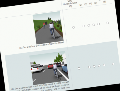
This survey, dubbed the “Neighborhood Street Study” asks detailed questions about how people use NE Multnomah, what they think about it, and how it compares to other types of bikeway facilities.
The city has already been gathering traffic information, finding that bike traffic on Multnomah is up 15 percent in the protected lanes’ first year. But traffic isn’t everything. It’s useful for the study to find out more about who’s riding and why.
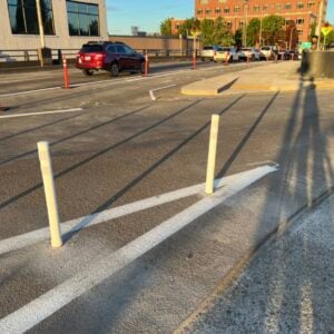
Separated from autos by a wide strip of beeswax yellow paint, a few parking spots, some plastic bollards and a set of concrete planters, Multnomah Street’s protected bikeway was the signature bike project from former Sam Adams staffer Tom Miller’s brief stint running the Portland Bureau of Transportation. It’s now part of a six-city study of how protected bike lanes are working.
The research is funded by People For Bikes’ Green Lane Project (full disclosure: I also work for People For Bikes; but we cover them only at Jonathan’s request) and by the Oregon Transportation Research and Education Consortium.


Thanks for reading.
BikePortland has served this community with independent community journalism since 2005. We rely on subscriptions from readers like you to survive. Your financial support is vital in keeping this valuable resource alive and well.
Please subscribe today to strengthen and expand our work.
Does anyone know why there is a groove the length of the bike lane the size of a truck tire? It makes the lane less comfortable than it be without it.
I *almost* mentioned that in the survey, but then it slipped my mind in the open comment section. I hope other people do mention it. Especially up in front of the Lloyd Cinemas, it’s pretty noticeable.
where the old bike lane stripe was ground off?
I’ve been stopping to take pictures of those obstructions every day and asking @Aaron Brown to post them on his (basically public-shaming) Tumblr, “America’s Best Biking City” http://americasbestbicyclingcity.tumblr.com/. It makes coming up on one of the obstructions gleefully fun.
Took the survey… hope it helps.
While I applaud the attempt to get *any* feedback from cyclists on this kind of project… I always let out a *sigh* of resignation whenever I see the “strongly/mildly agree/disagree” format typical of these surveys. I know it will spit out a quick bar graph right into PowerPoint for the researchers, but it just seems so arbitrary and open to squidgy interpretation.
Why not just ask for an explicit text response for each question?? We live in Twitter’s world now and know how to stay below 140 characters if needed.
Seems like the devil is always in the details (and context) when folks think about whether Installation X is “successful” or “not working”. Yes, there are catch-all “additional comments” boxes at the end, but by then I’m cross-eyed and ready to move on.
What I meant to say before my phone bugged out is that open ended questions like you are suggesting may give your more detail, but are open to researcher bias. To get standardized coding from it, each response has to be individually assesed and placed in boxes to compare. Thus, researcher bias could enter into the equation. It is best to balance the two approahces of open ended and “pick a choice” qestions.
that survey design is all kinds of wrong. wow. maybe it was my browser, but it is rendered nearly unintelligible.
Kittens, I don’t know what platform and browser setup you used, but on my Mac using Safari, I had to turn off AdBlock (blocks ads) and Ghostery (blocks trackers) in order to see all the graphics and formatting. *sigh* (again)…