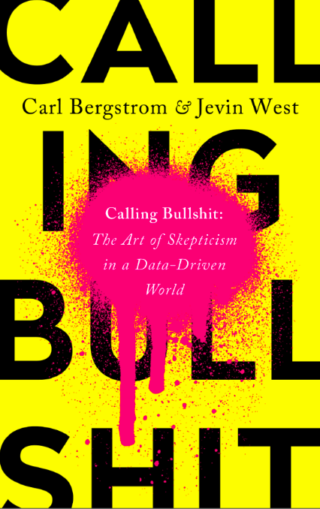
Calling Bullshit: The Art of Skepticism in a Data-Driven World (Penguin Random House, 2020) is a much-needed guide for folks awash in numbers who are just trying to make informed decisions. Anyone working or advocating in transportation should read it.
The preface begins with a definition of bullshit and a discussion of its different types. The authors, Carl T. Bergstrom and Jevin D. West, a biologist and a data scientist at the University of Washington, distinguish between old-school and new-school bullshit. Their book focusses on the new-school type which “uses the language of math and science and statistics to create the impression of rigor and accuracy,” and they introduce the concept of “mathiness,” their analog to comedian Stephen Colbert’s “truthiness.” Mathiness refers “to formulas and expressions that may look and feel like math—even as they disregard the logical coherence and formal rigor of actual mathematics.”
Each chapter guides the reader through topics like causality, selection bias, data visualization, and big data, with examples from contemporary news. The result is a topical, fast-paced and laugh-out-loud funny book.
Pernicious Percentages
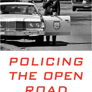
As I was reading, however, I found myself providing my own examples from transportation. Take traffic enforcement. The statistic that approximately 30% of shootings of police happen during traffic stops has been cited in prominent court cases for decades and has been used to justify giving the police broad authority to search during a traffic stop.
Advertisement
But a student of Calling Bullshit will realize the more pertinent question takes shootings out of the denominator and puts it in the numerator: out of the total number of traffic stops, what percentage result in shootings of officers? A recent study of traffic stops in Florida showed that traffic stops are less dangerous than the 30% statistic would lead one to believe:
Under a conservative estimate, the rate for a felonious killing of an officer during a routine traffic stop was only 1 in every 6.5 million stops, the rate for an assault resulting in serious injury to an officer was only 1 in every 361,111 stops, and the rate for an assault against officers (whether it results in injury or not) was only 1 in every 6,959 stops.
Although those odds still might not be good enough to call policing a safe occupation, they leave a different impression than the 30% statistic.
Black Boxes

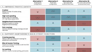
One of my favorite sections of the book was “Bullshit and Black Boxes.” A “black box” is a formula or device into which data is fed and results exit; but figuring out what actually happens in the box is either beyond your skillset or would take a lot of time. Whenever I look at one of the many Portland Bureau of Transportation prioritization schemes, even though they are well-documented, I feel like I’m in the presence of a black box. Luckily, Bergstrom and West advise the reader how to approach one — you don’t need to open it, just look critically at the input and the output.
The black box I bumped into a couple of years ago was the PedPDX Pedestrian Priority Network. I think this prioritization is worth taking time to understand, in that it follows a method which will most likely continue to be used (the Safe Routes to Schools project list, for example, uses a similar model). My calculations were made two years ago, and do not reflect more recent tweaks that might have been made to the data sets or rubrics.
PedPDX prioritizes streets to receive safety improvements with this formula:
Safety + Equity + Demand = Priority Score.
Although it looks fair enough, be wary of an equation that takes that form—the policy jiggering takes place at the back end with the scoring rubric used to build the Safety, Equity and Demand data sets. The scoring rubric in turn determines the number of points in each set, and their distribution. This is important because the shape of the data sets (the distribution) can deform the results into something far from the even-steven contributions the headline equation implies.
Did I lose you in the previous paragraph? I told you it was a black box!
More specifically, PedPDX designed the safety rubric to select for the characteristics of high crash corridors. To accomplish this, the scoring rubric initially gave almost two thirds of Portland’s streets a pedestrian risk score of 0 (that lowest score has since been updated from 0 to 1, out of 10 points). Thus the Safety data set skewed far to the left and on average did not contribute much to the final results. Perhaps counter-intuitively, this gave the few streets that did receive a high safety score a big leg up. The output distortion away from the “equally weighted” top line equation is quite big. For example, 2,702 streets received a top score of 10 in the equity category, but only eight street segments in the safety category received a 10.
The important point is that this method is vulnerable to distortion which is difficult to discover without access to the databases and a spreadsheet. Thus it is not transparent, and the seemingly even safety, equity, demand equation can end up being misleading.
But back to the book! I highly recommend Calling Bullshit. The authors are wonderful teachers and do an outstanding job of explaining some difficult concepts. Reading it will make you a more discerning consumer of data, and might even embolden you to take a look under the hood yourself. As Bergstrom and West write, “You do not need to be a professional statistician or econometrician or data scientist to think critically about quantitative arguments, nor do you need extensive data sets and weeks of effort to see through bullshit. It is often sufficient to apply basic logical reasoning to a problem…”
(This might be a little rosy, sometimes you do need a data set, a spreadsheet and a week!)

— Lisa Caballero, lisacaballero853@gmail.com
— Get our headlines delivered to your inbox.
— Support this independent community media outlet with a one-time contribution or monthly subscription.


Thanks for reading.
BikePortland has served this community with independent community journalism since 2005. We rely on subscriptions from readers like you to survive. Your financial support is vital in keeping this valuable resource alive and well.
Please subscribe today to strengthen and expand our work.
My favorite is when you have an x-y chat with one of the variables being derived from the other, for example population versus population growth rate, it always ends up being a hyperbola. Something I learned in planning school on how to lie with data – it works every time, journalists and politicians are always fooled.
I can speak to this, I’m a data analyst. It is an ethical part of my job to take criticism and show the full data set and process. You also have to be able to talk about things that are included and those that are not. There also has to be follow-up with questions that arise. If we measured it slightly differently (time/number that qualify) what would we arrive at? Is our methodology sound and relevant? What can the data not tell us? What are the actual #s rather than just the %s?
The big theme right now is to be able to tell a “story” with your data. However, this also means that you are guiding the listener with parts that you think are interesting. This, of course, can really be prone to agenda steering.
Solutions? Have an actual meeting where the data methodology is discussed and questioned. When its public agencies they should release the data set for the public to see (its not patented or owned by a company – remove identifiers to individuals for privacy), not just the power point slide. There should also be a wiki with the data definitions and how they are collected. It would be more work but it would be transparent.
Thank you for your comment Brendan. I’m not a data analyst, just a rusty computer programmer, so it’s good to hear your thoughts. You can find the 353 page PedPDX report, and its 11 appendices online. It provides the information you mention in your last paragraph.
It’s the final steps of the prioritization that raised red flags for me. The data sets aren’t normalized, and can’t be. That means the big differences in their distributions whip that little equity, safety, demand equation around every which way. That struck me as a non-standard use of a data set and an equation.
Given the policy/political emphasis placed on equity/safety/demand, the output should align with the advertised equation. I don’t see how to make that happen with this algorithm.
With Safe Routes to School, they actually put coefficients in front of the equation, which they describe as 60% equity, 30% safety and 10% route density. I haven’t looked at that data set, which has got to be a lot smaller than the 23K road segments in PedPDX, but it starts to look arbitrary to me.
I didn’t see any discussion of distribution in the documentation.
Really well done piece.
My favorite recent example of calling BS on “mathiness” comes from the NYT last week in an article about the outdoor transmission rate of covid-19. The CDC were claiming (at the time anyway) that the outdoor transmission rate of covid was “less than 10%”, which the Times dubbed “true but misleading”. The article cited data suggesting that the actual outdoor transmission rate is a tenth of 1% to one-hundredth of 1%. The analogy they used was that its like saying that “less than 20,000 people are attacked by sharks each year”, when the documented number is 150. Both true AND misleading. That’s Bullsh*t.