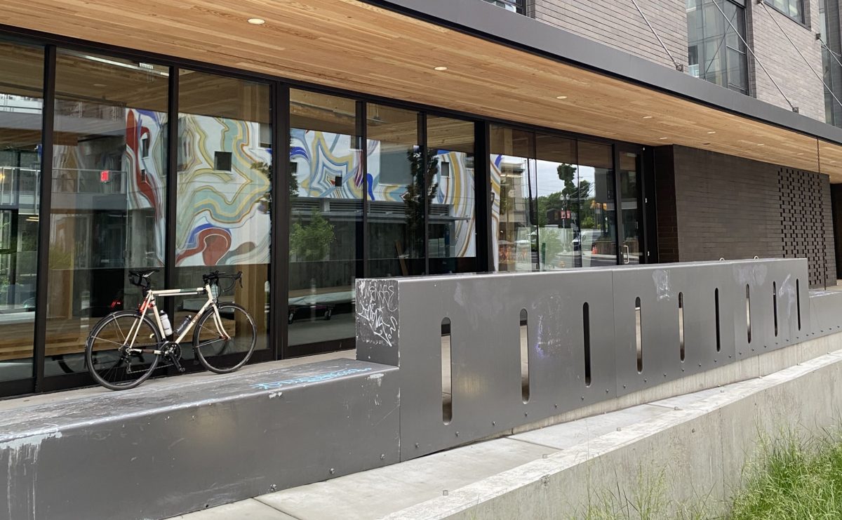
(Photos: J. Maus/BikePortland)
“Sideyard has become an activator of the urban context because it also emphasizes public transport connectivity as well as pedestrian and bicycle accessibility. The addition of a ground-floor bike bar and pedestrian-friendly plaza extended from the city sidewalk enhance these functions.”
When I read those sentences in an article that popped up on one of my Google Alerts last night I was intrigued. So this morning I swung by the Couch Curve on the east end of the Burnside Bridge to get a closer look.
This bridgehead area is changing fast and it’s such a high-profile part of our bike network that it deserves every piece of bike-friendly infrastructure it can get. PBOT has already done us a solid by making an elevated bike lane and creating a tiny, carfree, bike cut-through street. Now a private developer was adding a “bike bar”? Cool!
Unfortunately the reality isn’t as good as I’d hoped.
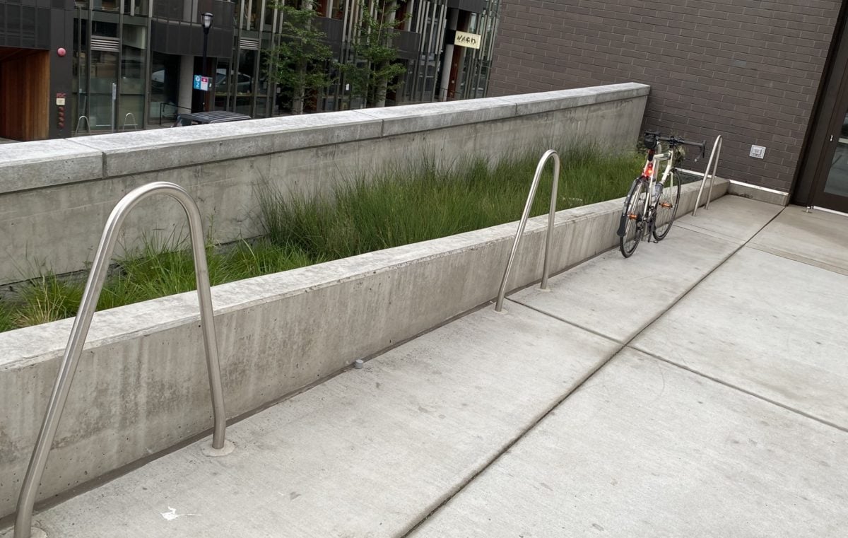
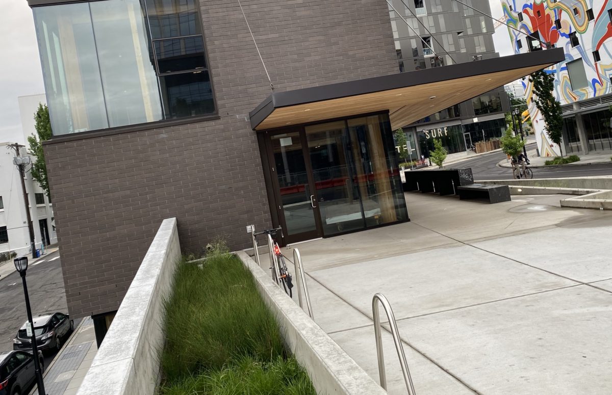
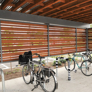
When I rolled up the ramp to the plaza and bike parking, the first thing I noticed was a row of three staple racks. I love staple racks! But these were installed right up against a concrete landscaping wall. A few others on the site are just inches away from the building’s exterior wall. This keeps the racks (and bikes) clear from the plaza area; but it also makes the staples much less useful. Staple racks are great for parking two bikes side-by-side. When you put them next to a wall, they are only half-way to their potential. And proximity to a wall means wide bikes (like trikes and cargo bikes) can’t snug up to the staple.
This is a common issue with new buildings as you’ll recall from our story about renovations to the US Bancorp tower in in 2015.
Advertisement
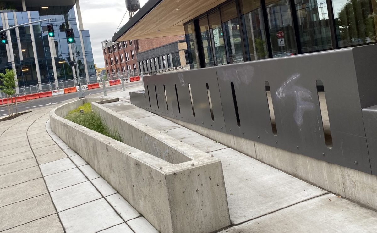
But I was really there for the bike bar.
The bar is a big metal structure that faces Couch and is adjacent to the plaza’s access ramp. There are holes in it where I assume bike wheels are supposed to go. I say “assume” because it’s not intuitive (there are no signs) and I wouldn’t have even thought to put a bike wheel in them if I hadn’t read that article and had “bike bar” floating in my head.
When I rolled my bike toward the hole, the flat portion atop structure (the “bar” where people might hang out on a nice day) was too low. My handlebars hit the bar and prevented my wheel from reaching the hole. I tried my rear wheel and got the same result — except it was my saddle that hit the top instead of my handlebars. And even if my wheel did fit through, wouldn’t it stick out into the ramp? Am I missing something here?
I understand the importance of urban design aesthetics, but we need places to park bikes. Places that are abundant, easy to use, and offer good security (even if my wheels would have reached the holes, there was nothing to lock to). I just don’t understand why we can’t have both: Racks that look good and work well. The racks at this Sideyard building remind me of the strange racks at Fields Park in the Pearl District. All looks and no utility.
The building itself looks really cool and I’m excited for all the changes at the bridgehead in general. But I won’t be raising a glass at this bar any time soon.
— Jonathan Maus: (503) 706-8804, @jonathan_maus on Twitter and jonathan@bikeportland.org
— Get our headlines delivered to your inbox.
— Support this independent community media outlet with a one-time contribution or monthly subscription.




Thanks for reading.
BikePortland has served this community with independent community journalism since 2005. We rely on subscriptions from readers like you to survive. Your financial support is vital in keeping this valuable resource alive and well.
Please subscribe today to strengthen and expand our work.
The ‘Bike bar’ might be useless for cyclists but those lower portions will be well used by skaters.
They already are well used! Tons of grinding damage already very visible.
I don’t know why developers don’t just put metal coping on everything. Isn’t activating the space the end goal? If there was some metal coping on the planter, maybe that goofy bike bar wouldn’t be getting torn up.
Activating the space with the right people is the end goal. People who deface spaces with graffiti, who damage infrastructure with their stunting are not the right people. People who use the space to the exclusion of others with their frenetic, loud and danger fraught antics are not the right people.
The goofy bar (no argument there) would not get torn up if skaters didn’t seek out virgin edges the way zombies seek brains. Thoughtlessly and inexorably as though theirs were the only values that mattered.
In Portland Oregon in the twilight of the American empire, you can choose skaters or tents & needles. Seems like an easy choice to me. I do think that we may have different opinions about skateboarding too (it’s not a crime!). 🙂
Agreed! Skateboarding is not a crime. Destruction of property is a crime and the Venn diagram of the two shows overlap. do the math
Not grinding “damage”, it’s patina. A sign of skateboarding infrastructure done well. Thank you, developer for including a skatepark in your plans.
This is the correct answer!!
look closer, that wall’s got skater-stoppers in the concrete.
That’s confusing. You can’t put your wheels through the slots, and it looks like you should be able to. But if you could, the wheels would protrude into the ramp area. The ramp looks like it’s already minimal width (about 3′) but even if it’s wider, anyone walking or rolling up or down it could still hit their legs or bike or wheelchair or dog on protruding bike tires.
The ramp also looks steep enough it should have handrails so it can be used by people needing accessibility. Even if there are alternative accessible routes up, if you provide a ramp you should provide handrails (again if it’s steep enough to require them) so people needing them have the option of using that ramp. Maybe it’s just not done yet.
The planter is so narrow landscaping will never make it look like more than a concrete well. It would have been nicer to have a ramp wide enough two people could actually pass, especially if that’s the main route to bring bikes up to the rack. Maybe they needed a certain square footage of stormwater planter, so just tried to squeeze too much into a limited area. Based on the photos, weird all in all.
Even if you could fit a bike in one of those slots, what are you supposed to lock it to?
I really wanted them to be arrow slits.
They would need a small horizontal gap near the top to be good arrow slits.
This is why human factors and usability testing are so important in architectural planning
Amen. How things get designed and how they get used are two very different things.
This is often very true with policy. A planner can have a desired outcome in mind from a specific policy, but the end result might be something very different. Sometimes better but usually worse.
Yet more proof that the city staff of Plan Review do not ride bicycles.
The best looking bike racks have bikes at them. I am always happy to see a mostly-full rack @ my destination. That is an indicator that this place is bike-friendly and I’m rolling up to a place that is already hopping.
Fancy racks always have me feeling like “OK is this going to work?” Especially if it has no bikes locked to it.
This type of useless infrastructure really gets my goat. It’s worse than useless actually, it’s like bolted down litter.
Then again, I don’t even like the new portland racks with the crossbar at the bottom. I get it as a security feature, but I’m always smacking my pedal in to the crossbar.
I like the racks they have in Amsterdam, which have a lower bar, but it’s a tube instead of flat stock, so less pedal interference.
that’s no better, and maybe worse, than an old school wheel-bender rack. Design / execution fail! No one at the city cares…
Do they still have those damn things in front of the downtown library?
The staples up against the wall look like they don’t allow use of a lock in the lower part because it would hit the wall. Is there any spec in the bike parking manual about how close a staple rack can be to a wall? These shouldn’t qualify. And I sure hope the “bike bar” doesn’t get counted as any required bike parking. It should actually have those slots filled in so someone doesn’t park their bike there and block the disabled access ramp!
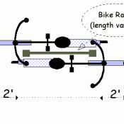
Yes, I posted in here but all bicycle parking racks are required to be 2′-6″ from the wall:
Table 266-7 of the parking code:
https://www.portlandoregon.gov/bps/article/53320
Unfortunately, maybe 3 architects in the city know about this.
Architect here. We’re aware. In this case the potential spaces against the wall simply don’t count towards the overall bike parking requirement. The city won’t stop you from wasting half the capacity of a bike rack, as long as you meet the minimum required number of spaces that comply with the dimensional requirements.
The city also doesn’t (to my knowledge) actually look at practical concerns about how a lock gets between the wall and the rack.
This is the kind of thing I would expect to see outside of the Peloton Apartments on Williams.
Worse than useless is right. Not only completely useless for parking much less locking up bikes, but someone is patting themselves on the back for having done something for cyclists, the money has been spent and this useless feature is taking up real estate where an actually functional bike rack could be.
And now they can say, “We put in bike racks and no one uses them. There must be no demand for bike racks.”
I’m sure I’ll get lots of push back for this, but my preferred locking method is to put my U lock through the rear wheel and around the seat stay and staple. This secures the bike and rear wheel (and rear wheels are way more valuable than front wheels). So the bike would still be parallel to the wall. Doing this method it looks like you could (mostly) fit two average bikes per each of those staples.
Yes it’s not perfect, but these racks are space saving on what looks to be a sidewalk/entrance way. I think most riders should be able to lock up here, and also encourages cyclists to minimize how much their bikes are sticking out into the walkway. Again, it could be done better, but this is by no means close to the worst.
I think your comments are all reasonable, especially if this were a retrofit–trying to add some more parking into an existing space. But it’s an all-new, fairly high-budget project, and the designers started out with a clean slate. What it looks like to me is that they’d gotten the design to a certain point, then realized they needed bike parking, and crammed it in as best as they could. Or, they had better solutions, but the owner nixed them because bike parking was given a “just meet code without taking up more space than you need to” priority.
If a wheel could roll into those slots (and somehow not block the ramp) even without locking it would be a useful place to pull up on your bike, park, then have some lunch, talk with a friend, work on a laptop, etc.
I’m just constantly disappointed at how multi tenant housing in that area preys on cyclists. Up and down SW Ankeny from SW28th all the way to the river. Including north and south of that road. There are buildings with obvious lures to cyclist residents. Underneath the veneer, you have gentrification and an unnecessary focus on a small area of Portland.
It’s almost like cyclists have no agency in their actions and can’t avoid these places or make their own choices.
This is simply marketing, and just about every business does it.
Preys on cyclists? Say what now?
Are you sure this isn’t meant to be a bar that you sit at, to watch bikes go by? That could be what they mean by a bike bar. The slots may just be ornamental, so it’s not a slab of metal. Maybe I’m just giving them the benefit of the doubt, because I can’t imagine how anyone would think this would work as bike parking.
If I were less lazy, I’d look up the project by address on portlandmaps.com, then look at the link to the permit drawings, and look at the site plan and project zoning info to see the calcs for how many bicycle spaces were required and provided, including whether this bike bar thing is shown as bicycle parking, and if so, how many spaces it’s claimed to provide. I’d also check if the racks crammed against the concrete are shown are providing one space each (legitimate) or two (bogus).
If it turns out that the bike bar is shown as providing ANY required parking, or if the other racks are shown as providing two required spaces each, that means the project isn’t providing as much bike parking as required. That is a zoning violation, even if the racks got approved by mistake during plan review. Then I could call 823-whatever and report the violation, and the City Code Enforcement would then open a case (maybe after bugging them a couple times) and require the building owner to make changes so the project had the required spaces.
You can’t expect someone who writes things like “an activator of urban context” to be able to design a sensible, usable public space.
Jonathan, you asked: “Can you guess what this metal thing with the holes is for? ”
– cross bow slits to shoot arrows at traffic?
– e-scooter wheel parking slots? (They need love too?)
I am not sure why anyone would assume that those “holes in the wall” were for bike parking…there is no sign posted as such. 😉
And as for the that ‘rack’ and the staples pushed up to the wall…just pull the building plan and see how much and where their short term bike parking is…if these areas are counted (and the staples at 2 bikes each) then there needs to be an inspection looking at some minimal performance test. The City does have a new bike parking code?!
Now if these areas are just extra “parking” then there is not much more anyone can do other than scold the architects.
I’m trying to decide if you are being funny or not. When I read Bike Bar I was assuming it was going to be a pub or something like used to be on North Williams.
Just FYI, those bike racks were installed incorrectly. Per Portland parking code, they are required to be a minimum of 2 feet 6 inches from any object:
https://www.portlandoregon.gov/bps/article/53320
(Table 266-7)
You could complain to the city and have them redo them. Thats just ridiculous they screwed that up so badly.
https://www.portlandoregon.gov/bps/article/53320
See figure 266-10 on page 32. These staples are installed as “horizontal space” against a wall.
They aren’t 12″ from the wall, so don’t meet that one either, although some are where the wall is so low they’d work fine. And the standards only apply to required spaces, so as others have said they’re in violation if they’re not extra spaces. But “not illegal” isn’t a very high standard.
So did they use a 16 inch wheel bike to test their mutli thousand dollar art installation?