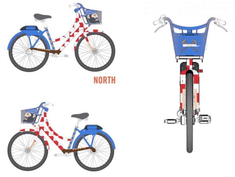
A panel of judges has picked the finalists in a design competition that will bring new colors to Portland’s fleet of Biketown bikes.
And it’s time to vote on them.
The Biketown Design Challenge kicked off in February and now the best “Show us your Portland” designs have been uploaded to an online gallery. Public voting will determine which one design from each of the city’s five “quadrants” will be added to the fleet via specially-wrapped bikes.
Below are the 15 finalists (three from each of the five quadrants). I’ve also included the artist’s name and their inspiration statement.
North Portland
Explore North Portland
Bridgette Coleman
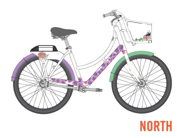
“I wanted to capture the amazing sights that can be seen while exploring North Portland (The best neighborhood in town).”
Ride, Paul Bunyon, ride!
Teresa Bubb
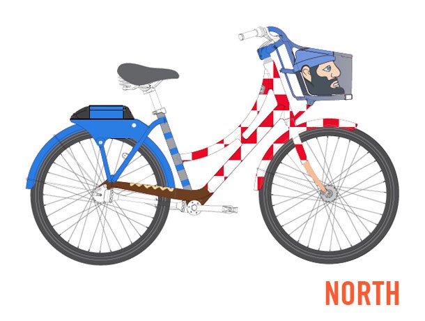
“Since the Oregon State centennial of 1959, Paul Bunyon has stood patiently, arms crossed, smiling over beloved North Portland. As a North Portland ambassador and fashion trend setter, Paul has personified the region smiling through the winters as easily as the summers. He has contentedly watched over people, dogs, cars, MAX and bikes…..thousands of bikes and bikers. But this year, the 59th year since the 1959 centennial, it is Paul’s time to ride!! Stretch out those concrete arms, roll up the right leg of his skinny jeans and jump on a Nike town bike to the other quadrants of the city. Time to explore this city that has grown up around him. Please help Paul get his bike and ride, Paul Bunyon ride!!!”
Smith and Bybee
Stevyn Llewellyn
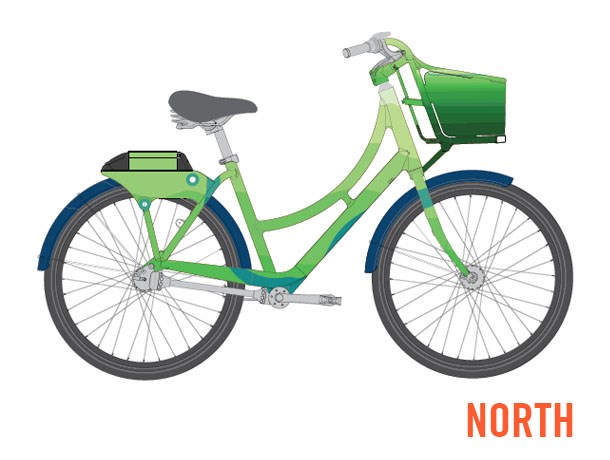
“This design was inspired by one of my personal favorite spots to visit in North Portland, the Smith and Bybee Wetlands Natural Area. The appeal of this place is the lush greenery, tranquil waters and varied wildlife.
The foundation of the design was originally drawn from a map, and my intention was to create an image where the colors and elements serve as a means to draw focus to the appreciation of this special area.”
Advertisement
Northeast
North East Cycling Life
Sean Lambert
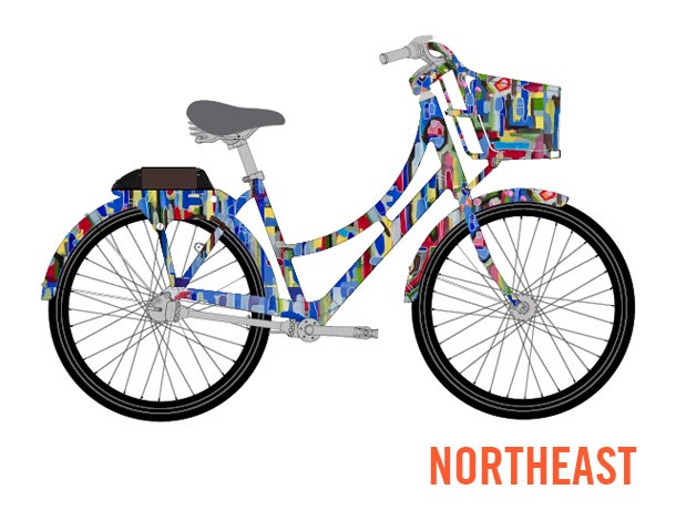
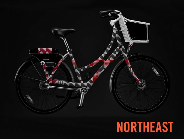
“The intersection of city streets adhering to a vague grid system bikes traverse with seemingly greater ease than vehicles has fascinated me since I first called Portland home. The many one way avenues coupled with tricky sight lines give a nearly palatable sense of adventure to all who get behind the wheel or hop on a bike. This same type of “controlled chaos” is reflected in my approach to art. I utilize a structured personal aesthetic along with an explorative color palette to convey movement, balance, and form; the same elements we find in roadways throughout NE Portland. However, what makes any place great is its people. The vitality and energy I put into my art is sustained by the friends and neighbors I’m proud to know throughout Rose City as a whole; they have inspired me to continue to create and design, knowing we can all share in what makes Biketown possible.”
1977. Historic seasons and team legends. An icon of teamwork, unity, and competition. All in the name of Jack Ramsay. Number 77 forever.
Main & Leading
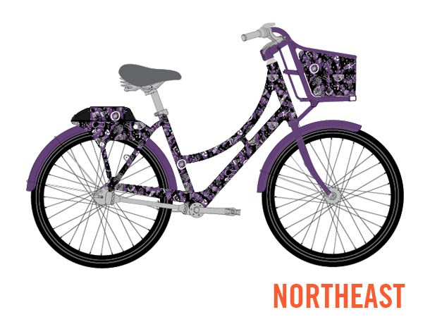
Chloe Miller & Spencer Groshong
“Inspired by our love of Portland, this pattern was drawn while frequenting many of our favorite establishments around our neighborhood in NE Portland. This design brings together our personal experiences with the city, and aims to communicate how proud we are to be part of Rip City.”
Northwest
Colorful Portland
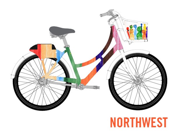
Renata Castro
“I see Portland as the gathering of several cultures in a multidisciplinary and innovative range in the way people interact and express themselves creatively. And it is these people who were born or who chose to adopt the city that inspired me to translate them in a multicolored way; the essence that I see of a whole.”
Everyday people
Adolph Bastendorff
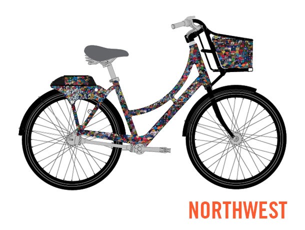
“The world we live in. I attempt to speak in a universal language in order to reach as many people from around the world as possible. My work is a reflection of the diversity of Portland. This series represents groups of people coming together as one. A group of individuals who decide to live as one community.”
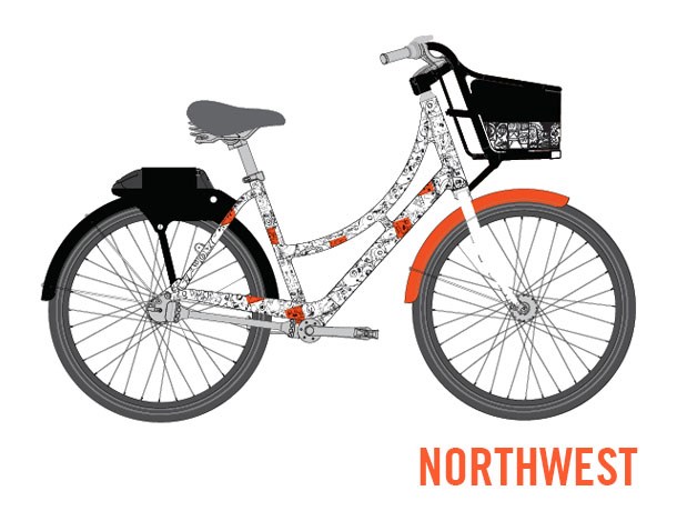
“After living & working all over the city through the last 15 years I’ve found the NW to be the most vibrant and diverse area of Portland. This area is growing more in the metropolitan sense than anywhere else in the state and still making space for creatives and quality Portland strange.
The NW is often passed over by residents on the Eastside of the river. I’ve seen programs like Biketown start to bring even more people to adventure the inner NW areas. Our city was built for bike commuters so facilitating peoples adventures is a great success Biketown has to report.
I regularly notice pairs and groups of tourists on the Biketown bikes in my neighborhood of Old Town. My design is inspired by the many partners who come to our city & grab a bike to beat traffic or for a pedal adventure. The bikes live here & invite people to ride.”
Southeast
Explorin’ Southeast!
Marguerite Schumm
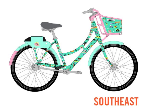
“How can you sum up all of Southeast Portland into one illustration? By honoring all of it!
Think of all the fun neighborhoods that you can travel to via BIKETOWN: To start you can grab drinks in Brooklyn, bike over to OMSI, head up Hawthorne and catch a film at the Bagdad, head down to Portland Mercado for a bite to eat, maybe later you can watch a sunset on Mount Tabor! The list goes on and on, and this illustration reflects the many beautiful, fun and quirky facets of Southeast Portland!
Let’s hop on a bike and explore it!”
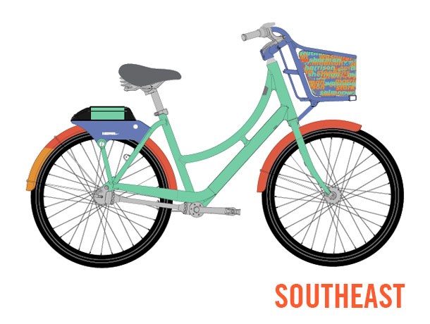
“I’m inspired by the neighborhoods in Southeast Portland, each with unique homes in an array of colors you won’t find anywhere else. To represent this, I’ve created a multicolor collage of all the street names in Biketown’s SE range, layered on top of each other to represent the activity and depth you’ll find when you explore Southeast. The open source font used in this wrap has a forward slant, suggesting movement and travel, and the actual SVG image was created by a script, which will make it easier to export the pattern to fully wrap the bike.”
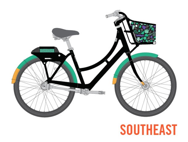
“Having grown up in SE Portland, I wanted to create a design that honors the ingenuity that has come from this quadrant of the city while encouraging the rider to consider their own journey and what SE means to them. This bike is named after my father, who immigrated to Portland in the 80s and continues to contribute to its landscape.
I have created two abstract patterns to represent the always changing area of SE. While there are illustrations based on my own experiences in SE (for example, the trumpet is a nod to the late “Working” Kirk Reeves, a true Portland artist), a lot of the design is open to interpretation. When you see an illustration of a carrot, maybe you think of a meal you had at Ava Gene’s, or perhaps of a defunct store like the Daily Grind. Some people will be able to spot the illustration of Fubonn, and some won’t- and that’s ok. This flexibility is intentional and meant to cause the viewer to think about where they are and what they are experiencing. SE Portland has always fostered creative exploration, and this is an invitation for the rider to take part in the process.”
Southwest
Donut Town
Mark Shimahara
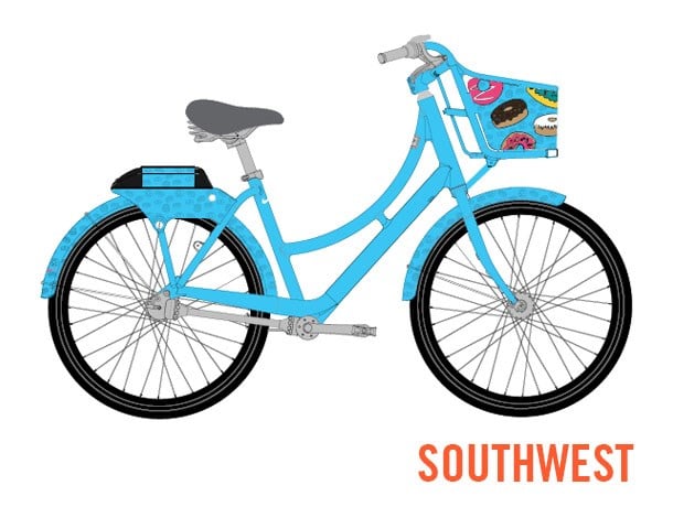
“We all know Portland has some of the world’s best donuts, but where to get them can be divisive. Locals and tourists line up at various locations such as Blue Star and Voodoo in the Southwest for a taste of their favorite treat. This design celebrates Portland donuts, which are as as kooky, colorful and eclectic as Portlanders.”
The Fabric of our Times
Damon Watters
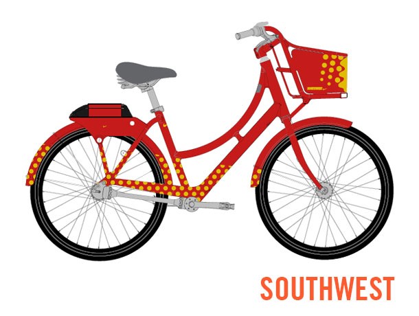
“Having worked in the agency that started the Biketown initiative I felt the initial design was so strong and had such great functional and aesthetic character. Focused on uniting people to be stronger together and harnessing on the ultra-positive festival vibe of summer…”
Waterfront Wanderer
Ayla Leisure
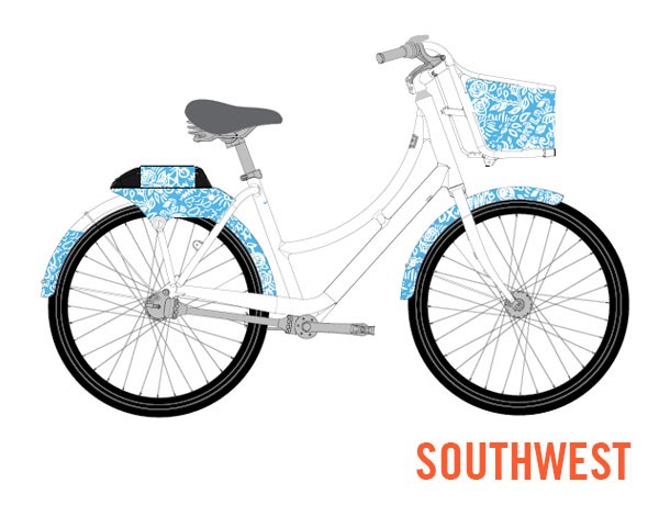
“Portland is home to me. I have grown up in Oregon. The main inspiration for my design was to create something that captures what the city means to me, and the things I find beautiful about it. I chose to stick to a blue and white color scheme to compliment the orange BIKETOWN aesthetic. The blue is meant to tie into the water that connects the city, while keeping the imagery simple and relatable.
I made my design so that it could be easily rotated and repeated, or it could be tiled together to contour to the form of the wrap. Additional white graphic elements could also be added as needed to fill gaps, or to showcase more things that I love about the city, while keeping them smaller in size so the elements don’t get lost on the frame of the bike.
I plan to use this design opportunity to weave in symbols the Portland community can make connections to. Hopefully my design will simultaneously capture the modern, weird, active, adventurous, proud, kind and dynamic nature of the city I call home.”
Online voting is open to all Biketown members from today until May 3rd. The winners will be announced shortly thereafer and you can expect to see the designs rolling around Portland this summer.
— Jonathan Maus: (503) 706-8804, @jonathan_maus on Twitter and jonathan@bikeportland.org
Never miss a story. Sign-up for the daily BP Headlines email.
BikePortland needs your support.




Thanks for reading.
BikePortland has served this community with independent community journalism since 2005. We rely on subscriptions from readers like you to survive. Your financial support is vital in keeping this valuable resource alive and well.
Please subscribe today to strengthen and expand our work.
Oooh, really dig that 77 design.
Any of these are better than overbearing-orange.
Looks like Barbie Bikes versus the Blue Ox.
Seems like the bike themes should reflect the areas someone on the bike might actually visit. Paul Bunyan is about 2 miles outside the Biketown boundary.
Not sure what Paul Bunyan has to do with NoPo anyway and not sure we need more white dude imagery. St. Johns and all the dive bars have far more to do with the actual character of the area, and PIR is far more interesting/influential as a feature.
Also, I am not sure it is good to glorify a fictional “hero” who converted the native forest and intact climax ecosystems of the upper midwest and northwest in to wood for crackerbox saloons and apple crates.
I was going to post “it’s only going to be a matter of minutes before someone is offended”…
I wouldn’t describe myself as offended. Rather, I don’t see what Paul Bunyan has to do with anything — this is a purely manufactured identity and not a very good one at that. How many years of drama did it take to apply another coat of pain? I was ready to go out and do it myself just so I wouldn’t have to listen to people yak about it. At least the Smith and Bybee themed bike is connected to something that’s technically part of NoPo.
Though I also think that is a poor choice both because it’s a good 6 miles from the boundary of Biketown no one in their right mind thinks of lakes when you mention NoPo, and I doubt more than a tiny percent have ever been to the lakes. Which leaves us with the Barbie bike. Ugh.
If nobody mentioned it was Paul Bunyan, I would have just assumed it’s an homage to hipsters.
Paul Bunyan is folklore from Maine and Minnesota… not oregon. weird.
There are a lot of trees in Minnesota. They’re in between the twos and the fours.
A bike can be “Strong, light, cheap…pick any two.”
Let’s face it, Biketown’s steeds may be strong, of necessity, but no way light or cheap.
The severe constraints imposed by intended use result in a vehicle that would be no one’s first choice to buy and ride personally.
Tarting them up brings to mind another proverb that I’ll not repeat…
If someone likes the Bunyan bikes so much that they decide to bike instead of walk, they can say they’re not walking any more due to having Bunyans.
While in a picky mood I must remark that the old Schwinn catalogs invariably pictured bikes in profile with valve stems carefully positioned at the bottom of the wheel.
From the renderings above one might conclude that Biketown machines have no valve stems at all.
Glories of digital graphics!
I hope there’s a celebration party to announce the winners in each of the five quadrants, with entertainment provided by a five-piece quartet.
Just don’t do it.
“Since many of today’s best-known manufacturers no longer produce products and advertise them, but rather buy products and ‘brand’ them, these companies are forever on the prowl for creative new ways to build and strengthen their brand images. Manufacturing products may require drills, furnaces, hammers and the like, but creating a brand calls for a completely different set of tools and materials. It requires an endless parade of brand extensions, continuously renewed imagery for marketing and, most of all, fresh new spaces to disseminate the brand’s idea of itself. […] I’ll look at how, in ways both insidious and overt, this corporate obsession with brand identity is waging a war on public and individual space: on public institutions such as schools, on youthful identities, on the concept of nationality and on the possibilities for unmarketed space.” (Naomi Klein, No Logo, 1999)