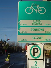
Have you seen these signs popping up around town? They’re officially known as bikeway network signs and according to City of Portland bicycle coordinator Roger Geller, there are finally enough of them installed that you should be able to rely on them to find your way. But just to make sure, Roger wants us to test them out and let him know where improvements can be made.
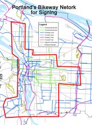
He’s sent me a special map of the city’s bike routes with a boundary drawn (in red) around where the signs have gone up. So if you have a few extra minutes, pick out a destination on one of these signs and see if you can get there without any wrong turns. If you already know your way around, try and act like you’re new in town and let the signs be your guide. Or better yet, encourage your less-bikey family and friends to use them and see what they think.
But before you give feedback, Roger wants to share the following:
1) We plan to place signs at approximately 300 intersections…but not all of the signs that we can afford are up yet, but a lot are. Most existing signs are within the area outlined in red.
2) We’re only directing cyclists on streets which we’ve either made some improvements for bicycling…There are often other, local routes that cyclists use in their neighborhood that may work better for some trips than the improved route, but only the
improved route is signed.3) Signs are intended to be placed wherever cyclists face a decision about which way to turn–typically at the intersection of two bikeways.
4) The type of feedback I’m primarily seeking is whether or not the signs work for way-finding. I.e., can people get to where the signs direct them? I want to know particularly if there are signs missing at particular junctions.
People should feel free to respond directly to me. It would be helpful if the subject line of emails about the signs said: “Bikeway Signs” and then listed the particular intersection where they noted a deficiency, such as “Bikeway Signs: SE Ankeny & 7th”.
Here’s Roger’s contact info:
voice: (503) 823-7671
email: roger.geller@pdxtrans.org
As for my opinion…I’m excited because these signs give bikes more credibility and respect as a viable mode of transport, not just a recreational pasttime. As for utility, I don’t think they’ll do much for veteran riders but I don’t think we’re the target market. For many riders (and would-be riders), these signs will encourage them to leave their car at home more often, and will help them discover new places by bike.
These signs, which were first conceived 1o years ago by Mia Birk (Roger’s predecessor) on a research trip to Europe, are a testament to the hard work of the pros at the Office of Transportation. They pushed this idea over many hurdles (including wrestling with ODOT and the Feds) and the result is something that makes riding easier and more enjoyable for all of us.
Now the least we can do is help them out by providing some constructive feedback.

Thanks for reading.
BikePortland has served this community with independent community journalism since 2005. We rely on subscriptions from readers like you to survive. Your financial support is vital in keeping this valuable resource alive and well.
Please subscribe today to strengthen and expand our work.
For this 45-year-old cyclist, the print is a little small 🙂
i agree with chris- the type is too small to read until you are about 10 feet from it… can the numbers be bigger?
I just noticed those for the first time this weekend.
I think they are a great idea. Personally, when I am out and about I usually know my way around. But if I’m taking a new route or for a more casual cyclist, they will really be beneficial.
Yes, the print is too small: I didn’t notice the mileage on the signs until I saw the photo in this article. I thought, rather, that the signs must simply (1) designate a bike route and (2) list some information about jurisdiction over the bike route in the rows below the bicycle symbol.
This is great! We should be embracing this. I can’t wait to check ’em out.
it would be super-useful to have these on the streets that connect the springwater corridor to the sellwood trail. no matter how experienced, i’ve never met a biker who could explain how to get between the two. and when i lived down there, you’d find a lot of confused bicyclists roaming the side streets.
thanks for doing this!
Great idea. Distances should be in metric as well, considering potential visitors stand a high chance of being from a locale that uses it.
Thanks for your comments.
I agree that the font on the initial signs is too small. Since then, we’ve increased the font size and weight. However, the signs already produced with the smaller font will remain.
Jami, would you please be more specific about which streets you’d like signed? What are you referring to when you say the “Sellwood Trail”? Feel free to contact me directly via email.
I like the idea of going metric but am afraid that we don’t have enough room on the signs to accommodate that. Keep in mind that our primary target audience are city residents who we want to encourage to ride. Our out-of-country visitors will have to do the mental calculations to convert to a measurement they understand, much as we do when visiting Canada, Europe, or Asia.
Again, thanks for your comments. Please continue to explore the network and send me additional thoughts and comments.
I am curious how the time to destination numbers were developed.
I think something to consider for a future rev would be to add mini/simple route maps to each destination. My guess is there are not many turns per direction, so they wouldn’t have to be too detailed. Just something to give people a visual sense of what their route looks like. So for instance, they go straight for a while but need to be on the lookout for a right turn, then a left, etc.
I would expect these would by definition need to be so small that people would have to stop to read them, but I think that’s OK.
I’ve seen them popping up all over the eastside and I like them.
I know a lot of folks who are American born and raised, but start doing something physical and they start thinking metric. I’m more likely to tell you that it’s about 5k between Sellwood and Ross Island bridges as I am to tell you it’s 3 miles. I like the idea of changing the time factor on the signs to KM, since the 6 mph factor is highly variable on weather, traffic, and rider-specific factors (bike, fitness, trip purpose).
Mikee,
To develop the time to destination we measured the distance (via a GIS mapping program) and assumed a “no-sweat” 10 mph travel speed. At that speed, a cyclist requires 6 minutes to travel one mile.
The original proposal for the project included developing map kiosks at key locations around the city so people could map our their routes. Unfortunately, our budget was insufficient to proceed with those.
I think these are the kiosks Roger is referring to.
Roger these signs are flippin fantastic.
Perhaps a higher degree of integration and consistancy with the circle stencils on the boulevards would help first timers… keep up the great work.
I noticed these signs last week.
I thought they were great, and was surprised to see them.
I do not agree that the metric is neccessary.
We all know the reluctance of america to switch to the metric system.
We also know that others, from other countries, know of our reluctance to switch…
Therefore , I believe that most already know the conversions, or just straight know our system.
So, unless it is cheap or the same cost to include this to the already crowded signs, it may just be too much info, or too much for some to deal with.
Once again, this is my opinion.
Roger, I would like to come into contact with you to talk about some things, good, bad, or otherwise, if you are down with this, Jonathan can easily link us up.
Once again, I like the signs, and wait to see more of them.
Dabby
Dabby, feel free to contact me at roger.geller@pdxtrans.org.
How many of these signs have been installed and how much did they cost?
Just yesterday, these signs helped me find a new route outside of my normal work commute.
I was on riding on SE Clinton, and one of these signs pointed me to Springwater Corridor. This connection was new to me. By following the signs and the sharrows, I was able to navigate what would have otherwise been a tricky route. Nice work!
Charlie in Oregon,
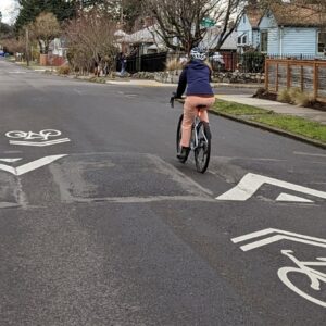
The overall project had a budget of $154,000. Approximately $40,000 went toward design and planning. With the remaining $114,000 we’ll purchase and install approximately 800 bicycle boulevard pavement markings (circular, 1′ diameter markings on low traffic streets that we’ve developed for bicycling and want to highlight to people on bikes), and approximately 400 signs at about 150 locations. This represents about half of all planned signs and locations. The estimated cost for producing each sign is $80; it’s costing us an average of $210 for installation at each location.
These signs are a great link to the existing web-based bike route finders.
http://www.bycycle.org
http://www.thecornucopia.org/virt-tour.htm
I haven’t followed the signs much becuase I’m a veteran, but the idea is fantastic.
I would suggest one at the intersection of the Hawthorne Bridge and the East Esplanade, also one on SE Caruthers (near the MLK overpass) directing cyclists to the Oaks Bottom trail.
As someone who has been waiting for these signs for 10 years…ever since I worked on the Tillamook “bikeway” design… I must say while I am glad to finally see the signs and pavement markers, I am a bit disappointed at how “restrained” they are. The pavement markers are hardly visible unless one looks for them and in places are pretty far apart. The directional signs are informative but offer no hint that there is a bike network/system.
I was hoping for something more demonstrative that says, especially to motorized vehicles…”Hey, you are on a bike facility!”
Maybe the signs should be outside the red area because it seems like the core area is already saturated with riders who already know their routes. These are obviously not for commuters. Or am I missing something? If the audience is newer cyclists (or tourists) then do we know anything about cycling demographics that can assist in placement?
Other than the type being larger, I’d like to see the arrow more prominent. It looks like a banner from a little ways away. The arrows should also be consistent. If you have left arrows and right arrows in one style and then a forward one in a completely different style, then it appears that something is strangely different about going forward. Do all signs have complete directions? Meaning left, right, and forward? Just curious.
I like the distance concept.
I don’t know how often signs become obsolete but having individual distance and arrow signs below the bike symbol sign may prevent this in the future…. and allow for more destinations to be added. Like “Rocco’s Pizza 2.5 miles…”
Nice work!
I second the idea of getting signs that will lead you from the west end of the Springwater Corridor to the Esplanade. I know this will not be necessary in a year or two wtih the new overpass and extension of the Corridor, but for now, it’s pretty tricky getting from Point A to Point B.
I’m very excited about these signs, conceptually, but have to say so far, I’ve only seen them in passing and have yet to be somewhere I personally use them (as a local during February…) I also agree that the font should be bigger.
This may /may not be relevant, but I’d say the most confusing bike-related issues from newcomers and visitors is where to cross the river- for instance, the best way to navigate Madison to the Burnside Bridge or the best way to bike down to the Esplanade from points East. Not sure if these places have signs already, but these are what I hear the most complaints about.
Thanks!
Thanks for keeping the comments coming. They’re helpful. To address some of the comments/questions:
We will place signs outside of the red area as well; that’s just the area where we’ve focused our currently limited budget. That’s also where our bikeway network is most dense, leading to more bikeway intersections, leading to more bikeway signs…
Portland citizens who bicycle for transportation are still a small minority of our population. These signs are really intended for people who are not yet regularly cycling (or cycling at all) to show them how to get to where they want to go and let them know that it really doesn’t take very long. The signs will also work for experienced cyclists who perhaps don’t yet know how to get everywhere they want to by bicycle (see comment #17, above).
The disagreement in arrow style was forced upon us by federal regulators–they didn’t like the straight-ahead arrow we had originally designed that was more consistent with the left and right arrows.
The plurality of signs are straight-left-right, but there are many different combinations, ranging from just one direction only, to combinations like left-left-right, right-right-straight, etc. It just depends on the nature of the intersecting bikeways.
We are placing signs so as to lead cyclists to the Eastbank Esplanade and Springwater Corridor. However, at this point we are only directing people along developed bikeways (the colored lines on the map attached to the original post). Let me know if there are deficiencies. Once the 3 bridges project is open on the Springwater (bridging McLoughlin, Johnson Creek and the railyard) we’ll direct people to the connection between where the trail ends at Umatilla to where it will pick up again at 19th & Ochoco.
I don’t believe we directed people from SE close to the Hawthorne Bridge up to the Burnside Bridge. Instead, we generally directed people in that area to “Downtown”, and lead them to the Hawthorne Bridge.
Again, thanks for your comments. Please ride the city’s bikeways, continue looking for the signs, and let me know if we’ve left any gaps in directing people along the routes.
Roger Geller
This is an excellent development. I was riding from the SE to Council Crest on Sunday (2.26.06) when I noticed the signs. I agree with others that the text lacks weight. I would wager that the majority of TriMet commuters are familiar with the number 503 238-RIDE shouldn’t all of these new signs also include a web address or number where additional information can be found.
– No on metric; too specialized
– Mileage font should match location font; distance more important than duration
– Keep locations broad as is; limits sign clutter
– What if arrow width was shorter then put distance text in front of arrow in green space?
All IMHO
i’ll take a closer look, but right off the bat I have been pleased to see the signs cuz
— they remind me when I am looking for a junction on a route
— they tell other road users they’re on a bike route
nice work!
I agree that signs directing people between the sellwood area and the rest of the springwater corridor would be awesome. It’s super hard to find the connection, and while I realize that there will eventually be a bridge there, at this point it becomes a little difficult. Especially for out of towners (like my uncle and aunt who wanted to do the ride on their tandem and got so frustrated they wound up driving home instead).
Also, a little off topic, but are there any plans to resurface the Springwater trail past the mcgloughlin cutoff to match the pavement smoothness in the area leading up to Sellwood? That would be really nice, although my gut says it’s too expensive of a project.
I have noticed one apparent error in the network: on N Weidler eastbound at Williams right before the I-5 overpass, the sign points right (south on Williams) to North Portland. This should be pointing the other way, up the bikeway on Williams. If you followed the sign here as it is, it would send you the wrong way down a one-way street towards the Rose Quarter.
Chris, thanks for noticing. However, the sign is correct. Just prior to the intersection of Weidler and Williams we provide cyclists with an opportunity to “turn right to go left.” If you follow the sign to North Portland and turn right though the break in the curbing/median, you’ll see a short stretch of a bicycle lane on the otherwise one-way street that parallels Weidler just to its south. This then brings you to Williams and another sign that points you left (north) up Williams and on to North Portland.
We did this in part because we had the opportunity to do so given this little parallel street fragment, but more importantly because this is a rather heavy bicycle move (east on Weidler to north on Williams) and can be a difficult left turn for cyclists not comfortable contending with high volumes of car traffic.
Try it again, follow the signs, and I think you’ll find it works.
sorry, the “sellwood trail” is the north-south trail along east side of the river — i can’t think of the proper name for it.
umatilla, i think, is the intended street for bikes to use between the sellwood trail and the springwater corridor for the most part, but last weekend i noticed a new kink — umatilla sure doesn’t take you straight to the exciting new red bike/pedestrian overpass over mcloughlin. it’s still a big ol’ mess down there, and a lot of good would be served by signs like these.
thanks, and keep up the good work!