
(Drawings: Vinci Hamp Architects)
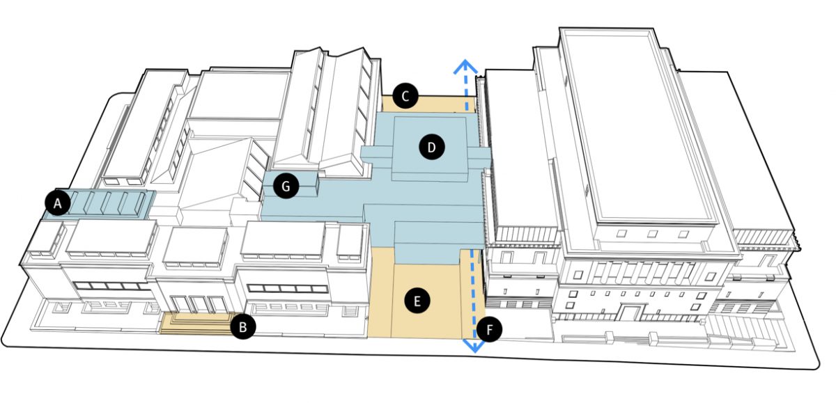
The Portland Art Museum has proposed a new design for their forthcoming Rothko Pavilion project that includes an open walkway through Madison Plaza on the South Park Blocks. The move comes after the museum fielded widespread opposition to previous plans that would have would have closed off the 24/7 public access through the plaza that people enjoy today.
“The original design has evolved in a way that… complements the urban landscape.”
— Portland Art Museum
For months, PAM insisted that losing public access through the plaza was a worthy tradeoff for improved access to their exhibits. Many Portlanders strongly disagreed and they worried the project would reduce connectivity for walking and rolling in the central city — something that goes against all of Portland’s urban planning goals. In addition to major concerns voiced by adjacent residents who use the plaza to access the South Park Blocks and other destinations, PAM’s initial design drew strong opposition from the City of Portland’s Bicycle Advisory Committee and Pedestrian Advisory Committee.
Now the museum has changed their tune.
In a statement posted to their website on August 10th, PAM said,
“The Museum has spent the past several months revisiting the initial 2015 concept with the staff, board, and the Museum’s Accessibility Advisory Task Force, as well as listening to a number of community members and Portland city officials. As a result, the original design has evolved in a way that not only offers enhanced circulation, improved art and public spaces, and amenities within and around the Museum, but also one that complements the urban landscape.”
Instead of resisting an open passageway and insisting that it wasn’t feasible, PAM now says, “an open passageway and a new entry structure between the Museum’s two buildings will further integrate the Museum campus into the fabric of the neighborhood and the city.”
Advertisement


PAM Executive Director Brian Ferriso added that, “The design will continue to be refined and articulated, but we are inspired by the latest iteration, which we believe better invites the public to engage in art and creates a campus that is assimilated more fully within our downtown neighborhood.”
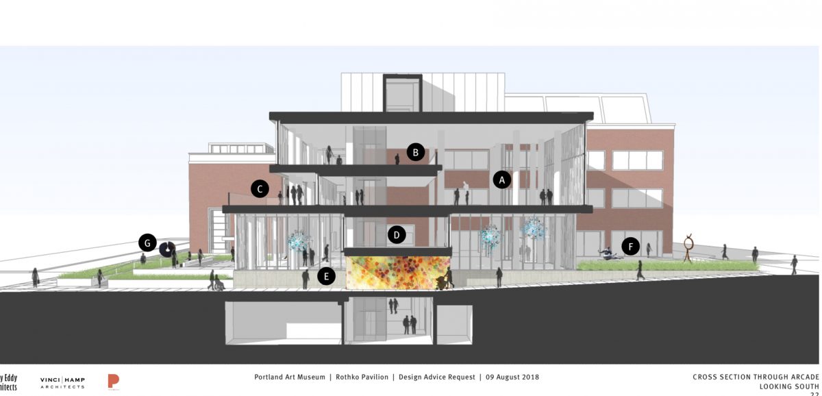
In design drawings submitted to the City of Portland, PAM refers to the passageway as a “public passage arcade.”
Walking, biking, and central city livability advocates who pushed PAM to come up with a better design deserve a lot of credit for the design changes.
Wendy Rahm, a former PAM board member and nearby resident, spearheaded one of the opposition efforts. At a city council hearing on the project in April 2017 she testified that earlier designs that would have closed the plaza to free, unfettered public access, “Would create a superblock and a physical and psychological barrier.” She also said PAM’s approach had, “A ring of elitism to it.”
In an email last week meant to rally advocates to a Historic Landmarks Commission meeting on Monday, Rahm said, “From my perspective, this change [in the project design] deserves our whole-hearted support and thanks.”
UPDATE, 2:34 pm: Rahm just emailed her supporters with an update on the HLC meeting. Seems as though commissioners were not impressed with the latest design:
Hi all,
The August 27 Historic Landmarks Commission (HLC) second design advice request (DAR) meeting on the Rothko Pavilion concept plan, scheduled to last 1.5 hours, ran just under 4 hours. It included a staff presentation, PAM presentation, a presentation by PDOT (on Jefferson St loading dock), public testimony (not a lot, but a few supporting the passage concept and some opposing other aspects) and wound up with the comments by the commissioners (HLC and 2 from the Design Commission). The audio is up on the web. You can find it here: https://efiles.portlandoregon.gov/Record/11695733/
The Commissioners comments (probably the last hour or so of the hearing) were largely very critical of the Rothko Pavilion concept plan, the Jefferson Street loading dock, and the treatment of the historic Park Avenue entrance to the Belluschi building. It is hard to summarize all the points made, but one commissioner’s comments summed it up well enough (my version!):
The concept plan began inside, first addressing the museum’s needs and then moving on to the outside with what area was left, which left the public realm short-changed. PAM’s architects need to start over, this time beginning with the needs of the public realm in terms of a passage way combined with much more open space/plazas (not a “tunnel”) and then moving inside to meet the museum’s needs. Since PAM is downtown’s primary cultural institution, the public realm around it is what will be a draw both for the city and for the museum. And the pavilion’s architecture should be more dramatic. (I hope I got everything right).
*Other comments during the commissioner comment period included the following:
Plaza/passage/pavilion. “least amount of give back,” “feels inhospitable and ungenerous,” “not gracious,” “is not just an infill project,” “arcade is an important part of the pavilion and not auxiliary,” “more care to public realm,” “is not fitting into the city,” “view corridors,” “festival street”
Jefferson Street. “significant risk to the public realm,” “active use street,” ”on ramp for 26”
During the proceeding, for policy lovers, some of the citations of guidelines, code, and policies not being met by the concept are A-3, A-8, B-1, B-2, B-3, B-5, C-4, C-6. One other commissioner commented: “The guidelines are not being met….any modification requires a betterment and this is not.”*
My guess is there will be another DAR in the museum’s future, but that is only a guess. I really have no idea how they will proceed after this difficult hearing.
— Jonathan Maus: (503) 706-8804, @jonathan_maus on Twitter and jonathan@bikeportland.org
Never miss a story. Sign-up for the daily BP Headlines email.
BikePortland needs your support.


Thanks for reading.
BikePortland has served this community with independent community journalism since 2005. We rely on subscriptions from readers like you to survive. Your financial support is vital in keeping this valuable resource alive and well.
Please subscribe today to strengthen and expand our work.
great news! I will renew my membership after all
Will the passageway be open 24 hours or will access be limited to museum hours?
i believe that remains to be ironed out. Wendy Rahm has told me she and others testified at the commission hearing asking to get that promise of 24/7 access in writing.
UPDATE, 2:34 pm: Rahm just emailed her supporters with an update on the HLC meeting. Seems as though commissioners were not impressed with the latest design:
See? Was that so hard?
Looking at the rendering, it seems to me that the “tunnel” eliminates a row of staples that I’ve used many times in the past while visiting PAM. I may be wrong, maybe that subject was addressed and I missed it. I rarely if ever drive downtown, but PAM is one of the great places I do go when I cycle downtown, either to visit exhibits, or go to events for instance the CO kickoff, or the Greg LeMond lecture. (And I’ve been to the streamliner exhibit, too) Bike parking needs to be amplified in numbers, not eliminated. (And like the dissenting voices, I’m not at all a fan of a claustrophobic “tunnel” in the first place.)
It looks way better to me, but that’s because it was so horrible to begin with. “Way better” doesn’t mean it’s very good. Since I didn’t look at any drawings beyond what are in this article, I’m basing that in part on the Landmark’s Commission lukewarm response, who I’m sure DID take a careful look.
I really appreciate the efforts of everyone who didn’t accept the museum’s early excuses, lack of trying, and lack of concern for the public. Too bad so many Portland institutions seem to get caught up in their own self-importance–“We’re the good guys–you should be glad we’re building this for you”.
The sad thing is that so often here, a project starts with great potential, and by the time it’s over, everyone’s worn down and just glad the project didn’t wreck things. In this case, the public passage through the block should have been a starting point, with efforts made to make it great, as has happened in other cities. Instead, it may end up as “at least you can still get through”.
This new design is only “better” because the previous design was so “poor” for the public realm and cross block circulation. I concur with the Historic Landmarks Commission’s (HLC) design criticisms outlined here…it still a tunnel…especially with the dip it terminates the view through it pretty much…thus creating a mental “barrier” communicating “keep out”.
Your comment made me look at the passage slopes, that do create the blocked view situation you mentioned.
There are some things going on with the renderings that are (intentionally or not) deceptive.
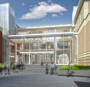
First, the view from 10th looking east is fine–you can tell from the near figure and the converging lines on the brick building on the left that that view is taken at eye level of someone standing on the sidewalk.
But the view from 10th is taken from floating several feet above that, a view nobody will have in reality. Raising the viewpoint gives the impression that the addition will be much more transparent than it really is. From a realistic eye-level view, you’d see more ceiling and would see much less through the lobby.
Further, the little “skybridge”–the glassed-in passage that runs over the top of the tunnel, with it’s bottom forming the ceiling of the tunnel–is shown from Park with that ceiling level a couple feet lower than it is shown in the rendering from 10th (look at it relative to the white “stripe” on the brick wall it attaches to). Hopefully, the higher tunnel ceiling is the correct one.
Maybe worst, the rendering shows someone in a wheelchair entering the passage from Park, giving the impression that the passage is a viable path for a wheelchair (or stroller, etc.). But if you look at the section, you can see why they put that person in the wheelchair entering from that street. If they entered from 10th, the passage is too steep downhill for a wheelchair (meaning too steep uphill going west).
That passage wouldn’t have a steep section if it were a gradual ascent east to west. But it looks like it was kept flat and low from Park eastward to the tunnel, so that the little “skybridge” could fit. Then, heading from the tunnel to 10th, it had to do all the climbing in a half block—not enough distance for a gradual slope usable by anyone in a wheelchair.
The main thing I don’t like about that is showing the wheelchair in the rendering, located so it misleads people. Along with the “floating” viewpoint, and the two different tunnel ceiling heights, it makes me question the thought that went into the design, and gives me the impression that the architects and museum are trying to “sell” a design that isn’t as good as what’s implied.
Oops, meant to write that “The view from PARK (not 10th) is taken from floating several feet above…”
I also don’t like how the tunnel doesn’t have straight walls running through it–it has a jog so when you enter it (from either direction), you can’t see if anyone is lurking behind the jog. It’s a “Let’s make a bad passage, so nobody will object when we close it off in a couple years” design.
“q” – All good points.
If the new design does create a new slope – where there was not one – thus that is “worse” (takes more physical energy in one direction) than existing…then how does this meet ADA architectural or ADA PROWAG (this route is still public right of way?)? [Or am I missing an important detail in the weeds?]
I don’t know the answer, but hopefully someone else may. And I’m just basing my comments on the section that shows a very long ramp that looks too steep, especially without landings that are required on all but the gentlest slopes (1:20 max. I think).
To me, a successful design is one that would take only a glance to know it’s easily usable by people in wheelchairs (or who otherwise have difficulties with slopes). I’d respond better to a rendering that had a big red circle around the ramp with an honest “Need to make sure this isn’t too steep!” than I do to one that throws in a figure in a wheelchair to give the impression that a steep ramp is still useable.
Thanks to all the people who attended meetings, wrote in, and bugged all their friends to do the same over this mind-numbingly simple issue. Looks like they are moving in the right direction, finally.
It needs a design that easily “says” that is has a public easement, that people are allowed to walk there. Doors don’t “say” that it is public.
That looks like a great place for me to set up my tent
Yikes. Don’t even say that!
Yeah, realistically, any tunnel like this is a perfect place for a homeless camp. Makes me think of the bike path underpasses next to Powell near Vanilla. Lots of people would avoid the tunnel rather than walking through a narrow space with a homeless camp in it.
Have they never seen the bike path through the Rijksmuseum? https://bicycledutch.wordpress.com/2016/05/31/the-bicycle-passage-of-the-amsterdam-rijksmuseum/
What I love the most about that (thank you for link) isn’t how great the passage is (I’d seek it out to ride or walk through it). It’s the view from inside the museum, showing how the people going past outside through the huge windows activate the whole interior space, and connect it to the city, something Portland’s museum could use more of.
Are there any safety concerns? This looks like a prime loitering spot for vagrants.
Those modern-art vagrants are the worst.
It really is nothing to joke about. Personal safety does matter some folks.
I ended my PAM membership b/c of the stand they took originally – esp the bizarre stance of the communications director that somehow PAM was doing the public a favor by blocking the passageway and if that meant lost memberships, then so be it. When I read the news about the new passageway, I was hoping I could re-start my membership, but looks like I’ll wait a while, til I see the proof in this pudding. Thanks to the eagle eyes for seeing the many flaws in the new plan, and thanks to the commissioners for holding out for a much better plan. PAM has really made a mess of what should be a really great facility for everyone.
I haven’t been to the Portland Art Museum in years and have never been a member, but this whole debacle makes me want to stay away.
This new design concept they’ve come up with doesn’t make me change my mind on staying away. It’s a tunnel, it doesn’t look safe, and it looks like an afterthought to the design instead of an intentional part of the design.
I’m glad it’s heading back to the drawing board, and maybe PAM will come down off their high horse and work to make it a good place for everyone, not just for them.
It looks like the proposed passageway is essentially the same passageway that exists now.
The differences are 1) the middle part of the passageway goes under the pavilion and 2) the grade of the passageway may have been changed to accommodate the pavilion.
1) seems like no big deal. 2) seems like the grade needs to be checked for ADA compliance,
Amsterdam gets the wonderful passage through their museum. Portland should be happy once it’s verified that the tunnel is code compliant?
In other words, our standard is, “It’s not illegal”?
Then why bother with design review? After all, if the plans could go straight to the building permit review, it will be checked for building code and ADA compliance.
The passage through the Rijksmuseum was always a major thoroughfare, from the initial construction of the museum. It is the gateway connecting a whole neighborhood to the main access bridge, was originally designed for trams, was used as a major auto road for most of the museum’s history, and after cars were banned it was a major bicycle route.
The passage between the two PAM buildings is not much more than an alley used as a quick shortcut through the block. It is not a major connector, since it connects to nothing on the west but a quiet sidewalk. It gets about as much use as that sidewalk. You can sit in the patio long enough to drink a coffee and see only a handful of people using the passage.
Why should PAM build some grand, disused, pointless thoroughfare in place of today’s alley? Just because there is one in Amsterdam?
The passage can be anything people agree to make it. It’s not heavily used now because it’s not a great route now, either. That’s no reason to limit what Portland should expect it to be. Why not make it something that people would PREFER to use?
I said it should be something more than a tunnel-like passage that manages to comply with codes. Don’t put words in my mouth–I didn’t say it should be something comparable in scale to the one in Amsterdam. I was comparing the differences–the fact that the Dutch museum managed to accommodate a “major thoroughfare” (in your words) right through it, while Portland’s museum can’t manage so far to design more than an unpleasant tunnel that doesn’t even look code compliant.
The main point of the Amsterdam example is that it CELEBRATES the passage through it, and the passage even makes the museum experience better. Portland should do the same thing–not the same scale, but with the same spirit.
I think the passage is not heavily used because it doesn’t have a major connective function. It goes from SW 10th to SW Park. There isn’t any major natural flow of people between those two streets at that location. It is not a commute route, busy retail area, school zone, etc and the passage itself has no attractions to draw people.
All the passage does is provide a way to cut through the block. But it only saves time/steps if you are already in the middle of the block. When you walk through a “grid” type of city like Portland, you go from one intersection to the next. From an intersection, going out of your way to take a mid-block passage is not actually a shortcut to the next intersection. It doesn’t save you steps over using sidewalks.
That’s why not matter how nice PAM makes the passage, it won’t be a heavily used route.
A nicer and wider passage might become a place to hang out, sort of a covered public park. Until Portland gets a handle on its downtown camping/homeless issues, that’s probably the last thing a museum (or any other property owner) would want to create. A large space, required to be open to the public 24/7, sheltered from rain, right in the middle of your museum/other facility – not good.
It’s not just “a way to cut through the block”. SW Madison runs right into the museum, and runs continuously east for almost five miles, becoming Hawthorne, all the way to Mt. Tabor Park. To the west of the museum, Madison stops as a vehicle street, but continues for people biking and walking. And the whole area from the museum west to the stadium is currently developed at a fraction of its potential. There could easily be 10,000 more people living and working there in several years, who would appreciate using Madison without having to walk around the museum.
You mention that Portland is a “grid” city, but ignore that the grid comes right to the museum’s front door, blocked by the museum. Anyone traveling west on Madison would literally crash into the front of the museum without the connection.
It won’t be a “heavily used route” compared to many other streets. But that doesn’t mean it should be turned into a token tunnel.
Yes, “a nicer and wider passage might become a place to hang out, sort of a covered public park”. That would be great, in comparison to a cramped tunnel-like passage. If the homeless/camping issues are a concern for a wider space, they’re also a concern for a narrow area. I wouldn’t bet that a wider connection designed well would be a greater problem than the one currently shown with its windowless, almost-underground tunnel section with its jogs that create corners that make it feel unsafe to use. If it came to it, I’d also rather have a nice connection open 16 hours per day than a crappy one always open.
“Madison stops as a vehicle street, but continues for people biking and walking”
West of the museum, there is only a one block cut-through alley from 10th to 11th. Which is also not very much used. For the same reason that the PAM passage is not much used.
“And the whole area from the museum west to the stadium is currently developed at a fraction of its potential.”
Anything west of the freeway doesn’t matter, because the nearest roads crossing the freeway are Jefferson and Salmon, and the PAM passage won’t be a short cut for anyone walking on those streets.
From the freeway east to PAM, there are only two blocks that might be redeveloped to high-rise condos/apartments, between 11th, 13th, Jefferson and Main. Sure, residents there might find the PAM passage to be a convenient short-cut. So we’re talking about the possible convenience of the future residents of just two city blocks of hypothetical unbuilt high rises.
“I’d also rather have a nicer connection open 16 hours per day than a crappy one always open.”
If the museum were confident that the city would actually prevent camping and allow closure at night, then maybe the conversation would be different (just guessing). But I don’t think anyone in downtown (or elsewhere in Portland) has any reason to be confident about that.
Some of what you say about development west of the museum would make sense if people walking or biking from one point downtown to another went straight the entire way in the east-west direction, then made one 90 degree turn and went the rest of the way in the north-south direction. But for all kinds of reasons, lots of people don’t travel that way. The grid accommodates them, and the museum interrupts it.
This passageway needs to work for the future context. If not many people will use it for the first few years (which I don’t believe) that’s not important. If current conditions really don’t allow a connection to stay open 24 hours/day, then the City should allow nighttime closure of some or all of it. That’s certainly something that can be done if it’s in the City’s best interests.
I wanted to add my broader thoughts about this project. I agree PAM should be urged, cajoled, pushed, etc to make the passageway a good piece of bike/ped infrastructure that benefits the people who use it. But we shouldn’t lose sight of the benefit that PAM brings to our city as a whole, which dwarfs the potential + or – impact of the passageway. This was highlighted in the Op-Ed linked below.
https://www.oregonlive.com/opinion/index.ssf/2018/08/opinion_portland_arts_scene_a.html
Yes, of course.
But remember, that’s the argument the museum was using quite recently to justify not providing any decent access, period. And it does get tiresome every time a Portland institution wants something for itself that isn’t in the public interest: “We’re very important to the City, so don’t criticize our plans. We just know for certain that we can’t accommodate what you want (even though we haven’t bothered to study it much)”.
The Japanese Garden used it recently to try to close a public trail through the woods, and to avoid building an important sidewalk. The Zoo used it to make a temporary parking lot in an natural area permanent. University of Portland used it to argue against providing space for a public trail. And now the museum. It’s not an either/or thing.
I can’t wait for the pedestrian complaints against “Maniac” bikers. It’s too narrow. And short. Great place to menace people, complete with a chokepoint.
I just noticed there have been further improvements to the Rothko Pavilion design. Now looks to be at street-level (not a tunnel), and I believe a bit wider (hard to tell as drawings aren’t dimensioned). Also retains bike racks, albeit non-standard ones.
http://www.nextportland.com/2019/02/26/rothko-pavilion-receives-design-advice-images/