(Data from Portland Bureau of Transportation, geocoded by SteveLeathers and mapped using Google Fusion Tables)
If the last two years of city bike counts tell any coherent story about biking in Portland, it’s this: Biking keeps rising in Portland’s bike-friendliest neighborhoods, but not fast enough to make up for declines in the parts of Portland where biking is often unpleasant.
Though the data released by the city Thursday night is far from perfect — it’s gathered largely by volunteers at one-time two-hour rush-hour counts on summer weekdays of their choosing — it’s one more clue to a Portland mystery: why did the city’s bike-commute rate stop growing five years ago?
Given the data’s many limitations, the most reliable patterns are probably the ones with the broadest geographic scope. To find a few of those patterns, we averaged bike counts in 2011 and 2012 and compared them to averaged bike counts at the same locations in 2013-2014. (If a location had only one year of data available in each time period, we used that year. If it had no years available, we didn’t include the data point.) We recognized counts as changes only if the count rose or fell by at least 10 bikes.
Here’s what we found:
Citywide, bike counts rose at 69 locations and fell at 68 locations. The total number of bikes observed rose by 1,489, or 4 percent. (The city’s population grew 3 percent over the same period.)
In the downtown area (including the South Waterfront and everything inside the 405/Willamette River loop), bike counts rose at 14 locations and fell at 10. Throughout the area, bike counts rose by 637, or 9 percent.
In North Portland, bike counts rose at 10 locations and fell at nine. Throughout the area, bike counts rose by 601, or 9 percent.
In inner Northeast, bike counts rose at 15 locations and fell at nine. Throughout the area, bike counts rose by 348, or 6 percent.
Advertisement
In inner Southeast, bike counts rose at 17 locations and fell at 13. Throughout the area, bike counts rose by 171, or 2 percent.
In Northwest, bike counts rose at seven locations and fell at three. Throughout the area, bike counts rose by 157, or 6 percent.
In Southwest, bike counts rose at two locations and fell at 13. Throughout the area, bike counts fell by 237, or 9 percent.
In East Portland, bike counts rose at three locations and fell at 10. Throughout the area, bike counts fell by 200, or 9 percent.
For specific locations, the data was less reliable. For example, the biggest drop citywide (Caruthers at the Eastbank Esplanade) reflected detours around Orange Line construction, as did the biggest increase (SE Clay at Water). One of the biggest declines, Southeast Clinton at 13th, seems alarming until you notice that it results entirely from one anomalously low count (73 bikes during one evening rush hour in 2013).
That said, a few other local patterns seemed to emerge:
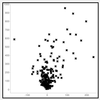
Most of the most popular locations got more popular. Most of the least popular locations got less pouplar. Here’s a chart that compares the change in number of bikes (horizontal axis) to the number of bikes in 2011-2012 (vertical axis). The two extreme outliers are related to the TriMet detour. Other than that, the trend is pretty clear: the more bikes a location had in 2011-2012, the more likely its bike count was to rise further.
North Williams and Vancouver continued to show strong growth. This doesn’t reflect the effects of the Williams Avenue redesign that began in late 2014.
People responded to new infrastructure. Southwest Moody, Northeast Multnomah, and the downtown Oak/Stark couplet saw significant traffic boosts following the installation of protected or green-colored bike lanes (or, in Moody’s case, the addition of OHSU’s free bike valet to the recently constructed bikeway). Going Street, whose neighborhood greenway was extended from Vancouver west to Interstate in 2013, also saw growth.
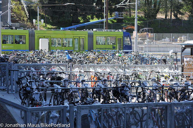
(Photo: J.Maus/BikePortland)
Bike counts fell throughout the Portland State University area. This is consistent with the university’s survey data, which last year found a significant drop in student bike use after years of growth.
The Mount Tabor and St. Johns areas didn’t show any growth. This might be because, with many available side-streets but no comfortable arterial routes, bike traffic was harder to measure.
Finally, here’s a map of total biking in Portland: average bike counts from 2012 to 2014. Red dots averaged less than 20 bikes; purple dots, 20 to 100; yellow dots, 100 to 400; blue dots, 400 to 700; and green dots, 700 to 1,100.
It’s exciting that the city has, for the first time, made this data easy for the public to explore. What patterns do you see? What do you think has caused them?
Think this data is useful? Consider volunteering to collect some of it this summer.




Thanks for reading.
BikePortland has served this community with independent community journalism since 2005. We rely on subscriptions from readers like you to survive. Your financial support is vital in keeping this valuable resource alive and well.
Please subscribe today to strengthen and expand our work.
I for one try to avoid any street that has huge numbers of bikes, and cars, on it. It makes my commute less stressful, less dangerous, and unfortunately invisible to the counters. SE Clinton and Ladd’s are a ‘ship show’ in the AM and PM commutes.
I agree. I love the new 50s bikeway, but do miss having the route more or less to myself (and I know that’s not even that bike trafficked).
I just moved from close-in to outer SE and my commute is Woodward/Clinton. It’s a *delightful* mixture of auto drivers either raging around heavy bike traffic or driving so meekly that faster cyclists are tailgating them. Diverters are sorely needed, and education in the vein of “please only use Clinton for local access, not as a through-street”
My intuition is that the years since 2000 have seen two trends that are probably not sustainable.
First, cycling grew as a result of its being a cultural statement (hip, urban, eco-friendly, or something along those lines). Cultural fads come and go; what’s hip today is out of style tomorrow.
Second, cycling grew as a result of the extraordinary economic downturn that began in 2008 and met a force multiplier in the rise of petroleum prices that accompanied China’s simultaneous economic expansion. I’d be in another line of work if I could reliably forecast gas prices, but my suspicion is that they won’t reach the heights of 2009-2012 very often.
What to make of all that? I’d say that relying on temporary trends is bad policy. As Michael pointed out, cycling use reliably grew where infrastructure was improved. That seems the best way forward.
…did bicycling rise in the years of deep great session (2009-2011) vs. 2005-07? Or is there new analysis I am unaware of?
My memory of the data then was a drop. Less jobs and those that got them had longer commutes (my thoughts from then).
Bike commuting didn’t rise much from 2005 to 2007 or at all from 2009-2011; almost all of the increase happened very quickly in 2007-2009. This was definitely gas-price related, but isn’t the same pattern that other cities saw.
Numbers:
http://bikeportland.org/2014/09/18/census-shows-big-leaps-biking-cities-portland-inches-backward-111088
Discussion:
http://bikeportland.org/2013/07/02/what-caused-portlands-biking-boom-89491
(edit: I corrected the first sentence of this post)
I think this is a great start in understanding the trends. That said, I would love to hear from a statistician how significant these numbers are.
Just looking at 24 hour counts on the Hawthorne bridge, last week Tuesday saw 5003, Thursday saw 8890. While that is an extreme example of variability within a week, what if they measured in 2011 and saw 5003, then measured in 2014 and saw 8890. Or vice versa?
I think there needs to be more regular counting, like on the Hawthorne bridge. Where else are bikes being counted on a daily, weekly or even monthly basis?
Exactly. In the year-to-year counts, all I see is a lot of noise. No obvious trends; at least nothing to draw any conclusions with.
You can get a start with common sense. If your measurements are highly variable (as they are with this data), then for any given change to be significant, it needs to move by more than the variability inherent in the data.* I can’t calculate p-values without digging into the spreadsheet, but they’re not going to tell you something markedly different from what you see by eyeballing it. If counts change by more than 1000 from measurement to measurement, you’ll need a lot of samples (which we don’t have) or a really dramatic change (i.e. way more than +/- 10 bikes) to conclude anything.
I’m not sure how the scatter plot is a “clear” trend. Aside from reversing the dependent and independent axes, it is what in my business would be called a “potato graph”: pretty much the opposite of a strong correlation. (The graph doesn’t show density contours, so maybe there’s something hidden in there I don’t see?)
* In slightly more technical form, the confidence interval is proportional to the variance and inversely proportional to the sample size. The certainty that a population change has occurred is inversely proportional to the overlap of the confidence intervals in the “before” and “after” cases.
Conducting two-hour counts once per year is clearly not a reliable method of assessing long range trends.
Take a look at the daily fluctuations in the counts on the Hawthorne Bridge. Variations of more than 10 percent from one day to the next are common.
If you get a two-hour count of 200 at some location, you’d be hard pressed to predict whether tomorrow or the same day next will be higher or lower. In fact, it’s likely that it will be lower than 190 or higher than 210 when you next count it.
As for the graphic of this data…perhaps the classification needs to be tinkered with…using “10 bikes” vs. say 10% (or a higher % to account for the daily flux in traffic, as a previous poster posted) would not be flexible enough for use across a city unless all the counts locations have a very similar magnitude of traffic.
10 bikes +/- on the Hawthorne or Williams would not be an annual trend (more likely a group of co-workers going out for beer) vs. a count on a very secondary route.
[Unless I am missing something deeper in the survey methodology…vs. my skim of this article. Or was the description in the graphic poorly worded?]
You’re interpreting it correctly, Todd. I decided to use absolute rather than percentage figures because so many of the base numbers are so small. An intersection that gets 13 bikes during rush hour one year and 5 bikes the next year is probably not 61% less attractive, but if it’s 13 in one year and 2 in the next year, seems to me that something is more likely going on.
I’ll take this opportunity to announce that 25% of new residents travel by bike… at least that’s how most news outlets would spin it…
Except that’s not true. Imagine a city with population of 1MM, of which 1% cycle, or 10K. If population goes up by 3%, that’s +30K, while cyclists go up by 4%, or +400. So only 400/30K, or 1.33%, of new residents cycle.
Even more evidence that the city should install safe, separated cycle facilities to increase the rate of people who ride.
Don’t forget “efficient”. PBOT has really dropped the ball here with nonsense like Moody, SW Multnomah, and the new bit on SW Terwilliger and Capitol Hwy. I think people need to be able to *average* 12mph on bike trips for it to be a compelling option, which means flat and straight parts need to be easy and relaxing at 15-20mph. A separated facility littered with peds, curb cuts, and red lights won’t give you that.
not alarming at all… I’ve been avoiding it since the Orange Line construction began, and I’ll continue avoiding it because it now takes 3x as long to bike through that tangle of intersections and traffic control devices…
I thought I was the only one who thought the turns, rail crossings and sidewalk routing east of the Tillicum Bridge were counter intuitive. I think with bus and major intersections going one way, and train and Max crossings going another way (without gate arms!) that someone is going to get hurt. What a fluster cluck.
I still take it, as it feels safer to me than the Ladd -> Clay > 6th alternative. It’s tricky but has more separated infrastructure.
Aaron, Yea, the Hawthorne Bridge leaves a lot to be desired also. Eastbound between the McGloughlin ramp and Ladds is a very hazardous section.
I agree. There was a minute when the design could have seamlessly connected Clinton to the Springwater, then we got the convoluted, (almost) intentionally poor design we have now.
Too bad. Another missed opportunity by the city to take a step forward, instead of an expensive stumble sideways.
“The Mount Tabor and St. Johns areas didn’t show any growth. This might be because, with many available side-streets but no comfortable arterial routes, bike traffic was harder to measure.”
Bike traffic would increase to and from St. John’s if the city finished stripping the bike lane from N Ida to N Richmond (about a mile). The road is more than wide enough for bikes and cars to travel on. GET IT DONE!
I see an increasing amount of traffic on Fessenden, which some of that is folks who live in NoPo and work in the Vancouver area.
I live on a sharrowed street (N Houghton) and have also witnessed an increased amount of bike traffic going through the Portsmouth neighborhood.
If the city finished striping Willamette, plus striped Willis to include bike lanes – Willis is an easy ride to get from Kenton through Portsmouth – one would not need to reconfigure Lombard to include bikes, which I believe would be a bad idea.
The N Central Greenway is substantially complete, but N Houghton has not been finished (both north of Lombard and parallel). No greenways parallel and south of Lombard have been constructed, though several are planned. The RR cut is a significant obstacle.
N Willis is mostly 40 feet wide. Parking would need to be removed to add bike lane to the collector street. Widening the sidewalk in the very wide curb to property line area might make better sense – separated MUPs on both sides.
Willamette west of Ida is more narrow and would need parking removed from both sides of the road to add bike lanes.
Given PBOT’s strategy of ignoring the west side, this seems like their desired outcome. But in general, my guess is that more drivers speeding without consequence leads to fewer cyclists. Another data point: a guy who had moved here from L.A. said our most congested traffic was no big deal — like sitting in a car for 40 minutes to travel 10 miles is just fine.
Biking up Corbett the other day, I was passed twice by the same driver eating a donut (taking a bite while passing me both times — the second while crossing Barbur.)
Some of these locations seem odd for an afternoon count. I would guess that Bond sees much more traffic in the morning (one-way headed north.) Maybe true for Corbett too.
‘Strategy’, as in purposeful moves? Is downtown not part of your ‘westside’?
SW Multnomah? SW Vermont? Multnomah Village? SW Oak? SW Stark? Spring Garden?
Downtown is definitely part of the westside, and definitely has been ignored. The bike lanes on SW Stark and Oak were added 6 years ago now, and only exist because those streets are lightly used by motorists. They’re not that much use for cyclists trying to get through downtown: neither street connects directly to any of the bridges, or to the neighborhoods west of downtown. SW Oak dead ends at the streetcar tracks.
I’m looking forward to seeing what comes out of the Central City Multimodal Safety Project, but it’s long overdue. I don’t think there’s any part of the city where the gulf between the potential bike ridership and the actual ridership is larger.
Back in 2006, my commute home from Tigard to northwest used to consistently take an hour+. By car via I-5 or Barbur.
LA notoriously has the worst traffic in the country. Forty minutes for ten miles sounds terrible to us, but when one’s baseline is two hours to get three miles*, that sounds positively lovely.
* true numbers from an acquaintance’s commute
Crazy. 1.5mph is walking-with-a-toddler speed.
Tyler,
When was that minute? Clinton was not converted to a bike street over any 1-year time span.
Poor design? by what standard? What’s your metric?
The circles were installed in the early 90’s to stop cut-through auto traffic diverting from Division and Powell – not for bikes, just for local livability.
The speed bumps were installed to reduce observed speeding – 85ths 5 over the posted 25, again for neighborhood livability, not the 20 mph greenway speed goal.
Clinton has yet to be ‘designed’ as a neighborhood greenway.
Actually, I believe Tyler is referring not to Clinton as an entire corridor, but rather to the section (click my name to see in G Maps) that was improved as part of the Portland Milwaukie Light Rail – that is to say, by TriMet.
I’m curious as to what the “seamless connection” to the waterfront would have been, given heavy rail crossings, light rail crossings, a couplet of high-traffic streets, etc.
The worst thing is all those fences, and a forced convulted sidewalks at the 11th Ave. crossing. It’s one thing to allow wheelchair users and cyclists to cross at 90 degrees, but it’s another to prohibit anybody else from crossing parallel to the roadway if they have that capability. I know, it’s all about “safety”, but it looks like it was designed by Trimet’s lawyers.
“has yet to be ‘designed’ as a neighborhood greenway”
sadly, we’ve been hearing that from you for many years…
I think snapshots are so variable as to be irrelevant. If it isn’t an average over a period of time it really doesn’t show statistically relevant data
Not exactly sure how you say it is down in the Tabor area.
Doesn’t look like any counts were done on SE Division from 60th to Gresham (which has a bike path).
Why no counts on arterials? None on Hawthorne east of 12.
And how is Multnomah a huge increase when it’s logged less than twenty riders at two different spots on its counts.
I know a lot of people spend a lot time on this stuff, but I do have to wonder what good it does, and how affects planning issues when there are so many problems with basing data on studies like this where the possible number of variables are so numerous while the sampling/polling size is so small.
For actual data, of course bike counts might be down on SW Shattuck Road due to the historic levels of high auto traffic on that road during the Fanno Creek bridge construction nearby on SW Oleson Road.
Will there be any sense of urgency if we see a third year of declining bike mode share (when ACS numbers come out)? I doubt it. In fact, my read of our current political situation is that the majority of our current council are not friends of people who cycle.
I noticed a couple spots they could add to future counts to capture more bikes. Moody & Meade is a new destination for OHSU, PSU and OSU students that is growing now and will continue to grow as campus buildings and Tilikum Crossing open.
And actually, both counts on Moody look to be in the afternoon but the full picture can only be derived from a morning count. A significant number of bikes go uphill on the Tram and, of those, the most popular off-hill routes are along neighborhood streets and Sam Jackson. A lot of riders will avoid Campus Drive in the afternoon due to congestion. A lot of these could be captured at Terwilliger & Sheridan–but that is a morning count.
So to bring it all together, the Tram and South Waterfront create an unusual traffic pattern that was impossible to predict back when these counts were first performed and it appears not being captured now. People bike Moody in the morning and Sam Jackson or neighborhood streets in the afternoon. Anyway, it’s still helpful data and I’m glad they do it–just offering my two cents for future fine tuning.