(Photos © J. Maus)
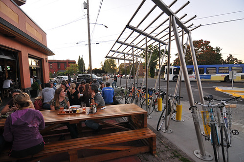
A new bike parking structure in Woodlawn is nearly completed and is already getting a lot of use.
The NE Durham and Dekum Green Street Bike Art Project is a collaboration between the the City’s environmental services and transportation bureaus and the Regional Arts and Culture Council. The goal of the project was to build a spot for plantings in the sidewalk area to help with stormwater management (a.k.a. a “green street facility) that combines a covered bike parking shelter with public art.
Judging from some observations of the street yesterday, the project looks to be a success. The bike racks were nearly full and people gathered on the sidewalk nearby to enjoy friends, food and drinks at Breakside Brewery.
When I first reported about this project back in October, there was a mild outcry at the design. Artists Buster Simpson and Peg Butler had originally planned to include a rusted out car as the centerpiece of the bike shelter. The artists said the sculptural portion of the shelter — to be created from “sliced and pieced together oil drums, portions of a car frame, and living plants” — would make a statement about, “a future less dependent on the automobile and petroleum based economy.”
Many thought the vision of an old car giving way to gleaming bike racks would make a powerful statement; but others didn’t like the design at all. One commenter put it this way:
“This comes off as an US vs. THEM statement and has already generated negative feelings from viewing the concept renderings, and that is from people inside the bicycling community.”
After hearing from the community in a public meeting back in January, the artist and the Bureau of Environmental Services decided to scrap the car and oil drums altogether. The oil drums will remain.
Here’s the initial design with the car…
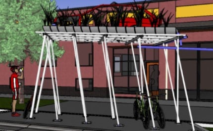
And here’s the modified design (note the oil drums that will act as pots for plants)..

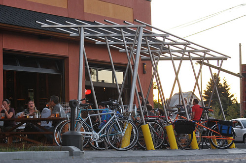
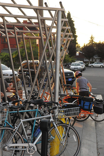
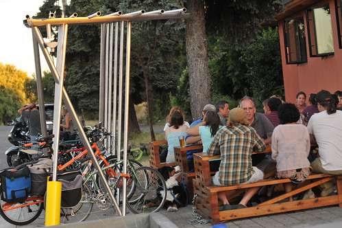
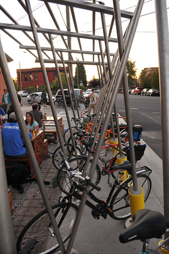
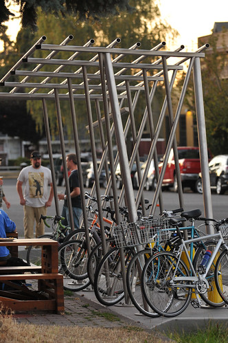
The shelter is easy to access via a ramped curb from Durham Street. The poles (u-locks easily fit around them) are solid and anchored to the ground with cement columns. The shelter has capacity for about 11 bikes at the minimum (more if you don’t mind doubling up with a friend). Below are a few more shots…
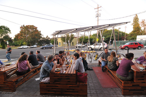
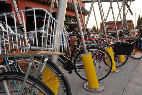
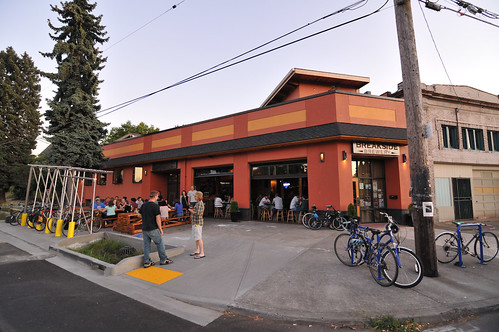
I’m anxious to see how the roof comes together. What do you think?
UPDATE, 3:30pm:
Below are some notes about the design sent to me by the Regional Arts and Culture Council Public Art Manager Kristin Calhoun:
“The art installation works with materials and imagery related to petroleum use and production. The exterior of the oil barrels is painted with an iridescent paint that shifts hues mirroring the rainbow sheen that appears when oil meets water. On the underside of each barrel, the name of an oil field is stenciled, referring to the history and culture of oil use: the field names connect the petroleum product to a place of origin with its own story. The halved oil barrels are filled with soil and plants, a positive transformation that seeds possibility.
Dekumstruction [the name of the installation] receives roof water from an adjacent building via an aluminum pipe. The water then flows through the oil barrel planters to a downspout that delivers it to an upended barrel, ‘beating the drum’ on rainy days. Also, at street level, at the north and south ends of the installation, there are stormwater infiltration areas that collect and infiltrate the street stormwater, which carries with it gas and oil. The infiltration areas slow the water and allow it to percolate into the ground where some of the toxins are taken up by the roots of plants. The overall project expresses shifting attitudes about energy and stormwater management.
The lower bike rack is also designed by Simpson & Butler as a prototype for repeated use around the City. The bike rack and planters take the place of two car parking spots and can provide parking for up to 20 bikes of various types and is capable of supporting 5000 pounds to accommodate the work of different artists at each location.”

Thanks for reading.
BikePortland has served this community with independent community journalism since 2005. We rely on subscriptions from readers like you to survive. Your financial support is vital in keeping this valuable resource alive and well.
Please subscribe today to strengthen and expand our work.
So…if now there is no longer any greenery or overhead coverage will there be a revision to add perhaps a clear roofing to the structure to shade/ keep dry the bikes?
Ps. I am a long time fan of Buster’s water+art work in the Puget Sound.
There will still be plants put on it, they just haven’t been installed yet.
These new racks are always full. It is easy as a pedestrian to get around them- and it is now easier to cross the street.
The city is finishing up the final touches on the Holman Greenway a few blocks away, including making great improvements at 13th and Holman Park- they are actually working on this today.
Durham Ave (Which is the street that this new structure is built will also be added to the Greenway system linking Holman to Bryant (Another Greenway.)
Triple win for the neighborhood!
If they wait long enough, maybe a car will run into it, and then they can just plant stuff in the wreckage.
It’s hard to tell from the photos and the old pictures on google maps, but does this push pedestrians into the street?
If I recall there is ample room between the picnic tables and the building for pedestrians.
I think it was a good call to remove the car from the design. I think it looks beautiful and a nice addition to that triangle of up and coming businesses.
More opportunities to position car hulks in ironic poses in the public right of way will arise in the future.
I’m curious to know how “covered” an experience the final roof will create. Continuous cover or drip-central?
Not a very practical bike shed without the roof, though I question the practicality of any bike shed lacking wind protection given that rain tends to fall horizontally in Portland, especially as you get closer to the gorge.
Would have been cooler with a car, but a non-car-based hanging garden is still pretty good.
These folks need to start thinking about parking capacity when they build bike parking facilities. Pretty much every one in the city is jammed up on your average summer day.
Time to start doubling the sizes of new bike parking facilities starting next year?
Ted Buehler
I agree. Good design as-is, but better with the car and will need much more capacity in the future.
Aww, man! I loved that rusty car design. Still, a great job on this and I’m personally stoked they are carrying forward the dependency on petroleum theme.
I like the unconventional look and feel of these. One point of feedback is the large concrete pylons required (perhaps needed to hold up a car?) for the design make it difficult to utilize the full capacity of the parking, towards the street. You could feasibly double the capacity with some design tweaks.
Given that the pylons weren’t in the car version but were in the final version, I’m guessing it’s to make the structure crashworthy if something substantial, like a car, hits it. Besides, given how close this is to the curb, you should be pulling in anyway. It’s not like a staple is designed to hold more than two bikes anyway.
“Shelter”?
I’m glad the car was removed.
I was hard on the design back when it had a car in it, but this looks pretty cool. Although now, ironically (or maybe expectedly, since I’m ever the curmudgeon), I find myself keenly aware, thanks to the Williams Ave. saga, and yes, I know this is a lot of commas (and parentheses… just go with it), but, I’m suddenly keenly aware, as I said, that this structure’s placement, smack-dab in the ‘hood, or what used to be the ‘hood, is going to be a symbol of gentrification for some people.
The opening of two restaurants in the area — now called the “Dekum Triangle” — sounded the alarm for gentrification long before there was any talk of expanded bicycle parking.
Gentrification happens, pure and simple, whether people like it or not.
At least this, ahem, vestige of gentrification gets more people to ride and park bikes, as opposed to new freeways that only encourage more driving and the construction of car-centric suburbs.
“Gentrification happens, pure and simple, whether people like it or not.”
Not true.
Gentrification happens in large part because PDC wants it to happen, encourages it, rewards it; and also because far too many folks including those who are pushed out by it think that rising property values are a good thing.
I’m glad they changed the design. The dead car just made it ugly and over time it would have been targeted by graffiti artists, hooligans, etc. I think the oil barrels are much more appropriate and with the names of oil fields on the bottom will make a huge statement.
The water capture system and the drum beat of the rain on the upended barrel will give it a prophetic sound.
It’s good to know that public input still matters.
I live 1 block away from this intersection and while I’m glad to have bike parking there, I still find the design ugly. The city has specific guidelines for buildings in that block so that they fit into the look and feel of the neighbourhood; this structure is extremely modern in design and looks like it belongs in downtown Vancouver or San Fran, not at the heart of a ped/bike friendly neighbourhood in Portland.
While I’m glad they took the disgusting junker car out of the idea, I have no idea why they jammed it right up against the tables and created something that is so tall that it completely blocks the beautiful look of the entrance to Breakside as you come down Dekum. They could have easily put one on the street in place of a parking spot, but this wasn’t really done as much for bike parking as it was to spend an EPA $50K+ grant on a half a block of space for ‘stormwater’. They also lied and told us it was a local artist – not true, he’s from Seattle. So not only is it an eyesore that, as another commenter wrote, does not blend in with the neighborhood aesthetic, it also is not even created by a Portland artist. As someone who was at that highly charged meeting to discuss this, I was most offended by the attitude of those putting this together, including the artist, who had a ‘we know better than you all in Woodlawn’ attitude and, oh yeah, told us about this AFTER the fact – so we never really had a say in the first place. There are SO many gorgeous pieces of local art and aesthetically cooperative bicycle parking apparatus in the city, it reminds me every time I walk by about how we weren’t listened to, AND that I now never want to sit outside when I eat there. Total bummer for Woodlawn.
A better question is why is the restaurant allowed to dominate the entire pedestrian space with their tables?
Looking at the pics, I must say this seems to tromp all over the ADA Act…..
I don’t care how cool you are trying to be, you do not mess with the handicapped.
People have disabilities. Restricting their movement with public art (good or bad) is a handicap.
jus’sayin!
I love it. I used to live in that neighborhood about a year ago, and I love the way the street is slowly developing. Also the Firehouse Restaurant across the street was used in a Portlandia sketch.
Sorta sad though that this is yet another area people of limited income will be forced out of. I wonder if the folks enjoying these establishments ever stop to think about that.
I live a couple of blocks away and I feel like Breakside is pretty out of touch with the neighborhood. The feel does not match the neighborhood. It feels more like Beaverton, or a chain restaurant, the food a mediocre, and the employees, at least the time I went, felt like they belonged west of the West Hills– a little bit sorority and out of place. I much prefer Good Neighbor Pizza. I feel like Breakside is a sign that yuppies will replace the artists that replaced the low-income folks in Woodlawn.