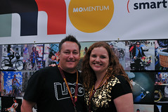
Just because it’s a handmade bike show, doesn’t mean there isn’t other news to cover here in Austin. On that note, last night I ran into Mia Kohout, co-publisher of Momentum Magazine. The successful bike lifestyle publication based in Vancouver, B.C. celebrates its 50th issue with their March edition and Kohout had some major news to share… Momentum has undergone a serious makeover.
The March issue with the new look hasn’t been printed up yet, but Kohout gave me a sneak peek. Saying the new design is “cleaner and a little more mainstream” Kohout said the changes reflect their goal of, “trying to speak to people that aren’t doing this yet.”
By “this,” Kohout means living the bicycle lifestyle.
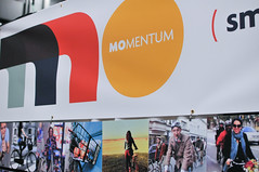
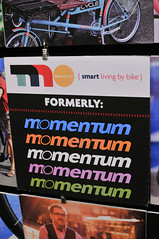
The biggest change is a new logo/wordmark that shortens Momentum to “Mo” and the new tagline “Smart living by bike.” Momentum hired Jim Nissen, a magazine design and marketing consultant to be its creative director and he worked with Kohout, along with her co-publisher Tania Lo, on the new design.
Kohout says she hopes the new look of the magazine, which has more white space and a clean layout reminiscent of a magazine like Real Simple, is meant to connect with who they see as their target readers — “conscientious urban professionals,” which she describes as 30-50 year olds living in cities within four miles of their work. Kohout compared their editorial approach with Wired. “It’s a technology magazine, but it’s also about the technology lifestyle.”
Look for the new, all grown-up Momentum in your mailbox or at your local bike shop in the next few weeks.




Thanks for reading.
BikePortland has served this community with independent community journalism since 2005. We rely on subscriptions from readers like you to survive. Your financial support is vital in keeping this valuable resource alive and well.
Please subscribe today to strengthen and expand our work.
Go Mo!
Yea Mia, looks great. Love Momentum.
I can’t be the only person that knows that there is already a ‘mo magazine, right?
Ooooh, rebranding.
I liked the old logo better, the new one looks like MasterCard
I had the same thought. The new logo leaves me sad.
I like the new look so far, but not really sure about the ‘mo’. Of course the real test will be in the execution of the rag.
The best thing about momentum was it’s price. Hope that doesn’t change.
“…their target readers — “conscientious urban professionals,” which she describes as 30-50 year olds living in cities within four miles of their work.”
I am *thrilled* to see such honesty and clarity in a description of a targeted market in the bicycle industry!