
roof of new bike corral coming
to Dekum Street.
Our story last week about a new on-street bike corral coming to Dekum Street in the Woodlawn neighborhood sparked a lot of discussion. Many readers weighed in with negative opinions about the design (especially the car part) and wondered whether or not there would be more opportunity for public input. I followed up with folks behind the project and got some answers to your questions. I can also share a detailed artist’s statement and updated project drawings.
“The sculpture functions both as provocateur and healer and approaches a potentially divisive issue with a sense of humor…”
— from artist’s statement
The project is a collaboration between the artists (Buster Simpson and Peg Butler), the Bureau of Environmental Services (it will have an planted roof and other stormwater management aspects), and the Regional Arts and Culture Council (RACC).
Kristin Calhoun, Public Art Manager for RACC says the design (see more of it below) has been approved by the RACC Public Art Advisory Committee as a final design. However, Calhoun adds that, “the artists are willing to meet with the community to present the design and listen to feedback if members of the community desire it before the work goes into fabrication.”
Before anyone decides to open this up to more public input, let’s make sure opinions are based on the latest, most accurate information. Below are the current artist renderings of how the bike corral will turn out (NOTE: These are only conceptual drawings. Calhoun says they are not, “an exact rendering of how the final artwork will look, especially the car frame.”):
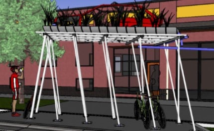
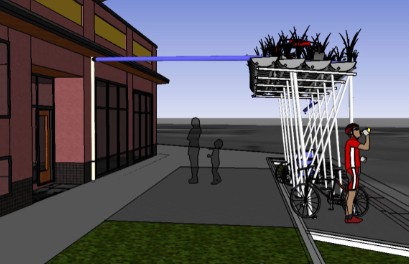
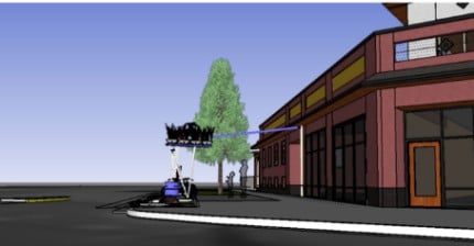

The car seems to be the most controversial aspect of the project (judging from comments on our last story). Calhoun, the artists, and the BES representative wanted to make it clear that the “sculpture will be a gesture of a car relic, not an actual car.”
Here’s more in the words of the artists (from a statement dated November 2nd):
“… the sculptural portion of the project is titled, “Dekumstruction” and is a concept that invokes a vision of a future less dependent on the automobile and petroleum based economy. The sculpture functions both as provocateur and healer and approaches a potentially divisive issue with a sense of humor… The car has been lifted up, overhead, out of the space to allow room for bike parking. The concept suggests making way for modes of transportation that are more environmentally friendly and repurposes the carbon based car as an iconic relic….
The sculpture will be created from sliced and pieced together oil drums, portions of a car frame and living plants. The car frame literally becomes a framing device for ecological transportation and presents a barebones abstraction of the automobile. The canopy will be a living life raft carrying a remnant of a petroleum based economy. Oil barrels lose their power with the car sitting on top, “gone to seed.” Vegetation will eventually grow up through the car to remediate its impact historically and visually.”
You can download the entire arist’s statement here (PDF).
Hopefully this gives you more clarity and background on this project. From RACC’s perspective, the design is final, the project is funded, and they are moving forward toward completion this coming spring.


Thanks for reading.
BikePortland has served this community with independent community journalism since 2005. We rely on subscriptions from readers like you to survive. Your financial support is vital in keeping this valuable resource alive and well.
Please subscribe today to strengthen and expand our work.
I find the effete language of artists statements deeply amusing. Ditch the iron, keep the planted roof such that it changes with the seasons to maintain interest and put a windmill and battery up there to light the racks at night.
Woodlawn Triangle has a huge need for more Bicycle parking- between Good Neighbor Pizzeria, Buffalo Gardens, Woodlawn Coffee and Pastry, the Firehouse, Believe Movement Studio, UpCycles, BASK Massage, etc. There isn’t enough room for all of the employee parking.
There is a long stream of comments about this installation on the “It’s All Happening in Woodlawn” FB page.
I’m usually a big fan of Peg Butler’s work. I’m glad to see that there is still room for neighborhood input.
gregg,
fwiw, the artists did say that the design allows for addition of another level of bike parking above the existing one.
As if having a rusty car on blocks on the front lawn wasn’t an eyesore. They could at least get the skoobie doo mystery machine up there. I’ve seen one racing around Portland –for mysteries and such.
I love it. We need much much more art that celebrates the end of automobility. Hurrah for public art.
I support this, too.
without an actual concept drawing of the car section it’s impossible for us to weigh in with opinions… it still sounds ugly…
mello yellow, I drive by one in SE almost weekly…
You could think of it this way: one day we’re going to have millions of unwanted cars littering our landscape. Not that we don’t already have a lot that some of us would rather do without. This installation seems to anticipate that.
Cars are (already) everywhere. I think appropriating the symbol and juxtaposing it with bike infrastructure is very helpful. Just think of what Santa Rosa did (an obelisk of junked, smashed bikes near a car dealership).
Spiffy:
Have you seen the A-Team van as well? I saw it on a north portland history ride. B.A. called me a fool.
Wow, the artists statement seems more like post-justification of an idea that divides the community rather than brings people together.
This comes off as an US vs. THEM statement and has already generated negative feelings from viewing the concept renderings, and that is from people inside the bicycling community.
Also, why waste an opportunity to glorify the bicycle on what seems to be a fairly cool structure instead of making a subtle attack against automobiles? I would also say that referring to the car as a ‘carbon based relic’ seems to me to be a misguided statement – cars aren’t going away, and attacking the ‘auto’ in this way appears to be an affront to the non biking public. For crying out loud, what is the percentage of the materials that this will be constructed out of that will be brought to the job site via car / truck? Iconic relic – really??
I would also respectfully disagree with 9watts statement (4), and suggest that we need more art that glorifies the renaissance that the bicycle is enjoying in the collective consciousness right now rather than continuing to call attention to autos positive or negative.
Pumping up your cause without dissing ‘the other guy’ is a much better path to go down in my opinion – it makes it easier for the car people to eventually get on a bike – or at least have compassion for people using different modes of transport.
Oh great. Now it looks like a field car
Oh great. Now it looks like a field car
Most Portland public art is misunderstood anyway. Now a giant outline bike sculpture made in aluminum is easy for anyone to understand. Most people aren’t art snobs who care about silly “interpretations.” KISS.
When and where will the meeting with the artists take place? I suggest the Village Ballroom. Or will it wait until the November neighborhood association meeting?
I think art should challenge the status quo. Cars are for better or worse the status quo. The idea that the car’s centrality should not be challenged in a bit of public art suggests to me that some people are in fact worried that the car isn’t here to stay, and don’t want it rubbed in. It is just that kind of conversation that I think good public art can spawn.
And here we are.
Remember these folks? http://www.thestar.com/News/GTA/article/410165
“The ‘Shared Propulsion Car’ is a 1986 Buick Regal that has been converted to a pedal car as part of an art installation by Montreal artist Michel de Broin. Last fall, it ran afoul of the law for safety violations and the charges were dismissed in a Toronto court Thursday April 3, 2008.”
I like it! The context of bike parking under a decaying car just might blow people’s minds. It’s nice to see such an overt symbol of what the future might look like.
My only criticism is that, like many art racks, I wonder how ‘functional’ those poles will be compared to staple racks. I wonder if the design will lead to a few bikes falling over, slipping down the pole, etc.
Great work, Buster & Peg!
Sarah Bott,
There is not a meeting scheduled yet. Sorry if that was not clear. As of right now, my understanding is that they will move ahead unless they are compelled to open it back up for input. Check the Woodlawn N’hood Facebook page for more info.
The concept and its written presentation seem pretty straightforward and intelligent to me. I’m no fan of the worse forms of art-speak either (I’m an artist myself), but artists are required to make statements in the process of getting commissions. Part of the artist’s role is that of provocateur, but with a piece of public art it is always a balancing act between the various elements: aesthetic, material, conceptual, philosophical, and the community’s standards (if such can be articulated) of theses same things. These artists seem to have it fairly close to right, right out of the gate.
All that said, you can’t please everyone. That’s life. But hopefully those whose personal standards are somehow violated by the mere suggestion of a decaying (and now flowering) automobile (and this could be people on either side of the bike/car “debate”) can just let it go and see what time brings as this project is built and becomes part of the neighborhood.
Ok. But can we make it a Ferrari? Something pretty. A fiberglass 308(magnum PI).
1) Anybody who’s ever written one knows artists’ statements are at least 20% BS.
2) Stop over-making bike racks. A simple staple rack is a fine artistic statement. The finest form is function. Simplicity. iPods and fixies attest to that. Heck, my bike doesn’t even need an overhang. It doesn’t mind being wet. Actually it doesn’t have feelings at all.
3) I will cease to spend money in the Woodlawn area over this. Literally. Not a big up-in-arms boycott; more like this… “thing” is just enough to tip my attitude about the area from just-above-indifference, to indifference.
– Your friendly neighborhood art crank.
Buster Simpson did the amazing
HOST ANALOG which is in front of the Convention Center.
Look at the time lapse pictures on the page below, or better yet, go check it out in person. Then you will have a better idea of how the “relic car” will look as overtaken by plantings in the future.There are few ruins in Portland left standing. Although this piece will be a “conceptual ruin”, I think it will be a good thing.
http://www.bustersimpson.net/hostanalog/
“Before anyone decides to open this up to more public input, let’s make sure opinions are based on the latest, most accurate information.”
BUT…
The question remains where was the pre-design public input opportunity? Was there outreach to the neighborhood to input on the concept or review of the call for artists and so on?
The revitalization of the Dekum Triangle and rezoning to make it happen came as result of robust neighborhood input and authentic outreach by the City. That was a process the neighbors owned in helping define and improve their neighborhood.
I encourage you to call Debbie Bischoff at the city and ask her about what went into that project, the outreach employed and the number of neighbors who showed up to participate. I believe you will find that it stands in marked contrast to what was employed for this proposed artwork in the same part of the neighborhood.
It is to their credit that the artists are willing to meet with the neighbors to listen. However, why is this their burden to bear?
If BES and RACC failed to adequately connect with the neighborhood or facilitate any tangible outreach until after “the design (had) been approved by the RACC Public Art Advisory Committee as a final design,” then it is BES and RACC that need to own that shortcoming and correct it – not the artists.
i’m sorry i still think this is an ugly eyesore. why does it have to be so tall? the normal ones in the street that they do on alberta and in other areas allow way more bikes.
how about giving us a choice of several to look at and vote on, rather than ‘this is what we’re going to do’?
or better yet, put in normal bike parking and invest the money in more productive ways like a place for kids to go in the neighborhood after school.
Add some skeletons in the car. Make it more post apocalyptic nuclear war!! Maybe some radioactive mutants.
Or you could ditch the whole car thing and make a design that’s not an eyesore.
Maybe they can add the Rumpspankers sign adorning the car? That would be sweet.
Art by committee is always the way to go go go.
In between the tulips and the junipers we straddle the mundane and inoculating presence of foolhardy causal for what should be considered on one side as good and on another side as wrong.
(Sometimes the committee is right. (Portlandia should face the park. The asshole of a building shouldn’t pour out onto the greenspace.))
quit yer bitchin. I know where you sleep, and sometimes it’s under the weary wary wonder of the wayward wanders of two wheels or two feet. Drifting back into the day while you slumber, recollecting the discarded sentiment of “does this moment mind that I occupied it?”, “did I find the righteous manner”/”would I care to be better if I cared”
strive to strive
You didn’t even know that you’re an artist, yet you create every day.
You could focus your intention anywhere.
You could make any intersection a profound thing.
how about some corugated sheet metal on the roof, connect that to some rain barrels, use that to water some nice plants at the site. sometimes functionality can be the best art
I still think it’s incredibly ugly.
dang,
i thought vanessa had it rough when she had to work with us zoobombers on building a public art bike rack. (hi vanessa!!!)
its ART, people! its not a politician. you dont get a vote. who asked you people, anyway?
OMG that art expresses views and opinions!! it makes people think?? It might offend somebody!!?? who could allow such a thing to happen!!!??
all you people need to go take the “keep portland weird stickers off your subarus and drive them back to vancouver or california of wherever
It seems to me that peoples issue with this isn’t the in your face message as much as how incredibly ugly it is.
I think its in poor taste, it rather see something celebrating bicycles than bashing cars.
But really, its just freaking terrible looking. Who would want this in their neighborhood? Maybe that’s the point though, make terrible art that the community hates so that you can walk around with the smug “persecuted artist that way ahead of my time” swagger.
I think it looks cool. And it DOES include rain barrels; part of its point is stormwater management so I expect they have plans to make good use of that water.
There is tons of weird art in the city. Some you like; some you hate; deal with it.
Since when is art, even public art, something done by committee? I’m sure the artist was chosen based on some criteria. Now we should just let them do their job. I don’t want to come in to any of your work places, look over your shoulder and tell you how to do your job. Why does everyone want to do this with artists?
@cupcake
“who asked you people, anyway?” – Nobody.
A rendering after all approvals were in place was brought to a neighborhood meeting as an information piece.
go “back to vancouver or california of wherever” –
Many of the folks voicing objections here and all everyone voicing objection on the Woodlawn FB site are residents of Woodlawn.
I have lived in the area for nine years (I reside on NE 22nd). During those nine years, I have had the Abandoned Auto Hotline number programmed in my phone.
The reality is that picking up litter, reporting graffiti, and reporting junked and abandoned autos is still a regular routine for me and other neighbors. Among the neighbors I have spoken with, this is the core objection.
Do I want to vote on art? No, I don’t.
But is it really unfair to presume that the appointed officials tasked with selecting public art would take the pulse of the neighborhood before a final design selection?
This particular decision – to put a junked auto up on a pedestal (actual or artist fabrication) in the most visible part of Woodlawn – reflects a pretty pronounced tone-deafness.
Given this, I think the neighbors have every right to voice their objections and attempt to have the process actually engage them rather than just sitting back and dealing with it.
In my comment @23 I called the area by the wrong name – old habits die hard – it’s the Woodlawn Triangle.
My first impression was of a decaying car about to crush some bikes.
It’s ugly, it figuratively elevates the automobile above the bicycle and the bronze New Zealand flax the artists have included in their conceptual rendering will be too heavy for the roof of the structure.
The leaning poles will also lead to falling and fallen bikes. An ideal environment for wheel stompers. Why does “art” take precedence over practicality and common sense?
The sad fact of getting paid as a fine artist is that you have to put together the big pretentious words into a statement about the piece. I think it functions as an ego stroke for the people funding the project, it shows that they are paying for something sophisticated and intellectual.
The current illustration looks like the corner of a farm property where they put the dead cars and trucks. I think if the vegetation were completely encompassing the car so it was the shape of a car but just green it would convey what the artist is trying to convey without looking like a junker sitting in a field.
mello yello what do you have against 60’s vans? They are hard enough to find without people sawing them up for art projects.
And cupcake I’m sure a lot of those Subaru drivers are Portland natives. A Californian would be much more likely to have a cool old Ford Econoline van than a stupid Subaru.
This art in its final form might look gorgeous and revitalize the neighborhood – or it could suck and contribute to the image of a run-down neighborhood in a state of decay. Or any number of things.
I don’t like it. Like Lyle says, it symbolically elevates the car. This art looks even more like an abandoned car thatn the previous art, with the addition of “grass”. I’m from Detroit, a car with no doors in a grassy field is not a welcoming sight to me, even after nearly 11 years of Portlandization.
The real question is, what does the Woodlawn Neighborhood Association think? And what do the neighboring NA’s of King, Piedmont, etc think? They walk, ride and drive through Woodlawn every day, and the Woodlawn folks live there. I would hope the city does some sort of final check-in with the public on whether they feel this beautifies the neighborhood.
I live on that block and would like to chime in. I’m a designer by trade and all day long I have people evaluating and criticizing my work. Some of it is valid, some of it is stupid. But either way, I usually learn something from it. I don’t know this artist or their work. They probably have done some really amazing stuff in the past. This piece, however, is unattractive, overbearing and ill-conceived. In my opinion. But, that’s OK. Every artist has a bad day. even Picasso turned out a stinker once in a while. Hell, the Beatles recorded Maxwell’s Silver Hammer. So, why not ask this artist to go back to the ole drawing board with some of this feedback (which by the way, appears to 95% negative) and come up with a revised concept. It’s not that hard to do and take it from me, it happens every day. By the way, I’m a bike commuter and often frequent this site. Keep up the good work!
ely #32
(There is tons of weird art in the city. Some you like; some you hate; deal with it)
Is this tax money they are spending? who is paying for this? Is this money well spent? does it matter how obnoxious it is? can they do anything? just deal with it?
I also live in Woodlawn, and I hate the idea.
The design is still an eyesore. We’re trying to improve the neighborhood, and someone thinks putting a representation of an abandoned car is funny or “thought-provoking”?
It also detracts from the businesses there. It looms over people at the outside seating at Breakside and obscures the view of people at the tables and inside the brewpub.
Breakside apparently isn’t too thrilled about it, either; they put “art” in quotation marks in a recent Facebook entry.
It’s RACC money and like with the Zoobomb sculpture this is exactly what this money is intended to be used for.
Also, I have to pay for a stupid war for oil with my taxes, so don’t bitch about a bike enclosure.
skid-
would you bitch if they had a war tank on top of the sculpture?
RACC funds- so it is public money. Not a donation or something.
Regardless of appearances, a sculpture is not necessarily a bike rack. Can we who live in and visit Woodlawn Triangle please have some more bike racks as functional as the blue staple racks (or even just some plain old blue staple racks) regardless of whether this sculpture that looks pretty dubious as a functional bike rack gets built?
I live in the neighborhood as well, and while I appreciate the adventurous intentions of this design, (and I do!) I’m sorry to say it is a Fail. It is unattractive and doesn’t seem practical. It looks like it might block the view of the neighborhood from the upper level of Breakside, which would be really sad. Abort.
I was recently in Seattle visiting. My Seattle friend showed me the art project that went in under the Fremont Bridge. In this case there was a community contest – with the community submitting enteries and making the choice as I understand it.
I would like to see the community be involved in what is going to be in the community rather then the top down appoach which is what is being used here.
It has been approved – great – were we asked NO – why not take that approved piece of art and find a community that wants it.
It appears that this one does not.