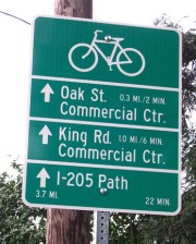
(Photo: Matt Menely)
The City of Milwaukie (which borders Portland to the southeast) has installed its first of 212 bikeway network signs. Milwaukie resident Matt Menely spotted the first one, which is located near SE 28th and Monroe.
The Bikeway Signage Plan project began with a series of public meetings in February 2009 and the signs are a part of Milwaukie’s Bike Plan which was adopted by City Council in December 2007.
The installation will be done in three phases and the first phase includes 48 signs. According to City of Milwaukie planner Brett Kelver, they have $10,000 allocated for the first 40 signs. The signs cost $250 (fabrication and installation) each and money for the project comes from a fund for biking and walking projects set aside with 1% of Milwaukie’s state gas tax revenues. The signs are similar in style to signs the City of Portland began installing back in late 2005.
What’s the purpose of the signs? Here is a list of benefits as laid out in the Milwaukie Bicycle Wayfinding Signage Plan (which was developed by Alta Planning):
Signage can serve both wayfinding and safety purposes, including:
- Helping to familiarize users with the bikeway system;
- Helping users identify the best routes to significant destinations;
- Helping to address misperceptions about time and distance;
- and Helping to overcome a “barrier to entry” for people who do not bicycle often, but who want
to get started.
Below is a detail of a map showing all the locations (the purple line to the north is the Springwater Corridor Trail):
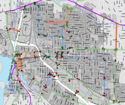
More information on this project at the City of Milwaukie website.


Thanks for reading.
BikePortland has served this community with independent community journalism since 2005. We rely on subscriptions from readers like you to survive. Your financial support is vital in keeping this valuable resource alive and well.
Please subscribe today to strengthen and expand our work.
Nice! But it’s a shame that they couldn’t be made exactly like the ones in East Portland (white background if I remember correctly) for the sake of continuity as cyclists go from one district to another.
I still find signage along these lines to be much less useful to new riders than a system like Berkeley’s. Their bike routes have street signs that are a different color from the standard green, so you know immediately when you’ve come upon a bike route, no matter what block (and if you have even a general sense of where you’re going, you can just ride it until it intersects another bike route that will angle you closer). Wayfinding signs like these or the Portland version aren’t nearly numerous enough to do that.
The Milwauke signs look as if they’re designed according to MUTCD guidelines, the national standard. Vancouver/Clark County did the same thing a couple of years ago. Portland started putting signs up before the MUTCD standard was developed & published.
Hi Jim…
….from the photo above…I am not sure that the City of Milwaukie signage meets the current Chapter 9 of the MUTCD (Page 799):
http://mutcd.fhwa.dot.gov/pdfs/2009/part9.pdf
The new MUTCD design is more similar to a true ‘finger sign’ than Portland’s older design work. Perhaps Milwaukie combined both styles (Portland’s layout and the MUTCD font/ colours) – a hybrid of sorts?
[My thoughts: Perhaps this signing effort either got approved very quickly before the final MUTCD changes were approved or used only local funds to streamline the project?]
Milwaukie – Best Suburb Ever !
They are very good planners, and you can always see them at the booth at the farmers market.
Signage – very important. I learned that from the Mia and Mia article in the last Momentum.
(Why oh why is there an auto insurance add in my bikeportland ??)
re comment 4, at para. 9B.22, the MUTCD discusses the use of “auxiliary plaques” in conjunction with the basic route guides. stacking these onto a single sheet of metal is probably okay.
The style of signage conveys intended use.
Signs for cyclists that resemble road signs, and are consistently applied EVERYWHERE, imply that cyclists are using the road lawfully.
Signage that is inconsistent in style; different shapes, sizes, and colors; implies that the cycling public are without direction. Too often signage for cyclists too closely resembles the signage for recreational areas and activities – thus further reinforcing the idea that cyclists are not serious road users.
Use the MUTCD and love it or expect anarchy.
To Jim, Todd, and others concerned about MUTCD –
I had a conversation about bicycle wayfinding signage with Bruce Friedman a few months ago on this topic that may clear some things up. Or, it might just raise more questions. Here are a couple of key things to note.
1) While Portland’s, Milwaukie’s and other cities’ bicycle wayfinding signage is not included in the MUTCD, it is not technically in violation of it. With few exceptions, the MUTCD cares only about traffic control devices. Wayfinding signage is guide signage, and not considered a traffic control device.
2) These signs are variants on the D1 series of MUTCD signs. ODOT has specifically approved an exception for the City of Portland to use sign OBD1-3c in place of MUTCD D1-3c. See page 28 of this PDF. As noted, Milwaukie’s sign is slightly different than Portland’s.
3) Approving these signs to MUTCD through experimentation would follow a different model than experimentation is usually done for MUTCD. Because guide signs don’t change traffic control and probably don’t change travel behavior at the exact point of installation, any efficacy of the signs is hard to measure. It would probably take some type of before/after survey, and might be large and expensive in order to yield any conclusive result. If anyone has any good ideas about an effective experiment design that could measure bicycle wayfinding signage, I’d guess that someone at PDOT would be happy to hear about it. The MUTCD Bicycle Technical Committee could be interested too.
For other folks not familiar with the MUTCD, one thing to note is that compliance with the national standard is not actively enforced. Voluntary compliance is achieved because jurisdictions not complying with a national standard are at higher risk of being held responsible if someone sues and claims a traffic control device was flawed and caused harm/damages. Bicycle wayfinding signs, as guide signs and not control devices, are at much lower risk of being the subject of litigation. Cities can therefore experiment with this type of signage without much exposure.
Hi Elliot – for the readers… you do bring up an important difference between informational signs (white on green, etc.) and regulatory (black on white, etc.).
Thanks for more discussion on the issue.
These initiatives in wayfinding signs are very important as I travel a lot to areas where I am a bicycling visitor and find them very helpful.
Though I would hope the future MUTCD editions allow for font boldness and sign enlargement when these signs are placed on a very wide arterial or intersection. During Chicago’s demonstration period – I had difficultly reading their MUTCD type signs when used on very wide oneway streets – especially when the bike lane was on the left side.
MUTCD-compliant or not, I like how they give both riding time and mileage.
Vancouver WA put in MUTCD-compliant signs, and they lack the helpful “minutes” metric.
Nice work!
Ted Buehler
Jonathan,
Thanks for doing this story!
It’s nice to see these signs finally going up. I hope that it is just the beginning of more/bigger bike related projects in Milwaukie’s future. I also hope that seeing these signs & story will encourage more people in Milwaukie to get involved.
I was surprised by the number of views this photo got over the weekend on flickr!
It is really great to have time on the signs. It should be bigger though so drivers can see it.
Jim (#3), Todd (#4) – Good catch, they are designed similar to MUTCD guidelines. The sign design was discussed extensively during a public process about a year ago, and the sign design is also similar to the one ODOT adopted at the state level.
The process wasn’t exactly quick. There were a couple of public meetings that were sparsely attended (there were about 5-7 people for each meeting), and sign design and locations were the primary focus. As usual, Brett Kelver did an outstanding job getting the public involved (kudos also to City Planner Katie Mangle and the entire Milwaukie planning staff)
This project is a great example of why it’s important to get out to the various project meetings – there’s a tremendous opportunity to influence the design, planning, and implementation of bike-related projects, and it only takes a couple of hours of one’s time. Citizen involvement is extremely important and helpful for the planners.
It’s great to see this project be implemented! Milwaukie in the last 3 years has come up with an outstanding bicycle plan as part of their Transportation System Plan, developed a bike signage plan, installed new bike parking, and is now getting the signs up. Not bad for a community of 20,000 with a very small transportation budget!