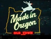
The effort by University of Oregon to re-design downtown Portland’s iconic “Made in Oregon” sign is once again in the news. Now that they own the building it is attached to, UO wants to make some changes to the sign. The issue created a bit of a dust-up at City Hall and now the Historic Landmarks Commission has rejected the plans.
Meanwhile, Portlander Curt Gardner sent me over how he thinks the sign should be redesigned.
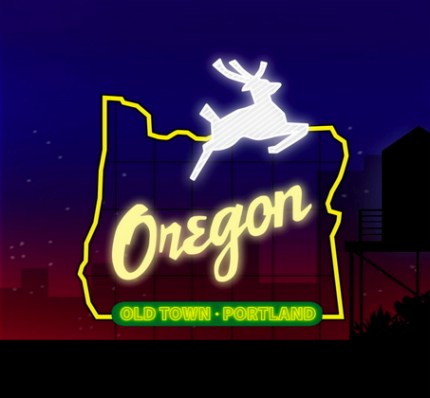
In the upper right is how the sign looks now. Below is a mock-up of what UO wants to do with the sign (they also want to put a neon “O” on a nearby water tower, which is what the Landmarks Commission didn’t like):
And here is Curt Gardner’s awesome idea (as posted to his blog a few days ago):
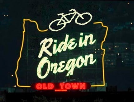
Nice work Curt. Too bad this isn’t a public design competition. If it was, you’d get my vote!





Thanks for reading.
BikePortland has served this community with independent community journalism since 2005. We rely on subscriptions from readers like you to survive. Your financial support is vital in keeping this valuable resource alive and well.
Please subscribe today to strengthen and expand our work.
Maybe we can revamp the sign to say, “Should bicyclists pay road use taxes?” I think that would be really popular.
The stag is my favorite part of this sign! I think replacing it with a bike is the worst sort of defacement. I’ve stopped caring what it actually -says- since they changed it to say “Made in Oregon” but please, for gods sakes, leave the stag.
~sad native
Replacing the stag would be sacrilege.
I hear you about the stag. I agree it’s pretty cool… how about a stag riding a bike? ;-).
No way. The stag stays.
I think they should leave it as it is. I understand that Made in Oregon is a gift shop and that’s where the current sign came from, but I like that it really references so much more. Things are made here, ideas are made here, people are made here (in every sense).
I say leave it as it is.
Regarding UO’s idea, letting the sign say only ‘Oregon’, doesn’t really cut it. If UO could set their obsession with self promotion aside in the interest of all of Portland, they might be able to recognize that ‘Made in Oregon’ has been and is working pretty well for everyone.
I’ll give UO credit for the yellow-green color change of ‘Old Town-Portland’ from the red ‘Old Town’. That’s a good change.
I like Curt Gardners idea for the bike on the sign, but somehow, it doesn’t look so good as the stag. How about an animated procession of bikes just above the ‘Old Town-Portland’ of UO’s design? Also, instead of ‘Ride in Oregon’, maybe just ‘Oregon Rides’.
I noticed the bike in the sign has no front and back lights. If you’re gonna kill Rudolph, at least make his nose a blinking rear light.
A bike… Really?
Feeling ill.
I’ve been around long enough to appreciate the stag and the “Made in Oregon”. The green is fine too; it says who we are.
The “Ride in Oregon” could be fine as a separate sign somewhere else. It’s in the same spirit as “Go by Train”. It also says who we are and, most importantly, what it is we are after or who we’d like to be. Nice work, Curt.
How about “white sugar”?
I have no problem with removing the stag and replacing it with a bike. How would that be more sacrilege then the original removal of the original White Satin Sugar sign?
Don’t replace the stag, put it on a bike…
bowchickbowwow
Ok, leave the stag. But how about someone making this (Ride in Oregon) as a T-shirt? I’m down with that!
WSBOB —
For once, I agree with you 😉
People love the sign. It’s an institution. How is UO’s desire to change it anything other than self-serving?
Typographically speaking, having just the ‘oregon’ in the middle with all that empty space above it, then having the stag crammed up at the top edge makes no ‘compositional’ sense at all. Hopefully UO decides they love the sign so much they shouldn’t want to change it.
yeah! I want that as a T-shirt too!
I thought a t-shirt would be great too… and I’ve already gotten permission from Curt Gardner to use it (thanks Curt).
now… who can help us with putting the design into t-shirt form?!
f5….a meeting of the minds is always encouraging. Hopefully, the people behind determining this sign’s next rendition will be able to have such a meeting. UO grads are after all..’Made in Oregon’ aren’t they?
Maybe instead of animated bikes moving across the lower part of the sign, there could be animated ducks waving UO pennants…sounds corny.
How about “Marketed in Oregon, Made in China?”
I feel like the sign issue has been settled by the City Council and the University of Oregon as much as it is going to be settled. The “Oregon” change from “Made in Oregon,” I think keeps the most people happy.
What I am not a fan of is the blatant use of the University of Oregon “O” on the water tower.
The proposed “O”‘s would replace the lettering on the current water tower which reads “Old Town: Portland’s Historic District.” I think this is a travesty and have proposed a potential new agreement that maybe people can get behind.
You can read about it on my blog at: http://pdxme.com/?p=483
Cute. But it is the stag that is the icon.
~n
Where have I seen this before….
Oh yeah.
http://www.ruckuscomponents.com/
I have to admit that the stag is cool!
(Sorry if I offended anyone’s sensibilities by my bike substitution! I see that feelings run deep on the sign.)
The bike design is really nice as a T-shirt, but leave the sign alone! I don’t know what UO is thinking, messing with such a treasured local landmark (and pretty much the most interesting part of the skyline short of Forest Park and a few bridges, IMO). How do they figure that blundering into town, defacing a landmark, and ticking everyone off in the process is good self-promotion?
Fun idea! A t-shirt would be awesome.
P.S. UO does not own the building; they lease their space.
It seems a bit disingenuous for UofO (based primarily out of Eugene) to stick a big self advertisement in the middle of downtown Portland, home of Portland State University. If PSU were to propose a giant Vikings sign along Franklin Blvd, I’m sure there would be all manner of ruckus.
I like “Made in Oregon” better than just “Oregon,” but eliminating Rudolph and his red nose at Christmas would be a sad turn of events.
@f5 (#13): I’m no graphic designer, but the vertical space over Oregon gives the stag room to jump. The current design has the stag in a jumping pose, but there’s no vertical clearance, so it looks awkward.
I think the stag should be replaced with a coffee cup and “Oregon” should be replaced with “Kalberer Hotel Supply”.
Or the stag replaced with a sheep and “Oregon” replaced with “Columbia Scouring Mills”.
Or… I dunno… “white stag”? that kind of rolls off the tongue nicely.
Wow. It looks like WWeek wanted in on the action:
http://blogs.wweek.com/news/2009/07/14/yet-another-suggestion-for-the-made-in-oregon-sign/
Neon letters saying “Joey Who?” would be a nice touch.
I think it should be changed to a dude doing a big line of meth. I’d even except somebody smoking or shooting meth. I’m sure there are as many or more people who do meth than people who ride.
The bike culture in Portland is getting a little too full of themselves.
And I don’t care what that sign is, it lost it’s character long ago. It’s nothing more than a billboard.
Made in Oregon is a company that descriminates. Also is owned by Naito Co. who owns most of the run down buildings downtown and the empty mall downtown…
I say take it down and CHANGE IT! also change naito parkway to Cesar Chaves (smiles) just kidding here
I’m a fan of UO. I prefer the nature treehugger theme and keeping the sign as is. A perfect opportunity to preserve some of Portland’s history.