According to the Federal Highway Administration, Americans drove 12.2 billion fewer miles this past June than a year ago.
An Associated Press article published yesterday, Traffic fatalities driven down by high gas prices, highlights a new study that draws a direct connection between less miles being driven and the lowest number of traffic deaths since 1961.
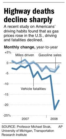
The study was completed by the University of Michigan Transportation Research Institute. The author of the study, Michael Sivak found that over a 12 month period (April 2007 to April 2008), as gas prices rose, driving and fatalities declined.
From the AP:
“The surprise, said Professor Michael Sivak, author of the study, was the huge decline in fatalities in March and April as gasoline prices surged above $3.20 a gallon.
Over the previous 10 months, monthly fatalities declined an average of 4.2 percent compared to the previous year. Then, Sivak’s data shows, fatalities dropped 22.1 percent in March and 17.9 percent in April of this year — numbers that did not show up in a recent federal report that tracked a drop in traffic deaths through the end of 2007.”
It’s an interesting article and I recommend giving it a read.


Thanks for reading.
BikePortland has served this community with independent community journalism since 2005. We rely on subscriptions from readers like you to survive. Your financial support is vital in keeping this valuable resource alive and well.
Please subscribe today to strengthen and expand our work.
Just the thought that that\’s billion miles with a \’B\’ reduction, is insane. I\’m having a hard time wrapping my noodle around that. If my math is anywhere close to correct, that looks like 18 trillion miles??
It would be interesting to see the graph pictured above going back to the stated 1961 year mentioned. Just showing two years doesn\’t mean much if it\’s a normal cycle. I\’m not arguing it is, just saying it\’d be interesting to see. It is nice seeing the spike go down though!
Not that I disagree with the general idea presented here, I must point out that there is another way to interpret the data. Prices of anything have to be evaluated with consideration to adjustment for inflation and income. This article gives consideration to these things:
http://www.economistblog.com/2008/03/09/real-gas-prices-weve-had-it-good-for-a-long-time/