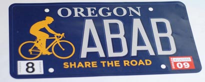
(Note: The plate is solid dark blue, the photo has some reflection on it.)
A bike advocate, a state legislator, a graphic designer, a former State Trooper and a rep from the Oregon DMV are currently working to resolve a design issue with Oregon’s new Share the Road license plate.
Applications for the current plate are on hold because the plate’s designer, Steve Sandstrom of Portland-based Sandstrom Design, does not approve of some key design changes made by the DMV prior to making the initial batch of 500 plates.
The main point of contention is that the plate was initially designed to fit five symbols. When the DMV said it could have only four letters, the designers re-configured the spacing to keep a sense of balance. But when the plates emerged from the DMV, that spacing was not maintained (the letters were forced to the right, see photos below).
As a result, Sandstrom has refused to sign off on the design.
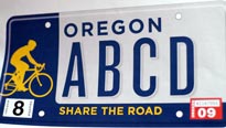
Notice the spacing.
|

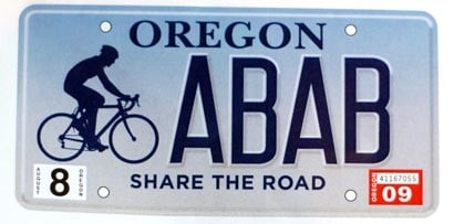
DMV’s final version, which the designer will not sign-off on..
|
According to key proponent of the plates, Cycle Oregon Executive Director Jerry Norquist, the current design has been discontinued and the DMV will issue a recall once a new design is agreed to. Anyone who has already received the original version must replace it with the new version (you are not required to return your plate).
Last Friday in Salem, in an attempt to get the plate back on track, Norquist met with Oregon State Senator (and main legislative sponsor of the plate) Floyd Prozanski, plate designer Steve Sandstrom, retired Oregon State Trooper Ken Chichester, and a legislative liaison from the DMV office.
The group tried to agree on which new plate design should be adopted.
The DMV rep was presented with three choices. The first choice was a plate with an all dark-blue background, white letters, a yellow rider and a yellow “Share the Road” slogan (see top of article). The second choice is the same, but with a small white border around blue background. The third choice (below) has a light-blue to white fade and dark-blue letters…
In the meeting, the DMV rep leaned toward the first choice but wanted to make sure they were able to make it. After checking on it, they then said it could not be an option due to the dark background and white letters (which seems strange given the design of the existing Crater Lake plate).
If the dark-blue and white letters option doesn’t happen, the final choice is likely be the blue-white fade design. All parties agree that this option could work, although there is some concern that the “Share the Road” slogan is not visible enough.
Norquist is working with Sandstrom to iron out a few final design issues and they hope to come up with something that works for everyone very soon.
This may seem like a lot of back-and-forth for just a license plate, but the stakes are high. In order to encourage sales, backers of the plate want to make sure the design is appealing. If 1,000 plates can be sold in the first 12 months of issue, the DMV will refund the application fee of $10,000.
On the other hand, if less than 500 plates are sold in the first 12 months, the plate will be listed “inactive”.
Norquist, whose goal is to get “Share the Road” on every Oregon license plate, says initial interest and sales have been brisk, but a better design would help them sell even quicker.
Stay tuned for a final decision.


Thanks for reading.
BikePortland has served this community with independent community journalism since 2005. We rely on subscriptions from readers like you to survive. Your financial support is vital in keeping this valuable resource alive and well.
Please subscribe today to strengthen and expand our work.
I like the dark blue background better – kind of a retro look going back to the blue Oregon plates of my childhood. Wish all the lettering was Yellow. The blue fade is nice too.
\”After checking on it, they then said it could not be an option due to the dark background and white letters…\” editor Maus
Why are the dark background and white letters a problem? No explanation offered? The top plate looks just fine. Nice to be able to see the entire cyclist silhouette. I think I like gold for the cyclist rather than dark blue. Not so crazy about the light-blue to white fade plate.
I like the blue fade. I hope they go with that. I\’ll order the plates even though they have got that roadie on there! Everyone wants their own particular kind of bicycling on the plate – for me that would be a 406 wheeled fixed gear folder. But they probably wouldn\’t get too many orders for that – maybe ONLY me!
I really like the solid blue. But If the current design graphics were flopped you would have a rider in a bike box.
How about picking up the previous suggestion of using the image of Brett Jarolimek\’s stencil vs. the current graphic? (With the designer\’s permission of course.)
http://bikeportland.org/2007/11/13/remembering-brett-jarolimek/
I vote for the dark blue design. It has a more unified and graphically stronger presence than those with the subdivided sections. Besides that design also seems to show the entire cyclist. Not one that\’s been nicked off the back. The light blue is my second choice, but I\’ll probably buy it regardless of the design they choose.
I like the dark background with white letters, but why are they limitiing the plate to only 4 characters? can\’t anyone there do basic math? That\’s only 456976 possible plates they can sell, including all the potential 4 letter cuss words that will have to be excluded in several languages…
Opus
Yeah, what\’s with the dorky roadie? how \’bout a retro commuter with a DJ lid?
Honestly, I don\’t care that much how they look, as long as you can read \”share the road\” and see a bike. Let\’s get the plates to the people! (Then, leave it parked and ride.)
Oh, boy! I\’ve got a collector\’s item 😉 if I get to keep the original plate. Should I put it on ebay?!?!
i cant decide…
tempest in a teapot?
or mountain out of a molehill?
that such an INANE design \”issue\” is holding this up is just ridiculous. i mean, really…
its a *license plate*. how it looks will be as important to anyone else on the road as your bumper stickers are, probably even less (that is to say, not at all). itll perform its intended function (raising money) just as well no matter how it looks. just press the blasted things, in white on black, blue on lighter blue, or freaking green on pink if thats what it takes, and get em on cars.
This sucks. I\’m waiting on two sets of share the road plates.
I don\’t care what it looks like, just send me the plates before my temp tags run out.
I think they ditched the blue background due to all the metal plates having a white background. I think the crater lake plates are made out of some other material.
\”That\’s only 456976 possible plates they can sell\”
Well if they add numbers to the mix it would be 1,679,616. Of course, excluding the curse words you can make from numbers and letters…
Oh, fer cryin\’ out loud, just pick one! Somebody should make an executive decision and move on.
Both options seem much more appealing then the current plate. I wonder if the top plate (the dark blue) could have yellow letters instead of white to meet the criteria? That would be a fun throwback to my childhood.
We parked next to another car with Share the Road plates tonight. Nice to see two of them side by side!
I\’m also stuck with a temporary tag while I await the plates; it\’ll be a pain in the neck if my tag expires before the matter is settled (and from the sound of it, that could be the case).
Also, will the DMV take into consideration the impact this delay could have on plate sales? If these license plates aren\’t getting onto cars, fewer people will know that they exist and therefore fewer people will be likely to sign up for them. If applications are on hold, is the 12-month timeclock on hold as well?
\”if applications are on hold, is the 12-month timeclock on hold as well?\”
I should have addressed this… Yes, as I understand it, part of the negotiations with the DMV will include a request to reset the time clock to a fresh 12 months.
Appears as if Steve Sandstrom has done a fine personal PR effort on his part for a design which could have been best served by a middle school art contest?
Can we stick \”Pacific Wonderland\” somewhere on it too?
Anon, why would you want to do that?
The blue fade design is nice..will go beautifully with my \”vintage Honda- blue\” car. Yes, the other is an instant collector\’s item. Save it. It will be worth more later
The design may not please everyone, but we do have oue STR plates here in WA.
wsbob #19
That\’s what the old gold on blue plates said.
Classic Oregon plates, blue with gold lettering is my preference too.
Can they add a mountain, a fish and a lake somewhere on it too?
I\’m a bit shocked to hear that only 500 or so plates have been made. My wife got her plates in January (ordered them the first day they were available) and they ended up being DD**.
We\’ve had a lot of folks ask us about them because they just aren\’t out there. I haven\’t seen a single other car with the plate yet.
I just ordered mine yesterday and they gave me a 90 day trip permit. They said it will probably take that much time to get them. Also funny was the fact that these plates cost me less than our current plates which support the arts
Jonathan, If they are looking to sell 1,000 plates and the inital batch of re-called plates was 500; how fast did that 500 sell out? or did it? could this give us an estimate of how likely selling 1,000 will be. Just curious if you know that info. thanks. P.S. I like the blue backgound also.
Well … to be fair … there isn\’t much art work going in to these to support on these plates.
I received mine, and don\’t much care how they look. I\’m happy to pay to support the cause, get some more exposure for cycling in the PNW. My plates are DDY. Wonder what letters they started with? Perhaps in the AA\’s?
The dark blue ones rule…kind of like the old Pacific Wonderland plates.
Yes, all the letters yellow would be great as well!
I have some Pacific Wonderland plates, and my friend does too. They are very easy to read.
It is nice to see the original design. Steve Sandstrom did a good job. I was poo pooing the design earlier, but I see now his original idea was messed with. Good job Mister Sandstrom.
I don\’t know. The blue with gold clashes with my \”Share the Road\” bumper sticker, but the fade to white doesn\’t quite complement my \”Start Seeing Bicycles\” bumper sticker. Such a quandary.
And only four letters?? How am I supposed to spell out \”ROADIE\”? I can\’t even do it with a \’Y\’! I think they should add more letters and make the guy ride a unicycle…
I was ready to pull the trigger on one of these plates even tho the design is just completely dorky. Interesting that the current designs had a much more clean and inspired beginning… I would hope the client doesnt take design-matters into their own hands like this again. Compared with other plates like Crater Lake, Arts, etc (even the classic pine tree) which have at least some aesthetic appeal, the current Share the Road plate looks remarkably amateurish and out of place.
I remember when Oregon plates were yellow with blue letters.
Why not go that route again? Classic!
Blue and gold!
Blue and gold!
Blue and gold!
I would love to know why exactly DMV doesn\’t think they can make those. Too close to the old Pacific Wonderland plates? The fading version is lame – it looks like a mid-90\’s web page background. If the Oregon at the top blinked, it would be pure AOL flashback.
Of the 3 I would vote for the last one, the faded light blue to white. The original designs with their high contrast colors and blocky format are just too abrupt, maybe even confrontational compare with the third. It gives a feel of a stone wall separating the areas. The third with it\’s fading color scheme presents more of a feeling of cooperation, or sharing. I also like that all of the cyclist is shown and is more prominent unlike the original design with it\’s chopped cyclist which makes the cyclist look to be something of an after thought.
My $.02
BillD, thanks for that explanation. I knew about the old \’pacific wonderland\’ phrase, but thought Anon might have been sarcastic in suggesting it on this plate in addition to its present composition. That phrase is great as are some of the other suggestions of mountains and lakes, etc. It just gets down to the reality of how much stuff you should want to cram onto this little plate. Simple might be better. Save \’Pacific Wonderland\’ for another special re-issue plate.
Dorky Roadie, you can spell roadie with 4 letters: ROA-D, RO-DE, RODY. For the first two, you just get yourself a little reflective tape and stick your own hyphen in there. Not sure it\’s legal, but I\’ve seen it done.
I like the last one better than any of the other options, including the original. It could only be improved by including the mountains in the background, like all the other non-profit plates do. 🙂 Of course, I\’ll be getting one for my car regardless.
YO! Just give the extra $$ you would pay for a f\’n license plate directly to the BTA for an annual membership. Put a cute share the road bumpersticker on your car and call it good.
Really…it\’s license plate for a car. If you really care, bypass Salem and give your money directly to a non-profit that is making a difference…NOT the DMV.
This is a good benefit to the community since it reminds drivers there are bikes on roads and cyclists in cars at times too.
My \”concern\” is there are too few characters \”ABAB\”. In Washington the WSU Cougar plates ran out of characters and DOL began flip flopping designs and adding numerals. While this is not a big deal I see the demand to far outstrip the production.
Chandler
Using alphabetic characters rather than numbers the four characters amount to almost 457,000 plates, less any four letter vanity plates. If we run out of letter combinations we can start a new plate.
They need to sell 1,000 in 12 months? What percentage of total plate sales would that be? It seems like they would sell 1,000 at the drop of a hat, no? I tried to get a set and was told not to because they may never come, but when they are issued I\’ll order a pair from the DMV for sure. And in response to the previous comment about giving the funds to the BTA directly, I\’m a member and biker and can think of few better ways to get people looking at the words Share the Road over and over and over. Props to the people who are working (and re-working) on this.
the fade is lame. solid blue w/ gold is much more visible. and attractive IMO.
I have a set of Share the Road plates, and just got the notice that I have to return them. I\’m bummed. I really like the current design. We didn\’t have any trouble getting them – they came in the mail within a couple of weeks.
Standstrom originally designed a great plate. The gold bicycle with the gold \”Share the Road\” stands out. Isn\’t that what it\’s all about?! I ordered the plates unseen to support a good cause and am now on a second permit dangling from my rear window. Send me the plate before I cancel the order!