In case you haven’t been paying attention, the Sellwood Bridge Project is slowly but surely reaching some important decision points.
Since bicycle and pedestrian issues will play a major factor in the design of this bridge, we should all be paying attention.
You have until this Wednesday (11/28) to weigh in on the latest online survey. Also on Wednesday is an open house where Multnomah County and project reps will receive input and share information on the final six designs still under consideration.
To get a better sense of the possibilities, check out these lifelike renderings of the six designs. (Images courtesy TY Lin International/CH2M Hill).
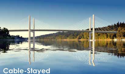

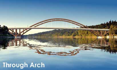
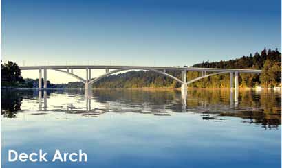
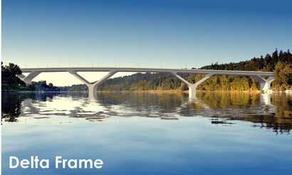
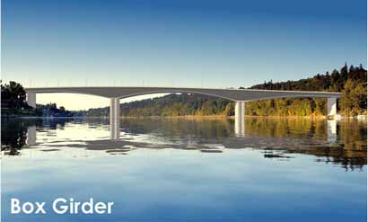
After tallying the survey, and receiving input at the open house, the Community Task Force will make their final recommendation for which bridge types should move onto more detailed study on December 3rd. Then , the Policy Advisory Group will make a final decision on December 10th.
After an environmental study of the remaining options is completed, a “preferred alternative” will be selected next summer.
Here are the details for the upcoming public open house:
-
Wednesday, November 28
6:00 to 9:00 pm
Oaks Park Dance Pavilion, just north of the bridge at 7100 SE Oaks Park Way.
*A short presentation followed by a question and answer session will be held on the hour at 6, 7 and 8 pm.
Editor’s Note: For your reading convenience, I’ve organized all my Sellwood Bridge Project articles into one category. Check it out.



Thanks for reading.
BikePortland has served this community with independent community journalism since 2005. We rely on subscriptions from readers like you to survive. Your financial support is vital in keeping this valuable resource alive and well.
Please subscribe today to strengthen and expand our work.
Beautiful renderings. Nice that they show how the reflections in the water might look. On the basis of appearance and aesthetics alone, I\’d personally prefer the Deck Arch configuration. Not as elegant as the existing bridge, but evokes some of the same grace.
The Cable-Stayed is interesting but too severe in appearance. The cables don\’t arc.
Very important is that the final design doesn\’t succumb to pressure for an increased volume of motor vehicle traffic over that of the current bridge. This is the bridge project that can start making a break from the pattern of devoting bridge use primarily to cars, for one balanced more equitably to healthier modes of transport; bikes, skates, walking, bus, trolley, light rail, etc.
At a few thousand bucks a pop, they should be nice pictures.
The through arch has a leaping quality and rhymes (visually) with the Fremont, at the other end. I find the curve has a very graceful, reaching quality. Having said that, all the renderings are what critics would call \”handsome departures\”. Here\’s hoping for the best. Thanks, Jonathan.
wsbob,
also keep in mind the bridge options for the portland-milwaukie light rail project. the leading options will have no car traffic, but may be open to buses and most definitely bikes/peds and streetcar.
That Delta Frame sure is pretty – not to mention one of the moderately priced options. Although I\’d be happy to ride across any of them.
I would vote for the simplicity and minimalism of the extradosed. How about we strive to be as sustainable and green as possible on this project?
Where do the trolls live?
It looks like the Through Arch might be the best option for the river since it has the greatest span between the supports. I heard something about predators like to wait next to the supports and grab fish that go by, so having them few and far between seems good.
Through Arch looks pretty too, but I\’m actually not an expert about the fish thing, so if someone else wants to comment…
Not to be overly critical, but the bridge designs look like they were lifted directly from a civil engineering textbook. Also the renderings are on par with what one would expect from an intermediate photoshop user–not the high quality that most architectural firms are putting out these days . Note the unrealistic rendering of the sky, etc. Again, not trying to be mean, just saying… I think the designers should be thinking more out of the box. How about a median with trees and other vegetation in order to offset some of the carbon from the cagers? Let\’s make something that lasts for several generations, think Brooklyn Bridge updated for modern times. Just saying…
Like Big Kahuna I got the Photoshop con right away. Some aesthetic dingbats are blowing smoke and flashing mirrors on this.
At this stage in Metro\’s Springwater 3 Bridges project the design engineer had produced scaled drawings and was on hand to answer questions. Same engineer was at the dedication to follow up. Fabulous results!
So far there is no public evidence that any actual engineering has been done on replacing the Sellwood. The County has built a PR bomb shelter.
I\’ve been to public meetings: ask a real question and the head flack will shut you up in a hurry!
#10: At this point, minimal \”engineering\” has been done. That\’s not the purpose of the process the County has undertaken. The federal process mandated for the Sellwood is not comparable to the process undertaked for 3 Bridges. Columbia Crossing is a more relevant comparison.
These examples pretty much WERE taken from textbook examples, scaled to fit the crossing width, span-length limitations of the different bridge types, river clearances mandated by the Coast Guard, etc.
The County is nowhere near ready to enter into design. The current project is to develop alternatives an analyze them in an EIS. The meeting on Weds. is to discuss the final element of the bridge: bridge type.
Decisions have already been made regarding alignment and cross section (including number of motor vehicle lanes, configuration of bike and pedestrian facilities, etc) for the four alternatives to be analyzed in the EIS.
In the design phase, the recommended bridge type will be designed in detail, possibly including color, treatments to make piers look like stone, all sorts of ideas, garnered from the ongoing public process.
Wait. They\’re photoshopped? I thought those were all real pictures! I\’m glad this fraud was pointed out. I hate being duped and now I hate the Sellwood Bridge project. Thanks, Big Kahuna!
Carl, I think we all understand the definition of a computer rendering. All I\’m saying is that I would be a little disappointed if after spending my hard earned money, this is all I got–a rendered image of textbook designs (and a rather shabby one at that). Wait a minute, I sort of did spend my hard earned money on this!
I think all bridges are decent and would ride across any one.
From a long term engineering standpoint, my vote went to the arched design since this has stood the test of time for strength, reliability, and efficiency. Though I\’m sure any bridge would be designed soundly, there are any number of unforeseen concerns. Fewer supports looks ideal. Not so thrilled that it mirrors the Fremont, but such is life.
Note that the really cool designs (Cable and Arch) are significantly more expensive than the others. My personal opinion is that such aesthetics are worthy considerations for such a large-scale, semi-permanent structure in such a prominent place with respect to our City\’s (and Neighborhood\’s) natural features. I am willing to pay more for such beauty.
However, that seems to run counter to the \”starve the public services and infrastructure\” mentality of many in the area. If nothing else, at least the Delta Frame adds a little novelty in an otherwise purely functional piece.
I\’d like to echo what Laura said above – trying to ask an engineer to do engineering on the project using what we have to work with now would be like asking an architect to design a house, without telling them what the lot dimensions are, how many bedrooms, bathrooms, floors, what type of foundation, other types of architecture in the neighborhood, etc.
That\’s what this process is for – since this would be a bridge that would be owned by everyone, same as the current bridge, we\’d like to know what people want, rather than just assume or force something. These are just graphics to get people thinking of what they\’d like to see, just like the lines on the map (remember Yellow, Blue, Teal, Purple, etc.?) or the lettered cross sections.
Of course, the county could\’ve called someone like Bechtel or Halliburton if they wanted… but they didn\’t (and didn\’t want to), so that\’s why we have this process.
Like to also say there\’s two other things that could keep anything from happening, and we\’d be stuck with the same bridge… 1) public disagrees with the outcome/locally preferred alternative, 2) funding sources for local amounts go up for a vote and it fails. In either of these cases, we\’d have another report on a library shelf, which is not what anyone wants.
So, if you\’re interested, please take a little time and stop by on Wednesday night. It\’s better than TV reruns or hours online… 😉
Thanks for the coverage.
Jason Barbour of the CTF (These thoughts are my own; I\’m not posting on behalf of the CTF or the county or anyone else.)
Typical Portland! They are offering us the chance to weigh in on the bridge type before one is chosen and designed, and all some people can do is criticize the quality of the graphics. These are basic concepts to allow public input. Look for the forest through the trees!
Big Kahuna #13: The County asked the engineers to do the photoshops with as generic a look as possible so that folks doing the survey or attending the meeting would be comparing basic bridge types. They could have done some colors, treatments, but they wanted folks to react to type, not \”style.\” Some of the types lend themselves to artistry more than others. But, again, at this point they are analyzing bridge type…not design.
a.O. #15 – Something to think about: One alternative will be to rehab the existing Sellwood Bridge for motor vehicles and build a new bike/ped bridge. Comments made by members of the Policy Advisory Committee at their October 1st meeting suggested that a \”signature\” ped/bike bridge might be appropriate. IIRC, the idea was suggested by Sam Adams and Robert Liberty.