(Photos: Jonathan Maus/BikePortland)
Welcome to our new Bike Parking Review column.
Grading bike parking is something we’ve done for years around here, so I thought it would be fun to give it a bit more structure and have some set judging criteria. This will hopefully give people a better guide for how to advocate for and create quality bike parking.
Quality bike parking is an absolutely essential ingredient to create a strong culture around cycling and increase the number of people who ride. We’re fortunate in Portland to have a transportation bureau who understands this. While we have many excellent examples around town, there’s a lot of room for improvement. Hopefully this column will help everyone do a better job.
Advertisement
To help guide the grading, I’ve developed a list of 10 elements of quality bike parking:
Protection from the elements: Are the racks covered or in an area where users won’t get wet in the rain? Obviously this will be a slam dunk element for all indoor parking.
Lighting: People on bikes need illumination in parking areas even more than car users because bikes don’t come with interior lights. Folks need lights to find their lock keys, rifle through cargo, and so on. Lighting is also related to security.
Rack spacing: Often overlooked, this element has to do with how much breathing room each rack is given. Especially important due to the popularity of larger cargo bikes and heavier electric bikes that are harder to maneuver.
Quantity: Self-explanatory. But keep in mind this will depend a lot on context.
Quality: Ribbon racks are automatic failure. Standard staple racks like the blue ones issued by City of Portland are the gold-standard. Art racks beware.
Location: Right up front near the main entrance is usually the best, but there can be exceptions. Strongly related to security.
Accessibility: One curb can be deal-breaker. Related to spacing.
Electrical charging access: This element has become a much bigger deal lately with the e-bike boom.
Security: Many factors go into this and it might be the single most important element these days — given how many people don’t even use bikes out of fears about getting them stolen.
Promotion/Signage: You can build the best bike parking in the world, but if you don’t make it drop-dead easy to find it’s a waste.
Advertisement
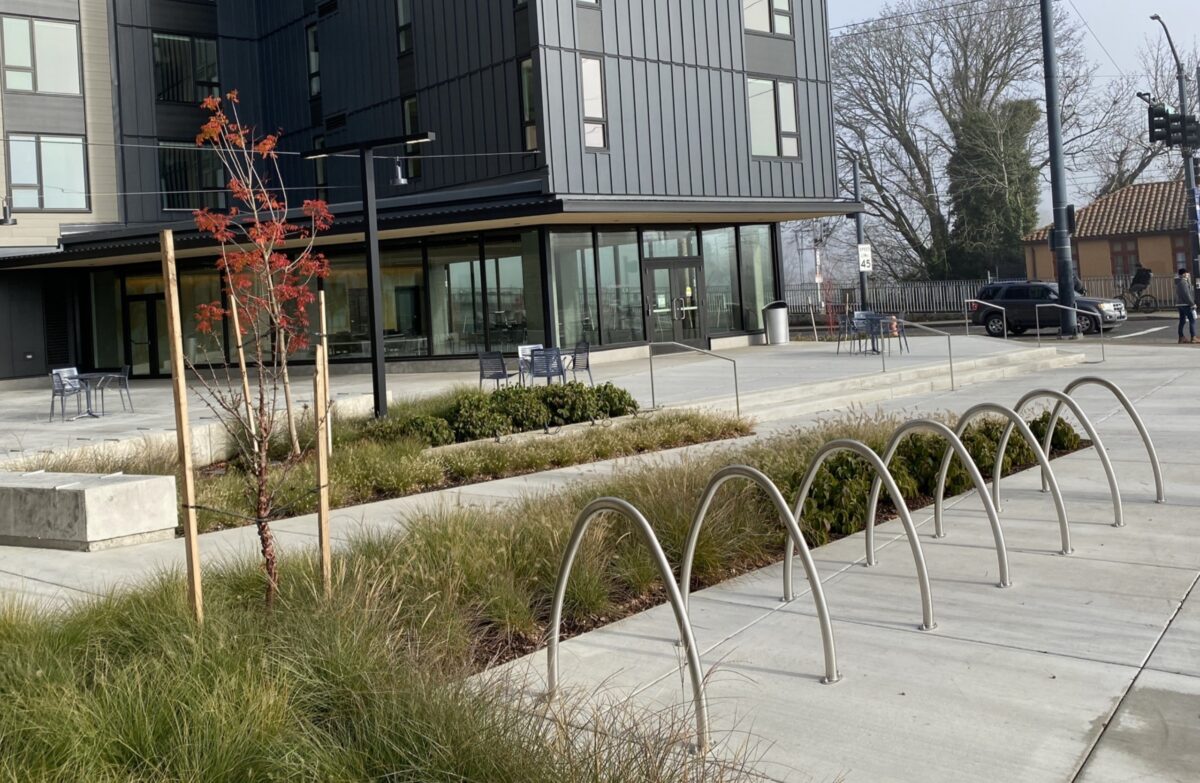
Renaissance Commons (2133 N Argyle Street) – Score: 7/10

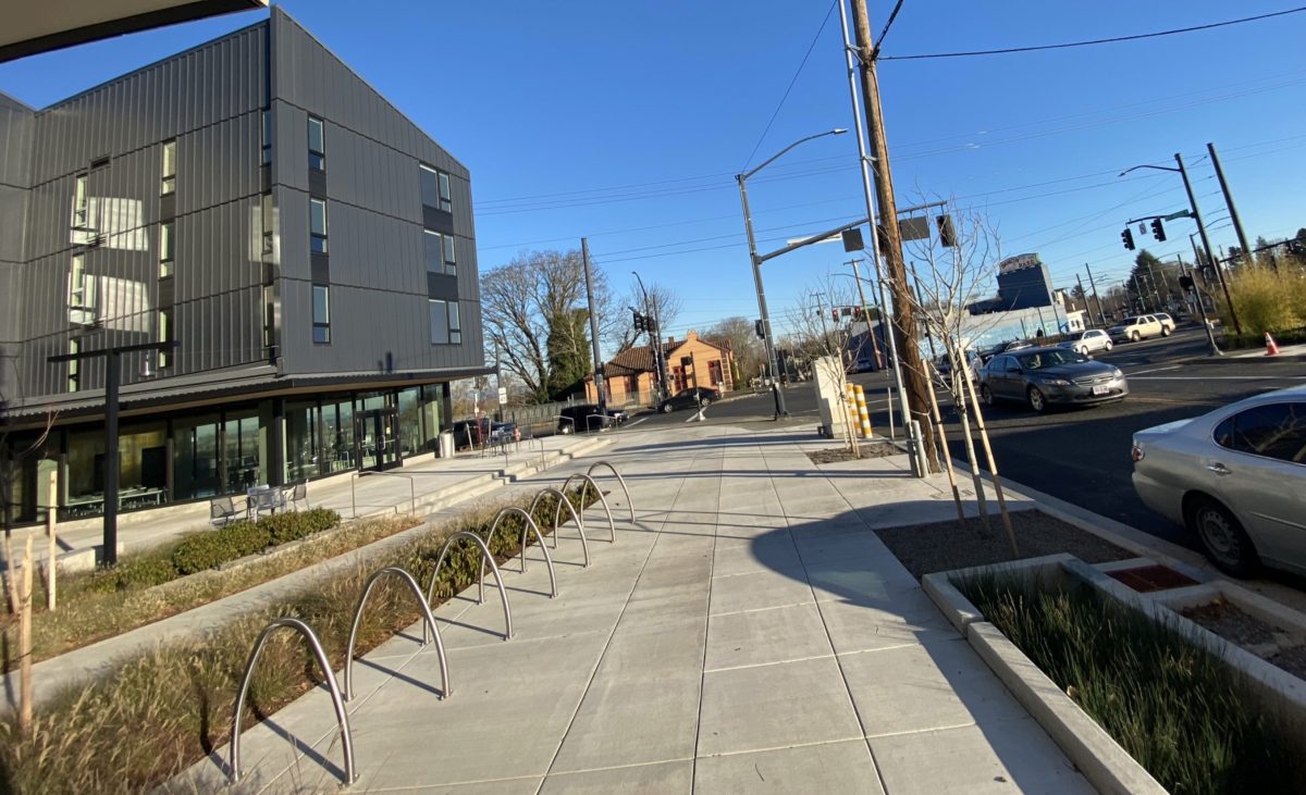
Today’s subject is a new housing development in north Portland: Renaissance Commons in the Kenton neighborhood on the corner of Denver/Interstate and Argyle. This is a recently completed, 189-unit project designed by MWA Architects and developed by Reach Community Development Corporation in partnership with the Portland Housing Bureau.
For this review I’m going to focus on the outdoor, short-term parking. It’s worth noting the site also has a full bike parking room (pictured above) behind a locked door and clearly visible from the main courtyard. From what I could tell it looks OK (although these indoor bike rooms have a horrible theft record) and consists of staple racks and some wall hooks.
Here are my grades on the outdoor racks…
Protection from the elements: ❌ No coverage at all.
Lighting: ✅ None specific to the racks, but they’re close to other light sources.
Rack spacing: ✅ Plenty of room to have two bikes side-by-side.
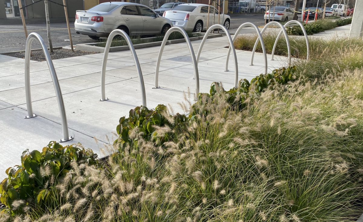
Quantity: ✅ 7 staples = 14 spaces. There are another 3 staples on the premises. This feels like enough at this time/location. Keep in mind there are other racks on other properties nearby.
Quality: ✅ These are beautiful racks of good quality.
Location: ✅ Right up front in the main courtyard near a busy corner!
Accessibility: ✅ Excellent. Adjacent to a wide sidewalk and there’s a curb ramp nearby for easy roll-in, roll-out. Could be even better if they had more room away from vegetation.
Electrical charging access: ❌ None.
Security: ✅ Location is everything and the high-visibility spot they chose will keep thieving to a minimum. Not sure if there are cameras in place (it’s likely in a new development); if so that would make this element even stronger.
Promotion/Signage: ❌ I didn’t notice any special signage or markings to help folks find these racks. Then again, they are in a very prominent place, so it’s not as important in this case.
Overall, this is a great example that quality bike parking doesn’t have to be expensive or complicated. Nice job MWA, ReachCDC and PHB!
I hope you found this helpful. I know we have some bike parking experts in the community, so if you have input on how to make this column more useful, I’m all ears.
— Jonathan Maus: (503) 706-8804, @jonathan_maus on Twitter and jonathan@bikeportland.org
— Get our headlines delivered to your inbox.
— Support this independent community media outlet with a one-time contribution or monthly subscription.


Thanks for reading.
BikePortland has served this community with independent community journalism since 2005. We rely on subscriptions from readers like you to survive. Your financial support is vital in keeping this valuable resource alive and well.
Please subscribe today to strengthen and expand our work.
I certainly appreciate your point of view that values function over form. If it doesn’t actually work, then it is pointless. Certainly! But, if it were me I still would have included an at least some aesthetic quality in the judging criteria. Some art racks are not perfect, but I still think that having something delightful in our visual landscape is important. Some “art racks” can still work well, albeit differently than the staple racks, or even in conjunction with them. Saying that aesthetics has absolutely zero value in our public spaces makes me a little sad. (Possibly just a ‘me issue,’ I suppose. I can accept that) Thanks for the overall effort 🙂
Thanks Mick O. Funny you mention aesthetics because I had that in my original list of elements. Then I realized (after someone pointed it out) that I had left out accessibility. I wanted to have an even 10 so, I dropped aesthetics. I think going forward I’ll consider appearance in the “Quality” element. And I’ll read the post again but I don’t think I’ve ever said “aesthetics has absolutely zero value in our public spaces”. OK I reread the post and I said “art racks beware”. That doesn’t mean they can’t be great. Also, note that I mentioned how “beautiful” these racks are in the Quality category. Thanks again for the feedback.
I’d suggest Spacing is a part of quality (perehaps “functionality” instead). Then that leaves you with an open slot for aesthetics.
Or use that open slot for “protection from the elements”, an item so important it merits being counted twice.
Aesthetics +1.
Love the criteria! Man I wish these were standardized for cities and used as criteria for DOTs and businesses. Security can perhaps be combined with lighting. Security is way > electrical charging. Ribbon racks automatic 0/10 please.
Side by side is honestly the least of my spacing concerns. You can almost always move over.
Bigger problems are fore-aft and a general lack of clearance for passage. I need room ahead of the staple to lock my dynohub wheel and down tube to the rack, and for personal reasons beyond decency I also want to give enough space for people with disability needs to pass.
That’s also the long way of me repeating that sometimes you have to park the “wrong” way on a ribbon, and I will never apologize to that guy at the 7-Eleven on NE 21st and Broadway for doing so.
I can’t tell for sure, but these look to be in the frontage zone of the ROW? If so, are shelter and electricity even possible by rule?
Shelter yes, like bus shelters. And isn’t electricity something a new development can plan for? After all, parking meters (and fancier bus shelters) require electricity and are right next to the sidewalk.
Parking meters don’t use much power. Many are solar powered with a battery inside.
I was wondering the same thing so downloaded the plans. They are on private property, so a shelter would have been possible. I don’t believe the PBOT allows shelters in the right-of-way. Bike racks in the right-of-way don’t also don’t count towards meeting the requirements for short-term parking, so it’s a pretty huge desincentive to providing anything at developments that are built to the property line.
I don’t think any bike parking facility can be considered “a great example” if there is no shelter from the rain. That is #1 in my book. Who likes to leave their bike in the rain?
yes! Thanks for reminding me about the bolts. I had this in my head to mention but forgot to. It is an issue worth knowing about as thieves have definitely become hip to unloosening them. I like when I see racks that are embedded in the concrete with no bolts at all.
If you love your bike, you’re just gambling using any racks like these anymore. Maybe it pays to have a “beater” bike when you have to?
I spent the afternoon today working with my city, including a city engineer commonly referred to as “Dr. No”, to locate bike racks in the public right-of-way in a city with low bike usage, a low rate that is directly related to a lack of bike parking citywide. That said, I’d add one more criteria:
Use: Are the bike racks actually being used on a regular basis? If not, they should be given a minus – likely the location, design, or lack of security is at fault. Not using racks is tantamount to empty parking spaces at malls and depressed shopping strips – it makes bike infrastructure look like a waste of resources by non-bicyclists in our community and weakens our cause.
In your Kenton example, the racks look nice, but they are empty, no one is parked there in the photos. Why is this?
You need to look at weighting your numbers: Security and Location I would give 2 points each and only a half point each for quantity and electrical charge access.
I would love to see “art car parking spaces” with murals and paver mosaics – it would go to no end on beautifying otherwise ugly wastes of asphalt.
Strategically placed, it can be an efficient deterrent to tent camps and could also serve as vehicle denial bollard to prevent vehicles associated with such activities from accessing an area.
I like the idea of being systematic in doing these reviews. One quibble though: I think you really need to check it out in the dark of night if you want to assess the quality of the lighting.
For a city that grows things so well, what a ridiculous amount of concrete…
Oh, hi Mark.
As someone in the site design field, I think this series should also highlight the landscape architects in the design. They are often the ones specifying rack products and locating them in the what is mostly their site design.
So for this case, we should also shout out to PLACE for the bike parking design!
This is an issue to consider before we consider. https://www.bikeforums.net/general-cycling-discussion/1067064-ideas-discouraging-homeless-people-using-bike-locker-public-storage.html
Amenities need to be hassle free as possible for intended people while making it inaccessible and/or undesirable as possible for deleterious activities. Electricity, if provided should be restricted in such ways to prevent usage for purposes other than charging e-bikes by intended clients and can not attract phone charging uninvited visitors.
I like this criteria. Looking forward to seeing more reviews.
I wholeheartedly wish the USPS would work with someone to make better bike parking at their facilities.
Thanks ChadwickF. That’s a good suggestion. The Post Office I use on N Killingsworth has one of those sad front wheel gutter racks. But there are also a few blue staples on the sidewalk.
Ha, I think I know the rack of which you speak, I had a PO box there in another lifetime. Those gutter-type racks always seem to have been there since time immemorial. Or perhaps they just remind me of grade-school or something.
Glad to know they have some staple racks close-by now.
My local PO now, Creston, has a wave rack smack dab in front of the doors, which is kind of an odd placement in my estimation.
Okay, I should go before this gets too rambling. Cheers.
These reviews are a great idea. They could become a valuable resource to designers and owners after a few are up. The checksheet alone is already helpful for reminding people (designers and reviewers) what to consider.
One thing that seems important to allow (but doesn’t have to be a checksheet item) is “additional comments”. Projects can always surprise, by doing something incredibly good or incredibly bad, but unanticipated. Those things might not fit in any checksheet category. For example, maybe a project has especially beautiful racks (mentioned under “quality”) but they ripped off the design from another project.
I might also allow a “bonus point” to tweak the final score up or down for whatever unexpected reason–sort of the way a weather report will have the objective temperature, then a “feels like” temperature that gives a more accurate picture of what you will really experience.
If someone does a great job with their bike rack design, I want others to “rip it off”. That’s how good ideas spread and crowd out lousy ones.
On a different topic, signage seems to be something that can be removed. If a project needs signage to direct people to its short-term parking, it’s a failure. I wouldn’t expect any good projects to have signage.
Of course we want people to take good ideas from other projects. I was thinking of blantantly copying an artistic design (“especially beautiful racks”) which isn’t good–plagiarism vs. inspiration.
Regardless of that, if a project’s bike rack is great because it got the idea for it from another project, that’s info I’d love to see in a review, so the original designer or project gets recognition.
I think you’re right about signage for short-term parking. At least (as in the above review) the project shouldn’t miss a point because the racks are located so prominently that signage isn’t needed.
I imagine there could be an unusual project where it could make sense to locate short-term racks somewhere not visually obvious. In that case, they could get their 1 point for “location” and the comment could say, “The location isn’t visually obvious, but good signage makes them easy to find”. So signage just gets mentioned under “location” in that unusual case, so still no need for a “signage” category.
Thank you for another great contribution to active transportation Jonathan. A more thorough guideline can be found through the Association of Pedestrian and Bicycle Professionals (apbp) here: shorturl.at/otCIS.
Also, security at an inverted U rack can be improved with a cross bar so the anchor bolts aren’t the weakest point. Seattle has used this design for a long time: shorturl.at/ckoBY
The correct links: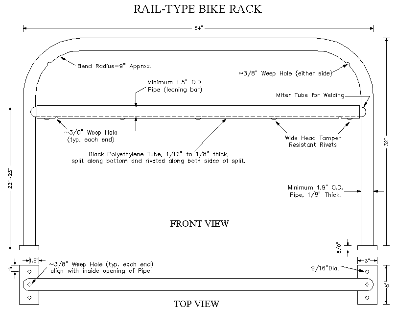
Association of Pedestrian and Bicycle Professionals (apbp) here: https://www.apbp.org/assets/docs/EssentialsofBikeParking_FINA.pdf. Also, security at an inverted U rack with a cross bar