When you step back far enough, the history of transportation starts to look less like a river — constant progress toward a final, permanent destination — and more like waves crashing against a beach.
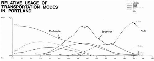
That’s the point of this chart. It pops up in the world of Portland planning from time to time, most recently in a slideshow by city planner Mauricio Leclerc about the history of parking in Portland. If you’ve never seen it before, it can be a mind-bender.
“It wasn’t until, I believe, the 1930s that the Boy Scouts did the first traffic counts across Portland’s bridges. Then things got pretty weird. People lost sight of why they were building cities.”
— former Portland Chief Transportation Planner Ernie Munch
There’s the age of walking, stretching into the past like the Mesozoic. There are the rise and fall of horses, made obsolete by trains and cars, and of streetcars, whose dominance peaked in the 1910s but was briefly threatened at that time by a wave of private jitney buses similar to today’s Uber and Lyft services.
Finally, there’s the all-eating automobile — and the implication, coded into that blank space between 1975 and 1990, that cars might soon recede just as every other mode eventually had.
That’s no coincidence. This chart comes from the 1973 draft environmental impact statement for the then-proposed Interstate 80N, popularly known as the Mount Hood Freeway. Over the next several years that impact statement, prepared by planners and engineers at the big engineering firm Skidmore Owings and Merrill, became a key weapon in killing Portland’s most infamous freeway plan and replacing it, eventually, with the city’s first MAX line.
Advertisement
It’s no longer widely known that this chart comes from that historic document. But on a tip from Leclerc, I Googled and emailed former Portland Chief Transportation Planner Ernie Munch. Munch, who had worked for Skidmore Owings and Merrill and still works in Portland as an architect, wrote back two hours later with the story behind the chart:

(Photo: PDXplan.org)
I originally made the chart for the Mt. Hood Freeway EIS back in maybe 1972. The basis was my survey of historical literature and photos of Portland. … Afterward, while at the City of Portland, I prepared a slide show which tried to illustrate the interaction of the landscape, transportation, legal systems, human values, economics, etc. in the forming of what are now, Portland’s inner-city neighborhoods. The historical study was the basis of the Arterial Streets Policy, which became the transportation element of the comp plan—the basis was not an analysis of census tracts and traffic demand as was the earlier PVMATS, 1990 plan. Steve Dotterrer, a friend and classmate at the U of O, took my place at the planning bureau and carried on with the show after I left the city in 1979.
So, back to the graph… it is fairly unscientific by today’s standards…. even by 1972 standards. I wasn’t too bothered by that at the time or now in fact. Most of Portland’s land use decisions followed transportation improvements. The early transportation planning work was all value based, Olmstead wanting to give people a feel of the landscape, Bennett wanting to make Portland beautiful, WS Ladd putting his Victorian values into a SE subdivision, (despite his engineer’s objections), etc. It wasn’t until, I believe, the 1930s that the Boy Scouts did the first traffic counts across Portland’s bridges. Then things got pretty weird. People lost sight of why they were building cities and fled to greener suburban pastures. As shown by the PVMTS plan in your attached slide show, in the 1970s, Portland could have gone either way.
So without anyone counting pedestrians and horses and boat traffic, it is not a scientific chart. You could liken it to an art work which illustrates a truth in abstract terms. Relative is the operative word. Relatively high, relatively low. It is relatively accurate.
(Links added.)
Munch noted in his email that the bike boom of the 1890s, lightly visible in this chart, made the auto boom possible because its advocates convinced the city and state to begin paving roads. Near the very end of the chart, it’s also possible to see the slight upward bend of the “streetcar and bus” and “bicycle” lines as Portlanders start responding to the oil crisis of 1973.
“It would be interesting to update the chart,” Munch added.


Thanks for reading.
BikePortland has served this community with independent community journalism since 2005. We rely on subscriptions from readers like you to survive. Your financial support is vital in keeping this valuable resource alive and well.
Please subscribe today to strengthen and expand our work.
I wonder if, in a chart updated a few years from now, Uber and Lyft will look like that cute little jitney blip. I wonder if autonomous cars will form a big wave.
One thing seems obvious: streetcars today are not going to reach the usage levels that streetcars of yore enjoyed.
I feel like self-driving cars are too little too late.
And as for the streetcar, the current system is infinitesimally tiny compared to the system that Portland had in the early 20th century.
“I wonder if, in a chart updated a few years from now…”
….that pedestrian line will experience a steep rise, along with bicycling.
And not (primarily) because of the Bicycle Master Plan either.
It is interesting to see that the bicycle line is barely visible. It would be interesting to see the chart updated to the present. Admittedly it is non rigorous and unquantitative. But probably the auto line would be starting to roll over, the bus/streetcar and bike and pedestrian lines would have risen modestly, and the airplane line would have risen substantially.
I want a t-shirt of the 2070 version of this, with a robot hoverbikes, Darth unicycles and such.
Coffee mug, maybe? Putting together a list of future BikePortland swag…
Poster?
Great story. I love reading about the history of this fantastic city. Thanks.
You make it, I will buy it.
This presentation was really informative. I’m glad you got access to the slides, Michael. Anyone who is interested in parking should page through them.
That pedestrian line makes we want to cry… A 100+ year downward trend for the simplest mode of travel imaginable?? We are clearly doing something wrong.
The city also expanded significantly during that time though. People had to travel further distances, so walking was reduced.
Causality runs all kinds of ways, though. The expansion of the city was itself a function of the ascension of non-human-powered modes. Streetcar suburbs, anyone?
Indeed. But can we talk about returning to the golden age of boat transit? I take this graph as absolute scientific proof that 1880 Portland closely resembled Venice.
Ernie Munch, Steve Dotterrer and Doug Wright (their initial boss at the Planning Bureau) were instrumental in helping shape the transportation system in Portland that we have today. The Arterial Streets Classification and Willamette River Greenway Plans, to say nothing of killing the Mt. Hood Freeway and initiating the light rail system, have all helped make Portland the great place it is today. Cycling has never been better in Portland because it was integrated into those plans from the beginning 40+ years ago. We all owe these people a great deal.
The entire Mt Hood Freeway EIS is a fascinating document and worth a read, if only to get a sense of the utter destruction that the freeway would have wrought on SE Portland (imagine Division and Clinton as frontage roads, as common in Texas). I also remember seeing that chart in the Intro section for the first time and being impressed by the breadth of modes covered.
Random extra facts: during that 1950 to 1980 auto spike Portland’s population was basically flat, I believe it even went down slightly. Literally all the area population growth was in the suburbs. From 1980 to 1990 the population only grew because of annexing East Portland.
The streetcar boom on the other hand corresponded pretty closely with a major population spike. Arguably that was Portland’s only real population boom too.
can we bring back the boat?
> can we bring back the boat?
Once we remove the east side freeway, much land will be freed for parks and river-view apartments.
This new population boom will be well served by a “yellow-canoe” program roughly modeled after the yellow-bike programs of yore.
If the freeway had been removed five years ago, we’d still be waiting for canoe share today.
Terrific reporting, Michael. Gets to the source, explains the history, and links to fascinating background documents. Also good to see that Munch acknowledges the graph illustrates historic trends, but is not scientific. We don’t know what units are being counted on the y axis.