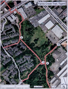
in Tigard along the Fanno Creek Trail.
(Map courtesy City of Tigard)
Riding a bike on Portland’s streets is made easier by the presence of way-finding signs.
Unfortunately once you get off the street and on to a trail you don’t find many (if any) directional signs. That’s especially true if you’re riding on trails in Washington or Clackamas County.
The folks at The Intertwine are trying to fix the problem by partnering with local jurisdictions to install way-finding signs along the Metro area’s trail network.
When I stopped by the future home of the signs yesterday there was one in place but just minutes after I arrived a crew came and took the sign down. They explained the signs were up as part of a “test run” and were being taken down to avoid vandalism until officials have a chance to view them early next week.
Once the signs get the official go-ahead all five will be put in place near downtown Tigard and the public will have a chance to weigh in on the signs’ design and effectiveness. The long-term plan is to install signs like these across the Metro region.
You can check out one of the signs in the picture below, or in person on the Fanno Creek Trail later next week.
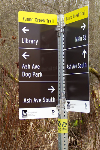
What do you think? Will these signs make it easier to ride on our network of trails and paths?



Thanks for reading.
BikePortland has served this community with independent community journalism since 2005. We rely on subscriptions from readers like you to survive. Your financial support is vital in keeping this valuable resource alive and well.
Please subscribe today to strengthen and expand our work.
hmmm… reminds me of when I had to report a problem to non-emergency dispatch. They couldn’t figure out how to send someone to the Fanno Creek Trail. I sent an email explaining the problem, but I don’t think I ever heard back from dispatch that they were made aware of the trails, and how they are routed not.
So, are Metro area dispatchers aware of the trails and how to send a response?
Answer… No, not to my satifaction. Guess It’s time to follow up with another email.
A great start. It would even more useful, since the FCT goes through a couple of cities, to indicate which one you are IN and if, say Beaverton is THAT way.
It’s hard to see in the photo but in the bottom left corner it does say “City of Tigard”, but your right in that the signs don’t show the direction/distance of other cities.
Any idea what the sign dimensions are? There seems to be an excess of blank space on them.
There doesn’t seem to be any mile-points indicated on these signs. That’s not good.
At Monday the 5th’s Broadway redesign meeting, an example of a wayfinding sign to be used in that area was shown. Different from these.
Here‘s a picture of the sign from further back. The pole was about 8’ high if I remember correctly. Hopefully that can give a little more perspective.
Hey…thanks for posting the link to the full pic. It shows the sign size to be about right.
Paul Johnson’s suggestion of larger lettering might be worth looking at.
The vandalism issue is definitely something to be concerned out. There’s too many people that don’t seem to think they exist as living beings unless they destroy or deface something. It stands to reason that more people traveling the regional trails means a greater appreciation for infrastructure like the Fanno Creek Trail, more eyes watching, which hopefully translates in to less inclination to damage the wayfinding signs.
Nice looking sign. Distance indication would be good.
Also, the back of the sign(s), if mounted as shown, could potentially be used at key locations for a “you are here” map – with a bike/ped focus.
Looks good. I would prefer more standard wayfinders, larger lettering and perhaps the use of the ClearviewHwy typeface for maximum readability and recognition, since Portland just created new wayfinders that got adopted as a national standard. Feels like Portland wasted some effort on that front by throwing out the standard Portland built for the nation and going with something relatively arbitrary.
Distances to prominent destinations would be very helpful. Particularly since much of the intertwine will be brand new. Tossing up a few maps here and there would be really nice, too.
RE: reporting emergencies or other problems…
Do the signs have any location numbers on them (as utility poles on streets often do)? If not, they should have unique location codes clearly noted (and 911 operators and other agencies should have that information in their geo info).
If there’s already a standard format, see if that works first. (Although these do look easier to read than Portland’s.) Ditto on the comments recommending adding distances and maps.
There is a great diversity of MUP & bikeway signage of varying quality and utility. Some seem merely to be decorative, some as if they are simply pedestrian scale versions of highway billboards.
Perhaps if there was some sort of standard for the bare minimum of design requirements.
OH WAIT, there is: Chapter 9 – section B signs.
No one questions the need for normal looking road signs and their readability is proven.
When every city has a different color scheme, font and layout it is far too easy for the general public to not take MUP signage seriously and see it mainly as wasteful fiscal spending.
Standards: not just good for users but similarly beneficial for keeping the mundanes quite.
I like these. Suggestions from others have been great– distances to destinations, what city you’re in, location numbers on the poles, making sure dispatch knows about these, emergency/non-emergency contact numbers and maps on the back. Looking forward to seeing these “in action”!
I’d be interested to hear from regular bikers whether this installation is preferred to one that was digital. Each have their pros/cons and often one particular pro (say, with digital, the ability to dispatch to specific location) might outweigh others that occur way more frequently (difficulty seeing offline signage at night).