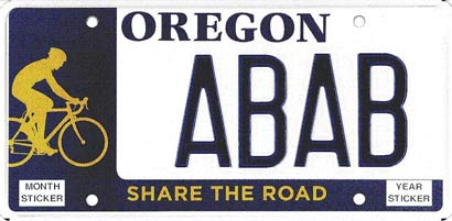
Following the passage of Senate Bill 789-A last June, beginning January 2nd, Oregon will join 11 other states where residents can order a Share the Road license plate through the Department of Motor Vehicles.
The plates will cost $10 (or $20 for four years) and the proceeds will go to cycling-related causes. Money raised (approximately $8.25 of each plate) will be doled out by the Cycle Oregon Fund and the Bicycle Transportation Alliance (BTA).
According to a press release from Cycle Oregon, fees to create the plate totaled more than $20,000, and were paid by Cycle Oregon, the BTA and the Oregon Trucking Association.
If more than 1,000 plates are issued in the first year, $10,000 of that amount is refunded. In addition, at least 500 plates per year must be issued in order to keep the Share the Road plate available.
Senator Floyd Prozanski, who sponsored the bill after losing his friend Jane Higdon in a bike/car collision, refers to the new plates as “a sort of moving public service announcement.”
Cycle Oregon ride director Jerry Norquist sees the plates as an important step in a “long term process” and adds that Oregon’s eventual goal is to “…be the first state with a public policy that requires ‘Share the Road’ to be included on every license plate issued.”
To receive the new plate, just write ‘I want the Share The Road plate’ on your renewal notice and send it in with an additional $10 above your regular renewal fee. If you’re between renewals, you can order the plate anytime after January 2 online or through a DMV office, for a $15 replacement plate fee plus the additional $10.
For more information download the press release (PDF).


Thanks for reading.
BikePortland has served this community with independent community journalism since 2005. We rely on subscriptions from readers like you to survive. Your financial support is vital in keeping this valuable resource alive and well.
Please subscribe today to strengthen and expand our work.
Nice!
I like how much more basic and matter-o-fact the plate is over Washington\’s share the road plate.
http://www.bicyclealliance.org/shareplate/share_plate.html
now I\’m conflicted….when are the Share the Road with Endanged Crater Lake Salmon coming out?
oh thats nice… stickers didn\’t work, so lets do a license plate.
its going to be horribly ironic when someone hits a bike with one of these…
It\’s just great that we\’ve got the plates now (or soon). But dear god in heaven they are ugly. I wonder what the design process was?
I agree with Robin wholeheartedly.
To be honest, I nearly vomited when I first saw Washington\’s \”Share the Road\” plates. It doesn\’t help that they use Arial where the normal plates use Helvetica.
Washington\’s plate is so gaudy that I wouldn\’t be surprised if someone got in a wreck whilst trying to read what it says.
Either way, I would be tempted to get this if I had a car.
Hmm.. don\’t mind the simple design, though I think it would be cooler to have the upright rider instead of the hunchbacked silhouette…
a very exciting development!
Washington rocks Oregon
Sweet, my plates come due in January. I will be ordering these
Wow those look terrible. Don\’t get me wrong…I support the idea and will go ahead and get some when I renew, but seriously they look terrible.
I like it.
But what do others think about the biker being on the right, as opposed to being on the left?
Aesthetic and wonky minds want to know.
I\’d say that looks pretty good. Maybe the cyclist could be a little brighter (maybe it is….can\’t rely too heavily on the monitor displayed image). Not too sure the white field for the letters/numbers is the best, but overall, looks good, and I\’m hoping it takes off in a big way.
I have been looking forward to these since the bill was introduced. I am hoping they look better in real life, however.
I will be sporting one of those.. sweetness.
Joe
I have to agree with those who say they are ugly; very true, no creativity at all.
Tally ho, I\’m in.
You design whiners can grouse all you want. And for good reason. It\’s ugly. But if that keeps you from reaching for your wallet, well, I feel your priorities are a bit misplaced.
Am I the only one who thinks that the Brett Stencil would look good. Especially given the portside placement?
_DA
Like a woman putting on something hideous and asking her man\’s opinion,
they\’re ugly to test your devotion.
The rider is on the left \’cause the rightwingers wouldn\’t let us on their side.
\”Share the Road with Endanged Crater Lake Salmon\” plates? I could totally dig that. A fish on a bike riding the rim road. Far out.
Yeah I\’ll get one, not much concerned about the beauty. The symboligy is where I stand and in memories of the great loses we have all felt. I\’ll display it proudly…though I do like the idea of a salmon
riding.
A big thanks to the BTA, Cycle Oregon, and the Oregon Trucking Association for coughing up the dough to make these.
But I also think they are pretty darn ugly. Looks like you guys held one license plate design over another to compare and could not decide which was best. Why the big white blob?
Worse than ironic; sorta like Hitler wearing a yarmulke.
My question is who will be the lucky person to get the letters B-I-K-E?
Do we just go to DMV to get one?
duh. sorry, i see the link now.
I went to the link for the new plates which is here:
http://www.oregon.gov/ODOT/DMV/vehicle/platenonprof.shtml#elks
All the other specialty plates have the tree. The bike plate looks horrible in the line up.
Why did\’nt they leave the tree as well? Seems very strange when all the other plates have it.It would have been a much better looking plate with a bicyclist and the tree.
007:
I\’ve added a paragraph to the story with more info about obtaining the plate.
My vote is for Washington. Maybe Johnathan can put on one of those vote tickers.
Yeah, it\’s ugly! Anyone making a \’plate\’ for bikes? Could make it with a salmon riding!
Can I order mine with a Mountain Biker? Nothing against the roadies.
Keeping the overall design fairly simple makes its key elements more readily identifiable. Putting more things like trees and what-have-you in the design will make it busier, but will the end result be better?
All you folks that have particular ideas about how the plate could be better might take a few minutes, draw up something simple, and post it here. I\’d sure be willing to look at some other ideas even though I\’m mostly content with the design. It\’s hard to get everything to work around the actual plate number/letter info.
I agree w/ Vanessa wholeheartedly in that they should\’ve left the tree. In fact, I thought they were OK looking until I clicked on that link to the Washington one, complete w/ mountain, aero-spoke profiled wheel and rider in the more sleek and aggressive profile. Crap- now I gotta move to Washington!
Sorry guys, but this one actually looks more like a commuter and not like a recreational rider (sometime\’s we\’re both).
Not that for or against either, but it\’s kind of nice to see this rider as a \’normal\’ (whatever that means) commuter, not a symbol inferred by Washington\’s:
\”watch out and share the road with people going through the mountains on multi-used paths on Sunday afternoons\”
Of course let me say that this is only MY dumb impression and of course I support both of them.
I like the plate. I might have to buy a car just so I can get one of those license plates
It\’s so ugly. I like Washington looks so nice with share the road, Why can Oregon do better like Washington share the road??!!??
I prefer Washington\’s as well. The Oregon design looks like it was done in 1980 on a Commodore 64.
But that is just my opinion.
I\’ll keep my Crater Lake plates…
But I refuse to put ANY \”share the road\” stuff on my car because I just know it will Jinx me. The minute I do is the minute I hit a pedestrian or bicyclist.
Hey now, don\’t slam the C64 just because your watch has more memory than it did – some great work was done on the C64.
Crappy designs can come state-of-the-art equipment also – no matter how nice the hardware, any design can be rendered into meaninglessness or ugliness by bureaucratic review.
Are these the \”flat plates\” like the Crater Lake plates, or the standard ones with raised lettering like all the rest?
Donald,
I think the stencil of Brett would look great placed on a road snaking off into the distance with Oregon\’s beautiful mountains in the background. The image of the rider can stay on the left and the rest of the design can be a background to the letters and numbers similar to the Crater Lake and tree plates.
wsbob, that\’s my first idea. If there\’s still time for more input on this I would be happy to contribute further.
That\’s a good idea Nuada. You should draw it up an see what it looks like and whether it would work. I should explain that I\’m not in any way associated with the production of this special plate, and I haven\’t read any of the articles accessible by the links above.
I imagine the plate design is set, although I don\’t know that for certain. Reading some of the comments from people that think it could be better, it seemed like a good idea for them to show everybody what those ideas might be.
Jonathan:
Not to pick nits, but I think Sen. Prozanski\’s friend Jane died from a collision from behind with a truck, not a car.
Jane would\’ve loved having one of these plates on her little Honda Hybrid that she drove to swimming every morning. Iron(wo)man Jane Higdon, Queen of Pain. What a loss.
Sweet, I just got my renewal notice… Good excuse to send it in early!
They should use Trajan…
http://www.goodiebag.tv/episodes/06_trajan_is_the_movie_font.htm
–Bill
Oh, I\’ll get one. But the design is a joke. That plate is just absolutely horrible looking.€
Can\’t select them online yet, which is annoying. Our tags expire on the 31st, so we\’ll just have to not drive on the 1st (no problem), and bike on over to the DMV on the 2nd to pick \’em up.
I had a friend just send me a notice that SB108 passed and we can now get the Share The Road license plates. So, I visited the DMV site to check out the cost, design, etc. I am absolutely floored!! I do not mean to offend, but if there are certain Legislators who wish to see this program go away due to a lack of interest, they may soon have their wish! I’m sorry, but that plate design is ghastly! In addition, the moment you install your “My Other Car is a BIKE!”plate frame, the catchy, but blunt, slogan for this excellent program is covered and illegible!! I did find a fix though: http://www.slobikevalet.org/index.php?option=com_content&task=view&id=122&Itemid=9
Further, the plates aren’t available as “Custom” (Vanity) plates. BUMMER! We had over a dozen witty, 6-letter combos just waiting in the wings for the plates…but instead, we’re stuck with the left-brained, computer-generated, “ACEC”, “ABEC”, or the coveted “ABBA”…if we were only so lucky.
On our last trip up to Mt. St. Helens for the Tour de Blast, we saw the gorgeous SHARE THE ROAD plate that Washington State developed and we all agreed that if the Bill passed in Oregon, we would jump at the chance to get these plates on our cars. I would invite the \”Design Committee\” to look at other Share the Road plates from states such as Florida, Kentucky, Georgia and Texas (complete with the \”Share the Road Y\’all\” slogan!).
Alas, having seen the Oregon design, I just had to share my utter exasperations. All that hard work, a potentially great program and such a valuable message, and I am left with the two-color disappointment before me…
Sorry, but for now, I am going to keep my customized, full-color, high-res Crater Lake plates instead.
Is it too late to take suggestions for changes to the plates? Who would design concepts go to? Thanks. Scott
ABEC would be a good one for a personalized plate by the way.
It is the speed rating for bearings…..
ABEC 7 is faster, ABEC 2 is slower.
I too see how plain, and most important to the message, not eye catching, the plate turned out, and how a frame would help to negate the statement even further.
I think they have available, from what I heard, 35 different vanity plates now.
Perhaps this diversity is what has simplified the design of some plates, maybe due to cost.
Or, it is more proof of the real attitude that our city and our state have towards cyclists.
Which is increasingly proving to be more negative than positive.
And $20,000 in funds that could have gone to many, many other projects, projects that could help to keep people alive on their bikes, not warm and fuzzy feeling in their cars.
Doesn\’t leave me with a warm and fuzzy feeling, I\’ll tell you that much…..
I just realized that it says proceeds will be doled out by these two groups.
This changes it a little, but the initial investment of 20,000 seems just ludicrous, and then to have proceeds doled out by a lobbyist group, and a big cycling corporation?
Doesn\’t sound very good to me…
All a matter of taste, I guess. While some of you think it\’s ugly, I like the simple design. Don\’t see any reason to have a tree included. I haven\’t ridden a bike up a tree since I was a kid.
I\’m still debating whether I should get the plate or not. I don\’t mind the unattractiveness of the design. After all, a license plate is supposed to be looked at by others, not myself, but I dread the effectiveness of the \”Share the Road\” message.
I believe that the majority of motorists don\’t really understand what \”Share the Road\” entails. To them, it means that bikes should hug the white line or be on the shoulder when a bike lane is not present. Cyclists taking the lane in situations permitted by the law are often deemed by motorists as \”NOT sharing the road\” on the cyclists\’ part (Case in point: last August\’s SE Clinton road rage incident).
The one benefit I can see — this plate reminds motorists that there are bikes on the road, and they should watch out for cyclists.
The Oregon one may be ugly, but a simple design seems to be more important. The WA one is a bit busy, not to mention it showing the rider in the middle of the lane. It\’s not going on my car, bicyclists can tell that I share the road by my driving.
Nuada,
I don\’t think a stencil of Brett would be a good example, especially when the investigation determined that he was speeding and would have been the one to be cited for the collision.