[Updated: 1/30, 3:31pm (see end of article)]
As I reported on Monday, the status of Oregon’s new Share the Road license plates are in temporary limbo.
I have since learned from the man behind the plates, Jerry Norquist, that the issue stems from a need to “fine tune” the design. Norquist says there has been a series of “miscommunications” about the design between himself, the plate’s designer (Sanstrom Design), and the Oregon Department of Motor Vehicles (DMV).
Norquist traveled to Salem yesterday morning (he lives in Sisters) to iron out the issues at the state DMV office. While there, he also met with the plate’s key legislative champion, Senator Floyd Prozanski of Eugene.
Prozanski has set up a meeting for this Friday between Norquist and the DMV’s legislative liaison.
In the meantime, Norquist said that the DMV is still taking registrations for the Share the Road plate, and he hopes the issue will be resolved and that everything will be “back online” very soon.
Norquist has worked hard to make this plate a reality. His goal is to demonstrate enough sales to support future legislation that would make “Share the Road” a part of every Oregon license plate.
Stay tuned for more developments on this story.
UPDATE: The graphics below show the plate as it came from the designer and then how it ended up after modifications by the DMV.
This is how it looked initially:
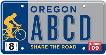
And then it was modified to its current design by the DMV:


Thanks for reading.
BikePortland has served this community with independent community journalism since 2005. We rely on subscriptions from readers like you to survive. Your financial support is vital in keeping this valuable resource alive and well.
Please subscribe today to strengthen and expand our work.
This seems like an awful lot of bureaucratic dramatic hootenanny for a license plate design.
Share the Road. (pssst….this *should* be simple no? Sigh.)
By the looks of the Sandstrom website, I can see where there may have been some problems. Sorry, don\’t get it.
interesting, Sandstrom is a client of ours
Sandstrom is one of best creative agencies in the Portland area. Though they most known for their branding and witty sensibility, they are more than capable of designing a license plate. Im personally not a fan of the license plate design, but I imagine the bureaucratic process of getting something of this magnitude produced left the public with a watered down final product. Hopefully through this hold up there is an opportunity for a better final product.
I know there is a deadline by which they need some number of plates to be sold (sorry for the vagueness but I can\’t remember the details). Does this delay restart the deadline? Jonathan, can you even decipher what I\’m talking about??
I haven\’t seen all of it, but based on what I did see, Sanstrom\’s got a great website and great work too. They even a sense of humor…I liked the bit about \”just need some arty types to do whatever you tell them\”.
I never really though the plate design was that bad, but then, I also never knew that Sanstrom designed it. Knowing that now, it\’s not hard for me to understand that the current plate design might not match Sanstrom\’s idea. The Share the Road plate design we\’ve been seeing is definitely not \”kick ass\”. Coming from a top-flight outfit like Sanstrom, it should be. Maybe the DMV decided Oregonians shouldn\’t have a \”kick ass\” license plate.
You folks are just kidding right? Their website is not only ugly, but downright hard to use. I know if I was looking for a \”web designer\” I wouldn\’t turn to them. From what I have seen of the current license plate design I would have to say their print design didn\’t go so well either. Maybe they\’re affordable?
I agree with pdxrocket. If Sanstroms\’s site is any reflection of their design capabilities we are in trouble.
Did anybody get past the retina burning color page to see the ridiculous phone? You actually had to press \”1\” for contact only to then get a popup with a long unformatted blob of text with an email at the end. Absolutely horrible. I can see why there may have been some \”miscommunications\”.
Sorry Mike (#8), I didn\’t get that far.
I\’m sorry, they could be the best in the business as far as I know, but I wouldn\’t hire them, just because of their website. It\’s completely impossible for me to get the information that I\’m looking for in a timely manner, which is the exact opposite of what a business website is SUPPOSED to do.
I\’m sure there were miscommunications somewhere, but based on an initial impression, (which, granted, may be flawed) I don\’t have high expectations as to the final product.
I hope I\’m wrong.
pdxrocket, did you even look at the Sanstrom website? I would agree that the changing color effect of the home page may be too trippy for some people, but the links lead to excellent examples of design work on products well known to Oregonians: Tazo Tea, Full Sail Ale, Miller High Life and Miller Lite, The Portland Trailblazers, Cycle Oregon.
The impression I get from Sanstrom through their website, is that they are very aware of the importance of being in tune with the current, modern world that people feel around them today, yet they can design and draw from a conservative tradition too. Their designs are clean and convey message clearly. Whether the “miscommunications” Jerry Norquist refers to, has to do with a descrepancy between a better looking plate Sanstrom had in mind, remains to be seen.
The sandstrom web page made my firefox browser curl up and die. Congratulations, not many companies are able to do this.
Additional note: all you people whining about the \’..difficulty..\’ and \’..timely..\’ issues related to using and getting information from their website should probably explain that you\’re using dial-up to access their site. I\’m guessing you\’re using dial-up, because I have dial-up, and yes, it takes awhile to load up the high-res photo images used to illustrate their work. This doesn\’t have to be such a great problem; just open another tab and you can go on and do your web surfing while their pages load up.
For a really easy to view example of Sansrom\’s design work, just look up to the right top side of the very page you\’re looking at right now. Sanstrom\’s design for Cycle Oregon\’s logo is there for you to see above the River City Bicycles logo.
wsbob – I do not want my license plate to be \”in tune with the current, modern world that people feel around them\”. I want it to show support for the cycling community, and look nice on my nice car at the same time. I won\’t be trading my Crater Lake plates for these any time soon.
As for the website, any developer that thinks palette cycling and page loads that need progress bars are clever ways to build a site is one I\’ll steer well clear of. Be creative, but show me you can do it in ways that don\’t destroy usability (and retinas).
Those photos are not particularly high-res, and there is no reason their site needs to be as slow as it is. I\’m hitting it from behind a T1 on a high-end laptop, and I got bored waiting for stuff to load. 4.2m for a couple paragraphs of text? Please.
Flash is the devil, and designers need to wean themselves of the macromedia crack. It\’s the online equivalent of the H2 – hugely bloated, blingtastic, and completely unnecessary.
I will say, though, the original plate design is about 1000x better than the DMV interpretation. Didn\’t they do something similar to the original \”Pine Tree\” plates? I vaguely remember an fuss over DMV uglifying it to the point the original designer asked them to stop making them.
I just noticed the before/after plate designs posted. As far as I\’m concerned, the original blue/gray/yellow scheme is far better than DMV\’s version. What could their reason for changing original scheme have been?
Doing a little research, there was a design contest in 1987 for new Oregon plates. The pine tree design was chosen, but it failed some legal guidelines on colors and contrast for \”readability\”, so the committee in charge modified it to meet the requirements. The result was hideous, the designer wept, and the citizens revolted. Within a year or so of issuing the modified design, the committee relented and gave us the version we have now, which is much closer to the original. There was even a lawsuit (Breen v. Oregon Transportation Commission) in which losing designers claimed the contest had been so fouled up by changing the winning design that it should be rerun.
These guys have the interim version here. Oregon DMV has neatly expunged it from their online list of historical plate designs. Obviously the old committee members are still lurking in the dark recesses of the DMV.
wow… the original design is MUCH better… amazing what a little color change and some font modifications can destroy…
wow, I used to respect Sandstrom, and even applied there. But I hate their site re-design (the old version was fantastical!) and the plate design even more. Too sad.
Whoa, BOTH versions suck, and suck hard.
In Sucky vs. Sucky, at least there\’s a naive So-Bad-It\’s-Almost (But-Stiil-Not-Quite)-Good quality to the DMV\’s version.
Man, the design intern totally let us down this time.
Well, maybe you people that are so certain the plate design sucks, also have some ideas about how it could be so-o-o much better. Feel free to share them right here on this thread. I\’d welcome the opportunity to take a look at some other plate design ideas that would do a better job of meeting the goals that this special plate is designed for.
Are you kidding? Sandstrom commands some of the highest design fees in the industry. We\’re not going to do their work for them.
I can tell you right now why the colors were changed, there isn\’t enough contrast between the background and the lettering on the original design. At a distance the two would merge to the eye and become unreadable.
Opus
@Dave #17: If memory serves, one of the reasons for the derision of the original pine tree plate was that the sky was a nice shade of smog brown. Not quite the \”Pacific wonderland\” image everyone likes to go for.