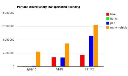
Graph by Bjorn Warloe
As we continue to digest the latest bike PR debacle spurred by reporting in The Oregonian yesterday, let’s take a look at a graph shall we?
Smart BikePortland reader and commenter Bjorn Warloe took budget numbers from the last three years and put them in a simple graph.
The Oregonian story painted a picture that funding for “bike projects” was coming at the expense of paving and “motor vehicle projects.” That’s one way to frame it I guess; but when you look at the overall spending picture, as Warloe’s graphs help us do, you see a different picture.


Thanks for reading.
BikePortland has served this community with independent community journalism since 2005. We rely on subscriptions from readers like you to survive. Your financial support is vital in keeping this valuable resource alive and well.
Please subscribe today to strengthen and expand our work.
Can someone put this same data into a less boring graphic representation please =)
Cool infographic anyone?