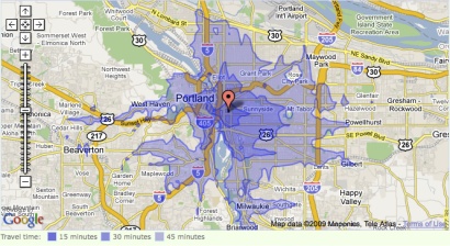
The folks at WalkScore have implemented a project similar to the joined forces with the Transit Shed tool that we told you about a few weeks ago.
What they came up with, the Transit Time Map, basically gives you a more flexible and multi-modal way to plan your travel throughout the day. The map is currently implemented, in a rough and occasionally slow form, in Seattle, Portland, and the San Francisco Bay area.

Here’s how the tool’s creators describe it:
A transit time map shows how far you can travel on public transit from a given location in a certain amount of time.
This map is a baby step towards helping you find a walkable, transit-friendly place to live so that you can ditch the zero (your car) and get with the hero (your new walkable condo near a light rail stop).
Did you know the average American spends over $8,000 per year on their car1? Did you know this is the equivalent of having a $135,000 mortgage?
WalkScore was inspired by a blog post at the Sightline Institute and is the product of a company called Front Seat. Their tag line is “Software for Civic Life:”
“Civic software connects people to the places we live, the resources we consume, and the communities we participate in.”
Front Seat is actively soliciting ideas for future projects. These folks will be worth watching as we navigate the transition from old media to new, and from old ideas about mobility to new ones about proximity.


Thanks for reading.
BikePortland has served this community with independent community journalism since 2005. We rely on subscriptions from readers like you to survive. Your financial support is vital in keeping this valuable resource alive and well.
Please subscribe today to strengthen and expand our work.
Actually, that’s the same tool, written by Brandon Martin-Anderson (
aka badhill). He’s a cool guy, avid cyclist (with point83) and smart programmer.
Check out another of his random projects here: using my gmap-pedometer data he rendered a map of everywhere I rode for a year.
Thanks Lee, I wondered about that. Fixed the story.
You went a lot of places. Did you log that on OSM?
I just tried this out – really cool.
I’d love to see an extension that, by assuming a moderate bike speed of 6 mi/hr, shows the areas where it is faster to go by foot/transit and those where it is faster to go by bicycle.
I just tried the walkability part… for our new neighborhood here and our old neighborhood in the burbs of Seattle. New PDX neighborhood got a “very walkable 86 out of 100” and the old burbie neighborhood got a “car dependent 12 out of 100”. Phew, that explains why we are happier here and down to one car!
I checked the trip from woodlawn to downtown, which is about 30 minutes on the 8 and 25 by bike. The site said it was +45
WOW! What a fantastic idea! This could be a really useful tool in analyzing locations within the city for livability, etc.