(All images: UVA Demogaphics Research Group)
![]()
If affordable proximity is one of the keys to great bike cities, understanding Portland’s biking boom means understanding its urban development decisions 20 years ago.
To see how our metro area grew, it’s useful to see how dramatically different things have gone down in different U.S. cities. A fascinating new website from the University of Virginia gives us a new way of looking at exactly that.
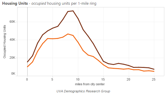
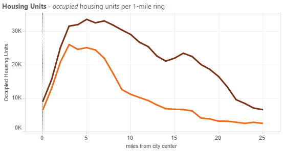
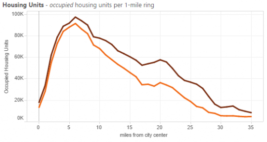
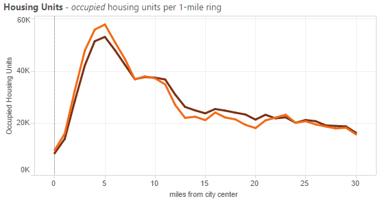
The chart above shows Portland at two key moments in American urban life: the orange line for 1990, when urban crime levels were near their peak and many central cities were seen as charity cases for their suburbs; and the brown line for 2012, when the economic boom of some U.S. cities was accelerating the country out of recession.
Downtown Portland is on the very left of the chart, with most of its bike-friendly grid within the first 5 miles. Outer suburbs like Ridgefield, Forest Grove, Newburg and Troutdale, 25 miles out, are on the right.
As you can see above, Portland’s inner suburbs — Gresham, Tigard, Beaverton, east Vancouver — have absorbed a huge share of growth in housing units since then, but closer-in neighborhoods have added quite a bit too, especially right around the six-mile-out Interstate 205 loop. At about 15 miles, you can see Portland’s famous urban growth boundary batten down the growth hatch.
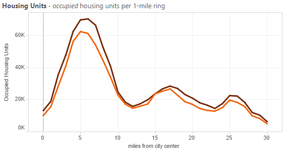
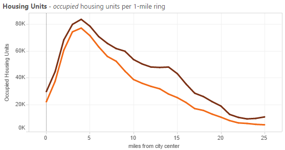
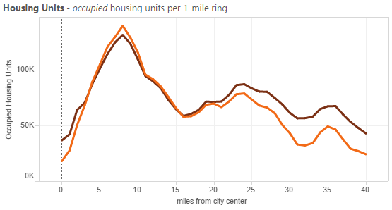
Compare that to Seattle:
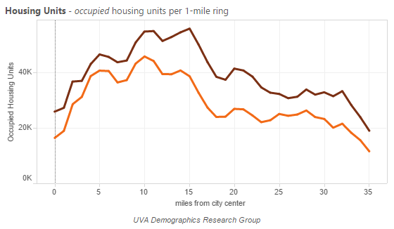
Notice that the scales on both axes are different. Seattle sprawls far further, and due in part to Washington’s more porous urban boundaries, new growth is more evenly distributed throughout.
Now for the fun part: let’s look at different cities around the country. The patterns vary wildly.
Low-rent sprawl: The sun-belt boomtowns
All these cities have more or less prevented big housing price increases despite rapid population gains … but are, instead, sprawling vastly, pouring billions into rapidly expanding freeway systems and driving up their residents’ transportation costs. Their central cities, meanwhile, have seen next to zero growth.
Here’s Raleigh:
Phoenix:

Houston:
Austin:
And Charlotte:

Locked in amber: The pricey coastal capitals
These are the cities where rents have really soared. That’s happened most famously, maybe, in San Francisco, and the chart here is particularly revealing. There’s actually been quite a lot of housing development in the very heart of San Francisco proper. It’s SF’s outer neighborhoods and especially its suburbs that have allowed almost zero new housing despite the soaring regional economy:
Advertisement
Los Angeles’s housing stock has been nearly untouched by 20 years of regional population growth, especially downtown:
The inner-ring suburbs of San Jose have grown a little more, but not nearly as much as their economy and workforce have since 1990.
Boston, by contrast, has seen its only significant housing growth in outer suburbs:
And Washington D.C. is even moreso, with the central city changing little despite a booming economy but the suburbs growing quite a bit:
Finally, New York City has seen a fair bit of development at about five miles out (note the much higher scale on the left axis) but almost none anywhere else in its vast metro area:

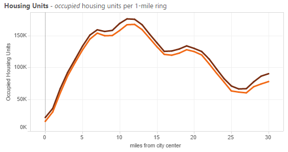
Inner-ring growth: The healthy heartland
Minneapolis-St. Paul, Denver and Salt Lake City are three cities that have, like Portland and Seattle, managed big economic gains without abandoning their central cities or (compared to California, Boston or New York, at least) experiencing crippling housing price spikes.
Here are the Twin Cities, treated as a unit. More of their growth has landed in inner suburbs than Portland’s, but at least it’s had somewhere to land:
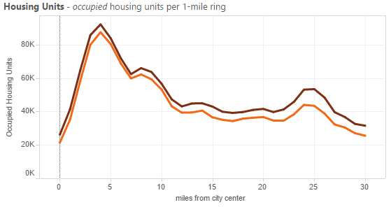
Denver’s history has been similar:
And Salt Lake City’s, though it’s seen more sprawl:
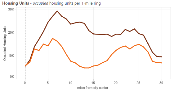
Stasis and decline: The Rust Belt
Here’s Pittsburgh, a city that I loved to visit but has had some rough decades. Its central city has actually lost occupied housing units, especially a few miles out:
The story is similar in Detroit:
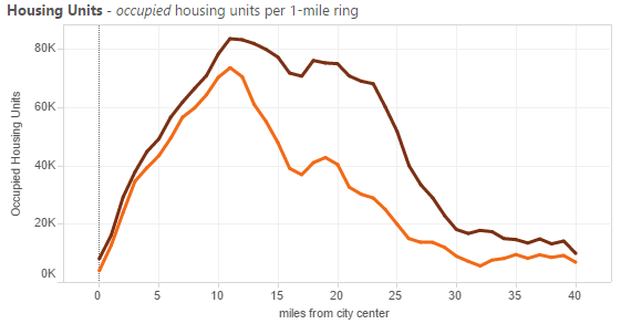
Chicago, the capital of the Midwest and one of its relative success stories, hasn’t seen much decline, its outer suburbs are absorbing quite a lot of growth, and its very close-in neighborhoods are filling up:
There are other combinations here: prosperous Corn Belt cities like Indianapolis or Des Moines, struggling East Coast metros like Providence or New Haven. But the more you look at, the more Portland’s chart up at the top stands out. Our urban growth boundary (including the fuzzier but still functional one in Clark County, Washington) hasn’t stifled growth; it’s directed it, mostly to the inner suburbs.
But things have been changing. For the fourth year in a row, the Census Bureau reported Thursday, Multnomah County added more residents than any of its suburbs.
Over 20 years, the Portland area has mostly kept up with wave after wave of demand for suburban homes. Will its central city be able to do the same?
— The Real Estate Beat is a regular column. You can sign up to get an email of Real Estate Beat posts (and nothing else) here, or read past installments here. This sponsorship has opened up and we’re looking for our next partner. If interested, please call Jonathan at (503) 706-8804.


Thanks for reading.
BikePortland has served this community with independent community journalism since 2005. We rely on subscriptions from readers like you to survive. Your financial support is vital in keeping this valuable resource alive and well.
Please subscribe today to strengthen and expand our work.
I repeat myself but, very interesting reporting. I always wonder how exceptional trends in Portland really are, or not. Keep these stories coming.
Additional information on MSP from today’s Star Tribune.
http://www.startribune.com/local/297605721.html
The old east coast cities are so much unlike the sunbelt. Go 45 miles out of NYC and you go through 5 or 6 “cities” from the colonial era. Sprawl connected them, so you have small city centers pockmarked all over, somewhat like Portland is trying to do with 205 and Lents. Plenty of that connecting sprawl is hideous though.
As an aside, counties having any power is a very foreign concept to anyone from that area.
Fascinating. Thanks for the excellent entry.
I’m having a little bit of trouble understanding these graphs. Wouldn’t each ring be progressively larger in land area than the last one? Meaning that if the 5 mile ring and the 10 ring had the same population density, the 10 mile ring would show much more overall population? Or am I completely wrong on this?
You’re not wrong. It’d be real nice if these were corrected for land area, but they’re not. These charts are mostly useful for seeing where growth is happening and how metros compare to each other, bad at expressing the existing built environment of each place.
It depends on the city though. Some might be up against mountains, rivers lakes, or oceans.
Exactly. The fact that Seattle’s graph looks the way it does is even more amazing, considering a significant portion of the land around the city is water. Puget sound has a significant sprawl problem.
I took the number of housing units from the Portland 2012 graph and divided by the square mile area of each ring (e.g. 3 miles from center = 46,000 housing units / pi*(3mi^2-2mi^2) = 1,600 units per sq mile.)
The occupied housing units per square mile becomes:
1 = 7000
2 = 2900
3 = 1600
4 = 1000
5 = 700
6 = 500
7 = 400
8 = 350
9 = 300
10 = 200
…and so on. At 20 miles, it’s down to 10 units per square mile.
This is assuming that I am interpreting the data correctly, of course, and includes the error from pulling numbers off the graph.
It would also be interesting to see a comparison of the occupied housing density shown on the graphs to the population density.
Thank you for doing that. I wish the data had been presented like that originally. At first glance the graphs make it look like there’s much stronger growth in the suburbs than there really is.
I think it is useful to see the information presented both ways because while the density dramatically increases near the center, there are still nearly four times as many people that live nine miles from the city center than within one mile.
Actually, my last statement is not consistent with the graph… There are nearly four times as many occupied housing units, but I don’t know how that compares to population.
Even better would be if you included the water area – Seattle is essentially a long rectangle with many square miles of water on the long sides. So, bit of an artificial measure to calculate housing density based on rings, when compared to almost every other city on this list Seattle is surrounded by large bodies of water. People don’t live 1-3 miles west nor 2-3 miles east of central Seattle – we leave that to the fish.
I interpret the Portland graph to say that people are substantially living in the Suburbs in the area. We just aren’t as big of a metro so our suburbs are a lot closer to the city. From 10-12 miles the populations have doubled in the last 20 years!
Seems like many in Portland would rather have Minneapolis’ graph (with a lot more people closer in), correct?
You are mostly right, but for each new unit 20 miles out, there are 9 new units 9 miles out. The delta between the lines is the important part of the graph, as it represents new housing.
Yes, that’s what I was pointing out. I was also saying that 9 miles is a lot more “suburban” in Portland than it is in most of the other cities graphed out.
I would also add, that 20 miles outside of downtown is outside the urban growth boundary for almost every area except for Forest Grove (and a couple others). So as we mentioned above, this is another barrier (although this one is not natural) that is shaping how far out people go.
Great post, Michael.
Interesting data and trends.
Another factor is where the new jobs are.
See http://tinyurl.com/pauhd3k
Brookings report on the “The growing distance between people and jobs in metropolitan America”
Will the central city be able to keep up with demand? Get rid of many/most of the surface parking lots downtown and you’ll have a lot of available land for new housing in the center of town.
Thought-provoking post, Michael. Here’s what I see in that UVA demographics data:
– Portland has added about 50% more new housing within its inner 5-mi ring that either San Francisco or Phoenix (and more than double Seattle).
– Yet the rate of new housing added 20 miles from the center and beyond is as low a San Francisco (far lower than Seattle or Phoenix).
This is strong evidence for the success of Portland’s urban growth boundary.
I made a quick scatterplot that normalizes by acreage, as suggested by maccoinnich (I treated all four cities as concentric rings, which as davemess notes, isn’t realistic). See it at:
http://tinyurl.com/citiesGrowthScatter
This is awesome.
On your first observation, I think a key issue is something other folks have mentioned in this thread: Half of the 5-mile circle around downtown Seattle is water. Compared to more than half of SF. Maybe a fifth of the circle around downtown Portland is either Forest Park or water.
We certainly did better than Phoenix, though.
The urban growth boundary prevents people who do not have a lot of money from building outside the boundary; but those with big $$ build what and where they want – mostly that means McMansions up on the hills in this area. A ride through the countryside in Washington county will clue you in real quickly to that fact.
If you want to have more affordable housing, you might learn something about the fees the government charges for a new home. These fees do NOT include the design of the home.
Just a couple of examples:
1) Cost of fees for a sewer connection in Portland are about $10,000:
http://home.costhelper.com/sewer-connection.html
2) Cost of permits for a home in Forest Grove are about $30,000:
http://www.forestgrove-or.gov/images/stories/services/building/pdf/BUILDFEE.sfr.july12014.pdf
Our government maggots need to be taken to the wood shed for some old-fashioned country style learnin’.
We tried the laissez faire approach when we didn’t require developers to pay for sewers, sidewalks, parks or paved roads in the mid-county. In the long term that doesn’t seem to have worked out too well for the residents of what is now East Portland.
Quote: “………and the brown line for 2012, when the economic boom of some U.S. cities was accelerating the country out of recession.”
.
Dream on. We are still in a depression but the soup lines are at Whole Foods, thanks to food stamps, welfare, unemployment, etc, etc, etc.
https://www.youtube.com/watch?v=bYkl3XlEneA
Quote: “……In the long term that doesn’t seem to have worked out too well for the residents of what is now East Portland.”
So, tacking on $30,000 to the price of a home will help people in East Portland, right? NOT.
These are some of the most fascinating growth and population distribution charts I’ve ever seen! Thanks so much for sharing this, Michael!