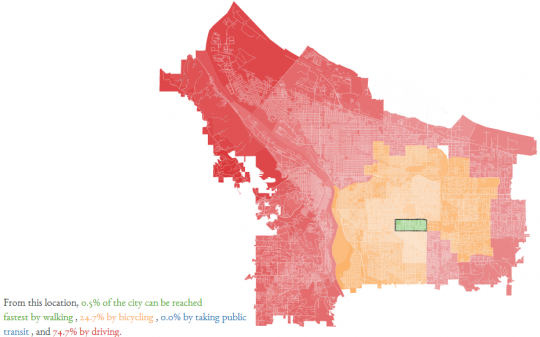
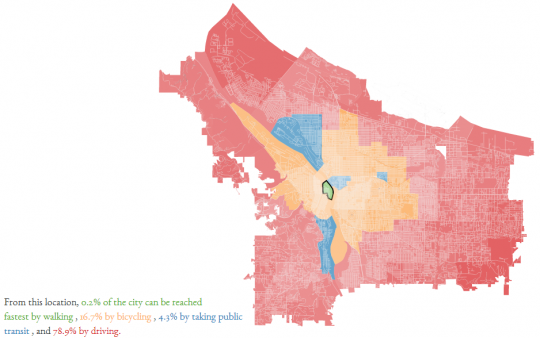
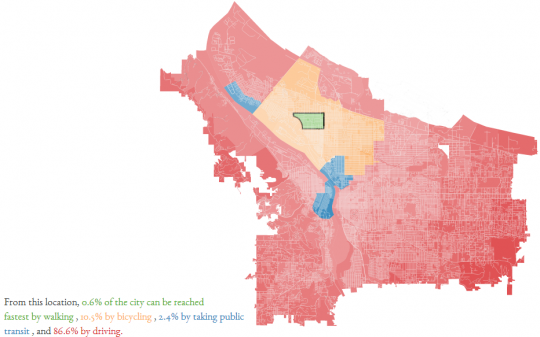
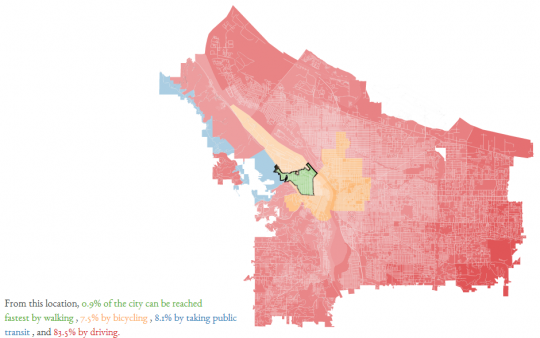
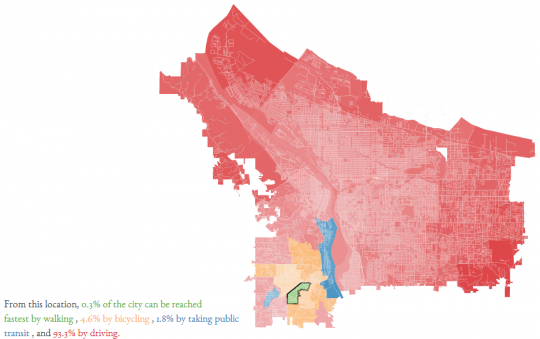
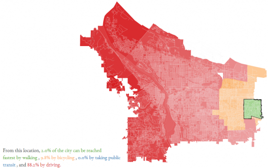
(Click to enlarge screenshot. Images from the MIT Media Lab You Are Here Project.)
In Portland’s South Tabor neighborhood, the fastest way to reach 25 percent of the city’s land area is on a bicycle.
That’s one of the interesting estimates coming out of the latest web visualization by the MIT Media Lab’s You Are Here Project, which this spring also whipped up a three-year map of reported bike collisions by Portland location.
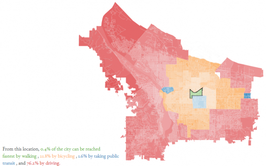
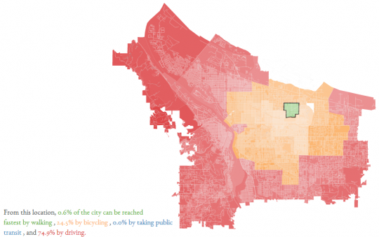
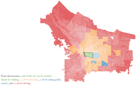
Their interactive online tool launched this month uses Google Maps travel time estimates to create color-coded maps of the city’s neighborhoods based on the fastest way to get from one neighborhood to the rest of the city: walking, biking, transit or car. And among the fun discoveries here is that the neighborhoods with the highest numbers for biking are up and down the middle of Portland’s east side.
Biking also does well by this measure in closer-in east-side neighborhoods, and of course due to greater density in these areas it’s easy to argue that you can reach a higher share of your destinations fastest by bicycle.
Head west, though, and it’s easy to see why Portlanders tend to start becoming more auto-oriented as they leave the connected street grid.
Advertisement
Some of the limitations here are that the map assumes that walking is always the fastest way to reach the neighborhood one starts in, and also that it ignores the possibility that anybody would ever want to visit Gresham.
Every tool like this (here’s a similar one from a few years back) is imperfect. But this one captures two truths nicely: first, that no matter where you live in the city, a bicycle is going to be the fastest way to get to a bunch of places; and second, that your choices of how to get around have a strong effect on how many parts of your city become part of your life.
“Our walking city is not our subway city is not our driving city,” the creators write in their description of the tool. Well put.
Update 9:55 am: On Twitter, Evan Landman of Jarrett Walker and Associates points out that the methodology here tends to hurt public transit because the calculations are based on the geographic centers of Census block groups … which are typically at least a few blocks away from public transit lines, whereas actual destinations are more likely to be on public transit lines. Good point!
Via OPB. The You Are Here project also created similar maps of Manhattan, Brooklyn, Philadelphia, San Francisco, Boulder, Salt Lake and other cities.



Thanks for reading.
BikePortland has served this community with independent community journalism since 2005. We rely on subscriptions from readers like you to survive. Your financial support is vital in keeping this valuable resource alive and well.
Please subscribe today to strengthen and expand our work.
I think you can just add up the walk and bike numbers and call it all “bike.” You can walk maybe a half block in the time it takes to get your bike out, pack your lock, put your helmet on and start pedaling.
…or called it “wike” or “balk” 😉
I’m not sure I buy that those areas are faster to get to by bike. Maybe, if it is the peak of rush hour. Even if the arterials are congested, most people can just drive down the side streets, usually faster than you can bike. I like to think of these maps as a guide as to when you should walk, ride, or drive. I know that riding from Hollywood to Ladd’s is faster by car, but it is silly to drive that short distance when I can bike it, for example.
I was thinking they included the time it takes to find parking…
It would be very interesting to see their methodology. Clicking on my neighborhood put a lot of stuff in the bike zone that I know from experience is much faster to reach by car even at rush hour, a lot of stuff in the walk zone that I similarly know is faster by bike. If it were a question of rush hour and parking assumptions, I’d expect downtown to be all transit favored from my neighborhood, but that isn’t happening either. Color me skeptical.
I dunno I live in South Tabor, and even on my old three speed, it’s only a 5 minute (if I push it, but I seldom do) difference between biking and driving to downtown. Pretty much a push to Hawthorn, lower Division/Clinton, Mall 205/Gateway, Woodstock. And faster by bike to Foster and Lents.
And since I live more to the East of the neighborhood, that 5 minute difference would be made up if I lived more in the Western part, or decided to ride a faster bicycle. And if you including time for the parking spot search, my bicycle is on par with the car or better than the car in nearly every neighborhood in SE (Sellwood and east of 122 the exceptions).
But that is also why I choose to buy a house in this neighborhood 15 years ago. Everything was close, but not so close that I had to deal directly with any of it. I had enough of that when I lived on NW 21st a few years before moving here.
In North Tabor, the proximity to the freeway changes the equation a bit. If it is not congested, you can hop on I-84 and be downtown and parked in 10 minutes. I think their methodology is ignoring the freeways.
One of the seeming imperfections is how one travels by bike or foot if there is not a safe path to use. distance is not the same as safe distance.
fud. cycling and walking are incredibly safe activities. even in the usa they add to your life expectancy.
OK, “perceived” safe distance then. Taking the lane and riding down Sandy is objectively pretty safe, and would get you downtown fast. Most people still aren’t going to do it and will take a potentially longer/slower route instead if they feel less exposed.
Not in Florida.
If trying to reach the entire city, it makes sense that the place from which it is easiest to do so is in the center, rather than the edges and corners.
Totally. But I think the west-side maps show that it’s not just the edges and corners of the map that constrain the bike travel there, but the connectivity.
It’d be interesting to see what % of the neighborhood (rather than the entire city) is easiest to reach via bike vs. foot vs. car. The downtown numbers might look a lot better if that was shown.
We all drive, walk, and take transit at approximately the same speed in the city. Biking, not so much. It would be interesting to see how the orange areas would vary if they looked at both ends of the biking spectrum: slow, legal rider compared with fast scofflaw.
my thoughts exactly. treating car-centric traffic signals as yields makes cycling more efficient without any appreciable loss in safety.
if the goal is to increase mode share, cycling advocates should be promoting jay biking and the idaho stop instead of stockholm syndrome “bike ambassador” behavior.
I don’t think that’s Stockholm Syndrome. Some people just prefer a single set of airtight, unambiguous, and mode-agnostic rules.
I dunno, I kind of like the Stockholm Syndrome reference. Excessively empathizing with your oppressors?
I like how this story starts out with all the good points about being able to bike and walk to most of your neighborhood…
unlike The O who stated “If nothing else, the map […] shows just how inefficient mass transit has become for many neighborhoods.”
Mass transit is not inefficient if biking and walking are not options do to physical limitations (elderly, disabled, etc).
efficiency at The O is always about speeding motor-vehicles…
even though my neighborhood barely has any blue on the outskirts I still take the bus as an efficient means of transportation for getting 10-20 blocks when I’m too lazy for walking or don’t want the hassle of a bike…
Interesting, if a bit off the mark (for all the reasons listed), series of maps. I especially like the second map. 😉
And another limitation may be how transit is used…weekend and evening service would likely show worse numbers…while a combined Bike + MAX or Bike + CTRAN Express Bus might show some more useful and interesting real world bi-modalism.
The maps seem to ignore topography. Is it really faster to bicycle than to drive from downtown to northern Forest Heights? (Fifth map.) Maybe for the Bionic Man.
I think you could generate maps of “equal inaccuracy” without all the fancy datacrunching by simply drawing a circle of 2 mile radius from where ever you are and declaring that inside the circle, it is faster to bike than drive.
If you don’t own a car, travel times by bike and on foot are very competitive 🙂
I agree. I work up at OHSU and when I bike home it is about the same time as driving. Of course after working a 12 hour shift I am not always keen on riding my bike home, especially during the winter.
Does this map take hills into account? Because for me that makes a pretty big difference in how fast I can get somewhere on a bike. Especially with the kids on the cargo bike.
Ooops, John Liu just asked the same question.
Nope. It seems to assume that you either drive up Cornell to Forest Heights at 10 mph, or you bike up at 50 mph.