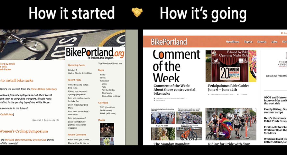
Things look a lot different around here huh? To you and me both.
On Monday afternoon we did the first complete update to this site since we launched in July 2005. I’m not sure if I should be embarrassed or proud that we kept the same theme and basic style for 17 years. Regardless, we have finally moved beyond the standard, single-column , “blog” format into something much more exciting.
This goes well beyond just wanting a new look. As publisher and editor of a site that has grown dramatically over the years, I’ve been very frustrated with inherent limitations of our old style. We’ve gone from “that guy’s bike blog,” to a mature news outlet that regularly features different writers and a wide range of issues (beyond bikes!) and content types. Simply put, I wanted to share more of our work in more compelling ways.
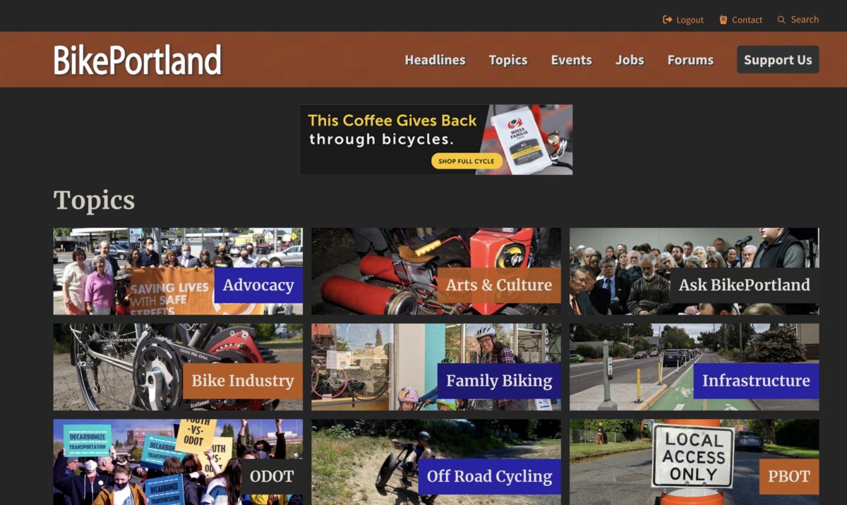
This new design by Steve Bozzone of Bozz Media allows us to do that. It features more stories above-the-fold and gives you a cleaner reading experience (if you’re looking for the stuff that used to be in our sidebars on the right, they’re now in our footer below).
I expect a lot of fiddling in the days and weeks to come.
And that’s just the start. From my perspective, what you can see here is actually the boring part of the change. Because we had such an old and clunky theme, we were not able to update to the latest editing tools of our content software (WordPress). Last night we finally made that update, and that means we have an exciting trove of new tools at our disposal to create more interesting posts and other types of content.
Along with our new look and the creative potential it unlocks, people who view BikePortland on a phone or tablet now have a much better experience.
Now the hard part: Please be patient as all of us here at BikePortland get up to speed with everything . The site is definitely not 100% done and there are many tweaks to make and bugs to fix. Back in the early days I’d spend many hours a week making tiny design adjustments and it took years for me to quit fiddling with things. I expect a lot of fiddling in the days and weeks to come.
As always, I’m extremely grateful for your support and our mission is to serve your needs. So if you have feedback, let us know!
Onto our next chapter…


Thanks for reading.
BikePortland has served this community with independent community journalism since 2005. We rely on subscriptions from readers like you to survive. Your financial support is vital in keeping this valuable resource alive and well.
Please subscribe today to strengthen and expand our work.
Looks good, JM. Congrats on the update.
As someone that bounces on and off the page semi regularly through out the day I was curious to see what was in store when I was greeted with the maintenance page yesterday. I’m quite happy with the new look! That dark mode toggle is a very welcome addition, I look forward to see what comes from all the fiddling.
Looks great! Dark mode for the win!
I miss the banner photo that the old layout offered. Graphically, it anchored things in a way that text doesn’t and the images were always interesting.
Yeah I miss that too Matti and I understand your feedback. Thanks.
Well, I hope you can work that back in. Graphics can be just as inspiring as the written word.
The new site looks good. Congrats on a successful upgrade.
How do we edit our comments on the new site after we’ve submitted them but before they get approval? I’m not seeing the usual editing tools.
After you post your comment, hover your mouse over your comment where you should see a gear icon to ‘Manage Comment’ to the bottom right, which should present an option to edit your comment.
I did see the gear icon but there was nothing to click on. However, I’ll delete the BP cookies and do a restart to see if that fixes things. Thanks.
Will the comments-only page be returning?
https://www.bikeportland.org/comments
I greatly miss this page and hope you can revive it. Like you, I find the comments section to be an integral part of your site and not having this page makes it very hard to keep up with ongoing commentary on stories. One now has to revisit multiple pages to determine if new comments have been made and then if you can do that, you need to detail in further to find the new one. Sure, on any one story you can sort by newest but that doesn’t help being able to quickly know which story has a new comment and having a link to that comment.
The front page looks pretty useless to me. It seems like I should set https://bikeportland.org/cats/frontpage as my bookmark?
Thanks for the feedback James. Can you be more specific about why you don’t like the Front Page? And yes, you can bookmark any link you want!
Congratulations, Jonathan, on the production deployment of your new site! So far, I haven’t encountered any significant issues. I recognize you’ll need to continue to make changes for a while.
And kudos to Steve for his hard work! I assume migrating many years of diverse content from WordPress was a huge task. You’ve got a valuable repository of historical Portland data, and I appreciate that you keep it. Other cities should be so lucky.
Q: Are you planning to have a Terms of Service statement regarding your privacy practices?
When I access your site via DuckDuckGo, your privacy grade is enhanced from D to C because three trackers are blocked. However, the browser also flags unknown privacy practices (no TOS).
I’ve been tardy in doing a TOS for my site. I don’t collect any personal data, however, just some high-level site metrics via Google Analytics. I have another to-do to improve page load times. Performance sucks on mobile devices.
Jonathan, after the dust settles from your deployment, I’m still interested in knowing whether you plan to publish a Terms of Service.
I think it would give your new site more legitimacy and it could help you increase your paid membership. It’s a consideration for me, but I might be among the few who take time to read the TOS pages before I sign up. This is the page that DuckDuckGo references when no TOS is found. https://tosdr.org/
I hope you can stop feeding the Meta beasts one day. As I said a while back, I recognize you need to operate across different platforms. And I suppose as long as folks are willing to trade their data for their privacy, you’ll have audiences on those platforms.
Thanks for this feedback Mark. I’ll talk to our web guy about it. Have never even considered doing this because I’m not even sure what it’s for but I can do some research and consider it.
Jonathan (or Steve), are you still collecting feedback from BP readers on site issues and suggestions for improvements? If so, should we submit them via reader comments, an email, your forum, a support e-form, or other?
Jonathan, in the note I emailed to you regarding a recent Forum discussion, I once again said that I think it would be beneficial for you to have a TOS agreement for your site. If one exists, I haven’t been able to find it on your site yet.
To be clear, this is not a technical matter; it’s a legal contract. I think a TOS would give BP more legitimacy as a news site. I also think a TOS could help you with your moderation activities.
I know you have subscribers and sponsors who are attorneys. Perhaps they could help you or refer you to an attorney who specializes in drafting data security and privacy language.
This is apples to oranges in terms of readership, but here are two components of the TOS agreement from The Oregonian/OregonLive.
https://www.oregonlive.com/user-agreement/
https://www.oregonlive.com/privacy-policy/
P.S. It’s a beautiful holiday weekend in Portland and you deserve to spend time with family and friends, so please don’t feel compelled to answer this soon.
Jonathan, have you drafted a Terms of Service statement for your site yet? I wasn’t able to find one this morning, but I might not be looking in the correct location. If you don’t plan to draft one, could you let me (readers) know. I still think what I said a year ago is relevant. Thanks.
A quick suggestion: the text size defaults to being very large in both my desktop browser (PC with firefox) and phone (iOS safari). It is particularly annoying on the phone, because so little text fits on the screen, it means constant scrolling. And if there’s images, the text doesn’t fit around them. Screenshot link below, where you see the not-particularly-long word “Patagonia” doesn’t fit. Fingers crossed this is an easy fix in WordPress to decrease default font size. (For those that need larger size, of course, this can be done for them in their browser.)
https://ibb.co/Zgqq45p
Looks great on a laptop (nice spacing and layout)! 🙂