The web-based toolkit that lets you track Portland transportation projects and related issues has been heaved into the Hales/Novick era.
When we wrote in July about the Portland Bureau of Planning and Sustainability’s Comprehensive Map App, its list of transportation projects was rooted largely in 2007, which had been the last time the city had updated its master list of transportation projects.
But as of last month, the city has a new list, and it’s now dropped that list into the Map App Explorer and the accompanying Proposed Draft Map App.
Among the changes: you won’t find $200 million for the rejected Columbia River Crossing. But you will find neighborhood greenways on Northeast 14th; upper Northeast 22nd; SE 34th; SE 14th/15th in Sellwood and Moreland; inner SE Steele; and Knott/Russell, Pacific/Oregon/Holladay and Mill/Main/Millmain in East Portland. Outer Stark Street is slated to get some sort of bike facilities eventually. There’s now a multi-use path listed alongside U.S. 26 heading west out of downtown and a “Fairmount Blvd Bikeway” in a loop directly west of Oregon Health and Science University.
All that and more, including plenty of non-bike-related projects, is now in both the Map App Explorer and the Proposed Draft Map App. (Confusingly, the two are different, but very-similar-looking, websites. You can toggle between them by clicking on the name of the opposite one at the top of the other. Give the city credit for innovation here but feel free to marvel at its ability to come up with new and creative usability problems.)
As Mayor Charlie Hales and Transportation Commissioner Steve Novick head into what’s looking like a knock-down fight with the Portland Business Alliance and the local gasoline industry over whether the city should get to spend $20 million a year on safety or only about $10 million, and whether poor people should have to help pay for it, it’s useful to know what’s at stake here.
Advertisement
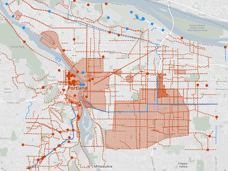
The Map App Explorer offers another neat feature that hasn’t been available on the Proposed Draft Map App: you can now view demographic data and proposed zoning or transportation projects on the same map.
For example, here’s the map of city transportation projects (in red) overlayed on a map of areas within 1/4 mile of a frequent-service transit stop. It’s a great illustration of how important these projects will be to improving low-car life in East Portland.

And here’s a map of the region’s population density, showing how parts of outer North, East and Southeast have more residents per square mile than many central neighborhoods:

There are lots of other useful tidbits here. Enjoy exploring.


Thanks for reading.
BikePortland has served this community with independent community journalism since 2005. We rely on subscriptions from readers like you to survive. Your financial support is vital in keeping this valuable resource alive and well.
Please subscribe today to strengthen and expand our work.
One thing I noticed that wasn’t in previous plans (e.g. Transportation System Plan) is that on the Larrabee ramp replacement (N Interstate where N Larrabee exits and crosses over Interstate Ave), it now indicates “provide improved pedestrian and bicycle facilities” which I think may be a recommendation to add a separated path around the west side of the Larrabee bridge columns.
Better still, take all southbound traffic up the ramp and over broadway, if they want to get to the steel bridge, and make the remaining southbound lanes a 2-way cycle track, Tillamook to at least Larrabee, if not also making one of the southbound lanes a cycle track all the way to Oregon.
That would be a great option but I don’t think it is feasible and it doesn’t fit within the N/NE Plan which sees the Lower Albina area continuing to be a working industrial area. The issue would be where the freight goes to access I-5. Currently it is down N Interstate, L of Larrabee at the Memorial Coliseum and onto Broadway. The Larrabee Ramp is weight restricted and most of the $16.5m price tag in the Project is for removing weight restriction (I think in either the Freight Master Plan or the Transportation Systems Plan the price tag without any bike/ped improvements was north of $20m, so the latest estimate has come down a little bit).
A replacement structure would most likely also include sidewalks on both sides and wider buffered or protected bike lanes, so it would improve things significantly on the structure itself as well as below.
Is there anywhere that describes the various transportation projects in more detail?
Did you click on a line or dot?
Either. As an example, project #40108 is “NE Broadway Bikeway”, costed at $3.5 million, with the description “Design and implement bicycle facilities with enhanced pedestrian/bicycle crossings and transit improvements.” I’m not looking for 100% engineering drawings, but there must be more detail on this somewhere.
Most of the descriptions are vague, but that’s by design. The TSP is basically a way to identify needs and general solutions, with the understanding that a 20-year plan can’t be in the business of designing projects. So think of this particular project as saying “we need bike facilities, improved crossings, and transit improvements along this street, but the design of that is yet to be determined.”
Some projects, like the Powell or Capitol Highway or Foster projects, come from detailed planning processes. In those cases, you can refer to the plan in question to get a sense of design. In the case of Broadway and most other projects, there hasn’t even been a plan developed.
If they really haven’t done any further planning done, how can they even put an estimated cost on the work? To use the same example, “enhanced pedestrian/bicycle crossings” could meet anything from paint and warning signs at a couple of intersections to curb extensions and full signalization at every intersection.
Enhanced ped/bike crossing is more than paint and signs. It is usually at least a pair of refuge islands ($20k) and if it is a 4-lane section, or has medium-high volume auto traffic, then in includes RRFB (+$70k) as a minimum (NCHRP 562 is the standard and 50/100 crossings per hour is the greenway standard/preferred level of service). Very busy streets, like outer Division, Stark, or 122nd qualify for Pedestrian Hybrid Beacons ($150k) or signals ($250k). Preliminary estimates are back of the envelope guesstimates with built in fudge factors for inflation.
Thanks for the informative explanation, but…. if this is a citizen engagement exercise, people shouldn’t have to ask on BikePortland for explanations of each and every project. The interactive maps are pretty, but they’re really lacking in useful information.
I agree that the real factor is how well do facilities built represent the needs of real riders. Budget helps but there are things we’ve seen lately that make me not sure budget would be put to good use. Eg some of the odd choices here http://bikeportland.org/2014/10/23/first-look-new-bike-facilities-open-along-new-max-orangle-line-112594 Why are the bike lanes on the wrong side of the planters here? https://www.flickr.com/photos/bikeportland/15415860277
I think the map app (despite it’s limitations) is a big step forward — but it does rely on good-faith by all participants. So if we treat the estimates as good-faith then the question is how do we avoid more of what we see along the Orange Line?
The density map is VERY misleading. It appears to be in quintiles, rather than natural breaks. This means the top 20% of census tracts are all shown in the darkest red, while the next 20% are shown in a slightly lighter shade, etc.. The density in Hillsboro, Beaverton, north Portland, SE portland, etc are nowhere near the density of downtown, the Pearl, or NW Portland. The Pearl district and NW Portland census tracts are about 30-40 people per acre (including street area) while all of the census tracts on the east side are closer to 15 persons per acre. Even with the latest building boom of apartments, this is unlikely to change significantly.
Good catch. I was misled. I’ll edit.
Many more people are against the new income tax than the PBA and the gas lobby. It rewards all drivers, particularly drivers of gas guzzlers and cars with studded tires. It also rewards government retirees that won’t pay the income tax and those in the cash economy. The tax becomes more regressive every year, and the expenditures for the first year are the only ones written into code. After that, the income tax becomes a new slush fund for council with no sunset.
As noted in the second 2013 transportation audit, the city doesn’t need new permanent funding for maintenance anyway. The city needs to catch up on deferred maintenance from a decade of negligence, but will have saved on future, and more expensive maintenance costs then.
Traffic enforcement, i.e. speed traps and Ladds Addition stop sign stings, qualify as “safety” projects in the ordinance for the new income tax btw.