What happens when top design firms are paired with expert bike makers and told to create the “ultimate urban utility bike”? Thanks to the Oregon Manifest Bike Design Project we now know the answer to that question.
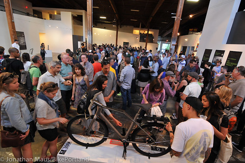
On Friday night, teams from five cities — New York, Seattle, Chicago, San Francisco and Portland — revealed their designs at five simultaneous parties. It was the climax of an eight-month collaborative process that took city bike design and engineering into completely new territory.
The organizers behind this competition believe that urban bikes get the short end of the R & D stick in the U.S. bike industry. “We think it’s the most important — yet least evolved category,” said event co-founder Shannon Holt, referring to the low priority city bikes are given (compared to racing bikes) by major bike brands.
Holt and her partner on the Manifest event, Jocelyn Sycip, hope the designs created in this competition will influence U.S. bike makers and convince them to take city bikes more seriously. To put a finer point on their goal, they inked a deal this year with Fuji Bikes who has agreed to mass-produce the winning bike. Instead of a judging panel like years past, this year’s winner will be decided by a public vote. Voting opens today and goes through August 3rd.
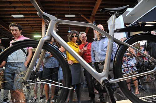
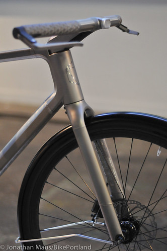
At Friday’s party, we saw the Portland entry for the first time. It did not disappoint. Dubbed “Solid,” by the team of Industry and Ti Cycles, the bike drew lots of attention.
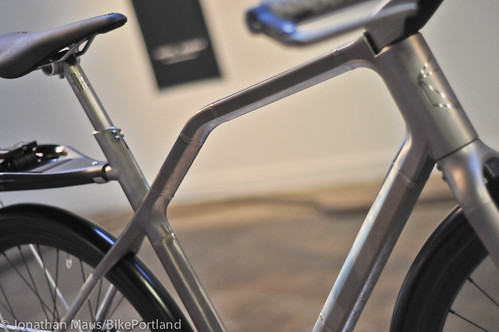
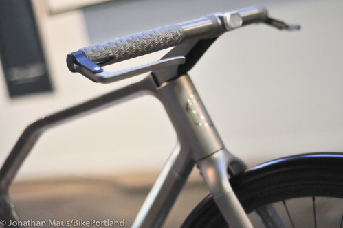
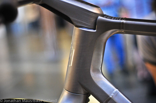
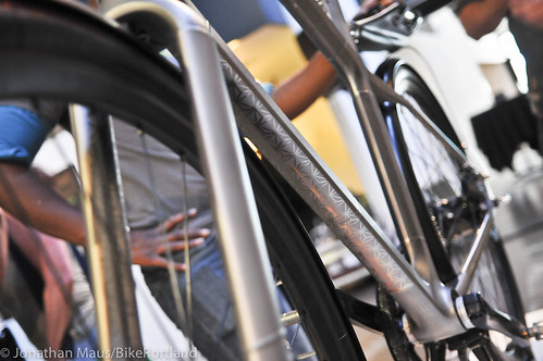
To create the Solid concept bike, the designers leaned heavily on the expertise of Dave Levy, a man with nearly three decades of custom frame building under his belt. Using a 3D printer, Levy and the Industry team designed tubes and parts out of titanium. It was a process Levy had never gone through before and he was quite excited to tell me about it…
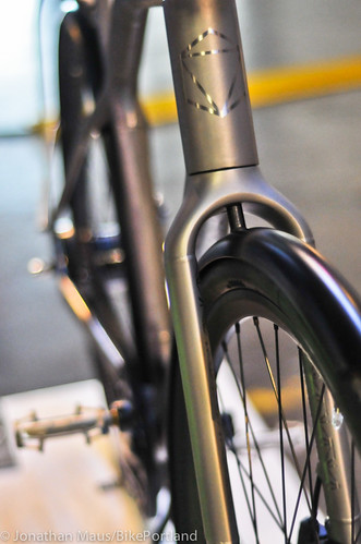
“With the printer, you can make shapes and pieces that it’s impossible to make any other way. You can vary wall thickness, vary shapes, and you can put material in areas it’s not possible to do any other way. Take the fork crown for instance. It has an interior structure that’s like a lattice. It looks similar to the structure you see inside of a bone. There are thin walls on the outside that are skins, then a lattice work that spreads loads to all the different points internally.”
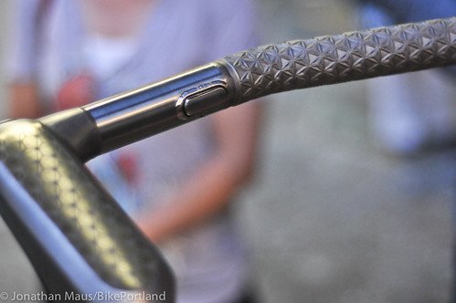
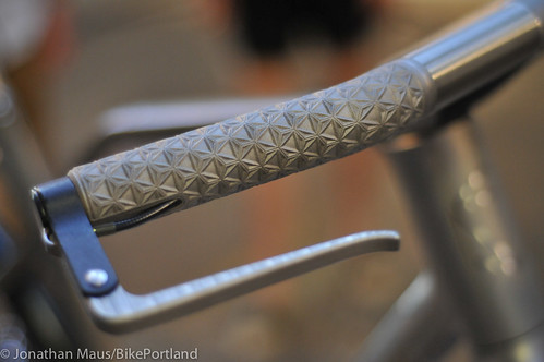
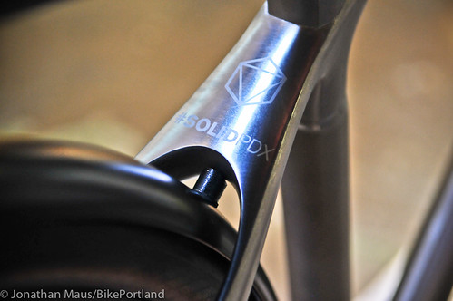
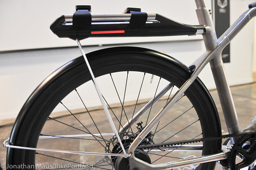
Thanks to internal routing of all its wiring and cables, the look of the Solid bike is very clean. Here are a few detail shots…
Advertisement
The Portland entry boasts a bunch of other neat features:
- Integrated, dynamo-powered front and rear lights. It also has side visibility due to a strip of red LEDs along both sides of the detachable rear rack.
- Electronic shifting via a push-button on the handlebars.
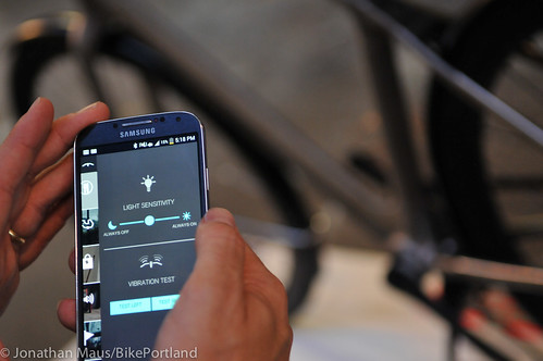
- The bike has bluetooth connectivity and its own smartphone app. The app turns on and off the lights, tracks the GPS signal, and also delivers route guidance via vibrations in the handlebars that tell you which direction to turn.
But it’s up against some stiff competition. Each team produced a video to introduce their bike. Here’s the Portland video:
Here are the videos of the four other entries:
San Francisco: Huge Design x 4130 Cycle Works – “EVO” – a hybrid bicycle that leverages a modular accessory platform for ultimate flexibility.
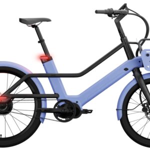
Seattle: TEAGUE x Sizemore Bicycle – “DENNY” – a bicycle to enable travel through the very diverse and unpredictable city that is Seattle.
New York City: Pensa x Horse Cycles – “MERGE” – an urban bicycle loaded with integrated functionality at your fingertips so you can RIDE YOUR WAY.
Chicago: MINIMAL x Method Bicycle –“BLACKLINE” – a bike for cruising during the summer months and able to contend with the rugged Windy City winters.
I love the versatility of the front and rear racks on the “Evo” from San Francisco, the handlebar/u-lock idea on the “Denny” is really clever, and the “Blackline” from Chicago has a striking look and some legit utility features. All the bikes have integrated lights and all but one opted for a belt drive. I was surprised we didn’t see or hear any mention of bells or horns and I thought there would be more entries with electric assist (there was only one). Overall, these are some impressive machines. It will be interesting to see which one is the most popular with the public and whether or not the bike industry takes note.
All five bikes will make the trip to Las Vegas in September to be displayed at the Interbike trade show (in the Chrome booth). Public voting is now open and goes through August 3rd. The winning bike will be produced next year. Learn more about each bike and place your vote at OregonManifest.com.






Thanks for reading.
BikePortland has served this community with independent community journalism since 2005. We rely on subscriptions from readers like you to survive. Your financial support is vital in keeping this valuable resource alive and well.
Please subscribe today to strengthen and expand our work.
lots of urban, very little utility… had to give it to the SF since it had the most uses…
Utility doesn’t necessarily mean carry a ton of shit. It means it can be used in many situations. I think cargo bikes offer some of the most limited utility out there.
any bike you can’t fit on a bus wouldn’t even fit in the category for me…
but I don’t see the many utilities of these bikes… they just seem to be about getting a minimal person from one place to the next… any bike aimed at the city better have a lock, lights, rack, and fenders… it doesn’t seem that any of these bikes do any of those really awesomely…
I don’t know. Trimet isn’t particularly useful when you have a bike. MAX moves really quickly on the west side, and between Lloyd and Gateway, but everywhere else, the service is pretty slow. I’d much rather ride and take a few more minutes to get to my destination (and avoid paying $5).
Or trade in your bus pass and get an e-assist. You won’t need Trimet ever again.
Do you ride much on the east side? Max is definitely a time saver there.
I am very impressed with all of the innovation around carrying options. However, a city utility bike and not one step through or upright handle bars?
“I am very impressed with all of the innovation around carrying options. ”
odd, I was very disappointed with the lack of carrying options…
Yep, my biggest thought “No step throughs?” obviously more about design and “innovation” than anything else.
Chicago’s a step-thru and the reason I don’t really like it.
No, that isn’t a step through. It is a unique design and I like the idea. It is sloped and lower, but go out a ride a true step through and then ride a mixte or an older women”s MTB with a lower top tube. A step through allows mounting by lifting your foot about the height of a tall stair step.
Th Denny and the Merge both have admirable locking features integrated into the bike. I really love the idea of never forgetting my lock again. The Merge has some other cool integrated features, too (like the disappearing rack).
But how does the Denny’s “minimal” fender even work?
Squeegee! ™
(I just wanted to say “squeegee”)
I doubt it. I feel like most of the spray comes from the other end and the side of the tires.
A shame there isn’t some sort of Frankenstein category that allows people to vote for specific displayed features to be combined into a single bike. Lots of interesting ideas.
Not a single upright bike. How are these “urban” again?
The bike itself isn’t revolutionary, but its application is pretty cool, I’ll admit. It was really just a means to showcase titanium laser sintering and all its possibilities. Personally, I would be more interested in components made with this technology rather than the frame. For example, with such a blank canvas, you’d think they maybe could have come up with a a better bottom bracket solution than English OBB. I am digging the steerer assembly, with its fork crown clamp, which I think is an improvement over the current standard.
Better get some gloves if you are going to ride that Titanium bike on a cool morning.
You kinda pegged it with mentioning the bikes as having “some legitimate utility features,” except at that point you should have recognized the yawning void between that and being an “ultimate” utility bike. Seems another “utility bikes designed by people who aren’t utility bike riders.”
Builders seem to finally have got the word that 27 speed derailleurs are the worst possible monstrosities on a city bike.
I’ve encountered one of Dave’s belt-drive titanium fixies, and its owner, both of which/whom were extremely cool!
There is no such thing as a 27 speed derailleur. There isn’t even a 27 speed system out there. And as someone who has commuted by bike for 25+ years, worked as a mechanic, and built frames (including belt drive, internally geared), no, derailleurs are not the worst possible monstrosity on a city bike. They’re light, reliable, durable, mechanically more efficient, inexpensive, and make changing flats a pretty simple affair.
Probably the worst thing related to bikes might be opinions that leap the hyperbolic shark and leave little room for different people who have real and legitimate preferences for different systems.
Wow, I just looked through some of your comment history. I think it’s safe to say that you’re obsessed with hating derailleurs.
I should amend that, obviously a 9 speed rear derailleur with a triple up front is a 27 speed system. Maths.
Tony:
Fourth grade math: 9 speed rear, 3 speed front, both derailleurs, 9 times 3 = 27 speed derailleur system. I had one, all Campy, on a very nice touring bike. Most road bikes now are 9, 10, 11 rear sprockets times 2 front sprockets, so have from 18 to 22 gears. “Derailing” means flipping a chain among sprockets. Call them chain-flippers–much easier to spell.
First, no one but road-racers really needs that many gears, and even they do not need that many because of really steep climbs and really fast descents. 90% of road racing is done in the peleton, where the premium is on management of energy. Many gears in the middle range enable a rider to cruise at an efficient cadence of about 60 rotations per minute for whatever speed the peleton deems optimal. Road-racers really do need all those gears. Also they need to know how to use them. Also they need good mechanics to clean and adjust everything every night.
A commuter with a derailleur system rides about as many miles a week as a road-racer does in a day. If she does not clean all the road gunk off her sprockets and jockey-rollers once a week she soon will restrict herself to 3 or 4 gears and end up blowing through the 4-way blinkered intersection at 26th & Clinton in order to avoid trying to access the low gears she would not need if she understood how a human-powered vehicle like a bicycle works in the first place. I am appalled at the inability of free-wheeling-commuters to handle their bicycles. Are we fixers the only competent riders out there?
Second, derailleur transmissions are the most difficult to operate and the least reliable component on any bicycle. Because the rear sprockets are so thin they wear quickly and need early replacement if the mechanical monstrosity is to have any hope of functioning properly. That is expensive.
Third, the extreme dish on the right side of the rear wheel required by the rear cog cluster makes that wheel marginally stable, as spokes on the left side must have lower tension. Left rear spokes easily loosen, and so break. In a crash the rear wheel is likely to “taco,” and must be rebuilt. Also expensive.
Fourth, neither steam nor electric locomotives have transmissions with multiple gears, because their torque characteristics make them work better with just one. A cyclist (sorry, JM!) has the same torque characteristic–greater than the high-speed engine-torque of a large motorcycle or a small car–at zero speed. One good gear is more than enough, especially if it is fixed, which gives about 30% more torque than a free-wheel. Archibald Sharp knew this in 1896.
Fifth, Read Chapter 15, by Aaron Goss, in Amy Walker’s “On Bicycles.”
Sixth, review Jonathan’s photo essays about commuting in Amsterdam or Copenhagen.
Cheers!
have to agree about the derailleur… that was first on my list to ditch once I started using a bike for transportation instead of recreation…
doubt that I’ll ever buy a bike with a derailleur again…
When I was a kid, I didn’t even understand the hassle of a bike. “Why balance? Three wheels is good enough”.
When I graduated to a BMX: “Hand brakes suck, my coaster brake was good enough”.
And the process went on. Eventually you figure out that everything sucks at something. There is no ideal.
Upgrading my 3-speed urban machine to a “27 speed derailleur” bike made it a much easier drag to my walkup apartment in the city. I can only imagine what 11-speed Di2 would do to my back.
Really, I am disappointed.
Besides the lack of even one Step Through design I am most amazed that both the SF and NYC bikes are actually ugly. Really ugly. Bikes in general are so elegant. I am just astonished that 40% of these bikes are hideous.
Is it something about “Urban” and “Utility” that subconsciously leads designers to believe it has to be blocky and awkward looking?
they all look very heavy too. being able to lug a bike up a flight of steps is actually quite utilitarian…
Can my spouse who is 34 weeks pregnant ride any of these safely and comfortably to the grocery store and back? Nope. That seems to me like a basic test of utility. IMO these bicycles demonstrate what is wrong-headed about the typical American approach a utility bicycle. Local Kinn Bikes designed something miles ahead of any of these IMO. Some neat gizmos though.
I think there were some neat features — haptic turn-by-turn directions could be a nice feature if it works (especially in these days of everybody being used to GPS). Locking that is integrated but still flexible is handy as well. Nice to see that all recognized lights should be integrated into the frame.
But overall, I agree with much of the criticism. What’s the point of having a collapsible rack when an old-school basket is far cheaper and more useful? How about a chain/belt guard? (I ride a belt drive exclusively, and while there isn’t a grease problem, your pants can still get sucked into the chainring. How about some integrated spot for a multi-tool/flat kit/spare tube? What about some sort of inflation?
I also agree that many of these were pretty ugly, though unlike Paul, I think the NYC design is one of the better looking.
I like the Evo’s front and rear rack quick mounting options for their versatility! I think “symmetry” in the semi isosceles main triangle is un-needed and unattractive. I likes Denny’s integrated handlebar lock. (if you cut my lock, you have no bars.) Similar to Denny’s, I made lighter water/debri-peeling fender-alternatives from 70’s era “tire savers” that could surpass the bristle brushes.
I kind of think all five bikes should make it to production; they all have redeeming qualities, but I don’t see a clear winner. I do think the modular rack systems on the Chicago and SF entries mean that this idea has merit; the idea of being able to put a kid on the back and carry groceries on the front is something that any urban utility bike must provide for in order to grow with the rider(s) (unless you’re going for a box bike).
I do agree with the idea that maybe a frankenbike that combined elements from each of the submissions might be the best one. Ti Cycles, for instance, I think has the best potential manufacturing process + materials, and likely clocks in at the lightest weight as a result. I would have liked to have seen a custom front Ti cargo rack on it, however, one big enough to carry two whole bags of groceries (which is the capacity of my own front rack).
Still, these all represent steps in the right direction, and it’s great to see such innovative design minds put towards solving the problem of how to build a better urban utility bike!!
I’m sad to admit that I find the Portland entry to be disappointing compared to the modular and Inspector Gadget-esque bikes that some of the other cities came up with. I love the versatility of the San Francisco bike, and could totally see myself riding something like that.
Very glad to see non-bolt-on carry options, but these can only be compared and evaluated with hands on use and experience. The turn signals and headlights of all seem feeble and nearly useless. When printing gets to something other than just titanium, whole-bike exterior lighting will be welcomed. Happy to get handlebar sensors and shake to turn feature, but voice is needed, and lights, and car detectors. Anti-theft options look clunky when compared to gps auto-recovery/lockout which will catch most thieves. All these bikes need electric motors on both wheels, seamless hidden electronic shifting (that INTEGRATE both derailures into one, one switch progression, not the two switches fiasco we now have). Rear camera and far forward camera on auto cycle presenting helmet view screens are a must. Black bikes are death traps.
Hmmm…. that sound like a new Cadillac Escalade…..or a Lexus…
The new XTR Di2 (electronic) group offers sequential shifting, so there’s that.
All these bikes are over-engineered without being actually useful.
I would say over industrial designed, not over engineered. But otherwise I agree with the useful comment.
We also need an automatic horn to sound when your jaw drops to scream or on scared face detection (obviously don’t mount a horn on the helmet, duh), helmet mounted turn signal integration, automobile brake triggers on too close proximity, aero fenders (at least).
Each bike has its positive and negatives. I guess Ti Cycles threw the cost consideration out the window and went balls-out. Sintered Ti parts are very very very expensive. I am big fan of Dave Levy’s work though.
love the fact that this segment is getting some attention and publicity. Maybe the major OEM’s will take notice.
you know, it’s cool looking in an architectural sort of way, but that top tube? Reducing the clearance so the frame becomes too large for people who could otherwise ride the bike? Huh. It’s a piece of art that is somewhat ridable, as opposed to a bike that is so well made that is also passes for art.
Revolting development: Bikes that need smart phones to be fully functional. ‘Can’t start my bike, the battery is dead’ !!
The modular rack system of the Evo is very useful for a utility bike. I’m a bit disappointed the Portland bike seemed much more focused on the “look” and technology while sacrificing usefullness. The last place I want to mess with another electronic user interface/app is on my bike. To me utility = simplicity.
This bike beats them all…. and of course it is sold (and used already!) in the Netherlands:
http://www.workcycles.com/home-products/handmade-city-bicycles/workcycles-fr8-universal-frame-as-city-bike
It’s sold and used in Portland, Oregon too:
http://clevercycles.com/workcycles-fr8-city-bike-universal-frame
Totally agree. Superior in so many ways.
except for climbing hills.
dream of the 1890s…
A few months ago, I was disappointed to see the design teams were comprised primarily of men, most of whom seemed white. I’m guessing more women on the teams might have approached some of these issues – especially step-thru, differently.
I see very little utility (for me) in any of these designs. No chain or skirt/coat guards, no step-through frames, every one with a butt-higher-than-hands geometry that’s of no utility to many/most older riders. The haptic handlebars and some of the integrated bluetooth technology ideas are the only things I don’t already have on my Workcycle. And I can ride that in a long skirt. Some interesting innovation here, but who’d they ask about “utility”?
Spot on. These are more art pieces than usable products. What were they thinking, that all urban bike riders are yuppies or art collectors??
25 year old design students.
Love the nod to Farris Bueller’s Day Off at the end of the Chicago video.
I’m impressed by how Manifest manages to get further and further away from practical (and already existing!) city bikes every year. Talk about re-inventing the wheel.
I suspect that it doesn’t. I sure don’t want to be riding behind it.
There are some good ideas but each entry has a deal-breaker for me except the Portland entry.
Dang. I replied to the wrong post.
What about low income people? Would they be able to afford a bike like this?
“And ready for anything, just like me.”
Seriously, Portland team? A conventionally attractive, thin, young woman pitching a bike because it’s “ready for anything, just like me”?
This pitch is problematic on so many levels. I thought the bike industry was trying to get away from being so male-focused. Real innovation would be a bike that appealed to the kind of people cities want to see on bikes: more women, more older folks, more heavier folks, and so on.
It’s clear that there’s a HUGE market for bikes like the one linked below (good call, Dweendaddy and Joseph E!) that are not just *sold* in Portland but actually MADE in Portland. I’d pay extra for a Portland-made bike exactly like this:
http://clevercycles.com/workcycles-fr8-city-bike-universal-frame
I do love many of the features of the Oregon Manifest competition’s bikes, undoubtedly, but in the end I need the *practical* features included in WorkCycles Fr8’s city bike design. Let’s build them in PDX!! And maybe even have the local manufacturer offer a version with the Dynamo lighting system built in! Oh–and have someone develop a Dynamo-like system in Portland, too. 🙂
The Kinn mid-tail bike is capable of hauling a kid and a pair of panniers on the back, yet still fits on MAX or a bus rack. The frame and wheels are made in Portland, and the bike was designed here. For good looks and utility, it beats any of the 5 designer bikes above.
http://www.kinnbikes.com/
Joseph,
Unfortunately from what I’ve learned, Kinn is no longer in operation. The founder isn’t returning emails and phone calls and several customers have been left out in the cold. If anyone has more information about Alistair and the past/present/future of Kinn I’d love to hear from you.
Some day I shall build an awesome utility bike
I haven’t seen a rear rack on the entries that could carry panniers or grocery baskets without heel strike. I agree with the criticism that these were designed by people who didn’t actually use utility bikes in their daily life. I also think the whiz bang hi tech features (like electronic shifting) are absurd and will make maintenance by owners impossible, and restrict their usefulness to the very affluent. My criteria definitely would include durable components and easy, inexpensive repair. But then, my 1991 Bridgestone CB-1 is still going strong. It’s already a very good utility bike.
Not sure how many ways you design an English roadster? Does adding flashy new gadgets count, guess it does?
As a welder, I personally wouldn’t ride any bike with welds mid-tube. The areas immediately surrounding the weld (called the heat affected zone) is weakened in the process, even if proper cooling techniques are applied- (lower HAZ is a big part of the reason the brazed lug frames are the most durable and longest lasting frames).
It will likely suffer stress fractures very quickly. Of course flimsy material isn’t exactly a turn off to many, considering the popularity of carbon fiber.
I want to argue that this is a terrible idea. A good bike frame should easily last 25 years or more, and lighting integrated into the frame pretty much ties you to today’s lights forever.
I share the opinion of some others here. I don’t particularly like any of these bikes; though there are a few interesting features, I think that they are all over-designed and not particularly utilitarian.
Wow, to me those bikes are ugly. Most of ’em look like bike share bikes or something. Doesn’t matter how useful a bike is if nobody wants to buy/be seen on the thing.
Also, all that integrated rack/light/lock stuff is going to sound like a bag of dimes in your top tube after awhile.
“…sound like a bag of dimes…”
That’s the thought I had looking at all the removable/stowaway gadgetry on some of those prototypes.
But then there’s this…
The last thing I want is a bike that can’t be used without a smartphone.
The Manifest (fail) site won’t load the video so I can vote for the Seattle bike?
Apparently it’s a fashion show, not a contest for “ultimate urban utility”. Like unreal models wearing bizarre clothes nobody would ever choose to wear (or could afford) in normal situations.
I want so badly for a contest like this to produce bikes that we all would appreciate and want, but apparently i’m not alone in feeling like it fails to produce that.
The aesthetics of the Pontiac Aztek come to bicycles. Interesting, but I wouldn’t buy any of them
I like the designs of the SF Evo and Chicago Blackline, but the NYC and Portland entries just seem overdesigned and underpractical. I think the Seattle Denny is the best of the bunch, and deserved the win.
For one thing, the other bikes either don’t tell us much about their integrated locks, or they use (FAIL!) cables. I don’t know how strong and cut-resistant the tubing of the Denny’s handlebar is, and maybe it’d be too heavy if it really were built tough enough to be a suitable U-lock replacement. But it is a wonderfully clever approach to the problem, and at least has the potential to provide security suited to an urban environment, something that can’t be said of the other bikes.
Another plus for the Denny is electric propulsion. However, I’d still hope that it would be offered in both electric and (cheaper, lighter) non-electric versions. Ideally the non-electric model would be electric-ready though, upgradeable by replacing the wheel and adding a battery pack.
One more comment is that the integrated lights on some of these bikes look like they might be blocked by the loads their racks are designed to carry. That’s a design fail right there.