(Photos: J. Maus/BikePortland)
“Sideyard has become an activator of the urban context because it also emphasizes public transport connectivity as well as pedestrian and bicycle accessibility. The addition of a ground-floor bike bar and pedestrian-friendly plaza extended from the city sidewalk enhance these functions.”
When I read those sentences in an article that popped up on one of my Google Alerts last night I was intrigued. So this morning I swung by the Couch Curve on the east end of the Burnside Bridge to get a closer look.
This bridgehead area is changing fast and it’s such a high-profile part of our bike network that it deserves every piece of bike-friendly infrastructure it can get. PBOT has already done us a solid by making an elevated bike lane and creating a tiny, carfree, bike cut-through street. Now a private developer was adding a “bike bar”? Cool!
Unfortunately the reality isn’t as good as I’d hoped.


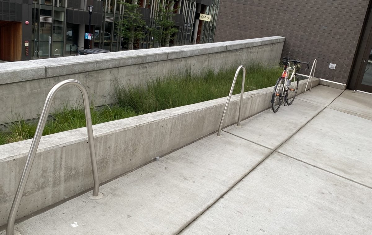
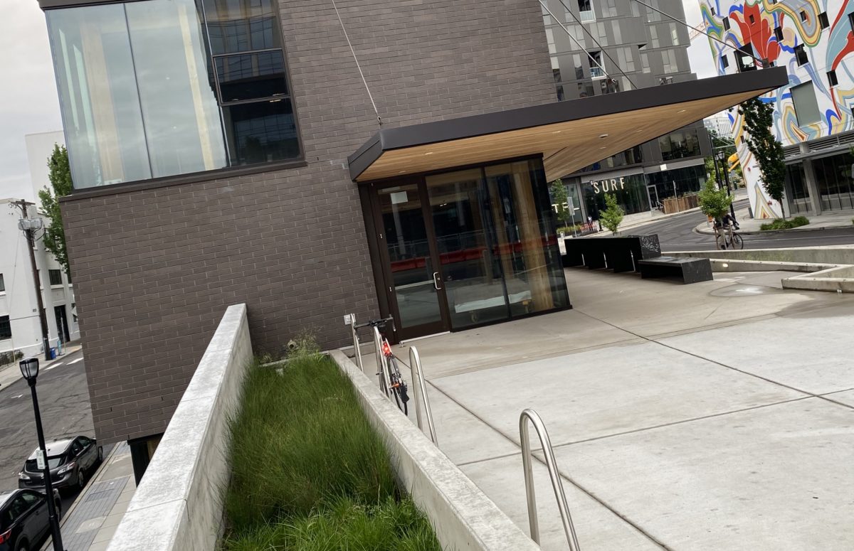
When I rolled up the ramp to the plaza and bike parking, the first thing I noticed was a row of three staple racks. I love staple racks! But these were installed right up against a concrete landscaping wall. A few others on the site are just inches away from the building’s exterior wall. This keeps the racks (and bikes) clear from the plaza area; but it also makes the staples much less useful. Staple racks are great for parking two bikes side-by-side. When you put them next to a wall, they are only half-way to their potential. And proximity to a wall means wide bikes (like trikes and cargo bikes) can’t snug up to the staple.
This is a common issue with new buildings as you’ll recall from our story about renovations to the US Bancorp tower in in 2015.
Advertisement


But I was really there for the bike bar.
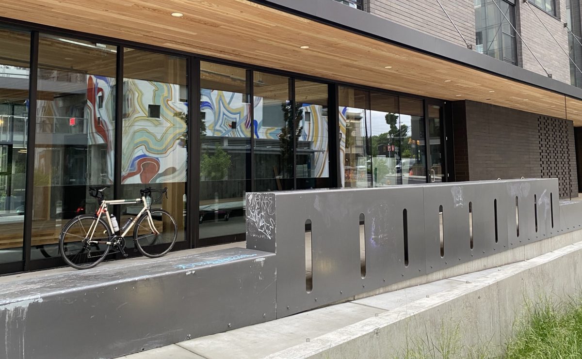
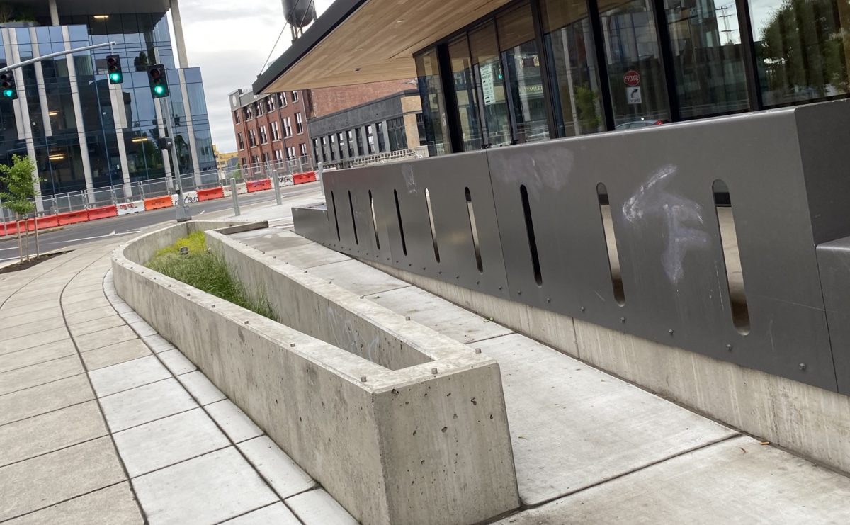
The bar is a big metal structure that faces Couch and is adjacent to the plaza’s access ramp. There are holes in it where I assume bike wheels are supposed to go. I say “assume” because it’s not intuitive (there are no signs) and I wouldn’t have even thought to put a bike wheel in them if I hadn’t read that article and had “bike bar” floating in my head.
When I rolled my bike toward the hole, the flat portion atop structure (the “bar” where people might hang out on a nice day) was too low. My handlebars hit the bar and prevented my wheel from reaching the hole. I tried my rear wheel and got the same result — except it was my saddle that hit the top instead of my handlebars. And even if my wheel did fit through, wouldn’t it stick out into the ramp? Am I missing something here?
I understand the importance of urban design aesthetics, but we need places to park bikes. Places that are abundant, easy to use, and offer good security (even if my wheels would have reached the holes, there was nothing to lock to). I just don’t understand why we can’t have both: Racks that look good and work well. The racks at this Sideyard building remind me of the strange racks at Fields Park in the Pearl District. All looks and no utility.
The building itself looks really cool and I’m excited for all the changes at the bridgehead in general. But I won’t be raising a glass at this bar any time soon.
— Jonathan Maus: (503) 706-8804, @jonathan_maus on Twitter and jonathan@bikeportland.org
— Get our headlines delivered to your inbox.
— Support this independent community media outlet with a one-time contribution or monthly subscription.


