(Photos: Jonathan Maus/BikePortland)
Welcome to our new Bike Parking Review column.
Grading bike parking is something we’ve done for years around here, so I thought it would be fun to give it a bit more structure and have some set judging criteria. This will hopefully give people a better guide for how to advocate for and create quality bike parking.
Quality bike parking is an absolutely essential ingredient to create a strong culture around cycling and increase the number of people who ride. We’re fortunate in Portland to have a transportation bureau who understands this. While we have many excellent examples around town, there’s a lot of room for improvement. Hopefully this column will help everyone do a better job.
Advertisement
To help guide the grading, I’ve developed a list of 10 elements of quality bike parking:
Protection from the elements: Are the racks covered or in an area where users won’t get wet in the rain? Obviously this will be a slam dunk element for all indoor parking.
Lighting: People on bikes need illumination in parking areas even more than car users because bikes don’t come with interior lights. Folks need lights to find their lock keys, rifle through cargo, and so on. Lighting is also related to security.
Rack spacing: Often overlooked, this element has to do with how much breathing room each rack is given. Especially important due to the popularity of larger cargo bikes and heavier electric bikes that are harder to maneuver.
Quantity: Self-explanatory. But keep in mind this will depend a lot on context.
Quality: Ribbon racks are automatic failure. Standard staple racks like the blue ones issued by City of Portland are the gold-standard. Art racks beware.
Location: Right up front near the main entrance is usually the best, but there can be exceptions. Strongly related to security.
Accessibility: One curb can be deal-breaker. Related to spacing.
Electrical charging access: This element has become a much bigger deal lately with the e-bike boom.
Security: Many factors go into this and it might be the single most important element these days — given how many people don’t even use bikes out of fears about getting them stolen.
Promotion/Signage: You can build the best bike parking in the world, but if you don’t make it drop-dead easy to find it’s a waste.
Advertisement
Renaissance Commons (2133 N Argyle Street) – Score: 7/10


Today’s subject is a new housing development in north Portland: Renaissance Commons in the Kenton neighborhood on the corner of Denver/Interstate and Argyle. This is a recently completed, 189-unit project designed by MWA Architects and developed by Reach Community Development Corporation in partnership with the Portland Housing Bureau.
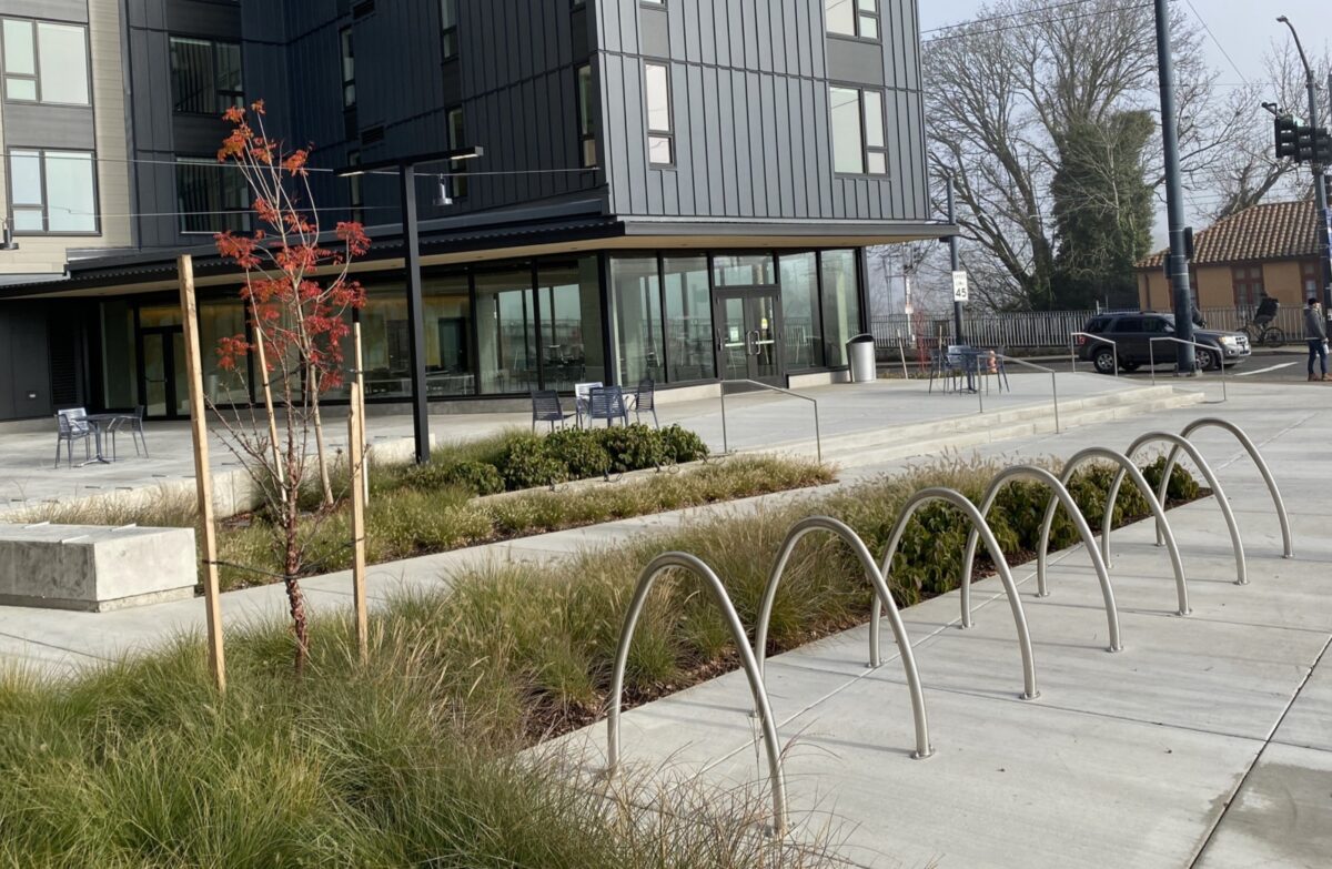
For this review I’m going to focus on the outdoor, short-term parking. It’s worth noting the site also has a full bike parking room (pictured above) behind a locked door and clearly visible from the main courtyard. From what I could tell it looks OK (although these indoor bike rooms have a horrible theft record) and consists of staple racks and some wall hooks.
Here are my grades on the outdoor racks…
Protection from the elements: ❌ No coverage at all.
Lighting: ✅ None specific to the racks, but they’re close to other light sources.
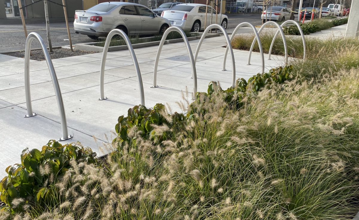
Rack spacing: ✅ Plenty of room to have two bikes side-by-side.
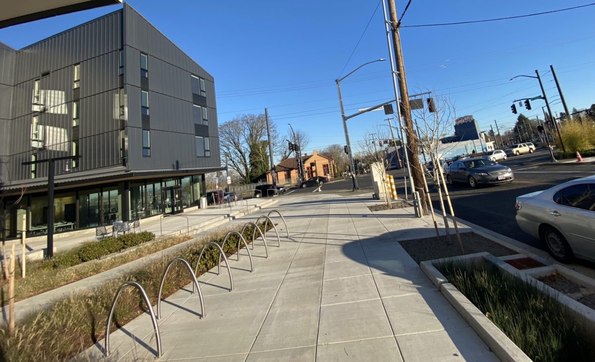
Quantity: ✅ 7 staples = 14 spaces. There are another 3 staples on the premises. This feels like enough at this time/location. Keep in mind there are other racks on other properties nearby.
Quality: ✅ These are beautiful racks of good quality.
Location: ✅ Right up front in the main courtyard near a busy corner!
Accessibility: ✅ Excellent. Adjacent to a wide sidewalk and there’s a curb ramp nearby for easy roll-in, roll-out. Could be even better if they had more room away from vegetation.
Electrical charging access: ❌ None.
Security: ✅ Location is everything and the high-visibility spot they chose will keep thieving to a minimum. Not sure if there are cameras in place (it’s likely in a new development); if so that would make this element even stronger.
Promotion/Signage: ❌ I didn’t notice any special signage or markings to help folks find these racks. Then again, they are in a very prominent place, so it’s not as important in this case.
Overall, this is a great example that quality bike parking doesn’t have to be expensive or complicated. Nice job MWA, ReachCDC and PHB!
I hope you found this helpful. I know we have some bike parking experts in the community, so if you have input on how to make this column more useful, I’m all ears.
— Jonathan Maus: (503) 706-8804, @jonathan_maus on Twitter and jonathan@bikeportland.org
— Get our headlines delivered to your inbox.
— Support this independent community media outlet with a one-time contribution or monthly subscription.


