There are all types of ways to push back against a project you don’t like. As social media has matured in recent years, a lot of folks have become good at creating graphics that — when they go viral — can be a very effective way to establish a narrative. Look no further than someone like Tom Flood, who we had on our podcast a year ago and who’s now working on a book. Or there’s ex-Portlander Zach Katz whose @betterstreetsai Twitter account has blown up in recent weeks.
But as the saying goes, with great power comes great responsibility.
Bob Ortblad, a retired civil engineer and self-described “Historian of 200 years of infrastructure” who we’ve featured as a source for his expertise on the Interstate Bridge Replacement Program, is also good at turning engineering data into compelling visuals. One of the graphics he recently shared was a bit too compelling.

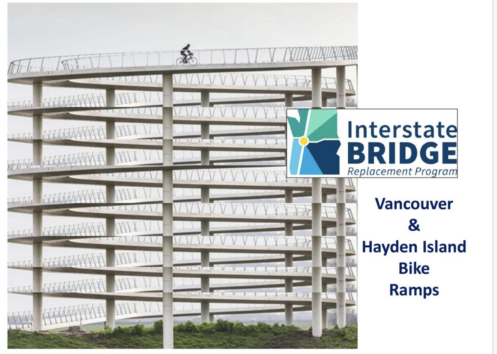
One of Ortblad’s main concerns with the IBR project is that it will be too high to easily bike and walk up to. To create a recent graphic, he took data from official, draft proposals of the bridge design, then combined with a Dutch bike ramp design manual to come up with a mockup he feels is an accurate representation of what we can expect to see on a new bridge. It’s a striking image that shows eight spirals required to reach the bridge deck level.
As you can see above, he then shared that graphic on Twitter with the official IBRP logo and font, and added no disclaimer to suggest it was a just a mock-up.
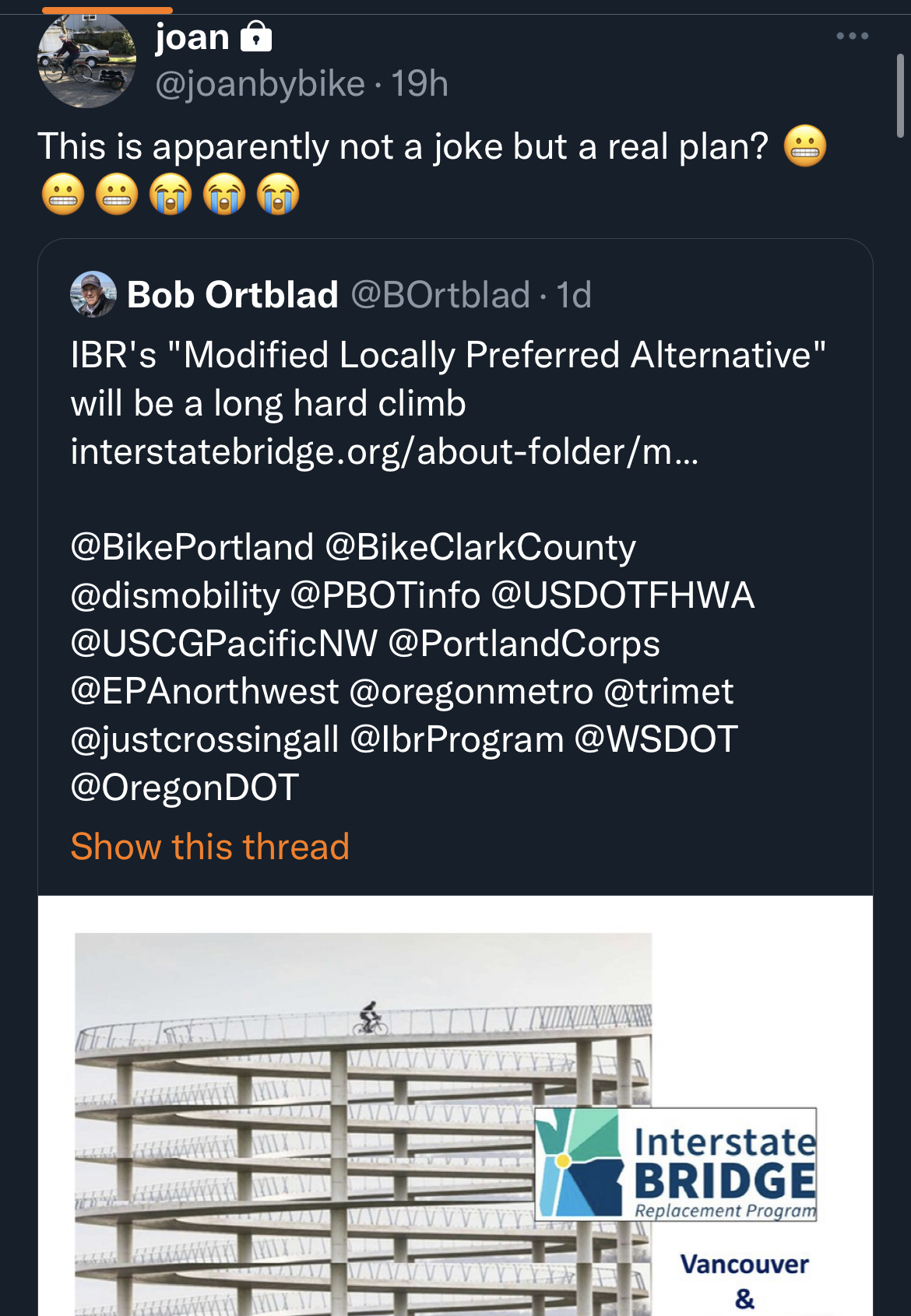
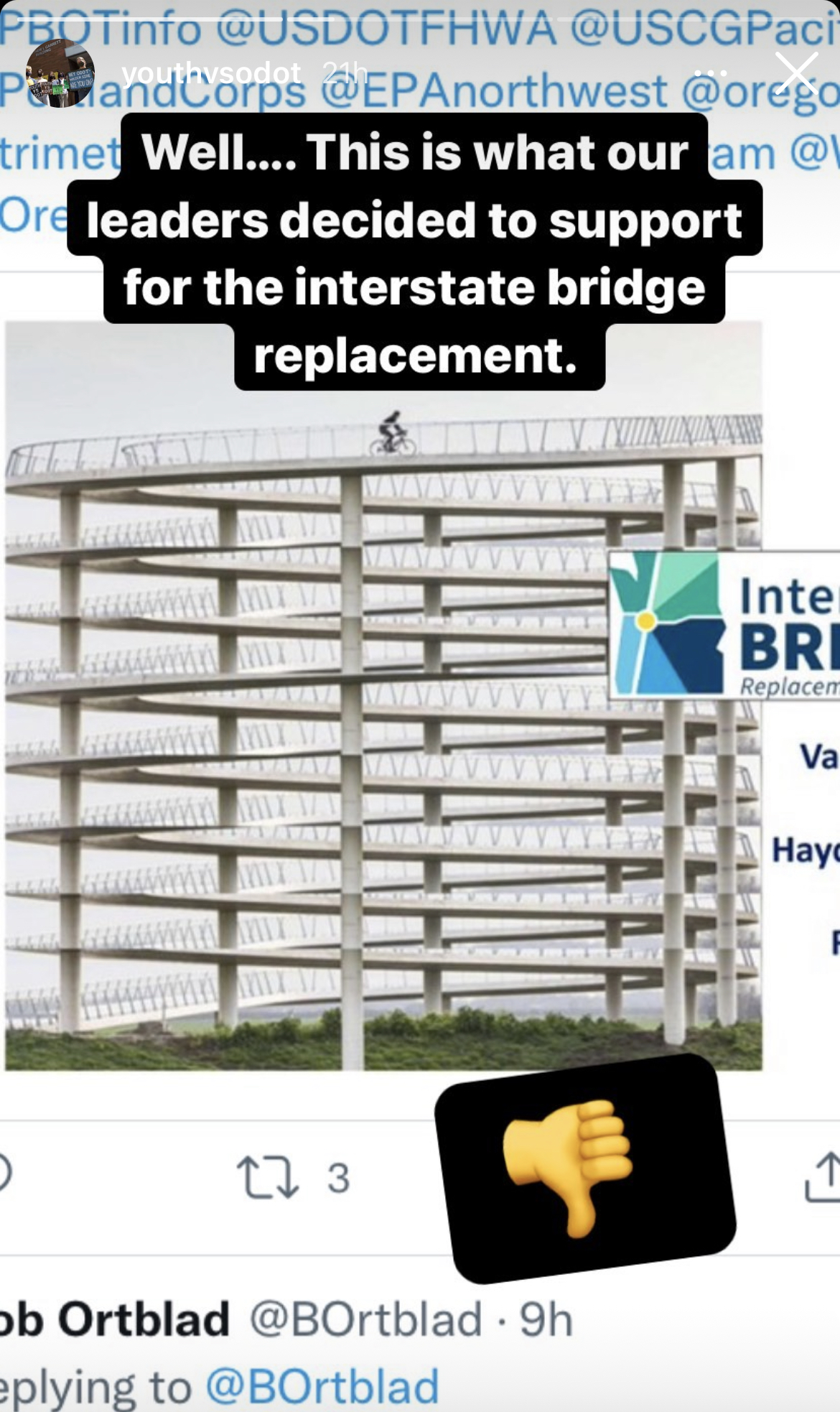

The striking image immediately caught the attention of several of Ortblad’s followers (above), some of whom expressed outrage based on their assumption that the graphic was real. Confusion ensued. The reactions also included some people (including me) urging Ortblad to rethink his approach to using such a misleading graphic.
Yesterday, the IBR account responded to his tweet to clarify that the graphic, “Was not created by IBR & uses our logo without authorization. Multiple ramp designs are under consideration to connect the multi-use path to the bridge. The pathways will be built for all users & will be greatly improved over what exists today.”
While I don’t like Ortblad’s misleading approach, he does seem to have made a point: If the IBRP would be more transparent with the ramp design, he wouldn’t have to speculate and there’d be no confusion (for their part, the IBRP would argue that they simply aren’t able to provide more detail at this stage of the process because the Locally Preferred Alternative was only endorsed in late July).
Advocacy can work in mysterious ways. And given that absurdly spiraling bike ramps are actually a tool DOTs have used in the past, maybe Ortblad’s misleading graphic will help us avoid the fate it depicts.