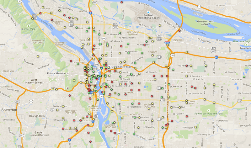

(Data from Portland Bureau of Transportation, geocoded by SteveLeathers and mapped using Google Fusion Tables)
If the last two years of city bike counts tell any coherent story about biking in Portland, it’s this: Biking keeps rising in Portland’s bike-friendliest neighborhoods, but not fast enough to make up for declines in the parts of Portland where biking is often unpleasant.
Though the data released by the city Thursday night is far from perfect — it’s gathered largely by volunteers at one-time two-hour rush-hour counts on summer weekdays of their choosing — it’s one more clue to a Portland mystery: why did the city’s bike-commute rate stop growing five years ago?
Given the data’s many limitations, the most reliable patterns are probably the ones with the broadest geographic scope. To find a few of those patterns, we averaged bike counts in 2011 and 2012 and compared them to averaged bike counts at the same locations in 2013-2014. (If a location had only one year of data available in each time period, we used that year. If it had no years available, we didn’t include the data point.) We recognized counts as changes only if the count rose or fell by at least 10 bikes.
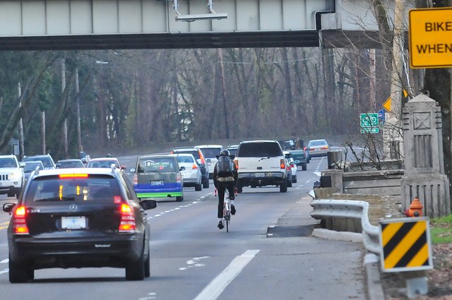
(Photo: J.Maus/BikePortland)
Here’s what we found:
Citywide, bike counts rose at 69 locations and fell at 68 locations. The total number of bikes observed rose by 1,489, or 4 percent. (The city’s population grew 3 percent over the same period.)
In the downtown area (including the South Waterfront and everything inside the 405/Willamette River loop), bike counts rose at 14 locations and fell at 10. Throughout the area, bike counts rose by 637, or 9 percent.
In North Portland, bike counts rose at 10 locations and fell at nine. Throughout the area, bike counts rose by 601, or 9 percent.
In inner Northeast, bike counts rose at 15 locations and fell at nine. Throughout the area, bike counts rose by 348, or 6 percent.
Advertisement

In inner Southeast, bike counts rose at 17 locations and fell at 13. Throughout the area, bike counts rose by 171, or 2 percent.
In Northwest, bike counts rose at seven locations and fell at three. Throughout the area, bike counts rose by 157, or 6 percent.
In Southwest, bike counts rose at two locations and fell at 13. Throughout the area, bike counts fell by 237, or 9 percent.
In East Portland, bike counts rose at three locations and fell at 10. Throughout the area, bike counts fell by 200, or 9 percent.
For specific locations, the data was less reliable. For example, the biggest drop citywide (Caruthers at the Eastbank Esplanade) reflected detours around Orange Line construction, as did the biggest increase (SE Clay at Water). One of the biggest declines, Southeast Clinton at 13th, seems alarming until you notice that it results entirely from one anomalously low count (73 bikes during one evening rush hour in 2013).
That said, a few other local patterns seemed to emerge:
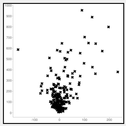
Most of the most popular locations got more popular. Most of the least popular locations got less pouplar. Here’s a chart that compares the change in number of bikes (horizontal axis) to the number of bikes in 2011-2012 (vertical axis). The two extreme outliers are related to the TriMet detour. Other than that, the trend is pretty clear: the more bikes a location had in 2011-2012, the more likely its bike count was to rise further.
North Williams and Vancouver continued to show strong growth. This doesn’t reflect the effects of the Williams Avenue redesign that began in late 2014.
People responded to new infrastructure. Southwest Moody, Northeast Multnomah, and the downtown Oak/Stark couplet saw significant traffic boosts following the installation of protected or green-colored bike lanes (or, in Moody’s case, the addition of OHSU’s free bike valet to the recently constructed bikeway). Going Street, whose neighborhood greenway was extended from Vancouver west to Interstate in 2013, also saw growth.
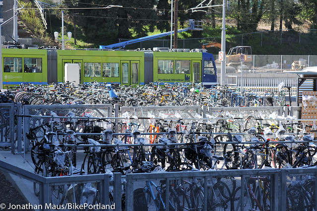
(Photo: J.Maus/BikePortland)
Bike counts fell throughout the Portland State University area. This is consistent with the university’s survey data, which last year found a significant drop in student bike use after years of growth.
The Mount Tabor and St. Johns areas didn’t show any growth. This might be because, with many available side-streets but no comfortable arterial routes, bike traffic was harder to measure.
Finally, here’s a map of total biking in Portland: average bike counts from 2012 to 2014. Red dots averaged less than 20 bikes; purple dots, 20 to 100; yellow dots, 100 to 400; blue dots, 400 to 700; and green dots, 700 to 1,100.
It’s exciting that the city has, for the first time, made this data easy for the public to explore. What patterns do you see? What do you think has caused them?
Think this data is useful? Consider volunteering to collect some of it this summer.