
(Click for interactive site)
Various organizations have tried their hand over the years at mapping Portland’s traffic-safety hot spots. Now, the city has created a map of its own.
It might be the best one yet.
Here’s one thing that sets the city’s map apart: instead of suggesting that road safety is something that matters only to people biking (whose injuries you can see on the map below)…

…it also maps the places where people have been injured while on foot…

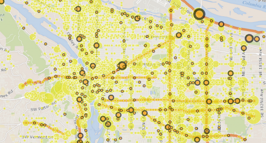
…and in cars.
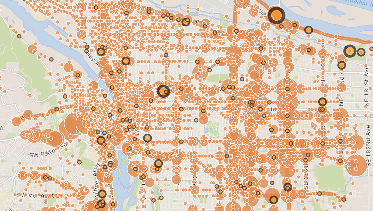
Something else: instead of mapping only fatalities, it also includes all reported injuries, serious and otherwise, from 2004-2013. This is obviously a very incomplete data set; many hundreds of injuries don’t get reported to any authorities, especially (perhaps) those suffered by people who might want to avoid attracting the law’s attention. It only includes crashes that involve motor vehicles, which means that a collision between a bike and a person, or between a bike and a pole, wouldn’t count.
Also omitted: bike crashes involving streetcar tracks. Advocacy group Active Right of Way invites crash reports and sends them to the city, but they’re not recorded here.
If you’re involved in a collision with a car, you can report it by printing out and mailing this form to the Oregon Department of Transportation.
Advertisement

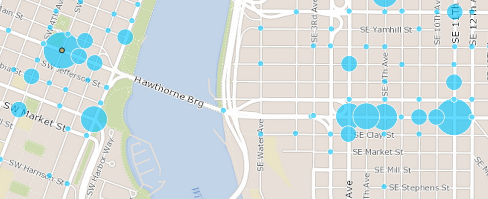
That said, this map offers the best data we’ve got, and when looked at over 10 years, the patterns start to emerge. For example, it’s pretty clear that inner Northeast and Northwest Broadway is the city’s densest corridor for bike-related collisions:


There are two more hotspots on either side of the Hawthorne Bridge — or, more specifically, a few blocks inland in each direction.
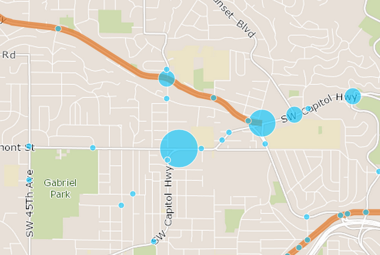
Capitol Highway is another clear problem corridor, especially at Vermont:
And almost every intersection on outer Division has seen bike-related collisions despite what are almost certainly much lower volumes:

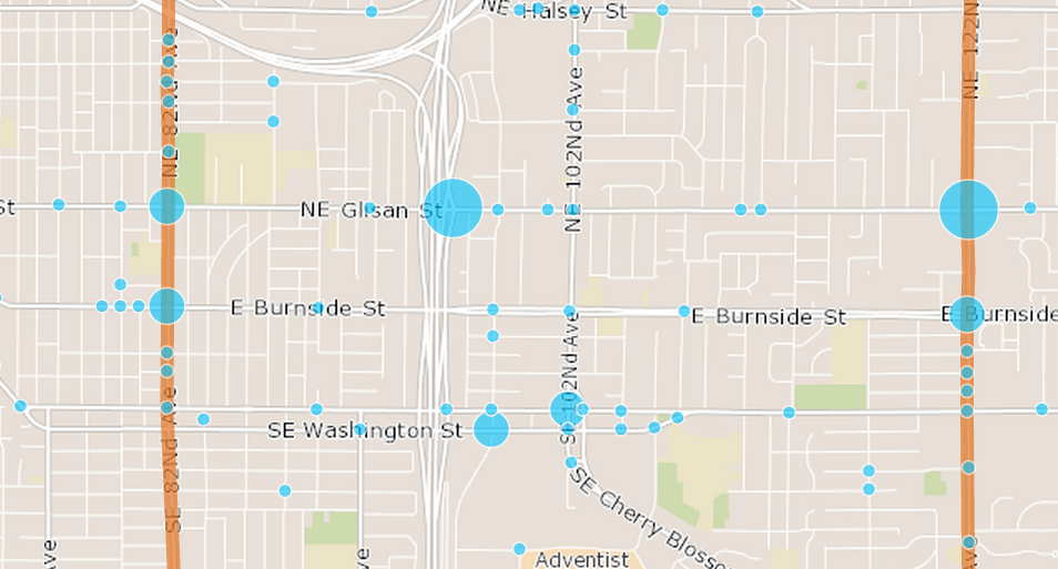
There are two isolated hotspots at the points where Northeast Glisan (a distinctly un-bike-friendly street in East Portland) crosses Interstate 205 and 122nd Avenue.
One thing to keep in mind with all these maps is that they’re not controlled for the traffic volumes at each location, which means that they’re largely population maps. That’s not useless, though. After all, if you’re deciding whether to improve a dangerous intersection that 5,000 people use every day and one that 200 people use every day, you’d probably want to start with the first one.
Active Transportation Division Manager Margi Bradway said Monday that two months after this map launched with the city’s Vision Zero announcement, she and her colleagues are already using it regularly to inform their decision-making and strengthen their case for the city to make improvements. If this is the first step to focusing resources where they’re needed, we’re all for it.