Old
|

New
|
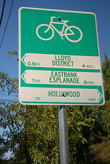
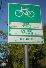
The City of Portland Bureau of Transportation (PBOT) has begun installation of new wayfinding signage along the growing network of bike boulevards. The new signs — which include arrows, distance, and travel times to key destinations — have a slightly different design than existing ones.
As you can see in the photos above, the destination labels are larger and more legible on the new signs and the colors are reversed. The old signs (which will remain in place) have a white pennant with green lettering and the words are in all caps. The bike symbol on the old signs was larger, giving designers less room to work with.
According to Roger Geller, the old signs were non-standard when they went in but ODOT gave Portland special permission to use them. Now, with ODOT’s tweaks, the signs are official and can be used as a standard in cities throughout the state.
The new signs follow more standard design conventions with white lettering on a green background. The ODOT-influenced signs also have a smaller bike symbol which left more room for the destination labels. The result, at least in my opinion, is clearer, more legible sign. You’ll also recall that these are the same signs the City of Milwaukie installed on some of their bikeways back in February.
The signs are part of the $1 million federal stimulus grant that is also paying for the 2,000-plus sharrows being installed on the bike boulevards.
At least one reader shares my opinion that the new signs are more legible from further away. Have you seen them yet? What’s your opinion?