Last week, the U.S. Department of Transportation announced $800 million in roadway safety grants nationwide, including more than $22 million for Portland-area projects. But it will take more than funding and a plan to achieve the goal of zero roadway fatalities nationwide. First we have to see where we currently stand and admit there’s a problem.
A new set of interactive visualization tools just released by the USDOT show just how dire America’s traffic safety crisis is. These visualizations use a national dataset of all fatal motor vehicle crashes from the National Highway Traffic Safety Administration (NHTSA) to “illustrate the significant impact of motor vehicle deaths in our communities.” These maps provide an illuminating look at traffic violence statistics nationwide, giving insight on the different factors that contribute to fatal crashes and where they’re most and least prominent.

How does Portland compare?
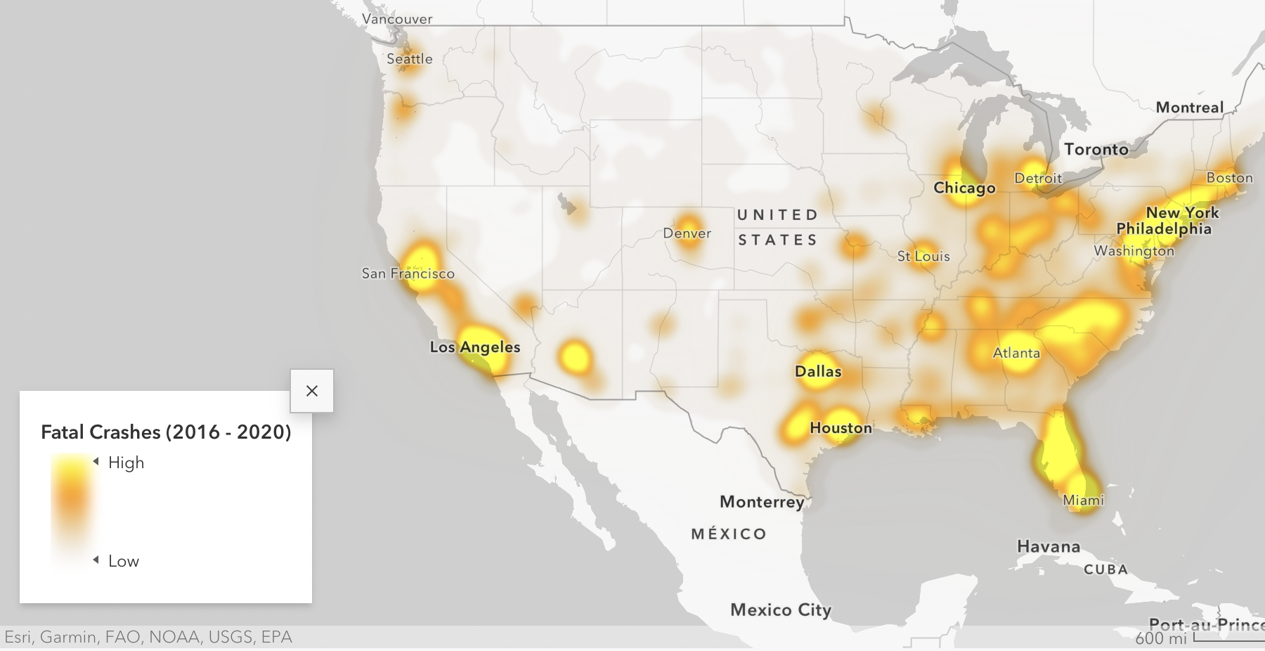
Looking at the first visualization, which shows traffic death hotspots across the U.S., Portland might seem like it’s in pretty good shape compared to other places in the country. While central and southern California, Florida and the mid-Atlantic coasts are covered in blobs of bright yellow to indicate a very high rate of fatal crashes, the Portland region is more of a burnt orange. The number of fatalities in Multnomah County from 2016-2020 was 5.3 times higher than the national average — but Los Angeles County experienced 63.4 times the national traffic crash deaths in that time.
However, it’s difficult to compare a county’s fatality rate against the “national average county,” because a lot of counties in the U.S. are in very rural areas. Los Angeles County has more than twelve times the population as Multnomah County, so it follows they’d have a much higher number of crash deaths. This is where another visualization, which looks at per capita crash rates, comes in handy.

Per capita, Kern County north of Los Angeles makes a better comparison against Multnomah County. About 100,000 more people reside in Kern County than Multnomah, but the fatality rate there is 18.57 per 100,000. In Multnomah County, it’s 7.68. The median for all counties nationally is 17.98, which points to a really dire situation particularly for rural areas.
The fact that the Portland area is doing better when compared to some other places is more of an indictment against them than a credit to us. From 2016-2020, 313 people died due in car crashes in Multnomah County, and the crisis has only been trending upwards in recent years. Our region is depicted on the less dire end of the spectrum nationally, which shows just how bad the problem is nationwide.
Inequitable impacts

The tool also depicts an “equity-focused analysis of the unequal distribution of roadway fatalities at the neighborhood level,” visualizing how many crashes take place in historically Disadvantaged Communities (DACs). DACs are defined by the USDOT through their Justice40 initiative, which aims to tackle transportation inequity. In order to fit the title of Historically Disadvantaged Community on the map, a neighborhood has to meet at least four of the following criteria:
- Transportation access disadvantage identifies communities and places that spend more, and take longer, to get where they need to go.
- Health disadvantage identifies communities based on variables associated with adverse health outcomes, disability, as well as environmental exposures.
- Environmental disadvantage identifies communities with disproportionately high levels of certain air pollutants and high potential presence of lead-based paint in housing units.
- Economic disadvantage identifies areas and populations with high poverty, low wealth, lack of local jobs, low homeownership, low educational attainment, and high inequality.
- Resilience disadvantage identifies communities vulnerable to hazards caused by climate change.
- Equity disadvantage identifies communities with a with a high percentile of persons (age 5+) who speak English “less than well.”
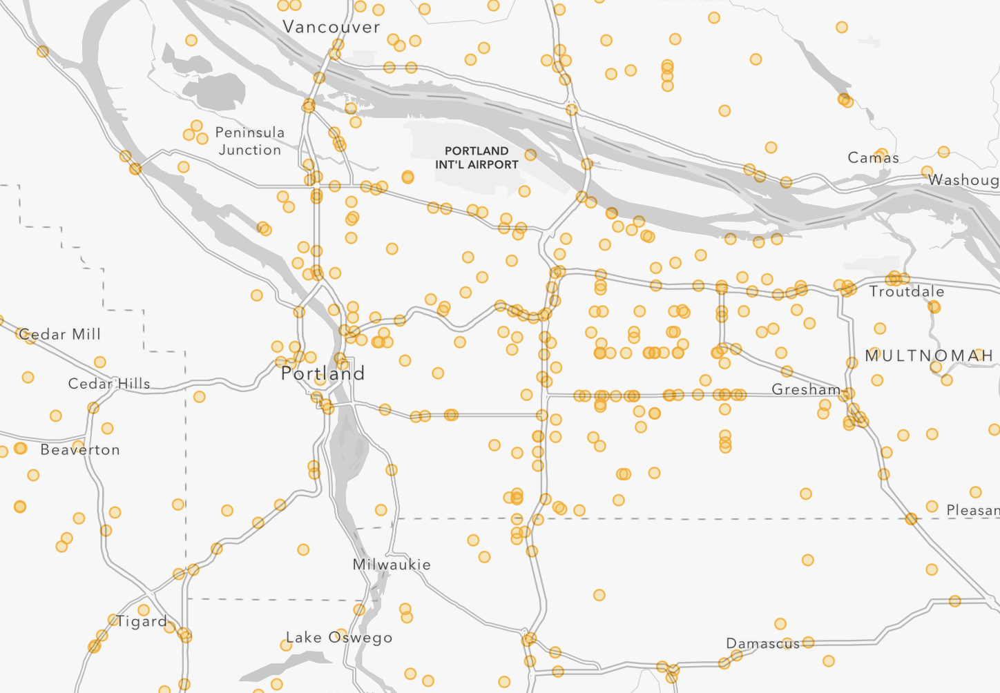
As transportation equity advocates know, people who live in DACs are more likely to be victims of traffic violence. When you zoom in on the map and look at where vehicular fatalities happen the most in Portland, they are located in the lowest-income parts of the city, predominantly in east and north Portland.
According to the data, nearly half (43%) of the communities in the top 20% of roadway fatalities nationwide belong meet the DAC criteria. 26% of all fatal crashes in DACs result in pedestrian deaths. (It’s unclear how the national data accounts for people biking or rolling.)
The Portland Bureau of Transportation’s annual fatality reports demonstrate this as well. But looking at the national data is helpful for putting together larger trends over time and place.

Is there any progress?
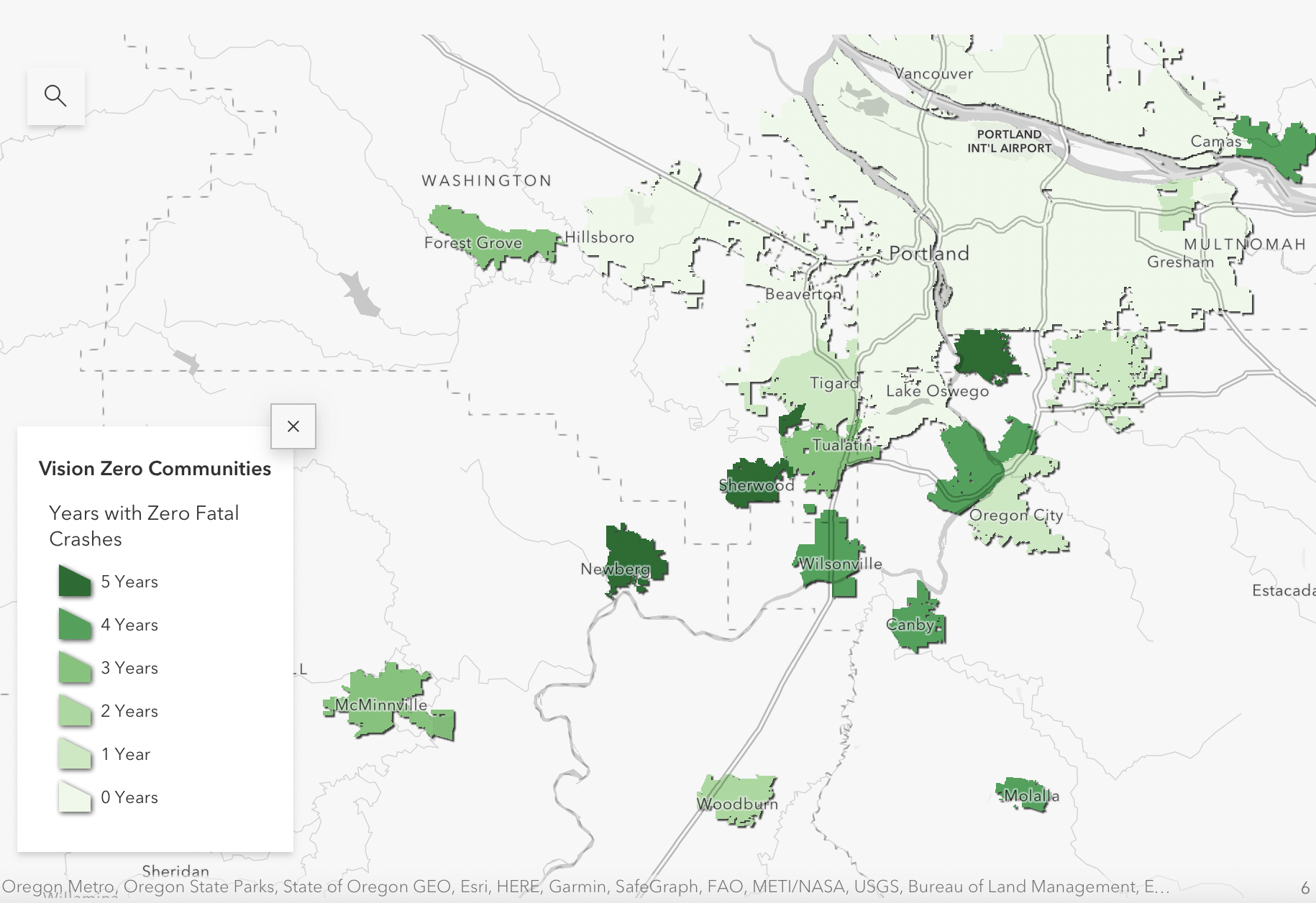
According to this data, there are some places in the Portland area that are doing well. Sherwood, Milwaukie and Newberg are all Vision Zero cities on the map, with no fatal crashes from 2016-2020. Wilsonville and West Linn are both in the top 25 small cities for low fatality rates, having reported one fatality each during those five years.
But as Kea Wilson points out in a Streetsblog article about this new tool, the cities that the DOT heralds as Vision Zero-achievers haven’t necessarily gotten there on purpose. Some, like Hoboken, New Jersey, have a dedicated Vision Zero strategy that guides their infrastructure development. Others haven’t put in quite so much work. Without more context, this data shouldn’t necessarily be used to indicate the best cities to emulate for meeting Vision Zero.
“Many are exclusive, minuscule suburbs that simply shunt faster vehicle traffic onto arterial roads outside their borders, effectively endangering residents every time they enter or leave,” Wilson writes.
While there are some glimmers of hope on the map, the overall takeaway from this data is bleak. Nationally and locally, the problem is getting worse by the year. The only good news depicted in this data set is that we have a national transportation department willing to look at the problem honestly enough to create these impactful visualizations.
You can find the full set of visualizations at the NRSS website.