
The main gripe Portlanders seem to have about bikesharing so far isn’t that it’s a bad idea — it’s that there isn’t going to be enough of it.
This is, as TriMet officials often say when they’re trying to cheer themselves up, a pretty good problem to have.
In the meantime, however, it’s still an interesting puzzle — as Willamette Week showed last week with a characteristically dramatic article reporting that the City of Portland is planning to focus its stations in the central city (something it’s been clear about from the beginning) and that (in a new development) it’s planning to grease the wheels for bikeshare sponsorship by offering to pay the up-front cost, essentially as a loan, should private sponsors step forward. (WW’s article also said unnamed sources think the likeliest sponsor is health company Kaiser Permanente.)
Also, as we shared in this week’s Monday Roundup, Transportation Nation has been reporting on the failure of Alta’s New York City bikeshare system to expand out of Manhattan as promptly as it said it would.
It all adds up to some legitimate concerns: With only enough money for 75 bikeshare stations in Portland, which neighborhoods should get them?
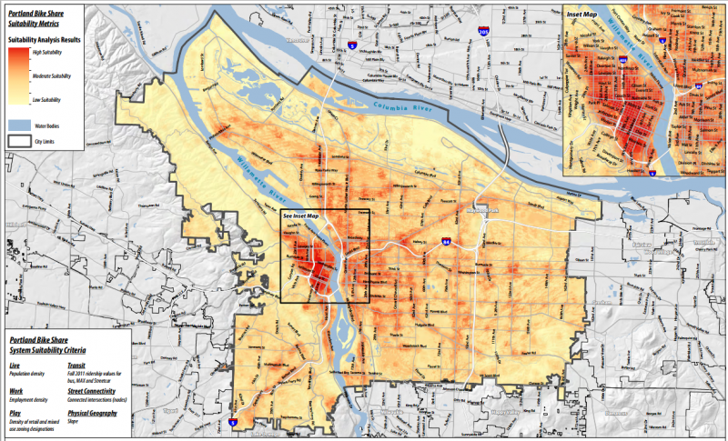
To answer that question, let’s look at some maps. First, let’s start with one prepared by Alta using a six-part formula they’ve developed in the eight cities where they currently operate bikeshare systems: residential density, job density, retail/mixed-use density, transit ridership, street connectivity and flat terrain:

Compare this to a similar analysis of “suitability” in Washington DC’s successful bikeshare program, including dots where the stations actually wound up:

And here’s a map showing which stations drew the most rides:

Alta did similar analyses in two cities close to Portland’s size, Cincinnati and Calgary:


And here are the first and proposed second phases of Minneapolis’s Nice Ride system, the one that’s likely to be most similar to Portland’s in user base and initial size. It successfully opened the second round of stations one year after launch, and a third round of stations a year after that. Total ridership has continued to grow rapidly thanks to that expansion, but ridership per station was highest when the system was confined to the central city.

Ridership, however, isn’t everything. Portland’s public startup cash for bikeshare came from a federal grant intended specifically for “equity,” and city council approved it only after committing to a “robust public process” about how to make it useful for poor Portlanders and Portlanders of color.
So, would stations downtown serve only the white and well-to-do? Well, here’s a map from the Coalition for a Livable Future’s Regional Equity Atlas showing the Census tracts with above-average percentages of residents in poverty in 2010:

And here’s one showing above-average percentages of people of color as of 2010:

These maps back up the fact that, as former Mayor Sam Adams pointed out in a testy exchange with Multnomah County Commissioner Deborah Kafoury at a 2011 Metro hearing, downtown includes “some of the most poor and diverse census tracts in central Portland.”
However, just because people live somewhere doesn’t mean they’ll use bikesharing. Bikesharing in other cities has been disproportionately underused by poor people and people of color; a shockingly low 3 percent of Capital Bikeshare riders are black. Some of that may be due to station location; another factor is up-front cost of annual membership (about $75) and the fact that they typically require credit cards to use (something that locks out 12 percent of Americans).
Here’s one final way to think about where bikeshare stations should go: the places where the city’s bikeshare station crowdsourcing tool shows that they’ve been most requested. Here are the top 20 most popular stations on the city’s website, all of which have received at least 40 votes:

Or looking at it another way, here are all the stations that have received at least 10 votes:

The puzzle of which neighborhoods bikeshare should serve is a real one, but it isn’t unique to Portland. It isn’t even unique to bikesharing. It’s almost exactly the same as a longstanding tradeoff in the world of public transit: should we focus transit in the areas where ridership is the highest and requires the least subsidy, or in areas where ridership will be lower but there are fewer other ways to get around?
The more money the public is willing to spend to subsidize a system, the more that system is able to afford serving less-profitable areas. In the case of Portland bikeshare, our city agreed to use federal money to subsidize the startup cost, but not to cover the ongoing cost of the service.
In the public transit world, every community comes to a compromise between the two extremes, then continues to tweak that compromise on an ongoing basis. That’s what to expect when and if Portland bikeshare finally shows up.