(Photos: Aaron Kuehn)
[Publisher’s Note: This is the first part of a three-part series by Portlander Aaron Kuehn. Aaron is the outgoing chair of BikeLoud PDX, a local bike advocacy nonprofit. He recently completed the bikeway design workshop offered by the Transportation Research and Education Center based at Portland State University.]
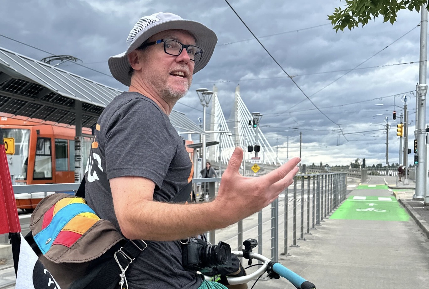
My name is Aaron Kuehn. I’m a design nerd, and for the past year I was the chair of BikeLoud — Portland’s outspoken bicycle transportation advocacy group. I think everyone has a role to play in designing great streets, so get out your colored pencils and some sheets of paper, and join me as we design our own excellent bikeways…
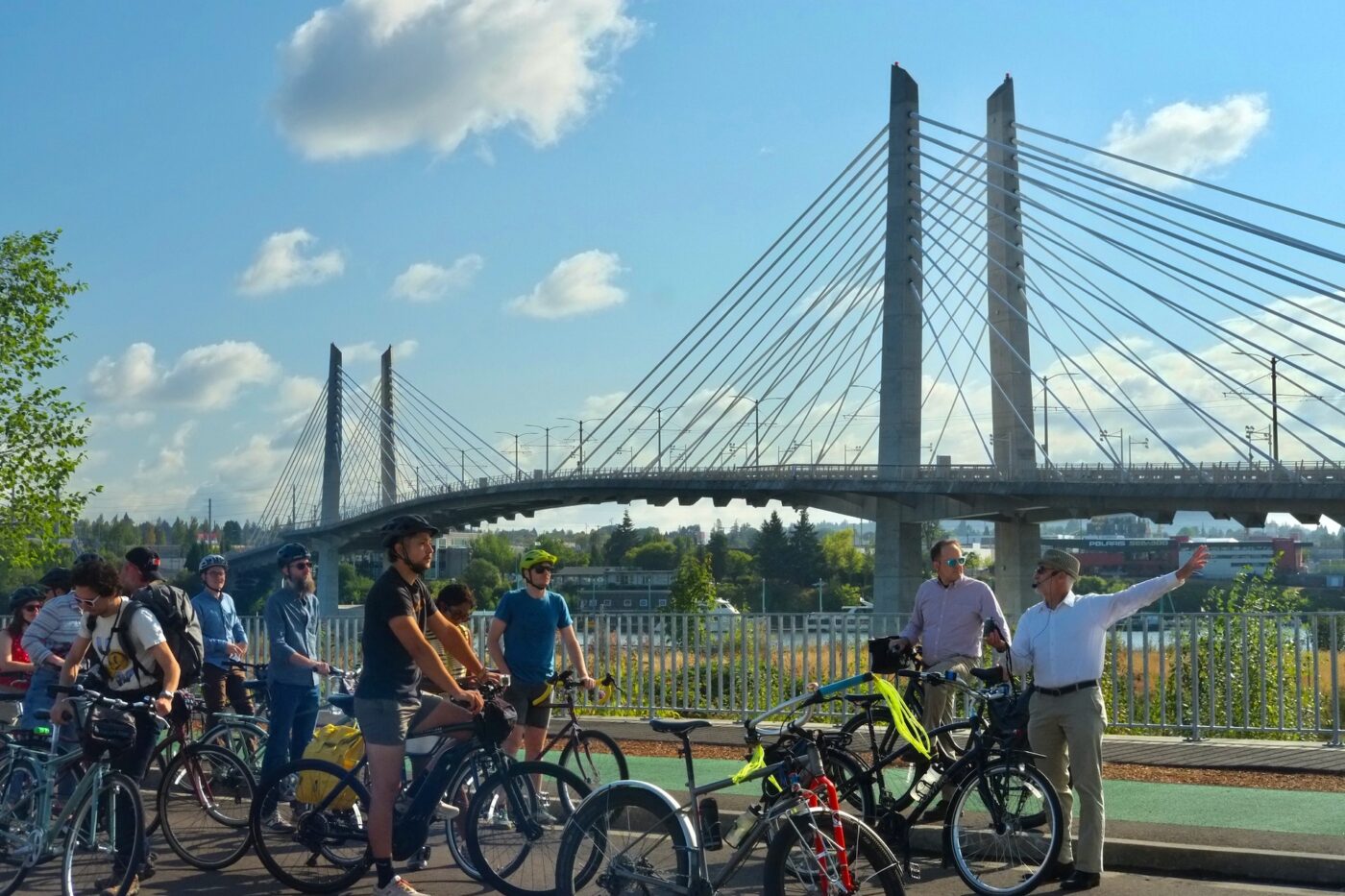
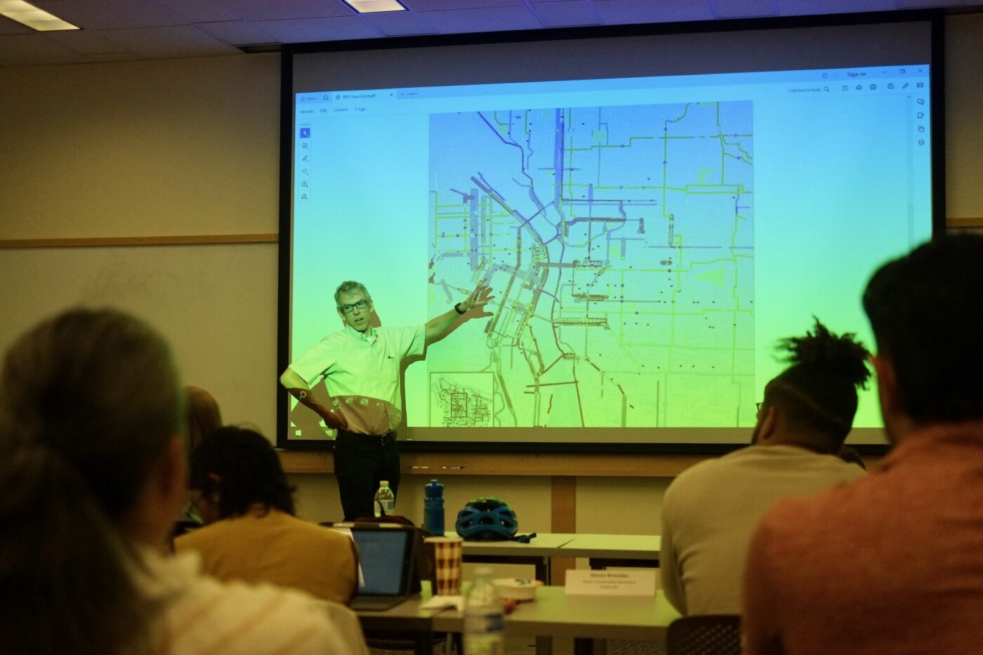
As Portland savored the last sparkling swigs of Bike Summer, I went back to school for a weeklong Bikeway Design Workshop with 17 transportation professionals to learn how to design better streets for biking.
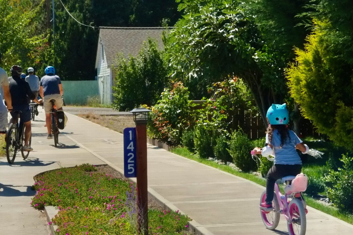
Summer group rides are a joyful pleasure, with safety in numbers and party vibes transforming almost any street into a great bikeway temporarily. Sustaining that experience year-round, outside a group ride, requires excellent bikeways.
Portland has a reputation as a Mecca for bikeway design. People attend this workshop from around the US to experience our infrastructure gallery in person, and hear from the luminaries responsible. I was there to pry back the craggy layers of Portland’s streets, to scrutinize the design process, and to share what I learned with you.

30% plans – Let’s go!
Let’s start on a 30% plan, just a rough draft of our bikeway, or what someone might refer to as a, “concept of a plan.” If you are feeling under-qualified, buck up! Sixty years ago Jane Jacobs, an activist without a degree or formal training in urban planning, exposed the entire car-centered urban planning field as a destructive and misconceived “pseudoscience.” You are part of the solution.
Things you’ll need:
- Paper
- Extra paper for revisions
- Pencil with eraser
- Colored pencils (especially green), or a computer
- Tape measure
- The MUTCD, or another big book to prop up your final design
Step 1 – Planning to fail
Look at you over-achievers already starting on your road diets — brake check — pencils down. Our new bikeways should work together and build toward a bright future, to catalyze social changes in our community that we desperately need. Before you get started with the fun stuff, read this entire 586-page Metro Regional Transportation Plan first. Just kidding!
Even the Oregon Department of Transportation just starts by drawing pictures of unrealistic hyper-expensive projects that ignore our regional transportation vision: “Everyone in the greater Portland region will have safe, reliable, affordable, efficient, and climate-friendly travel options that allow people to choose to drive less and support equitable, resilient, healthy and economically vibrant communities and region.”
Portland also has a 20-year Transportation System Plan, and a Bicycle Plan for 2030. The objective of the Bicycle Plan is to enable 25% of trips to be made by bike! The rosiest internal assessments show a long ride ahead.
Don’t let strategic planning, or a lack of progress on regional goals stand in the way of your design process. Your project is underway and the clock is ticking.
Step 2 – The user
Once you get the hang of drawing bicycles — which is the hardest part of bikeway design — you are going to want to show people riding them. But what kind of people? Portland’s long-time bicycle coordinator in a fedora, Roger Geller, wrote a legendary paper that first identified the four types of bicycle riders. He postulated most people are “interested” in bicycling, but also “concerned” about its safety. The bicycle riders in your design should look “interested but concerned.” You should also show riders of all-ages-and-abilities, which should get your creative juices flowing.
Acknowledging that our designs must facilitate all kinds of people to ride bikes opens up new design options. Your bikeway can be anywhere on the page now, not just squeezed over to the right by the parked cars, where only the ‘strong and fearless’ dare ride.
Step 3 – The network
If you are doing a perspective drawing of your design, or even a cross-section, you will need to show some context for your bikeway. Does it connect two parks or neighborhoods? Is it a way to get to school, or to the store? Which streets will your bikeway traverse?
With 55,000 streets in Portland, if each street segment was a brain cell, the network would be as complex as a slug brain. Slugs aren’t very smart, but they can design transportation networks — using desire lines.
Like slugs, bicyclists leave a shiny trail behind that can be observed in the right light. Location based services on phones, e-scooters, or bikeshare show the popular street segments and routes that people actually prefer – the slug trails. Lots of slug trails are on streets without existing bikeways, or on streets with bikeways that need a refresh. Pick one of those “desire lines” for your bikeway, and you will be ahead of state-of-the-practice designers.
Step 4 – Political willies
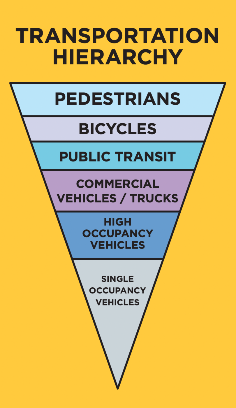
Drawing bikes and people is hard enough, does your design need to show cars too? Portland answered this in the 2009 Climate Action Plan. According to the “Green” Transportation Hierarchy, people walking and riding bikes should be the most prominent elements in your design, and cars should be considered last.
If you don’t show cars at all, people might get offended and say your design doesn’t look like a real street. You might hear there is not the political will to build your design, or there is no reason to build a bikeway without the traffic volumes to justify it.
The hysteria and passion people have for defending driving is a result of motonormativity, where attempts to reduce car use are interpreted as an attack on personal freedom. Because motonormativity is prevalent not just in drivers, but pedestrians, cyclists, transportation engineers, and throughout society — if your design doesn’t show cars you’ll have some explaining to do.
Set up at least one meeting with community members and other stakeholders to gather their feedback. Engineers still use the Decide Announce Defend (DAD) strategy during community meetings to ward off costly revisions, but you can use sticky notes, a multilingual survey, or other engagement tools to capture public sentiment.
Another way to involve the community in your design is to invite them to participate, or even make budget decisions. Sincere dialogue between project partners, like the City and the public, builds trust and begins the process of identifying the real interests that underlie our steadfast positions. When our real interests are identified, it’s easier to create designs that successfully respond to them.
Step 5 – Fieldwork
If at any time you feel stuck, or just need to exercise your legs, go out into the field for a site visit. Riding your bicycle is an important part of the design process. Imagine you are a real person riding on your future bikeway, what would you want? You can tell when a bikeway is only designed on paper — go ride it!
Our 30 Percent Plans are taking form. In the next part we’ll move onto 60% plans and incorporate the community feedback we received and make some big decisions using standards and best practices.
— This series is by Aaron Kuehn, a veteran cycling advocate, Bike Happy Hour regular and former chair of BikeLoud who rides a Marin Pine Mountain with hi-viz streamers. Read the full series here.
