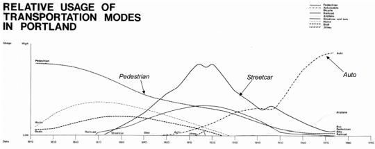
When you step back far enough, the history of transportation starts to look less like a river — constant progress toward a final, permanent destination — and more like waves crashing against a beach.
That’s the point of this chart. It pops up in the world of Portland planning from time to time, most recently in a slideshow by city planner Mauricio Leclerc about the history of parking in Portland. If you’ve never seen it before, it can be a mind-bender.
“It wasn’t until, I believe, the 1930s that the Boy Scouts did the first traffic counts across Portland’s bridges. Then things got pretty weird. People lost sight of why they were building cities.”
— former Portland Chief Transportation Planner Ernie Munch
There’s the age of walking, stretching into the past like the Mesozoic. There are the rise and fall of horses, made obsolete by trains and cars, and of streetcars, whose dominance peaked in the 1910s but was briefly threatened at that time by a wave of private jitney buses similar to today’s Uber and Lyft services.
Finally, there’s the all-eating automobile — and the implication, coded into that blank space between 1975 and 1990, that cars might soon recede just as every other mode eventually had.
That’s no coincidence. This chart comes from the 1973 draft environmental impact statement for the then-proposed Interstate 80N, popularly known as the Mount Hood Freeway. Over the next several years that impact statement, prepared by planners and engineers at the big engineering firm Skidmore Owings and Merrill, became a key weapon in killing Portland’s most infamous freeway plan and replacing it, eventually, with the city’s first MAX line.
Advertisement
It’s no longer widely known that this chart comes from that historic document. But on a tip from Leclerc, I Googled and emailed former Portland Chief Transportation Planner Ernie Munch. Munch, who had worked for Skidmore Owings and Merrill and still works in Portland as an architect, wrote back two hours later with the story behind the chart:

(Photo: PDXplan.org)
I originally made the chart for the Mt. Hood Freeway EIS back in maybe 1972. The basis was my survey of historical literature and photos of Portland. … Afterward, while at the City of Portland, I prepared a slide show which tried to illustrate the interaction of the landscape, transportation, legal systems, human values, economics, etc. in the forming of what are now, Portland’s inner-city neighborhoods. The historical study was the basis of the Arterial Streets Policy, which became the transportation element of the comp plan—the basis was not an analysis of census tracts and traffic demand as was the earlier PVMATS, 1990 plan. Steve Dotterrer, a friend and classmate at the U of O, took my place at the planning bureau and carried on with the show after I left the city in 1979.
So, back to the graph… it is fairly unscientific by today’s standards…. even by 1972 standards. I wasn’t too bothered by that at the time or now in fact. Most of Portland’s land use decisions followed transportation improvements. The early transportation planning work was all value based, Olmstead wanting to give people a feel of the landscape, Bennett wanting to make Portland beautiful, WS Ladd putting his Victorian values into a SE subdivision, (despite his engineer’s objections), etc. It wasn’t until, I believe, the 1930s that the Boy Scouts did the first traffic counts across Portland’s bridges. Then things got pretty weird. People lost sight of why they were building cities and fled to greener suburban pastures. As shown by the PVMTS plan in your attached slide show, in the 1970s, Portland could have gone either way.
So without anyone counting pedestrians and horses and boat traffic, it is not a scientific chart. You could liken it to an art work which illustrates a truth in abstract terms. Relative is the operative word. Relatively high, relatively low. It is relatively accurate.
(Links added.)
Munch noted in his email that the bike boom of the 1890s, lightly visible in this chart, made the auto boom possible because its advocates convinced the city and state to begin paving roads. Near the very end of the chart, it’s also possible to see the slight upward bend of the “streetcar and bus” and “bicycle” lines as Portlanders start responding to the oil crisis of 1973.
“It would be interesting to update the chart,” Munch added.


