(Photos M.Andersen/BikePortland)
This post is part of our special focus on east Portland this week.
When people talk about using “traffic calming” to design a “commercial greenway” — like the one proposed for NE 28th Avenue — it sometimes comes off as a strange, experimental sort of magic that we’d probably have to visit Europe to understand.
But we don’t. Most Portlanders — most Americans — walk or drive through areas that are models of safely shared space almost every day of our lives. But we don’t call them greenways or woonerfs or home zones.
We call them parking lots.
So far this week, we’ve talked a lot about things east Portland could learn from central Portland. Now let’s put the shoe on the other foot.
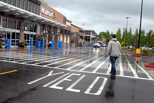
Because the Walmart at SE 82nd and Holgate lot sits entirely on private property, and therefore isn’t subject to the same design rules created for public roads in the mid-20th century, the people who designed its parking lot (whoever they were) were free to do everything they could think of to help people share space with cars without thinking twice about it.
It works perfectly.
It’s not that Walmart’s parking lot is as comfortable for walking or biking as a sidewalk or a park. Nowhere with rolling motor vehicles could be. But it’s as safe and comfortable as you’ll ever feel while sharing a street with cars. Because when you’re walking through a parking lot, that’s exactly what you’re doing.
Here are a few of the ingredients that designers of future human-friendly commercial streets might keep in mind — or head over to 82nd and Holgate to check out for themselves.
1) People are constantly walking in every direction.

The huge striped area in front of Walmart’s front door isn’t textured (though that’s a cool trick used by some other parking lots). It’s not signed. It’s not elevated. It’s just striped. And everyone who uses it seems to understand it perfectly — mostly because people are using it nonstop. I never saw a motor vehicle move more than 10 mph through this area, because its drivers were always on the lookout for something unexpected. When cars are moving at the speed of bikes, it’s no problem for them to negotiate naturally with everyone else on the road.
Advertisement
Peter Norton’s book Fighting Traffic tells the story of how automotive interest groups led a national campaign in the 1910s and 1920s to create the idea of “jaywalking.” Instead, city dwellers were ordered in the name of safety to remain in carefully engineered paths. The effect: urban car speeds rose dramatically.
Spend five minutes in Walmart’s parking lot and you might get a sense of how much was at stake when our great-grandparents fought that battle, which mostly ended the days when people just walked in whatever direction they were headed. Speaking of which…
2) There are no curbs.

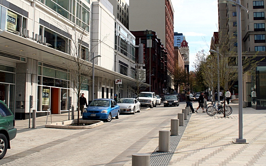
OK, this is probably in part to facilitate the great American tradition of wheeling your shopping cart directly to the trunk of your car. But curblessness (aided here by a brick stripe that could be felt by a white-tipped cane) is part of the magic that transforms this pavement from an ordered street into a freewheeling shared space.
You know where else you’ve seen this design, using curbless streets and posts to give people permission to scatter in every direction, blurring the line between sidewalk and street? Downtown Portland’s nationally celebrated architectural jewel, Director Park:

It works there. And it works here, too.
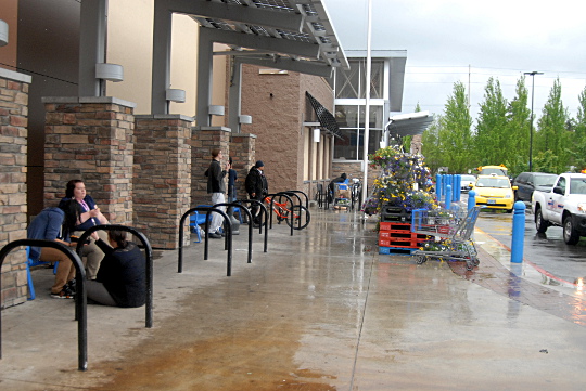
3) The walls have nooks, and the nooks have benches.

Again, these were probably included for a totally commercial purpose: they’re a good place to wait for a ride. But they have a social purpose, too, creating a public space where you can sit and talk in a part of town that isn’t set up for such things.
In architect-speak, these pillars and benches “activate the space” between Walmart’s entrances, further increasing the ratio of humans to cars in front of the store and giving people a place to enjoy things they just bought.
4) The crosswalks are elevated.

Further from Walmart’s front door, where walking is rarer and cars are more dominant, the parking lot reverses its no-curbs trick: it raises the crosswalks to sidewalk level.
This is an idea that’s been much discussed on 28th Avenue but generally understood to be impossible, even if the crossings are raised by a single inch, because 28th Avenue is designated as an emergency response corridor. (I was once told, within the span of a minute, that one-inch-high crosswalks are pointless because drivers don’t notice them, and also that they’re dangerous because they jostle the IV needles of people in ambulances.)
These concerns are probably valid on some streets. I don’t know how much damage a raging fire can do in the seconds it’d take for a fire truck to slow down to cross one of these crosswalks, or the cost of those seconds when an ambulance is racing toward a stroke victim. But I do know that raising a crosswalk by six inches has a radical effect on the behavior of people driving — and on people’s sense that this is a safe place to not be inside a car.

Obviously Walmart is a ruthlessly profit-driven company, and it certainly didn’t order its parking lot to be designed so carefully in order to reduce auto traffic — it probably did it to reduce injury lawsuits and to prevent people from having unpleasant experiences while attempting to give Walmart their money.
But that’s exactly the point. Traffic calming isn’t about reducing auto traffic or driving cars off the street. It’s about reducing injuries. And it’s about making places more pleasant to live, work and (yes) spend money in. In a city that says its top priority for 28th Avenue is to help local businesses continue to make money, there might be a lot we could all learn from Walmart.
The idea for this post came from local writer Jeff Mapes’ 2009 book Pedaling Revolution, in which he compared Dutch woonerfs to spaces outside “apartment complexes, where playing children, chatting neighbors, and carefully moving cars shared the parking lot.”

